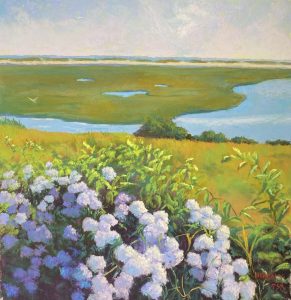
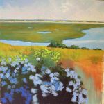
I’ve just completed my third painting from Nauset Marsh and I have 2 more I want to do. Hoping to be able to do them before we leave for Europe on Sept. 5. This is one I was really looking forward to because of the roses and the ability to play with colors. The composition is a little odd, with the marsh and land masses joined by the distant tops of trees peaking over the hill. But I liked it because it was different and provided some interesting shapes.
I decided that I didn’t want a bright blue sky in this one. So I added a little blue, then brushed a light pink over most of the rest of it to give the sense of fog or light clouds. I liked the softness of it and the fact that the pink relates to the flowers. I added water, distant sand bar, a tiny bit more water, and then the marsh. I played with various shapes of the water holes in the marsh, and softened the dunes, then added the water.
What looks like bushes are the tops of trees as this is a hill overlooking the marsh. They are kind of odd and I overdid trying to capture the one in the middle with too many colors. Finally settled for a warm green, cool green, dark green and a little violet. For the grasses, I used a combination of warm greens, yellow greens, a little pinky orange. I wanted to keep this part fairly simple, given the complexity of the foreground.
For the flowers, I started with three values of blue/blue violet and made shapes. I began working on the left side with pinks and a little light blue. The warmest color on the left is one of the really light violets from Blue Earth. When I got to the flowers in shade, they began with reddish violets, then I added blue violet on over. I loved the colors! BUT, these are white flowers surrounded by green! So I needed to add more of a sense of green. I used turquoises: a light one for the left side of the blooms in sun, and darker ones in the shadowed areas. Finally I added a very light yellow green, followed by the Ludwig yellow white on the blooms in sun on the right. It made a difference.
What I loved about the photo was the branch coming up on the right. I didn’t have to make this up! The flowers lead the eay to the bottom, but the branch leads it back into the picture plane (at least I hope it does!). My final touches were a few yellow orange grasses in the foreground and some real light yellow in the leaves, to make them stand out more from the grasses.
As I look at this, the horizon seems to be unstraight, but I think that might be the photo. Will take another look before it’s framed!

