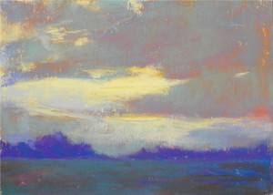
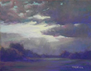
For my advanced class this week, I was to do a demo on working from a black and white photo using intuitive color. Last Monday I spent time doing color studies and chose the one given in this post. I liked the use of warm color under cool. When I began doing the demo, however, I began with warm, moved to blue greens, then started using cool pinks and majentas! All of a sudden I had a completely different color scheme! But I liked it and decided to stick with it. My challenge was what to do with the sky. I began with very light aqua and pinks, to keep with the cool red and greens. then put in the lightest soft yellow that I had. It is noticeably cooler than the yellow used in the color study but it definitely added brightness. It has more of a silvery quality, I think. The 11 x 14 format gave more room for the land and I decided to add a layer in the front so as not to have the solid line going across the bottom. The resulting picture is darker than the study, but I like it. I’m considering doing it again on a 16 x 20 pastelbord to see what happens that time. If I do, I’ll post it! The main lesson here is to let the painting speak to you. Once I started going in a new direction and liked it, I kept with it and put away the color study. I may frame both!


Dear Jean,
I LOVE the mood you created with your shift in color–but I’m not too clear from your written description just what youd did and in what order. Would you consider giving us a more detsiled explanation in class next week?
connie g
Connie–for the benefit of others, I will explain here. First of all, I did the painting on a darker paper than the study and a week apart. Secondly, I did not save out the pastels I used for the study. Had I done it all at one time and had I really wanted to reproduce the color exactly, I would have used the same paper and pastels. However, I thought I could approximate it. I began with a reddish brown hard pastel. Then looked for the grayed blue green that I had used in the study. Instead, I picked up a greener pastel. Having put that on, I instinctively looked at a cooler rose color Girault and applied that. That was when the color palette changed. I loved the combination of cool greens and cool reds. Then I applied cool blue violets below in the land mass. And voila! I had a completely different painting. I do plan to do a 16 x 20 version and will see where I go with color in that one. But first I must go to Massachusetts.
Using intuitive color in my paintings is just such a turn-on, a rush, deep pleasure.
Not always what buyers are looking for but I paint mostly for me, not what sells or what is accepted, or rule-following.
Several years ago I played with my on-site unused pastels and created 22 6 x 6 little “jewels” of brilliant, unexpected colors. Didn’t even follow the value rule. They all sold! Such fun. And that influenced many other paintings that followed.
Elizabeth–thanks so much for both comments. I was away and couldn’t get into my blog site. I DO think that we have to paint for ourselves first and worry about the buyer secondly. It shows if the emphasis is too much on what we think might sell! That being said, I’m doing more non-house pictures these days to see how the straight landscapes do. I love doing both and I know that there is always a market for a good painting. But, I’m running out of room!!! Your little paintings sound great. I’ve really enjoyed my little color studies as well. I like using the 6 x 6 pastelbords and scraps of UART. It’s very freeing I think.