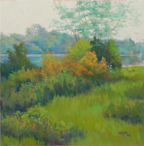
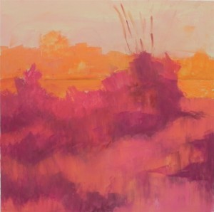
One of the things I love about winter is that I can work from photos without guilt! And one of the things I love about working from photos is the ability to think about them for awhile and play with various ideas. I began thinking about painting this scene from inland Maine on Monday and did sketches with a ball point pen on newsprint. Then, while driving to the grocery store on Thursday, I came up with the idea of doing an underpainting of complementary warm colors under the analogous warm and cool greens of the photo. The underpainting also allowed me to play with and improve on the composition: in the photo, there was a triangle of mown grass in the lower right and everything else was high bushes. The river was only visible on the right. By playing with shapes of darker value, I came up with a composition that invites the viewer to walk into the scene to the river. This painting is also about strokes. I used many small strokes of varying colors in all of the folieage and really had fun with oranges, using my new box of Dakota Blue Earth orange pastels. While the scene is a peaceful one, the strokes make it more active and vibrant. The sky is a combination of a pale grayed blue green, light orange, and a very light whitish green from the Art Spectrum “super soft” set that pulled it all together. While probably not visible in this image, I did leave some of the reds and oranges of the underpainting showing in small spots of color.


Another great lesson from Jean. I have not yet attempted a complementary underpainting but I may now do so after seeing the results of the finished painting.
The most important thing about doing a complementary underpainting, is to be sure that it’s either wet or sprayed. You don’t want the reds mixing with the greens! That will produce a grayed, muddy mess. I used Faber-Castell Polychromos pastels in pinks, reds, and oranges, and alcohol as a solvent.
Beautiful…So Alive!! I love it. Great lesson.
Was wondering what type of frame are you going to do? A gold finish, dark finsh? Matting or no matting?
Thanks Sandy. I will be framing this with a black frame, no mat. I’m hoping to work with my framer to construct a frame, but could also order a custom made frame from a plein air company. I generally use Hartford frames for my 16 x 20s and another company for larger sizes. 20 x 20 isn’t standard.
Merci pour cet article. Il n’y a pas longtemps que j’ai commencé à peindre les paysages avec pastels et vos explications sont très importantes…
Sorry… in english, I think it’s better (thank you Google Translate!!!)
Thank you for this article. There is not long since I started painting landscapes with pastels and your explanations are very important …
Glad I subscribed to your post. I am gaining new thoughts and ways to improve my pastel paintings.
Thanks Ernie. Pastel is a marvelous medium, but then I am very biased! Jean