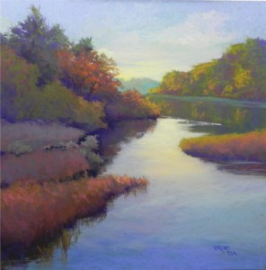
- Morning on the River, 20 x 20, UArt
The Evolution of a Painting-Part 4
In this final version, I have changed the tree in upper left completely in order to provide more sky and make it less domineering. Actually, there are now two trees: a spruce and a tree in fall foliage to its right. I added some warmer colors to the background trees at right and to the marshes on the left. And, I decided that the reeds were a distraction and took them out! With so much busyness on the left, the expanse of water with its changing colors is a welcome relief, I feel. The light water moving to the right is being caused by three ducks–little specks of dark color that can’t be seen in this image–that add interest to the painting. This picture was a struggle in many ways but I decided that I could make it work and kept an open mind as to what to retain, change or omit. While I’m sure it could be improved even more, I’m satisfied to let if rest for now. I think that the flow of shapes and values leads the eye to background and the sunny yellow sky and the tree at left does not dominate or disturb this flow.


Jean, clearly you are using a support that takes a lot of pastel – and a lot of punishment. The progress of this painting from start to finish is very interesting, and makes the point that change is possible in pastel if you have the vision, the courage (and the proper support – what is it?) I think the final result is very successful.
Niall–I seriously thought of calling this “The forgiving nature of pastel”! I don’t recommend too much experimentation on the painting surface, but it’s nice to know that we can make changes when we need to. When I was doing the small color studies, it seemed like the ability to add hard pastel was endless. This is UART 400 grit, by the way. It seems to take anything. I have the paper dry mounted by my framer so it is much sturdier and doesn’t buckle. My principle mistake was laziness! I didn’t do a large study ahead of time to see if the composition would translate well. I have an 18 x 24 pad of newsprint on which I can do 18 x 18 studies in charcoal or conte. That might have shown me the problems with the tree. I was too anxious to get into the pastel, given limited time. But it worked out OK. I just looked at the painting this morning and am pleased with it. One thing I didn’t mention in the posts was how I used the original studies. I was basically going from the third one (lower left) in terms of the sky and overall color, but with so much color, it really didn’t matter. It took on a life of its own!
Hello Jean,
You answered my question in your response to Niall. I also noted that you were able to work and rework on your painting surface and therefore wondered what surface you used. I have used pastels to alter watercolor paintings done on Arches watercolor paper especially the rough variety. What happens to me when I rework something too often is that I tend to develop “mud”. I know that comes from not enough familiarity with color theory so I am brushing up on that aspect so as to avoid the “mud”.
Love you blogs. Love your paintings
Marie–One thing to keep in mind is that I only brushed off the areas once. So it was easy to add soft pastel over and cover it up. Repeated brushing down is something that I dont’ recommend as it does produce a muddy surface. Ideally, there should be no brushing off, but that implies perfection! I personally don’t like working on watercolor paper. My favorite pastelist, Duane Wakeham, however, used Arches 300 lb. I’ve tried it and it just doesn’t work for me. It’s a very “soft” surface and you really can’t do ANY brushing off or use too many soft pastels. A harder surface, as I describe in my book, is more flexibile in this regard. I’m a newcomer to UART, but find it to be quite nice.
This blog entry is equivalent to a class. Love reading them and so looking forward to the workshop.
Me too! First, have to figure out what’s wrong with the one I’m working on. If I figure it out, I’ll post it with the secret!Pray for warm sunny skies for next week!