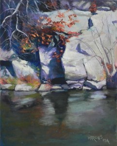
I’m really excited about this new set of rock photos that I’ve found. I’ve decided to make these the next series in my Insider’s Washington series. This is Maryland, but the C & O Canal is the favorite walking place of many people from the entire area. These rocks are at an area where the canal becomes a small lake, called Wide Water. The rocks here are particularly wonderful in shape and color and the fall foliage with these was quite spectacular. So today I did another 14 x 11 painting as a demo for my Wed. class, this time in person. It’s not easy doing such detailed work in front of people who are so enthusiastic and want to know everything! But I somehow persevered.
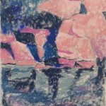
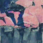
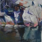
I’m showing the initial underpainting with and without the alcohol and the painting as it was at the time that my students left. I spent two more hours in the studio afterwards working on it, so the total time was about 5 hours.
My initial concerns were the composition as the photo showed pretty much half rocks and half water. I resolved it by making the rocks just a little larger than half (about 8″) and felt that the amount of water and rock was just right. My next concern was color. As I knew I’d be adding the warm red orange oak leaves, I wanted to use a lot of blue greens and neutrals. For my underpainting, I chose three values of a pinkish orange for the rocks and a combination of dark blues and blue greens for the shadows and water. The dark and light in this picture is what makes it.
I began with the rocks, laying in very light blue greens and warm neutrals. However, since I was working with a color photo, I couldn’t get past the fact that the rocks had a lot of violet in them and out came the violets! It looked better once I added them, but I tried to use greens as well. This painting is a complicated one, with many things in front of others. To begin with, I focused on the large shapes of dark and light created by the rocks. I filled in the area at upper left with blues and violets of slightly varying values to imply rocks behind the dead branches that were to come. I kept even the light areas on the cool side until very late in the demo when I added a light yellow to the sunlit areas. They really popped, particularly with the darks and hard edges of the rocks. I then added the tree on the right and it’s shadows, which helped make a large boring space more interesting. (And note, Deborah, that I got rid of the gorrilla face!)
Work done after the demo included finishing the bottom of the rocks at right and the water, adding the leaves and more small branches, finishing the top of the painting, and a lot of little stuff.
I’m thinking about redoing these in a larger format, or I could just have them reproduced larger. Not sure yet. I just know that I’m really enjoying this!


