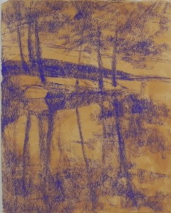
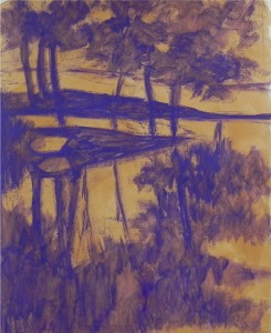
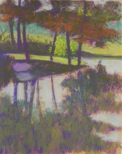
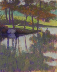
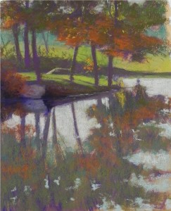
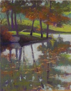
I’ve decided to experiment with putting 6 images into one blog post to see how this will work! This is the demonstration that I did for my Monday morning class. The photo had a little color and light, but wasn’t terribly exciting. But I saw possibilities, particularly for a big shape block-in. Photo 1. I began with a warm toned surface made with AS gel on Rives BFK, then lightly blocked in the major shapes of the composition. Photo 2. In class, I applied alcohol to create a partial underpainting with just one color. Stage 2. I began by lightly applying color with hard pastels and Giraults. My initial idea for the center of interest was a brightly lit bush behind the three trees to the right of the island. It appears in this image. However, it quickly became clear that what was catching the eye was the large rock and its reflection on the left. I didn’t make it dark enough and it really stood out. None of us liked it! Stage 3. I darkened the area around the rock and the rock and reflection. I also added a rock in the back and decided to replace the bush with small twigs of orange leaves. Liked all of this much better. Stage 4. The rock was still too prominent, so I brought the bush at left on over it and added reflections and liked it much better. I added more light to the leaves at top, then added red orange reflections in the water. Final picture. The last things were the addition of leaves on top of the water to add horizontal elements, and a brightening of the yellow green grass on the island. For the background, at various stages, I used yellow greens and blue greens and integrated them into each other to keep it subdued. I used red violet behind the bright grasses of the island, which provided complementary contrast. On the whole, I found this surface very nice for the type of flat reflections in the water, as well as for the details in the mid ground. The addition of darks, softening of the rock, and brightening of the grass were the key strokes that made the picture work.

