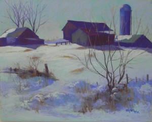
Yesterday I did the second of two snow demonstrations for my classes at Capitol Arts Network. I was more excited about the Monday demo, but I liked yesterday’s better! It’s on a 16 x 20 mounted UART 500 board from ProArt Panels. Unfortunately, it warped a bit, and I’m hoping that my framer can flatten it, as I really like the painting.
Started out with a rather wild underpainting. I used water color for the sky and snow and hard pastel for the buildings. And I used yellow green in the sky and snow areas! Not sure what the class thought. The different media created very different values of underpainting that I had to be careful to overcome. I ended up using nothing but blue greens and blue violets in the snow–no yellows or oranges. It gives it a unified look and the color is quite unique, I think. The warm pieces are in the buildings and in foreground grasses. I think I need to darken one piece of roof snow (in the middle).
The foreground was the big challenge as this is quite different from the photo. I felt like I was sculpting and making it up!
I’m having problems with the blog. Can only add text if I add the photos afterwards, which places them at the bottom. Not sure what’s going on. This is the only solution I’ve figured out for the moment. Any title ideas???


I love the feeling of this painting as I can imagine the chill I would feel looking across the field. Even though there is a lot of sunlight, the cast shadow colors make it feel very cold so something like “Three degrees below zero” feels like a title that encompasses a viewer who is standing outside or “Windswept” that describes the scene from the viewpoint of someone not standing out in the cold but perhaps from the comfort of a car. Well done.