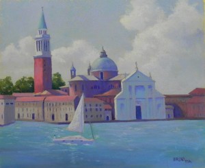
I’ve just done a lot more work on the picture I shared with you earlier this week. One friend suggested that the water was too much the same, and I agreed. I was lazy before! This time, after brushing a lot of it off, I added some darker colors in the foreground and lighter in the back, and used a mix of warm and cooler blues. I also added a lot of pastel to the buildings, using softer pastels and aiming for softer edges. I particularly like the way the right side came out. Also used some of my AS extra soft tinted whites in the clouds and put more color in the sky. I’m satisfied with it now and ready to post on Facebook.


That is a wonderful painting; the best!
Gee thanks Margaret. I fear that it is too much like a post card, or whatever! But it was fun doing it. About to post my two new Italy pictures.