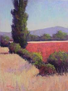
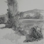
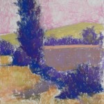
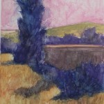
I completed my second 18 x 24 painting today. I used the second black and white photo and decided to use a color scheme of violets, reds, and oranges. Went with a cooler sky, using a blue violet at top, turquoise in the middle, and a light pink at the base of the sky. I’m including the underpainting with and without alcohol so you can see what it looks like. I began with a violet in the field to right, then added a brown over it which basically turned it to a muddy color in the underpainting. But it worked fine once I added the reds on top. My plan was to use oranges in the sunlit areas of the tree and bushes, but the red field killed that! So I used yellow greens, which really popped out. I wanted this to have a summery feel and the green does that. I really worked on the shapes, particularly of the bushes. I ended up with a huge bush in the lower right, so I made up a small one in front, then lowered the reds in to separate the bushes. Also brought a small piece of the distant field to the left of the tree and I think this is important to the balance of the painting. I like the way the real darks in the tree work (Terry Ludwig eggplant, of course!). The value is more striking in this picture than in the first. The red field is a combination of warm orangy and cool pinkish reds that I like a lot (Schminckes). I used a dark reddish brown in the tree and bushes to bring the red into other areas of the picture. The last thing I did was to add a few pieces of turquoise into the bushes and grasses to bring the sky color down.


Enjoying your new work!
Thanks Margaret. I’m having such a good time doing it!