Last week I spent 3 days painting in the Blue Ridge Mountains with three pastel friends. We had lovely weather in between cold rain and hot and hazy, so we planned it just right! This past week I spent a day in the studio working on the six paintings that I’d done. I tried to remember to film them before I started working on them, but I wasn’t always successful. So I have 4 of them with before/after images, but I’ll share them all with you. I’ll do this in two postings.
This was my first chance at plein air this year, so none of these is particularly good. Unlike some people, I rarely consider a plein air piece done until I’ve viewed it in the studio and made some changes. Invariably more light has to be added, or a building needs to be straightened. I do not consider these, or even more serious changes to be a problem in calling them plein air paintings. (But then, I never was a purist!) My purpose in showing these to you is primarily to explain the changes I made inside.
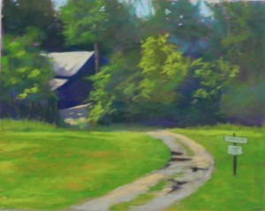
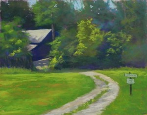
Our first day it was partly cloudy with sun coming and going. We decided to stay on the grounds and I kept looking at a driveway leading to a dark house in the woods. The light was hitting the roof, and as the morning went on, it lit part of the drive and a second roof as well. So it got more interesting as time went on! Unfortunately, my “before” picture is fuzzy, but you can still see the dark puddles that were in the lane. I decided that these either had to be lightened or removed. Given that I had added blue sky into the picture (which was really much higher up!), I decided that the puddles should be removed. I also added some light yellow greens to the bushes to the right of the house. No other changes were made to this painting. When we looked at the paintings on the first day, I was pleased with the values in the painting the strength of the contrasts, so I didn’t want to ruin that.
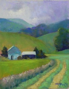
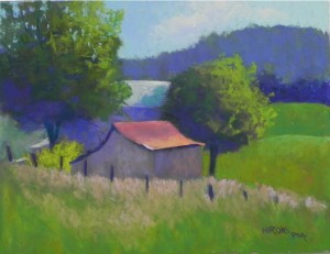
The second painting of the day was done after a shower. (Unfortunately, this is one I forgot to film before changing.) We found a covered platform behind a church with a great view of the fields and hills. I chose to paint a barn and farm buildings, with mown grasses leading to it and hills beyond. This was one of those times when the sun kept coming out and going in, and the light was constantly changing–the biggest challenge of plein air. When I got into the studio, there were three things that really bothered me about the painting. First was that I had made the right hand side too light-filled. Secondly, I had a large bush or tree to the right of the horizontal building and it looked like 3 things in a row of equal size. The third problem was with the mowed grasses at lower right. They were two one-dimensional. My first action was to cool off the field and tree on the right and blur the group of trees at the top of the hill. Then I brushed off the tree in the middle of the picture and added two trees, one in back of the building. Next, I added more darks and lights to the mowed grasses and lots of squiggly strokes to indicate mowed hay. I was quite happy with it then. This is probably my favorite of the group.
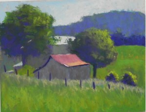
The first painting of the second day was done on Poorhouse Road! I chose a farm building with light hitting the roof and house behind it. There were two huge trees on either side of equal size. I decided to make one tree smaller and also to simplify the composition into color shapes. But it was a struggle! My initial feeling about this painting was that it was hopeless! But I decided to see what I could do with it in the studio. I forgot to film this until after I had brushed the drab green color off of the purple hill in the background. It suddenly became much better and I never touched it again! Next I worked on the sky, which was rather washed out in the initial version. I added several blues and then added light clouds into it. I started liking the picture more. I then decided that two “lollypop” trees was not a good thing. So I made the one on the left much larger, going off the page and added sky holes. I added more light to the yellow bush to the left of the forebuilding. I brushed off the roof of the house and decided to lower it. I also added a cast shadow from the tree, which I never really saw, but which I liked a whole lot! Then I brushed off some of the many layers on the little red roofed building and simplified it. I also deleted the two backlit bushes, which didn’t add anything to the picture. Lastly, I added a lot of oranges and pinks in the grasses to warm up the foreground and give more pattern to it. This is still not great, but it’s better than it was!

