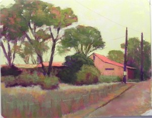
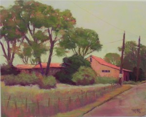
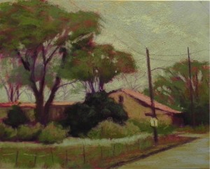
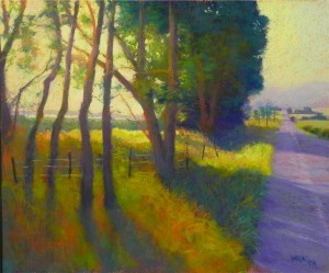
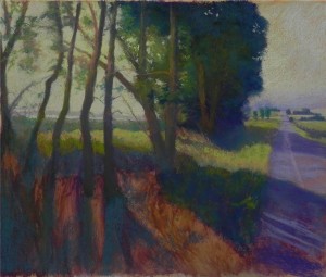
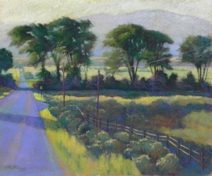
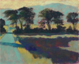
I had a great time at the gallery last Saturday doing my demonstration. Attending were former, current and future pastel students, gallery colleagues and two friends from the Library of Congress. It was great! The only downside was that the light wasn’t good and I was glad that I had done the study and had a preselected box of pastels with me. One thing I decided to change from the color study was the sky. My original was orange water color with a grayed green over it. For the demonstration I did a study with four colors of water color and light but not grayed colors on top. I asked which I should use and the yellow was suggested. So I used that and was very pleased with the glow. It shows up better in the initial photo than in the second (taken in different lighting). Over this I lightly brushed greens, a little blue, and some very light red violet. With the yellow behind, it vibrates! I worked REALLY quickly and this resulted in a fresh-looking but sometimes very unfinished painting (note the tree trunks at left in first photo.) A major change made in the final is that I cut off the roof at far left and ended the building, rather than continuing it off the edge. I much prefer this. Today I also worked on the right side of the picture–the front of the building, light fixture, and the road. I decided to keep the colors of the painting in the road, not wanting to add a blued color that wouldn’t work. I realized that what I had almost looked like a wet surface after rain. Given the color of the sky it was possible (even though there probably hasn’t been any rain there for a long time!) Still don’t have a title for it. I like the suggestions but haven’t had time to focus on it. Thanks to those who came. It was a great opportunity to share and discuss the flexibile nature and beauty of pastel.
Demo Color Study
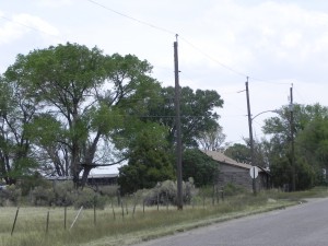
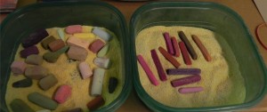
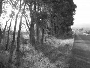
OK–I’ve been painting and listening to Bach and now I’m feeling much better! The photograph, as you can see is rather dull. Why would I want to paint that? For me, it’s about the shapes–the shape the building, which extends to the far left of the photo, and the shape of the roof on the right. Also like the shapes of the trees and the pattern of lighter grasses close to the bushes. The telephone poles and sign are an added attraction! My original thought was to change this into a sunny day and use blue water color in the sky. But I changed my mind and decided to keep it all in shades of warm, grayed greens, with orange, pink, and magenta. I started with orange watercolor in the sky. Then used a Great American “cad green” in its lightest value. Using white Pastelbord, I did a dual underpainting, using water color in the sky and hard pastels for the land objects. These are all in the box at right: majentas, purple, sienna browns, and pinky reds. Alcohol was used for the wash. The top layers of pastel are all soft: primarily Ludwigs and Great Americans. Unusual grayed greens were found for the bushes. I used additional warm color in the trees to keep them from being all green. I changed the composition to allow more of the house to show, adding windows and completely changing it’s makeup to stucco (or something more interesting than what it is!) I used similar colors in the road to those in the sky. The sky should probably be lighter and the final painting may well be. But I like the uniformity of color in this little painting and I’ll try to keep it so. Will bring these boxes of pastel with me to the demo, along with my travel box for additional color, if needed. I have no idea what to call this picture. Any ideas???
Reception pics
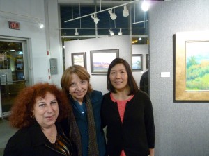
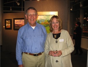
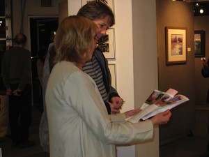
I’ve just wasted time trying to put an album on Facebook and gave up! I’ll post pictures here instead. I had a good reception on Friday night, despite the nor’easter and pouring rain, the government shut down, and the fear of default. Everyone around here is a little depressed, I think, and I am too. I had hoped that this fall would be a good time for a show with the economy picking up and so much beautiful weather. Now, I have no idea what is going to happen and I feel for so many people who have lost their jobs and income, who have travelled to the US to see national parks and been shut out, or who aren’t getting the care they need at NIH. I hope this craziness will end soon and our moods will pick up and people will want to buy art again. Sometimes I wonder what my life would be like if I gave it all up and just played the piano! But don’t worry, I’m not that good at the piano!!! I’m skipping church this morning to spend a quiet day in my studio preparing for next Saturday’s demonstration. I’ll be playing with color and that is always cheering! The first picture is mysteriously lacking a caption! It’s of three of my dear friends from the library community. Frieda Rosenberg (in the middle) drove all day in pouring rain from North Carolina, just to see my show! Then drove back the next day. I feel truly grateful that someone would take so much time and effort to come. Regina Reynolds (left) was my “partner in crime” at the Library of Congress–we worked together on many projects. And Hien Nguyen, is now the assistant CONSER Coordinator, carrying on much of the work that I began there. Hien has also been a faithful collector and follower of my work and I love hearing what she has to say about it. I was really heartened by the comments from people about the art. And I’m really happy with the way the frames look. This week the focus will be on teaching and the sun will come out. All will be well. Thanks for “listening”!
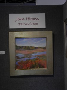
Color and Form
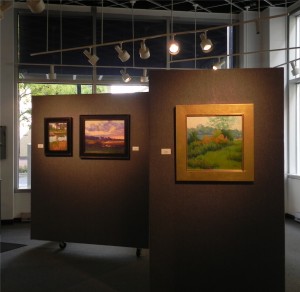
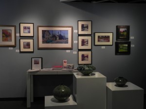
My show opened this afternoon at the Waverly Street Gallery in Bethesda, MD (www.waverlystreetgallery.com). Not all the lighting had been completed when I was there, but I took a few pictures anyway to show some of the framed pieces and layout. There are 42 paintings in the show from 18 x 24 down to 6″ square. I have 4 20″ x 20″ paintings, framed in 4″ wide gold frames from Mountains Edge Frames. I was afraid they might be too bright, but they look really beautiful and I am very happy with them. For many ot the 16″ x 20″‘s, 12″ x 16″ and 11″ x 14″ paintings I’m using Hassam silver frames from Hartford Frames. This is actually a very soft gold or champagne color that I love. None are shown in these photos. The gallery gives a lot of flexibility. I have 3 1/2 movable panels as well as a long blue wall on which to hang paintings. There is a lot of window area to allow passersby to see the work and come in to check it out. Putting on a show like this is always stressful. The framing, publicity, hanging, and reception amount to a lot of work. But once I’m there discussing the work with those who come in, it’s a lot more fun. I look forward to the reception on Friday night, gallery sitting on Saturday, and a demonstration next Saturday (Oct. 19). Wish you could all come!
A Walk in Exmoor
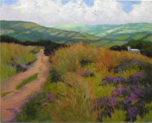
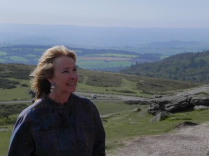
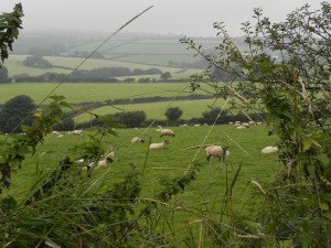
I have finally been able to do a painting from England. I attempted to do this one before with no photo available using the Rives in a large format and I really didn’t like it. So yesterday I powered up my Samsung and used it to get the needed detail and the coloring. I also decided to work smaller and on a trusty pastel surface–Pastelbord. This was our first real walk in the open moor and I had read a lot about the beauty of Exmoor. Unfortunately, we had our cloudiest weather there and the photo had a fairly dark cloud cover. But at times the sun came out and I used my photos and memory to give the sense of light on the distant hills. (For anyone who knows the area, this was a bridle path at Dunkary Beacon, the highest point in Exmoor.) We had it to ourselves, with the exception of one lost lamb who had gotten over the fence from where there were many sheep. (He wasn’t in this photo; I added him from another reference photo.) For the painting, I decided to first tone the board with watercolor, using a green gold that reminded me of the overall tone of the painting. It actually was quite light, but still gave a sense of warmth and glow. I began the lay in using hard pastels and pastel pencils (something I rarely do). The background detail was a challenge. There were defined fields and hedge rows, (really gorgeous) but they had to be softened. I started with various grayed greens, then added a grayed violet over them. I finally picked up a medium blue hard pastel and added that and it helped push it back. The other challenge was the foreground. The photo a lot of tall grasses, without much heather. The color and placement of the path were one of the things that attracted me to this particular scene, along with the dark bushes behind. I did not try to add the little stones and rocks as I was afraid I’d ruin it! Painting the sheep was another challenge. I drew him in with a pastel pencil, then I used various Giraults, adding and removing pieces of pastel. All of a sudden, I had an eye and his head turned a bit to the right and I was very happy with him. Since the field curves down to the right, I think the placement of the sheep at this spot arrests the downward motion and provides a focal point and something of interest.
Colorado Sunshine
Today I worked more on this painting that I shared an early version with 2 posts ago. It was almost done and I worked on it at home with some natural light coming in. I thought I’d include the black and white photo as well. This painting has definitely been more of a struggle than the first two and I’m sitll not sure that it is done. I didn’t really plan to paint it and then I did it over a period of a week or two. I’m glad that I did it, however. It makes a nice trio with Colorado Morning and Band of Trees. As to challenges: the large mass of trees was the first challenge. I wasn’t sure that I liked the shape, but I didn’t know what to do with it so I basically left it as it was. Then there was the light in the sky at left where the sun is. I went back and forth with whiter and yellower yellows until I was happy. The backlit trees were a challenge as well. I tried to give them the sense of being in bright light. I used a variety of blue greens, greens, and browns on them. Then today I added a beautiful red violet (I think it’s “Iris” from Great American) in several values and I was really happy! The red violet really sings against the yellow greens and earth tones. Overall the values are darker than those in the photo, I think and I fear that the surface is getting overworked. So I’m not sure whether to work further on it or not. What do you think???
Sugarland Cornfields
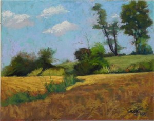
I’m back after a wonderful couple of hours in the Montgomery County Agricultural Preserve. I went to Sugarland Road (near Poolesville) and decided to paint stubbled cornfields with bushes and trees. I liked the rise with the trees and the patterns of the bushes. This was the first plein air painting I’ve done since a very hot day in June! The temperature was very comfortable and the air smelled of grass–really wonderful. I did a hard pastel underpainting, using some browns for the fields. I was in full son while painting the bushes and trees and then, all of a sudden, a cloud came over and cast a shadow on the near field, while leaving light on the left and a lovely band of light across to the right. I immediately grabbed a lighter ochre pastel and laid in the shape of the light. It was one of those magical moments that you only get when painting outside. I was reminded, however, that the most difficult part of plein air painting–I believe–is value. Getting the value of the sky right was my first challenge. I started out with a turquoisy pastel from Great American (Beacon) that looked good until I started putting in the trees and realized that they weren’t coming out dark enough against the sky. So I went over it with lighter blues and violets until I felt it looked about right. The next challenge is always the greens! They all seem to be either too dark or too light. And I know that when I come inside they will look even darker. However, these challenges aside, it was great to be outside again working from nature instead of in my studio with four walls and a black and white photo! I’ll get back to that later.
Morning Sunshine–in process
I feel like I’ve been neglecting my blog! It’s been a busy time and I’ve been dealing with a number of issues, including upcoming classes. I started this painting in the studio several days ago so that I’d have a painting in process on the easel for our first “Third Thursday” event. I was glad to have it and I had the other two Colorado paintings on display as well. You’ll note that this is Colorado and not England. I discovered last week that my husband’s suggestion to lower the quality on the camera before we went to England resulted in pictures that couldn’t be printed out! I was very depressed but am now the owner of a nice little Samsung notebook on which I plan to load the images. However, for now, I’m back to Colorado and using the same Reeves surface. This time I decided to do an underpainting over the entire picture. I liked the effect of it. The brown at the bottom is all underpainting that I have yet to cover. I”m liking the color a lot, however, and don’t want to totally get rid of it. I’m also trying to use blue greens more than violets for a change and I’m enjoying that, particularly the blue greens from my Girault set. The warm browns look so good with the blue green! The surface is still something I’m unsure about. Being in the studio allows me to look at paintings done on UART and Pastelmat and there are times when I long for sanded paper. So, with that in mind, I’m planning to now go out and enjoy this beautiful day and do a plein on sanded paper! Maybe two. If successful, I’ll share with you, along with the finished painting of Morning Sunshine.
England!
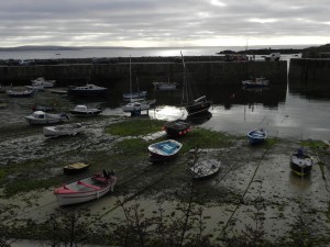
Friends–John and I are back from England and a wonderful two weeks. The second week was almost all sun. It was all beautiful–Exmoor, Cornwall, Dartmoor, Salisbury and Wells. The driving was the only negative and we won’t be doing it again. The roads are just too small and dangerous. But I was very thankful to have this last opportunity to see England on our own. I have 690 pictures!!! So you can expect to see paintings of England for awhile. On a different note, for those in the area, the Capitol Arts Network will innaugurate “Third Thursday” open studios on Sept. 19th, 5-8 pm. I’d love to see you in my studio. At the opening on Friday, I sold two unframed pictures and I wasn’t even there! So I’m very excited about this new chapter in my life. Hope you have all been well. Vacation is over and it’s time to get back to work!
Band of Trees
I spent the day at my new studio doing this companion painting to Colorado morning. This time I decided to use alcohol to give myself solid color in the shadow areas. The result was a really dark underpainting! I began by putting hard pastel in the un-painted areas, then moved to Giraults and soft pastels. I started with the same aqua for background mountain and road, which didn’t work real well as the road had to be darker. But a little of it shows through and I like that. I struggled with the dark, particularly the area under the trees. But it’s probably easier to lighten than it is to fill in a lot of little orange holes! And I’m pleased with the way it came out. I kept feeling that it needed warmth and the last thing I did was to brush burnt orange into the foreground and the shadow area behind the fence. Really liked it! I decided to add the two poles and the wire at the last moment as well and was glad that I did. Would love to hear your comments! Let me know if you are having problems. jeanhirons@comcast.netNow, to get ready for England!

