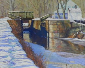
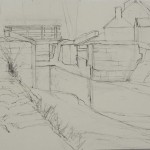
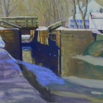
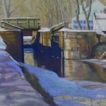
I spent several hours in the studio today finishing a painting I began several weeks ago. This one took a lot of work! A lot of drawing, a careful underpainting, and lots of color layering. I found i really needed to do it in small doses! I’m working from a series of photos taken in 2015 in anticipation of a December show at Artists and Makers in Rockville. It’s going to feature my snow paintings and I have to do them when the weather is cold and I’m inspired! But there’s nothing here to paint at the moment and who knows what the winter will bring. So I found this photo which I never worked from and was delighted to see it! I love the composition with the focus on the lock and the water and light leading back into the picture. The tavern is there but not the star of the show (as in another painting I did in 2015).
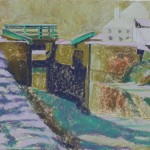
The drawing was carefully done. Then, I worked more slowly than normal on the underpainting as well, choosing colors that I thought would inspire me. Two things about the underpainting. First, I used a very light blue and violet Caran d’ache for the buildings and the underpainting is pretty useless! But it didn’t matter much. Second, I was working with a friend and she loved the application of hard pastel in the background and suggested I skip the alcohol in this part. Good suggestion! I left it and was very happy with it. Easy to go over it with Giraults and add the trees in, while retaining some of the different colors and textures of the initial layers.
The focus of the painting is on the lock and it’s light and shadow. In the photo, the building had very distinct and dark windows and shutters. I knew I didn’t want that. So I put in some color and smudged it and kept it pretty suggestive. I used a light tuquoise for the building and then added some light pink into it. I was really happy with this! (What I really like is that the buildings have the same colors as the snow in the foreground, giving some unity to the picture (I hope!))
The stone wall took work and I used a lot of Giraults to layer colors from cool violets and greens to warmer ochers and oranges. I went back and forth a lot from warm to cool, seeing both in the same stones, along with cast shadows and light. The reflections in the water were done with the same colors as above, but were smudged a bit and kept soft.
After completing the water, i put in the bushes and small tree along the left. I decided to use a bright red orange in places to perk it up and was very happy with that. Then I attacked the snow-covered tow path. I began with a light whitish green Unison and a very light pink Ludwig in the back. As I moved forward, I got out my Ludwig turquoises and used some darker blues. I used a combination of blues and turquoise for the shadows and pink and organge for the sun-lit snow.
I knew from the beginning that I’d like this picture because I loved the composition. I’m planning to revisit another painting I did and sold in 2015 in a larger version. But first, I might do my pine tree again in a different color scheme! We’ll see.
Happy winter to you all.

