Hello Friends. I’ve had a number of walks lately on the C&O Canal and plan to do a series of paintings of it. It’s fall here, finally, but the color is still wanting. However, the sunlight has been gorgeous. Today I did an all-class demo and finished the painting during the afternoon. I’ll be doing another on Wednesday and will also do a demo for my Saturday class. I also hope to just paint from my many pictures.
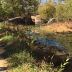
This subject is one I’ve done before. It’s my favorite lock by far, and there is still a little water in it (but not as much as I’ve given it). (The canal has been drained pretty much and some parts are nothing but grass.) I’m including the reference photo so you can see what it looked like.
For the underpainting, I decided to use greens under the greens and warmer colors that would go on top. It worked pretty well. I used oranges under the brighter greens and turquoise under the towpath and rock.
The tree in the upper left went very quickly. I used a several Roche oranges and then filled in behind with greens and some sky holes. The bush on the right, however, was a real challenge. I had planned to make it a brighter yellow, but when I tried to do it it didn’t look good at all. I got out my Blue Earth lemon set and used the wide variety of warm greens in it to get the shape of the bush. I then added yellow greens some orange and some lighter yellow near the sky. Much happier with it.
The lock itself had to be redrawn. I hadn’t spent enough time on the structure and angle of the cross pieces. But finally got it where down. Then we all felt that the tow path on the upper left was too hightened and accentuated. So I raised it and covered some of it with grasses.
The water and reflections and the lower part of the painting were a challenge. While there is a little water in the photo, much of it is mud!!! I put in the reflections of the trees and bushes in the upper right, then added various blues over the reflections. But when I went to do the grasses in the lower right, I realized that the very large dark shadow that was in the photo didn’t make sense if there was water. So I added more water, all the way to the bottom right, then made the darker area into grasses of the bank (or at least that’s what I tried to do!).
Anyway, I’m pretty happy with this painting and look forward to the next set of challenges!

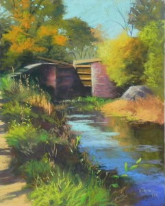
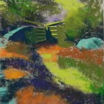
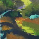
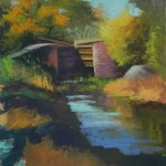
What a transformation. I like seeing more water. What I’d like to learn more about is, how do you decide what to use for the underpainting.
Janis
I spent time in the demo discussing the colors. Because I was planning to use more fall colors, I decided that the greens would be good underneath. I like putting turquoise under warm ochers in paths. I’ve pretty much decided that yellow green is my favorite color for skies as it adds a little glow. The rest has to do with getting the value right and thinking about warm vs. cool and what hard pastels are handy!!!