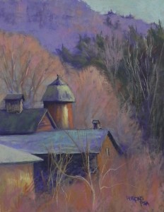
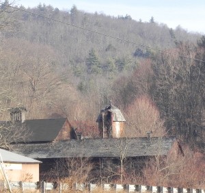
I spent yesterday in the studio giving a workshop to a friend and colleague at Washington ArtWorks. I decided on this photo from our recent trip north, as it included buildings in the landscape, as well as a chance to work on the composition and enhance the color. Ellyn was particularly interested in knowing my process of painting so I typed up a 10 step process, based on my book, but in the order that I think I make decisions. I then worked on changing the composition. [I mistakenly cropped the bottom off the photo, leaving the buildings too close to the edge. However, there were ugly fences in the way.] I wanted to have some sky and the background hill, so I decided to do a vertical and shorten the length of the long roof. The most important change was in moving the silo to the left so that it wouldn’t be standing on its own, right in the middle of the picture! Once the composition was finalized, I could focus on color. I went with my typical secondary triad of violet, orange and green, using off greens in the roofs and in the background evergreens. I like the way the buildings emerge from the leaf-less bushes and the shapes created by the sunlit trees. This painting came out much better than I expected and it proved to be a very good demonstration for a talented new student!


Definitely a success!
Jean,
I am trying to overcome the tendancy to overuse reference photos. The fact you took an ordinary photo and added color and personality to is amazing! One question when you use underpainting in your work are they based on temperature? I struggle on what underpainting technique to use and when. I have done contrasting underpainting before and it worked.
My see the 10 step process you mentioned above. I have your book. What chapter is it?
Timothy–there is nothing wrong with using reference photos. I use them all the time. It’s a matter of being able see beyond the photo to improve the composition or the color-whichever is needed. As to underpaintings, the primary “rule” is that they should be VALUE-based. You always want to find a color that is the appropriate value or perhaps a little darker. In this way you can create great abstracted underpaintings. Temperature comes in when I’m thinking about what color I want to work on top of. Will cool over warm be better or warm over warm? It depends on the subject matter and its complexity. Chapters 4 and 11 are the key chapters for underpaintings. 4 deals with various materials and technques, and 11 deals with color choices. A really good approach to try out is the 4-color block in that I learned from Doug Dawson. Look at that one in Chapter 11 and see if that might work for you.
Timothy–one more important thing about this photo–I made serious changes to the composition. That is ALWAYS the first and most important step. If you have a bad composition, no amount of good color can save it. Note the changes that I made to the length of the barn and the position of the silo. These were keys to the success of the painting. I did a number of drawings to begin with to get to this. Doing composition and values studies is the best way to creating successful pictures.