For the first time, I’m posting this blog from my studio on Wilkins Ave! I have my little all-in-one computer here and I’ll be giving my zoom classes on it beginning next Wednesday afternoon. I was concerned about the connection, but it seems to be OK. So I’m relieved.
This week I started doing the first paintings from the initial studies on Rives printmaking paper. It’s a surface I’ve used before and like a lot. I bought 10 sheets for $4 each at Plaza! SO it’s a bargain compared to mounted UART boards!!!
I used Golden fine pumice gel and burnt orange liquid acrylic to produce a lovely mid-toned off red surface. And it lay nice and flat with no buckling.
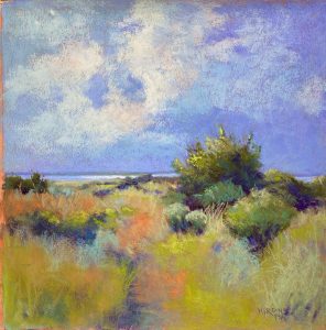
I did a charcoal drawing to begin with and laid in the pattern of darks in the land areas. I loved putting pieces of color in the distant land and developing the bushes and grasses. The sky was more challenging because of the surface. And I had problems with colors. The sky ended up very blue with not blue below. I added turquoises to both the sky and grass areas and then added some oranges into the clouds, trying to tie the colors together.
Compositionally, I cut the piece too much in half, despite my initial measuring. But it’s not too bad.
What I loved about doing the painting was working intuitively to create the composition of value shapes and the color interactions. l It didn’t work until I added the bright yellow greens into the foreground. This makes it come alive, I think.
I really loved getting back to this surface and a freer way of painting again. I plan to stick with it for awhile and I have a show lined up in March of next year where I can show them. So things seem to be working out
Now, I’ll add the second one!


Hi Jean: I love the color palette on this one. I agree that the horizon is too close to center, but the choice of more sky or more foreground is always hard when both are beautiful :-). Susan
Thanks Susan. I really didn’t think I liked this one but the more I look at it, the more I like it, even if the balance isn’t the greatest. Something to learn from this. Jean