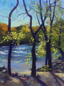
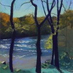
Today was a wet and miserable day–the perfect day to spend with friends in the studio. I began this painting two weeks ago today during an afternoon session and was happy to finally have time to get back to it. This was a complicated painting! A lot of layers of stuff going on here! But I thought it was a happy picture, with the dark back-lit trees against a brilliant sky, the flowing river, and the lovely yellow fall leaves.
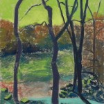
I began by drawing the trees and getting them in the position that I wanted, then drew in the big shapes of background island, water and foreground. For the underpainting, I chose a darker yellow green than I’ve used lately and I really liked the way it looked with the warm orange-green trees on the island. I used the local color in the island as I knew that it was going to be complicated to go over it and didn’t want really odd colors. I used darker green for the water and a warm reddish color where you can see the bottom of the river. I chose a turquoise to go under the browns at the bottom, as a cool under warm solution.
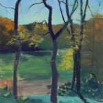
I began by painting the sky around the trees. I started with warm blue greens and later added blue violets on top. I used aqua at the bottom and then a light whitish yellow green to really give life to the sky just about the tree line.
I painted the tree trunks, using dark violet and dark red Ludwigs. (Much later, I lightened the parts of the trees above the tree line, but it’s hard to see in the image. The trees would appear lighter there with so much light around them.). I worked next on the trees on the island that form the backdrop. I used a combination of violets (at bottom), dark greens and oranges. The orange on the far left is a Roche pastel that was amazingly soft when I applied it.
Next I did the water. I used Giraults in grayed blues, blue greens and blue violets. In order to get the colors around the trees I blended the first layers with my fingers and even used a rubber-tipped blender along the sides of the trees. Then I used three different Art Spectrum soft tinted whites to put in the foam/highlights on the water. For the area close to the shore, I used Girault warm neutrals with blues on top and went back and forth a few times.
The bottom was the most challenging part for me. I went back and redrew the shadows and rocks with charcoal. I also changed the shadow on the lower mid-section. The two shadows were connected by a horizontal piece (as seen in underpainting) but I had no idea what was causing it and chose to leave it out. Getting enough detail, the right values, and soft edges was a challenge and my friends gave me much-needed critiques along the way! I was happy when I added the yellow color along the top of the dirt bank and let it lead into the water.
Finally, I added the smaller branches with a Girault and the leaves with various soft greens and yellows.
In my classes this winter, we’ll be discussing layering of pastel. I realized that this painting required a different, more complex layering than what I’m going to teach–the layering of subject matter! I hope it’s useful to see how I began and proceeded with the painting. I never would have done a subject like this when I was first beginning!

It turned out really beautiful, Jean!
Thanks Sandy. I struggled a bit but it came together pretty well.