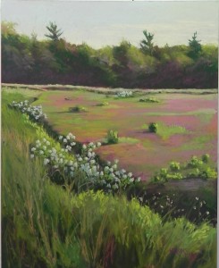
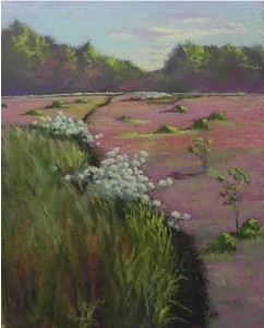
I was not completely happy with the first painting I did of the bog. So I decided to do it again, this time on the Rives with liquid primer. I felt that the texture of the Rives would give a better impression of the bog, and I wasn’t happy with the first composition. This time I practiced what I preached and did a sketch first. Then I went to my studio and worked only from my sketch and memory. Looking at the two of them, I am not sure that the second is an improvement! But I’d like your opinion. The sky is darker in the second and made to look more like dusk. I did more with the clouds as well. One big difference is the dark edge of the bog, which I brought down to the bottom in the second. This time, I also kept the background lighter and less detailed, brushing soft color over it to push it back. I added a dip in the trees to keep it from being straight across and to let more sky show. I don’t really like the stuff growing on the bog, but in both cases, it’s a lot of space to fill in. There were small trees, which I left out of the first, but decided to put in the second. Perhaps it would be better to just play with color in this area? There are significant differences in the two pictures. Would love to hear which you like best, or what aspect of each you prefer. It was interesting working from just a sketch and memory. I could play with the composition and colors much more freely (whether or not for the good!).


I love doing the same scene more than once. I learn so much that way. In looking at these two I personally like the foreground of #1. I think the shape holds up better and is more interesting but I like the background trees of #2. I like the softness of them.
I agree with first comment..I like the way you handled the distant trees in the second painting. I like how you lead the eye from the foreground into the picture on #2 but I like the handling of the foreground in first. I too like to paint the same location multiple time…never know what you will figure out!
Groan, this was a difficult decision. 🙂 After studying the two paintings for a few days, I have concluded I like the top painting best with two changes. I think the distant trees are better in the second painting because of the dip indicating a way to go farther back in the painting. And I like the back section of the dark path leading to the trees in #2 because it is more prominent as it heads to the trees. Hope this makes sense. Overall I like the patterns in #1.