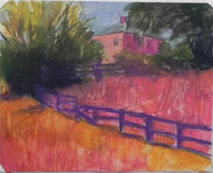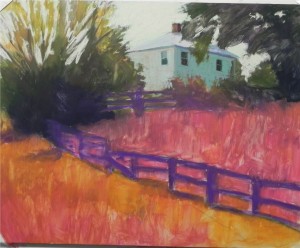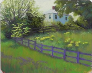
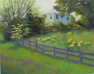
 Here are the last two pictures. In the first, I have filled in the field and grasses. I’ve reconfigured the fence but haven’t worked on it yet. I decided to add more color to the shadow side of the house and found a blue violet the same value as the blue green. This gives it added dimension, I think. I tried to keep the wild mustard from competing with the locust tree by adding a yellow green Girault over the initial yellows. I’ve made the foreground grasses brighter and added a band of purple bugle, which breaks up the space. In the final image (final for now only!), I’ve worked on the fence, added a little orange to the roof, and made other small changes, including removing the tape and finishing off the corners. I think I may need to add a little more variety of color and value to the fence but I’m quite happy with this now. It needs to rest for a day or two so I can bring a fresh eye to it. Thanks for sharing this cold day with me! I’ve enjoyed sharing my painting process with you all and will no doubt do it again.
Category Archives: Uncategorized
Demonstration–3
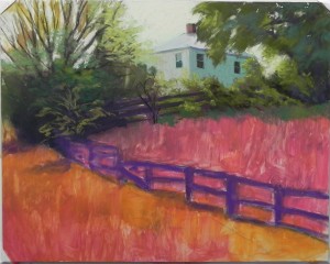
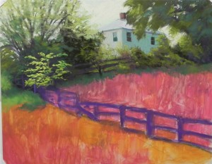 Here are the next two stages. In the first picture, I’ve painted in the tree at right and some of the foliage along the fence and have begun working on the large tree at left. I’ve used cooler, darker colors below, progressing up to lighter and warmer colors. I’ve also indicated lightly with a medium warm green where the small locust tree will go. In the next photo, I’ve complete the trees and left upper side of the picture. For the locust tree, I began with a light, cool Girault, then used two values of softer pastels to really give it punch. In the upper bushes along the fence, I’ve added several values of majenta to give more depth and interest to the color. I’m using a small piece of dark red violet for the fence and tree trunks. I’m very happy at this point with my choice of sky color–a big relief!
Demonstration–Part 2
- First application of pastel
I decided to use hard pastel for my underpainting, rather than watercolor, as I want really rich color and plan to cover the entire surface with pastel. I wanted to get a rich dark behind the locust tree and I certainly got it! The grasses inside the fence appear cooler
This next picture shows where I’m at right now. I’ve added pastel to the sky and house. My original thought was to put a brighter blue in the sky, but the photo influenced me and I went with a light, warm green, and some pale orange (not visible in this photo, I’m afraid). The roof of the house is painted with a slightly cooler green that distinguishes it from the sky but keeps the values similar. There is more house right now than what I see in the photo and my plan is to add more foliage over it. I’ve used light applications of two values of cool green Girault on the house and have let the underpainting color show through. This adds more interest to the bland walls. One of the things I notice at this point is that I’ve lost the angle of the upper fence–it needs to go down more on the left–and I will need to correct that. (Note: you might notice that the corners are taped. The board is stuck on foam core with artist’s tape, but it’s too heavy to stay and I find I need to tape the edges to keep if from landing on the floor! I’ll finish the corners later.)
Demonstration–Part 1
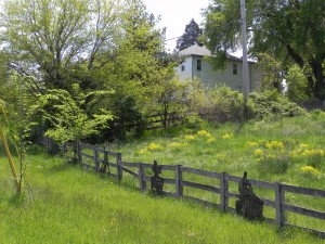
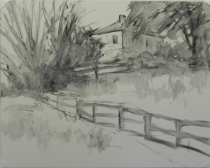
It’s going to be a cold, wet week, with no chance to paint outside. But on my way home from painting on Friday, I stopped to film a favorite house that I’ve always wanted to paint. I love the way it sits up on the hill and the triangle created by the fence. What struck me this time was the lovely little locust tree surrounded by dark foliage and located just where the fences come together. The wild mustard also adds a little extra color and there is bugle in the foreground that I’ll make more of. I knew right away that this would be a 16 x 20 on Pastelbord and that I would treat it similarly to my painting On the Road to Jackson. I started with charcoal to rough in the house, fence and foliage. I thought about leaving out the lower fence and adding it after the underpainting, but it is too critical to the composition and I wanted to get its location right. I need to change the length of some of the sections, but I’m happy with it’s positioning.
Another Plein Air
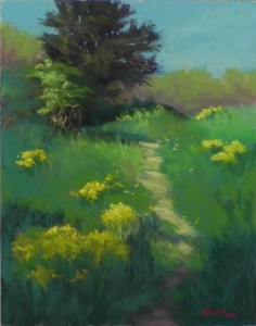
I got outside again today, another lovely but cooler day. Went back to the same location where I had found a path that intrigued me. I stood in mostly shade looking up at the sunlit hill. I focused on how to simplify and enhance the shapes in the composition. The background trees, for instance, did not form this lovely shape–but who would know! I did a small study with my tombow pens (read Richard McKinley’s latest blog–always a good reminder). My challenge was to present the mustard in both light and shadow. At the bottom, I used a number of greener and browner yellows to hopefully indicate the shadowed flowers. I liked the fact that the bottom was in shadow as it allowed me to bring down some of the color from the dark tree. Working outside twice now makes it clear to me how both similar and different plein air painting is from studio painting. In the studio, I have time to think about the composition and the best surface and technique that I will use. Outside one has to make much faster decisions. And I only brought one type and size of surface. But both come down to good shapes, values and colors. For the last year or two I’ve favored working on a toned surface that allowed me to immediately begin with pastel. Now, I’m working on the UART with hard pastels and alcohol underpainting and I like this approach very much as it helps me loosen up and focus on the broad shapes and the rythym and flow of the darks and lights.
Plein Air, At Last!
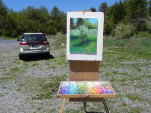
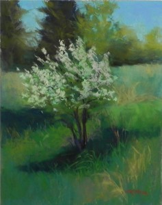
It was glorious out there this morning! We have so little really perfect weather and we seem to be in for more of it, so I hope to get out again. I found this young pear tree surrounded by dark evergreens and lovely shadows at Black Hills Regional Park, near Boyds, MD. I was a little worried about the complexity of the subject matter, but found that my recent foray into abstract shapes really helped and that was what I focused on. I also paid attention to using a real mix of greens. The color here is primarily observed color, with a few licenses taken. I also decided to get over my timid use of the 500 UART. I began with a hard pastel and alcohol wash and that really helped a lot. I put in dark greens under the light area of the tree and began with green pastels, leaving the “whites” till last. They are a combination of soft light greens, a light pink and a little light yellow. When I paint outside, I like to be close to my car, so as not to have to carry my gear too far. I bring a small box of hard pastels in my painting bag, and the right hand row of my Heilman backpack box is all Giraults. I used a lot of my new greens in the painting. FYI, I have made no changes to the painting since bringing it inside, except to sign my name. I keep seeing things I might like to tweek, but I decided to keep this as it was!
A Complete (sort of) Makeover!
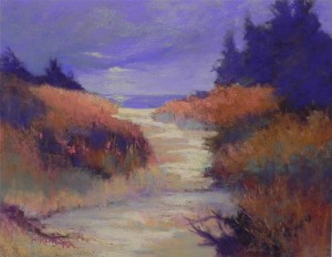
This morning when I went to the studio, I was REALLY unhappy with my second painting. The sky was dull and boring and I didn’t like the composition very much. So I decided to see what I could do with it. I began by stepping outside with a sturdy bristle brush and getting rid of the sky! I didn’t get back to the real red of the surface, but there was enough there to give me the idea of going darker in the sky, I got out my lovely red violets and then added some grayed blue greens and a hint of light shining through, changed the color of the water and did a lot of other things! I began by darkening the values of the grasses and the evergreens. I decided to make the trees at right be a solid shape of blue violet and used a little darker red violet in the smaller trees at the back. I got rid of the flowers on the bushes and played with color, trying to darken a bit without brushing down (always a challenge!). This is no masterpiece (I won’t be entering it into the PSA show!), but I think it will be framed and entered with its companion in my October show at Waverly Street Gallery. This exercise of working without any guide whatsoever is fun and a good test of one’s knowledge of color theory. But I’m ready to work from life and it’s a beautiful day and my backpack box is ready to go!
Beach Fantasies
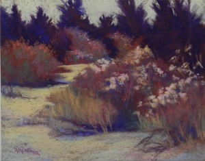
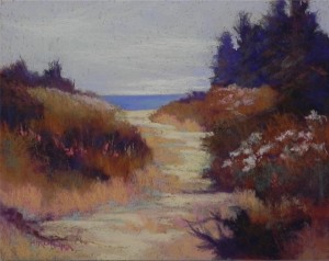
Yesterday I decided it was time for something different! I wanted to give myself the chance to play. Today is my birthday and I decided that creating a painting more from my imagination would be a good way to spend the day. The first painting was done from a black and white photo and color study, so the composition was pretty much set. The second was done from a different photo and the one I used for #1. I wanted to include the sea in this one, but I used a similar color palette. This is about as close to abstract painting as I get! It’s all about shape, value and color, pushing here and pulling there. Working on the Richeson was interesting as I haven’t really used it in years. It’s very rough and allows for a lot of broken color. The warm red surface was a good backdrop for the violets and browns, but I found myself wanting too much to fill it all in. The sky is more successful in the first one as there is much less of it–just pieces of color. The sky in the second was more of a struggle. There is more aqua in it, which doesn’t show in this image. I decided to add some light clouds to break it up, but it’s still reading like a large gray mass! I’m calling these both fantasies because the colors are totally intuitive, as is the composition in the second. I have flowers on the bushes but no greens! I didn’t want any. Sometimes we need to get out our artistic license and use whatever colors we want!
The Color Aqua
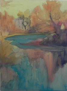
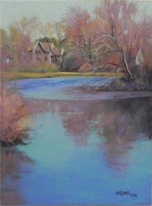
I am well known as liking the color purple–in my paintings and my clothing. But really, the color that excites me the most is aqua–particularly when I see it in water. It was the lovely blue green that excited me most about this scene of the Mattapoisett River. Yes, I like the house and the fact that there are two other buildings barely visible. The soft reds of the early spring budding trees add a lovely contrasting color. I spent some time deciding on a surface. I wanted to use a square but opted for a 12 x 16 because I have frames! (I have to think about economics these days.) I used the last piece of mounted 12 x 16 UART 500 and really enjoyed working on it. I relate to this surface quite differently than some others, I think. I decided on a water color underpainting to keep it loose, using warm colors in the sky. Left some of the sky showing through the light aqua pastel, but in the water I used more saturated and blended applications. I was really happy when I found just the right blue green to add to the right of the bush. I feel that this color grabs the eye and leads us into the picture (I hope!). I will probably change the title–any suggestions?
Spring’s Arrival
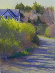
Some pictures are a joy to paint, others give us a lot of grief! This week I learned that two pictures from the first category–Gracie and Fog Study in Blue–were accepted for the juried show at the international pastel convention in Albuquerque (IAPS). I was delighted, of course. At the same time, I was struggling with this picture from my recent trip to Mattapoisett. The car was parked on this driveway and I was excited by the position of the house, the curve of the road, and the light. There was no forsythia in the picture, but it was in full bloom elsewhere, so I decided to add it against the cool blue violet of the house. I began with a drawing in graphite, then did a watercolor wash and lost most of my drawing! Had to work and rework the house to finally get it right. The background trees and bushes in the foreground weren’t too bad. But the road! I brushed it off at least twice trying to get the right values and angles for the shadows. I no longer have much of a sense of it. It seems busy to me. Would welcome any comments or suggestions! (I’m worried that my recent “up” time was ruined by a fall in Mass. and continuing back pain. Perhaps I’m now in a “down” time! Fortunately, my ups and downs aren’t very drastic, but I do find that I go periods of painting well or not so well, a common thing with many artists, I think.)

