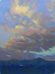
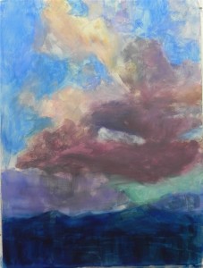
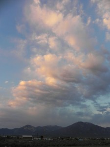
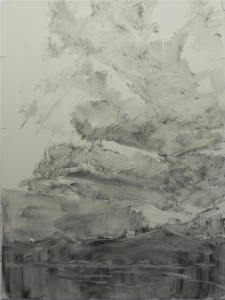
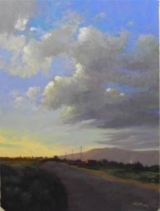
I put this in a place in my studio where I could look at it and the more I looked at it the more I became convinced that the sky was too dark. So yesterday, I brushed a lot of it off (just blue sky, not clouds) and went over it with lighter blues and a lighter blue green at the bottom. I had to brush off as the surface was getting cakey and I didn’t like it. For some reason, finding appropriate sky color is one of the most difficult things for me! Either they are too dark or too light, too violet or too green. The Blue Earth pastels have helped a lot and they are what I primarily used in this painting. But they are very soft and build up fast. Girault doesn’t have the best sky colors, from my perspective. I ended up adding some of my new Ludwig ultramarines to the top, which gives it a more violet cast, but I like the effect. The bottom is pretty dark but I decided not to change it. And next–Taos Sunset #3!
Category Archives: Uncategorized
Lock at Great Falls–Demo #3
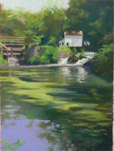 Here is the completed painting, for now at least. I spent a lot of time on the water and reflections, then the pond scum! What was nice was that it was in both shadow and light, so I added some blue green to the shadow areas, and a pale yellow green to the sunlit pieces. The water at bottom in the photo was more blue green, but I used a Ludwig blue violet that I like a lot and I think it works. This is far from perfect but it does capture the scene, I think. Now I think I’ll go back to bed!
Lock at Great Falls–Demo #2
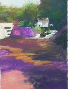
At this point, I’ve done a lot more with the upper part of the painting, adding in the lock, stone wall and greenery. I kept the water splashing at left cooler and a little darker than the water at right, so as not to compete. I’ve tried to break up the large mass of trees at upper right, and I’ve added some sky holes in the trees at left. I’m using my box of Girault greens, along with grayed violets and browns for everything but the sky. Having gotten this far, I realize that this would, indeed, have been a difficult demo. It’s the kind of thing that is best left to the private studio. Too much picky detail!
Lock at Great Falls-demo #1
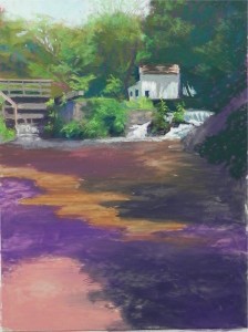
I recently gave a demonstration for the Falmouth Art Guild, where I’ll give a workshop next summer. The demo was of a house in New Mexico–not a subject I’m terribly familiar with! My original choice for the demo was this scene from Great Falls on the C&O Canal. It has a lot of detail, however, and I was afraid that it wouldn’t be a very good demo. So I used it this week when giving a one day tutorial. This was as far as I got. I couldn’t sleep this morning, so i decided to get up and finish it! The tutorial was about underpainting. I chose to do a big shape block in that encomapssed the trees and reflections in the water. But I left my drawing of the lock without underpainting, so as not to lose the small details. I debated whethe to just focus on water and add the shapes of lighter pon scum later, but decided the shape was key to the picture and gave it a separate color for the underpainting. For the dark area of trees, I began with a dark violet NuPastel. Then added warmer, lighter red violets, along with some oranges and browns in the trees to left. The dark area looks pretty flat at this point. I began with the building and falls (this isn’t the “great falls”–this is a really “little” falls!), which are the center of interest. I used various pale, cool green Giraults for the water initially, to tie it to the greenery around it. Then added a little yellow to spark it up.
Taos Sunset #2
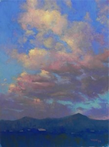 So here is the final picture. I filmed this “final” picture many, many times! I realize that with clouds, you may never be completely done! I began with the broad shapes of the clouds and added blues around them. Then I worked the clouds over the sky, particularly the light, wispy pieces. For this painting, I primarily used Giraults. I began with them in the sky, then used the Blue Earth pastels to achieve the colors I wanted. The clouds are primarily Girault, with a little Schmincke added at the end. I wanted to keep the foreground simple. I used several values of blue and blue-green Girault, then indicated a few roofs. I also then added some lighter blue green into the base of the clouds. Dark warm green was also added in the foreground. Doing this painting reminded me of the difficulty of doing clouds. They are nebulous, filmy things, but in order to have a strong painting, you have to have strong shapes. Getting these shapes, along with appropriate values, and sky holes and no hard edges, is the challenge. But a fun challenge, nonetheless!
Taos Sunset #2, Demo-2, Underpainting
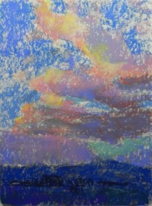
Given my displeasure with the watercolor underpainting, I decided to try hard pastel and mineral spirits. I used colors and values as close to what I was seeing as possible–something that is difficult with the limits of hard pastel. Given the complexity of the subject matter, I did not want to experiment with warm under cool or other possible schemes. After applying the first layer of mineral spirits, I decided to darken parts of the clouds, which you see in this photo. While this is not a particularly lovely underpainting, it was much easier to work with.
Taos Sunset #2, Demo-1
Taos Sunset #1
OK, I ‘m hoping the frog is gone! I’m happy now with the shape of the clouds. This was my first painting on white Wallis in some time. I bought it mounted from Dakota and have two more, so they are perfect for the series of three sunsets I want to do. I started with charcoal and wash with this, then used watercolor. This was NOT successful. Too light. I didn’t want to use hard pastel as I don’t have the right colors, and I couldn’t use alcohol because it is Wallis. I should have done hard pastel and water or mineral spirits for the bottom as the little white dots drove me crazy. This was one of the first images I shot, so not as much color in the clouds. The next two will have more oranges and pinks. Those who have studied with me know that I tend to avoid sunsets as being too cliched. And I really disliked a lot of the gaudy bright red/orange sunset paintings that I saw on Canyon Road in Santa Fe. But these pictures of the coulds reflecting the sunset really captured me and I couldn’t wait to get home and work with them. For this painting, I primarily used my two boxes of blue/cerulean Blue Earth pastels. The variety of grays is wonderful for clouds. I tried to maintain a color palette by using red violet, cool grayed greens, and grayed browns of differing values in both the clouds and the earth. Then I added some blue violet to the clouds to tie them to the blues of the sky around them. I think the result if pretty harmonious.
A New Adventure!
Sorry–no paintings to share with you. There is a large one on the easel that I actually signed. But then I realized that the cloud looked alot like the bottom of a frog with two legs in the air!!! So I’ll be working on that. BUT–I have some exciting news to share with you. This will be of more interest to those who are in the DC area, but I wanted to share it with everyone. I am going to be joining a new group of artists at the Capitol Arts Network(CAN) in Rockville. CAN is located in a warehouse that has been made into artist’s studios, a large gallery, and a beautiful teaching room. I’ve heard that they plan to purchase the building next door as well. I will be teaching at this facility in September, in addition to my class at the Yellow Barn. I plan to offer a 3 hour class Monday and Wednesday mornings. AND–I have taken the last available studio, which I hope to turn into a showplace for pastel. I”m asking that a window be cut into the wall that runs along the hall to the gallery and teaching room. So everyone can see the beauty of pastel as they go to their classes! The studio is big enough to hold small classes, demonstrations, mentoring or critique sessions. And I’m sure it will generate more students. This is a major move for me, both financially and time-wise. My plan was to teach less and try to give more workshops for pastel societies. But this opportunity to become part of a vibrant new community of artists near my house was too good to pass up. Two people have made this even more enticing. The director, Judith Heartsong, is a really wonderful, energetic person, filled with enthusiasm, ideas, and strong marketing skills. I hope to learn much from her. And Glen Kessler, my colleague at the Yellow Barn, also has a studio at CAN and has been very supportive of having me there as well. I am very much looking forward to working with him. So now I am looking at the IKEA and Blick catalogs to figure out how to furnish a second studio as cheaply as possible. Having two studios is going to be confusing at first. But I’ve got plenty of pastels, that’s for sure! I won’t have as much time to “play” with pastel and post on the blog this summer as I had planned, but I’ll do as much as possible. The idea of being able to show my work–framed AND unframed–in this new place is really exciting. Wish me luck!!!
Tiverton plein air
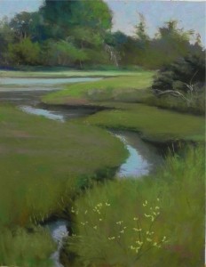
Last Wednesday, I had the pleasure of painting in Tiverton, RI in the Sepowet area, with my friend Janet Gendreau. The composition of this view of marsh and water caught my eye immediately, despite the preponderance of green. What was funny was that by the time I’d finished the lay-in, the water was up to the top of the grass, and by the time the underpainting was done, the water was completely covering the marsh! I guess it was a full moon. But I stuck with my original drawing and concept, wanting to make the shape of water in the mid-right the main focus of the painting. The addition of the yellow flowers at the end (which were everywhere but here) helped to break up the large mass in the lower right. I corrected the values in the back mass of trees in the studio and added more of a blue green to the water. The underpainting was done with warm oranges and reds, but little of it seems to be showing through. This area has long been one of my favorites. I hope to do a series of pictures from this area and perhaps teach a workshop here next summer.

