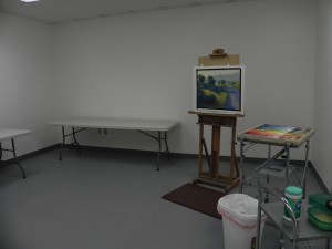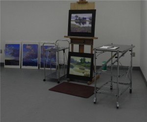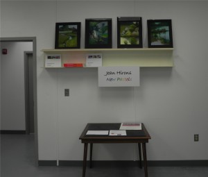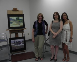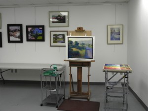
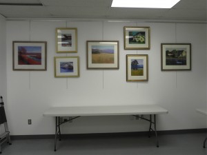
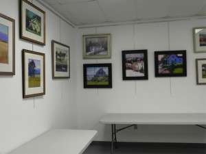
 Here are three images of my studio with the new tables and hanging system and 14 of my paintings on the walls! These are some of my favorites and it’s so wonderful to have them hanging in a space where people will see them, instead of being stacked in our guest room. The Walker hanging system arrived on Wed. and John spent much of yesterday getting it installed. I’m hanging pictures on two walls. Hope to have a window cut into the right wall (will look into corridor that leads to gallery and teaching studio). This Sunday it is supposed to rain and I plan to be there doing a companion piece to the painting on the easel. I LOVE using my new box and having carts on both sides. I have a high chair that I station at the right place where I can step back, sit, and evaluate. The tables will hold unframed paintings during openings and can accommodate 6 students during classes and workshops. I am really excited about this space. We are going to be introducing Third Thusdays in Sept. and I”ll be there on the 19th and hope that those in the area can come by. I’ll be in England from Aug. 24-Sept. 7 so no blog posts then. But hopefully, I’ll get a painting done Sunday and can send it to you. We are having gorgeous end of summer weather here–hope it’s equally nice where you are! I want to mention that it’s wonderful not having any spam from the blog, however, I haven’t had any comments either! If you are having problems, please send me an email: jeanhirons@comcast.net. I love hearing from you!
Category Archives: Uncategorized
No more spam!!!
Friends–I finally dealt with the spam problem on this blog. It means that you will have to identify those funny letters when posting a comment, as will new subscribers. But it will keep the Asians, the drug companies, the viagra dealers, and Ralph Lauren from bombarding my email account! I currently have over 3800 spam messages awaiting my approval! My concern has been that in my haste to rid them from my inbox, I would miss a legitimate post from a real live pastel artist! I hope I haven’t missed any of yours. I’m sorry for the inconvenience, but hopefully, it will make life more managable at my end.
In other news, 2 96″ tables came to my studio today (well, John and I had to drag them up from the back door). This is going to allow me to give 6-person classes and workshops, as well as extensions to the classes in the big room. And for the two openings a month, I can push them against the wall and use them for unframed work. Next week my new hanging system arrives and I’ll have paintings lining the walls! It will be so nice to get them out of their (seemingly permanent) resting spot in our downstairs bedroom!
Colorado Morning
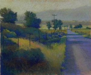
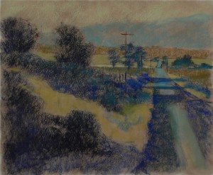
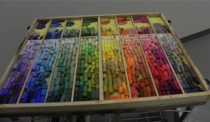
I spent today at my new studio with a 20 x 24 sheet of prepared Rives and a black and white photo from Colorado. This was taken near Salida on an early morning walk with very strong light and shadows. I toned the paper with burnt umber light–I wanted it to be more neutral and I really liked it. Then decided to start with hard pastels to lay in the shapes–something I didn’t do with the others. I found this to be a good way to start and have included the photo. I worked slowly from hard, to Girault, and finally to soft. Used a lot of Unisons and Schminckes, and Ludwig blue violets in the road. I had a CD player and listened to Bach and Welsh folk music! I really enjoyed being there in my own little world. I also filmed my new box so you can see the beautiful array of colors. At the top are the hard pastels and below them the Giraults. The soft are arranged the way I have my large box at home, with 7 columns for the various hues and the last for grays. Having all three kinds of pastel in one box is REALLY nice! So handy. And the pastels are so clean and beautiful.
Sepowet Pastorale #3
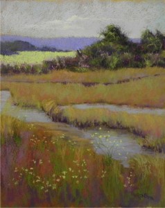
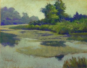
I’m still not sure about this picture! I did it on Saturday and worked on it more yesterday. Decided to share it with you for your comments. The original photo is all light greens with yellow in the distant field. I decided to use more earthy colors, mixing warms and cools in the marshes. The foreground was a real challenge. Very busy in the original photo. I did one version and brushed it down. Put a warm orange on to simulate the original tone, sprayed it with fixative, and went over it with color. I tried to keep it simple and not too distracting. But I liked the yellow flowers that were in the picture. They tie the distant yellow to the foreground. I started with more of a tree in the dark area and really hated it! So I brushed it off as much as possible and changed it to a bush and like it much better. Lesson to me: get your composition figured out before you jump into it! I teach this to others but I’m always eager to get to the painting. The sky and water are a light violet with some warm aqua and light red violet. They look kind of blah in this image! I thought about using a more bright day blue sky, but I kind of like the quietness of the violet. Would welcome opinions. Yesterday I cut the foam for my box and filled it with pastels. I got out my boxes of Schmincke and Great American and Unisons and put lots of colors in that I’ve never touched! Tried to get as many Ludwigs in as possible (never got a complete set of these). There’s also a separate row for the Giraults and hard pastels. It’s beautiful and it will be carefully transported to my new studio this morning. I told John yesterday that I was doing things backwards. I should be keeping the new box here and using my large Heilmann box to take to the studio, as it closes and is transportable! But the new box was designed to fit on my cart and I’m sure it’s going to be great. Will send a picture.
My New Studio!
Last night was the opening of an abstract show at the Capitol Arts Network (CAN) and the first time for me in my studio. I signed the lease on Thursday and we moved in an easel, two carts, the card table and a shelf that we found in the basement. John spent all day yesterday getting the shelf up. I placed four of my most successful plein air paintings on it (actually, I have very few others!). This week he made a pastel box for me that will be placed on top of the cart to the right of the easel (a chef’s cart from the Container Store that I got marked way down!). I had to steer people into the studio as it is somewhat hidden. But I’ll be getting a window to the corridor installed that should make a big difference. I hung my painting “Yellow House in Winter” in the hall just outside the door and that was a good draw. Most importantly, I had very positive feedback from the people who came. They loved the Taos pictures and the two Sepowet paintings. This is a new undertaking–and an expensive one!–but I’m hoping it’s going to work. I want to teach more and I can give small workshops or extensions of my classes in my studio. I will be ordering two long tables and the Walker hanging system. At last, paintings that have been hiding in my basement can be on the walls here in public view. And it’s really, really nice to be able to show unframed brand new work, something I’ve never been able to do. So I’m excited. I hope the place will really take off and I hope that I’ll enjoy painting and teaching in this new space. But for today–a rainy, quiet day–I’m going to begin a new Sepowet picture in my home studio.
Sepowet Pastorale #2
I’ve spent the last week working on two commissions and yesterday was the first chance to get back to my Sepowet series. For this painting, I toned the paper with a combination of raw umber light and raw sienna that created a lovely soft orange brown that I will use again. The first painting (#1) was done on burnt sienna. I’m including this early shot so you can see the color of the surface. I’m finding that I love working on the Rives paper. I’m beginning with Giraults, then using Ludwigs and Unisons–soft but not extremely soft. In the past, I felt that I got too gummy, but not with these paintings. It’s great to be able to use the soft pastels and enjoy it so much! As you can see, I’m not terribly interested in reality when it comes to the color. I worked from black and white again and decided to focus on greens and blues after doing several small color studies. I love using this warm green for the sky. In the center, I added some yellow to lighten it. so there would be a contrast with the cooler green at bottom. In the partial picture, you can see part of the layin, 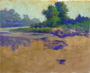 done with charcoal and just simple lines. For this technique, I want as little charcoal or graphite as possible, as it’s important to have the surface remain pure. I should have spent more time with the initial shapes as I had to correct a few and it’s not easy. Brushing down is not a good thing to do, as it dulls the undersurface and I had to do it very carefully. But I’m LOVING this! This week I move into my new studio! I’m going to buy a few things today, but we’ve found a lot of stuff in the house to bring and my husband is going to build me a new pastel box that I’ll be filling from my many drawers of pastels. Having a second studio is going to be a challenge. But having a more public venue should be stimulating. I want to continue working in this style and build on it. Have I found my style yet??? Who knows–but what fun!
- Partial painting showing color of surface
Sepowet Pastorale #1
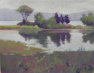
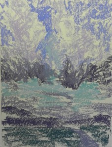
The weather here is dreadful and I’m spending time in my cool studio. Now that the sunset pictures are out of my system, I can play with the images from Tiverton, RI–an area called Sepowet. This has always been a magical place for me because of the beautiful fields, stone walls and elm trees against the backdrop of Narragansett Bay. I decided to experiment with using broken color instead of the painterly color that I usually use. I bought three sheets of Reeves BFK printmaking paper (white) and applied to coats of Art Spectrum Liquid primer, toned with burnt sienna liquid acrylic. I used a 1″ brush and was careful not to leave thick areas and even apply it. I find that hard pastels don’t work very well on this surface, so I used soft pastels–mainly Terry Ludwigs and Schminckes and a few Giraults. I worked from only a black and white photo. Since there is foliage, it has to be summer and there has to be green, but I didn’t want it to be as green as in the photo. (I haven’t looked at the original color photo since I did it!) In addition to the greens, I wanted to add warmer pinks, peaches, and red violets. The challenge is not to turn everything grey! The sky was overcast on this day so I decided to keep away from real blues. The color of the water is primarily a very light aqua. For the background land mass, I used a Ludwig blue violet, then put lighter violet and orange over it. The complement grayed it but also gives it some life, when seen close up. In the foreground, I applied violets, warm grayed reds and greens. I kept the colors pretty subdued, then applied a little brighter green to the foliage in the foreground and on the island. I had a really good time doing this and will try using this approach for other pictures from the area. I’ve also ordered 5 16 x20 ProArt UART 500 boards and might try doing the same picture on it using the color photo to see what might happen. (This is a 16 x 20). But I really love working from the black and white and learning to “see” my own color within it. This is what I want to teach in workshops.
Morning at Swain’s Lock
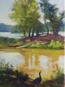
Yesterday I awoke to a bright blue sky and decided that I’d go out to paint, despite the prediction of 90’s later in the day. A friend went with me and we found that standing in the shade by the Potomac River was quite pleasant. When I first arrived, the foreground was all in shadow and there was a flock of geese. I took a picture of them for reference. Later, a blue heron flew in and landed to the left of the bright grasses on the little island. Took a picture of him too, but in the end left him out. I began with a hard pastel underpainting, going primarily for value to begin with. I didn’t limit the palette or give a lot of thought to the colors I used. I was more concerned with shape and value. I worked from top to bottom and by the time I got to the bottom, there was a lot of sunlight on it and it was very different from what I’d seen early on. I struggled with the foreground and considered it to be the weak point in the picture. This morning I looked at my photo of the geese and the dark foreground and decided to try to reproduce what I’d first seen that so attracted me. I brushed down the foreground and used dark colors to lay in three geese and grasses and added a few streaks of light. The geese were a bit of a struggle. Adding poorly drawn animals or birds to an otherwise pleasant landscape can make it look amateurish. I’m hoping that what I ended up with is acceptable. I like the dark foreground as it sets a contrast for the beautiful light on the water. I used some very light yellow greens in the water just about the foreground and in the distance. I love the way the river takes a bend at this point and the land on the left is cooler and more blue. I probably won’t get out again this week. Very hot and humid all week and I have so many other things to do! But it was wonderful being there for a brief time.
Taos Sunset #3
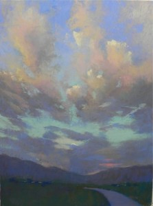
Here is the final picture. I have worked it and reworked it and refilmed it many times. These cloud pictures never seem to get done! I’m longing for a nice building at this point–something with defined edges and shadows! I used a lot of Girault in the clouds and only lightly added color to the sky, given the blue that was in the underpainting. I tried to use the same colors that are in #2 as the two pictures were taken right after one another. However, the foreground is a little lighter in this one. You can’t see it in this photo, I don’t think, by I added two little salmon colored dots where the road disappears to indicate a car. This is not as vibrant as it might be, but I like the subtlety. I’m glad that I did these and I’m glad to have them done! I don’t usually do this type of subject matter and it was fun for a change.
Taos Sunset #3–Underpainting
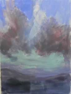
I decided to do something different with this third–and LAST–cloud picture. I didn’t like the cakiness in the last one and decided that I wanted to get the color in right up front. So I used Liz Haywood-Sullivan’s method of lightly applying soft pastel, than washed it in with mineral spirits. I didn’t start with charcoal with this one and the drawing was pretty sketchy. As a rule, I don’t like to use soft pastels for an underpainting, as I think they can become too gummy and thick if you aren’t careful. But I can see it with this subject matter as there aren’t enough of the right colors in the hard pastels for skies and clouds. (Reading this over makes me think that I sound like the writers in Cooks Magazine! If any of you have it, you’ll know what I’m referring to.) For some reason, the bottom is strange–there was a section in the middle that wouldn’t take the pastel very well. The Wallis paper didn’t always seem very happy with these applications!!!

