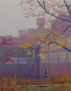
It’s snowing here and I’m going to stay home and enjoy it. My gallery is giving a champagne and chocolate “private” party today, but I’m afraid the turnout won’t be good. We bought our Christmas tree this morning and will decorate it by the fire this afternoon instead. It’s December! I always have mixed feelings. I love the music, the lights, the spirit of the season. But there is so much to do, to buy, to eat, cards to write, presents to be bought. And NO time for art! I wake up at 4:00 am thinking about the projects I’d like to be working on, but they fade away as soon as the day begins. But I just “finished” this small painting that I began several weeks ago so I’d have something to share with you. We were in Johnstown, PA in mid-Nov. and it was foggy in the morning and I got some great pictures of the old iron works and other buildings in the fog. Want to do a series of 11 x 14 small towns and cities pictures, including the one of Frederick that I shared. But … I’m also keen to try out the square Fisher boards again, perhaps trying out some abstracted landscaps in advance of a workshop I’m giving in January in my studio. No time for that either. It’s no wonder why I LOVE January so much! People think I’m very strange to love January, but really, having guilt-free time to spend painting inside is one of the things that January brings us. We’re back to healthier diets and real work. But for now, it’s December and Christmas for many of us. John and I will be travelling to Massachusetts on the 20th, returing on the 27th to host New Year’s Eve gathering here. I look forward to being with friends and family this month and hope that many of you will also be doing the same. It’s good to take time out from a solid diet of art (I guess!). Happy Christmas, Happy Hannukah. Enjoy!
Category Archives: Uncategorized
Harbor Sunrise
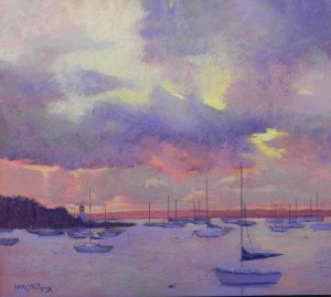
Brought this painting home from the studio yesterday and filmed it in sunshine this morning. Wanted to send it out as a Thanksgiving present to you all! I’ve resisted painting the Ned’s Point Light house in Mattapoisett, but every time I do, the painting sells! The photo reference for this was taken in the fall of 2010 on a trip home in September. (It’s when I made the decision to write a book.) I decided to try it out on the Reeves paper using a lightly toned red gel. I first tried to do it as a 22 x 30 and that was a disaster (went in the trash). I sarted over, planning to make this a 20 x 20, but I placed the horizon line too high! So I cropped off two inches at the bottom and made it into an 18 x 20. Much happier with it now. I had to make up the cloud shapes as the photo was kind of boring. I kept working and reworking them to try to give them interest without being overpowering. I worked a lot on the boat in the foreground but kept the others as simple shapes with masts. I hope you all have a lovely day with family and friends. We are driving to rural Loudon County, VA to be with some of our closest friends. Always a nice time. Will be in Mattapoisett for Christmas.
Another painting on Fisher 400
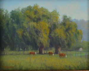
Margaret has kindly let me share her painting with you. It was when I saw this that I thought I should try the paper. The layering in the trees is really lovely as is the softness of the sky. The painting was in a frame so the edges are a little dark. However, you get the picture! Margaret says she doesn’t do underpaintings, just works directly on the paper. It would be easy on this paper as it accepts the pastel readily. But I was also able to layer and produce “chunks” of color in the grasses in my picture, which I liked. Thanks to Margaret for sharing this and her enthusiasm for this surface with us.
A New Surface
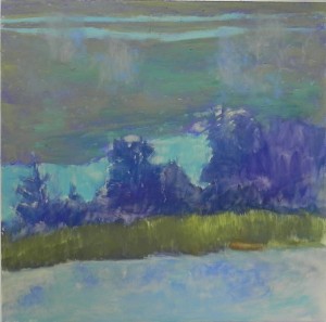
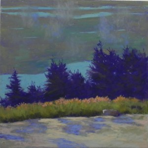
After a wonderful two days with my friend Frieda Rosenberg and her husband Don, who were here from Duram, NC, I had a few hours this afternoon to play in my home studio. Several weeks ago I purchased some 12 x 12 panels of Fisher paper from ProArt Panels. Margaret Bradburn, a new friend from this blog, suggested that I try it. I got 5 of the 12 x 12 panels mounted on foam core. It is a sanded surface, similar to Wallis and UART (500-600). Also some weeks ago, I went through old pictures, cropping to see what might make interesting squares. I found a photo taken at Acadia National Park in 2009 and have been wanting to try it and the paper out. I did some quick conte sketches on newsprint, but not a color study, as I had a pretty good idea what I wanted. One of the things I loved about the photo was the pieces of blue violet in the foreground rock and the orange tops of the grasses. I did an underpainting using cool colors of hard pastel and alcohol. I didn’t find it to be very successful. The brush seemed to knock off a lot of the hard pastel and it didn’t go on very evenly. Perhaps turpenoid would be better for this? I started painting with nothing but Giraults as the surface is very soft. The background is all Girault. I found that I could blend one color into another very nicely and it was easy putting the layers of fog on over the background. For the trees, I began with two values of red violet, then lightly added some greens. (After doing the underpainting, I put the photo away so I could work more freely and intuitively.) As I worked into the grasses and foreground rocks, I started with Giraults, but then went to softer pastels, using Ludwigs primarily. The surface took it beautifully. This is a lovely surface for painterly work; one that makes it easy to keep edges soft and blend one color into another. While it doesn’t produce broken color, you can see many colors coming through in the background (a combination of blue and red violet and warm and cool greens, all of similar values.) I look forward to working with the remaining 4 panels. But time is going to be very limited, alas! Happy Thanksgiving to you all.
Stronghold Reflections–Demonstration
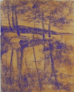
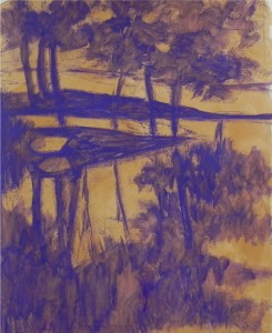
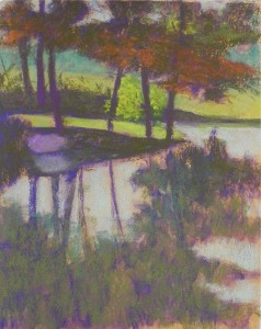
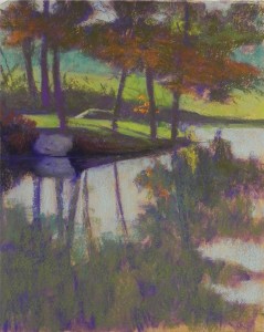
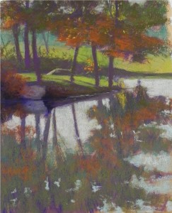
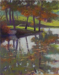
I’ve decided to experiment with putting 6 images into one blog post to see how this will work! This is the demonstration that I did for my Monday morning class. The photo had a little color and light, but wasn’t terribly exciting. But I saw possibilities, particularly for a big shape block-in. Photo 1. I began with a warm toned surface made with AS gel on Rives BFK, then lightly blocked in the major shapes of the composition. Photo 2. In class, I applied alcohol to create a partial underpainting with just one color. Stage 2. I began by lightly applying color with hard pastels and Giraults. My initial idea for the center of interest was a brightly lit bush behind the three trees to the right of the island. It appears in this image. However, it quickly became clear that what was catching the eye was the large rock and its reflection on the left. I didn’t make it dark enough and it really stood out. None of us liked it! Stage 3. I darkened the area around the rock and the rock and reflection. I also added a rock in the back and decided to replace the bush with small twigs of orange leaves. Liked all of this much better. Stage 4. The rock was still too prominent, so I brought the bush at left on over it and added reflections and liked it much better. I added more light to the leaves at top, then added red orange reflections in the water. Final picture. The last things were the addition of leaves on top of the water to add horizontal elements, and a brightening of the yellow green grass on the island. For the background, at various stages, I used yellow greens and blue greens and integrated them into each other to keep it subdued. I used red violet behind the bright grasses of the island, which provided complementary contrast. On the whole, I found this surface very nice for the type of flat reflections in the water, as well as for the details in the mid ground. The addition of darks, softening of the rock, and brightening of the grass were the key strokes that made the picture work.
Back Alley, Frederick–Finis!
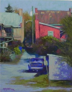
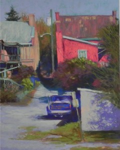
I looked at the picture with fresh eyes this morning and I saw that the right side of the house at left was too fat! So I shaved it off and was immediately MUCH happier with the picture. I made other small changes, trying to soften a bit of the detail at the left. The last thing was signing it with a majenta pencil, then adding some of this color into the bushes. It was amazing how much difference the building made and how quick it was to resolve. In the photo, both buildings are the same height. I purposely shortened the one at left to minimize it’s importance. In so doing, however, it became a little more squat than it is. So straightening and lessening the right side made a difference. The building is now there but not calling attention to itself as I felt it was before. I haven’t done much of this type of subject matter lately, but I love doing pictures of back alleys, with signs and telephone poles and blue trash barrels! They have so much character and interest to me. Frederick, MD is a great place to see this, along with lots of church steeples and water towers! What I loved about this scene was the angles of the truck, sign, and shadows, contrasted with the point on view of the houses and foreground shed.
Back Alley, Frederick–Done???
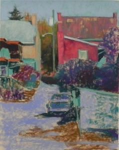
Here is the finished painting as of now (it’s dinner time!). This is not a great composition or painting, but I enjoyed the challenge of trying to make something out of it. What is the center of interest? I guess it has to be the red building as the color really draws the eye and it has dark surrounding it. But I like the truck and the shadows surrounding it. I’m not crazy about having a tree up the right side, but it’s what causes the shadows on the shed and these are really important. I moved the pole that you see in the middle as it was right next to the building and it was hard to see the shape of the building. My original plan was to keep the left side as sketchy as possible. Not sure I accomplished this. You’ll notice that it isn’t signed yet!
Back Alley, Frederick
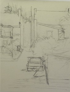
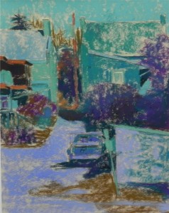
I have some rare time to paint at home today and tomorrow and decided to do a picture that is something I haven’t done much of lately–buildings and a truck! We were in Frederick, MD last Tues. dropping off pictures for a show and I took pictures along the canal. I particularly loved this back alley scene that included a roofing truck and buildings in different planes. There was a lot of careful drawing required for this, so I decided that I didn’t want to do a wet underpainting. This is the first time I’ve done a dry underpainting on the light UART (I’ve done it on Wallis Belgian mist). You can see that I left a lot of the paper showing through. The buildings have a lot of warm browns and reds in them and I decided to begin with cool blue greens in the hard pastels. I sprayed it pretty heavily to be sure that the colors wouldn’t mix and become muddy. I used my Terry Ludwig vibrants for the reds in the building at right and they were just right. Most of this is, of course, not yet done. But I thought it would be nice to give more of a step-by-step demo; something I haven’t had time for lately. I have no idea how this will turn out, but so far, I’m liking it and the process.
Violet Stream
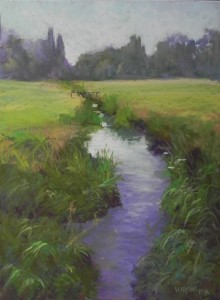
I’m sharing with you the painting demonstration I did for my Monday class at Capitol Arts Network. This is a picture from Salisbury, England. One person was quite surprised that I had chosen this subject to paint. But I knew as soon as I filmed it that I would paint it. It’s a classic Richard McKinley subject! My original thought was to do something more like Richard does, by using watercolor and lighter applications of pastel. So I did a watercolor underpainting, but then (of course) proceeded to cover it all up! I thought about doing a hard pastel underpainting in the lower part to provide the dark background, but instead added dark violet pastel. When I added the greens into it, it blended in very nicely and created a lovely effect. So I was happy enough with my approach. I made a number of changes as I went along, particularly in the background trees–lightening and reforming them. I also decided that having a certain amount of detail in the foreground really helped. I liked the few pieces of light on grasses in the lower left corner, feeling that they grabbed my eye and led it into the picture. I added a few small white flowers in the mid right. The center of interest, of course, is the light on the water. The stream leads the eye back to the trees. My original shape was ugly! So I made sure that this was a shape that I liked. As I was doing the picture, I really wondered if it would be any good. But when I finally finished, I was happy with it. Another demo tomorrow–this one will be a hard pastel block-in.
Public Footpath, Dartmoor
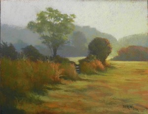
Here is my latest experiment using Rives paper, broken color, and morning light. The picture is from Dartmoor in Devon, England. I went for an early morning walk down the street from our B&B before breakfast. This is an area we had walked in the day before. I took the picture looking into the sun and everything was light-infused. I had to paint it from my Samsung tablet and it was pretty hard to see any colors other than brown! (I’m not sure the background colors and sky are coming through in my photo.) The background is blue greens with some violet on the left and warm colors brushed over on the right. The foreground was pretty dark in the picture. I used a combination of dark cool greens and dark warm reddish browns. The excitement for me was the spot of light to the right of the round bush and the light infusing the background hill. The color of the gel was a fairly dark sienna, on the reddish side. Not sure I’d use it again. I am enjoying working on this new surface and particularly using it to try to obtain the effects of diffused light. I’ve thought about doing the same picture again on UART just to see how different it might be. Working on this piece was interesting because most of the time I was working without a reference. I used it to begin with to get the composition in, then to try to figure out the coloring. But after the initial go at it, I just added color to the painting as I thought it needed it. The sky was a challenge. I began it with a light aqua in the dip at right, and progressed to cooler colors on the left. Yesterday while in my studio, I realized that it needed warm color brushed over. So I used a pale orange on the right, progressing to warm yellow green, and red violet on the left. It definitely gave me more of the effect that I was aiming for. Still not sure about the picture and would love comments or suggestions. With my show up and no plans for another any time soon, I feel free to experiment and try out new techniques and subject matter. Having the blog to share this on is so much fun!

