Abstracting the Landscape Workshop


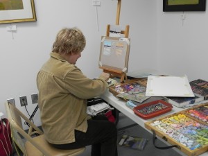
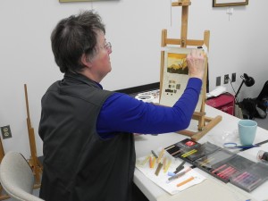
Nikki O'Neill doing color study

Nikki O’Neill doing color study

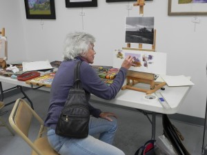
Catherine Nickle doing color study

Catherine Nickle doing color study

Dawn Capron and her color study

Dawn Capron and her color study


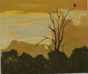
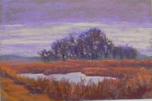
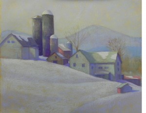
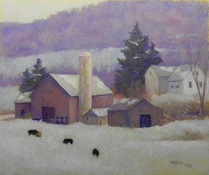
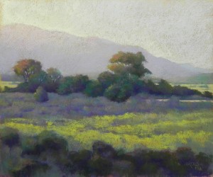
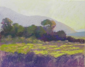
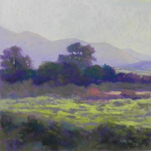
Nikki's painting of a scene from Africa

Nikki’s painting of a scene from Africa


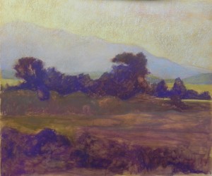
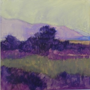
Catherine's painting

Catherine’s painting


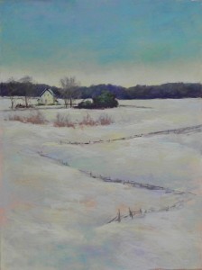
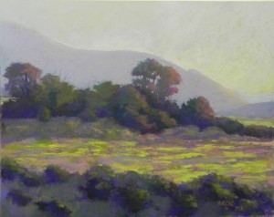
Dawn's painting

Dawn’s painting


On Friday and Saturday, 3 of the original 6 who had signed up for my first Abstracting the Landscape workshop met in my studio. On the original date we had a large snowstorm (of course!).  The follow up session will have 4 people in April. We all agreed that we were glad that it was a smaller group–more time to talk and share, and, of course, more table space for all the pastels!  The downside was not having all of the people to share with. As you will see from the paintings, none of us wants to become non-representational. But we all would like to become a little looser, stronger, bolder in our approaches to painting. We discussed what that meant in terms of composition, value, color, and technique and each person identified personal goals for themselves. We then did a number of studies on the first day–composition, value and color. Yesterday we all painted. (I will share my painting in a separate post.) It was an intense, but fun experience (enhanced by the discovery of the Saint Michel French bakery down the street and their almond croissants!!!)

I am looking forward to the next installment in April. And I’d like to find a way for the entire group to get together from time to time to share their progress. This is just a beginning for all of us.

The primary emphasis of the workshop was on defining strong shapes and I think this comes through beautifully in the three paintings.

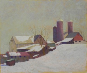
Amish Farm #2 (in progress)

Amish Farm #2 (in progress) 20 x 24

Amish Farm #2 (in progress) 20 x 24

This is the same farm that I painted in Amish Farm. I took a picture of it from the other side on the way home. There was a small mountain in the background and the farm was completely flat!  I changed that, moved the silos around and took great liberties with the color. I also added snow, which had all melted by the time we were there!  This painting has been giving me a lot of  trouble. I’ve discovered, however, that the surface can take a lot of wear and tear.  I’ve been able to brush off pastel then use a kneaded eraser to get back most of the surface color (which was raw sienna).  This has been a wonderful discovery!  The colors in this one were a challenge for me because the light source in the photo is coming from the left. I have changed it so that the house and barn have some light on them and it makes it much more interesting. I decided to use a light violet and greens for the both buildings (after several other unsuccessful combinations)  and I like the unity it produces (but is it too light???). I have small bits of red in three places. I added the little building in the foreground. I like the way the light on the house produces a strong vertical, with the horizontal to the right and the diagonal roof of the small building.  For the snow, I used three values of bluish white to create subtle movement. The picture is pretty light, but I wanted to capture the sense of light-infusion that I see when there is snow on the ground. Would appreciate your comments!  Is there too much green in the house, i.e., should the roof color be changed?  There is only one area of dark, at the bottom of the silos. (The silos were really fun. I played with light and shadow and texture and really like the way they came out. If you click on the picture and enlarge it, you’ll be able to see them more clearly.)


Off to gallery sit today, then two days of my Abstracting the Landscape workshop. Will bring this picture and see what they say. By the way, I did a lot of this this morning between 3:30 and 5:00 AM. A car overturned outside my bedroom window at 2:30 and I couldn’t get back to sleep!!!

A Winter Day (Pennsylvania Farm)

A Winter Day, 20 x 24, BFK RIves and gel

A Winter Day, 20 x 24, BFK RIves and gel

I was supposed to be giving the first day of my Abstracting the Landscape Workshop today, something I’ve been looking forward to for some time. But, alas, it is snowing heavily and I am home. So, since I love snowy days, I decided to make the most of it and paint. This is a farm near Altoona, PA. I shot the picture in November sans snow!  I used today’s weather as inspiration for the coloring and decided to try out some different pastels. The background trees are  done with 3 Henri Roche pastels.  I paid a lot for them, and I really should use them!  I also unwrapped  a bunch of the new Daler-Rowney that I bought years ago, thinking that some harder, Rembrandt-like pastels would be good for me. However, I very quickly gave up on that and went back to my trusty Giraults and Ludwigs!   I toned the gel with the same raw sienna gel that I used for the Amish Barn painting. I like the glow that comes through in the sky. I used several of the Daler-Rowney’s and a pale warm green Roche and it worked very nicely.  I wanted to keep the colors subdued and soft. I added reds to the barn, but only after adding violets and browns. And then, nothing too bright.  For the evergreens, I started out with a dark violet, then a dark green, then added a lighter grayed green over them using a diagonal stroke to simplify and soften them.  Really liked the affect.  The cows were in the field. I wondered about having two cows appearing to be eating grass when I’ve put snow around them!  However, I really liked the little dark shapes.  This painting doesn’t have the impact of the last barn picture, and there is more detail. But I DID leave out a whole lot of junk that was in front of the buildings!  It’s going down to 6 here tonight. Stay warm and safe everyone (on the East Coast)!

Colorado Sunrise #3

Colorado Sunrise, #3, 20 x 24, BFK Rives and AS liquid primer

Colorado Sunrise, #3, 20 x 24, BFK Rives and AS liquid primer

Underpainting of hard pastel and alcohol

I’ve just finished this third version of the same subject from the last two posts. This one is on the Rives paper with toned gel (I used an umber brown). I did an underpainting using hard pastels that is much warmer than the finished picture. Somehow I went for more of the blue violets in this one. I also decided to make a change and use the light source from the photo, which was coming from the left.  The array of trees and bushes in this version is a little straighter than the other two. But I like the shapes created by the lit and shadowed field. The bottom was a challenge. I decided to make it as abstract as possible with just shapes of color. This morning, I added more warmth–red violets from my new violet Blue Earth set.  It’s still a cooler picture.  But I’m happy with it at this point.

Yesterday I sold my Amish Barn picture!  I gave a two day workshop to four wonderful people in my studio and brought in the picture to show them.  Now I’m going to get it framed!  Haven’t even gotten it on Facebook yet!  Will do that next.

Another thing to share. If you live in New England, I will be giving my first Finding Your Style workshop in Tiverton, RI March 20-21 (Thurs.-Fri). This will be based on my book (of course!) and will consist of exercises, discussion and sharing, painting, and personal consultation.  I’ve been wanting to do this for some time and now is the opportunity. Next week’s workshop here will get me started. It’s about possibilities and where you want to go with your own work. I’ll share my own personal journey and desires and will ask participants to bring examples of work they’d like to emulate in some way.  We’ll discuss and try out materials, techniques, and exercises that will help get us there.  It’s only two days so limited, but I’m hoping that it will be informative and fun.  If you are interested let me know (Jeanhirons@comcast.net).

Colorado Sunrise #2

Colorado Sunrise #2, 16 x 20, UART 500

Colorado Sunrise #2, 16 x 20, UART 500

Picture at completion of demo

Picture at completion of demo

I’m using a rainy, lousy day to complete the painting that I did as a demo for the Gaithersburg Art Association last night.  We talked a lot and I had chosen a fairly large (16 x 20) surface to work on in a short time. I never got to the bottom at all and the rest of it is pretty rough. However, I brought the 12 x 12 with me so they could see where I was going.  One of the major things I did this morning was to change the size of the two trees. In the demo piece they are almost the same size. I shortened the one of the left to make the one on the right more dominant and the clear center of interest.  I refined colors and form a lot. One of the difficulties that I’ve created for myself is that I changed the light source from the photo.  In the original, the light is coming from the left. But I wanted to have it coming from the right, so I had to keep remembering that when looking at the darks and lights in the black and white photo.  I had a really good time sharing my processes and love of pastel with others last night. (Being an extrovert really does help!)  Now, I’m going to attack this picture one more time on a 20 x 24 sheet of Rives toned with burnt umber. Have decided to do an underpainting on top of that. Might be too dark. We’ll see–stay tuned!  (But probably not today)

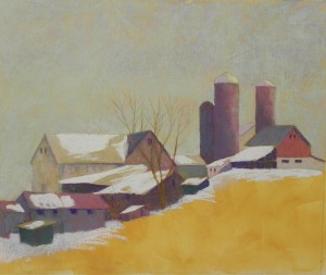
Amish Farm–Demonstration 3

Amish Farm, 20 x 24, BFK Rives

Amish Farm, 20 x 24, BFK Rives

Here is the picture with snow. You’ll notice I haven’t signed it yet!  I tried briefly to put in some corn and decided that would be a big mistake. So I used various lights to create a pattern and interest in the snow–a light blue and green and the pink I’d used before for the light areas.  I also decided that the two small green buildings (from last image) were distracting and put red over them. Now there is a progression from the reddish building in foreground of lower left to the red barn on the hill.  I think this is much more pleasing. If you look very carefully, you’ll see I couldn’t resist adding a small turquoise pail in front of the long building at lower left. I then added the color to the small building behind barn at left and in the dark shadowed area of the barn at right.  I added more trees at right, but decided to omit the one on the left, which I included in my initial drawing.  I tried to keep the trees simple and understated.  This isn’t much like the photograph, nor is it like what I imagined as I was riding in the car, but I like it!  I think the colors are more interesting and the piece is a bit more stylized.  In two weeks I’m giving a workshop to 6 people on abstracting the landscape and this was done with that workshop in mind.  I’d be interested to know what you think!

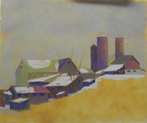
Amish Farm–Demonstration 2

Completed layers of soft pastel on buildings and snow on roofs

Completed layers of soft pastel on buildings and snow on roofs

Well, so far so good!  I resolved my problem with the sky by lightly layering an aqua Unison over the entire sky. It allows some of the underlying color to show through, so it isn’t all the same (you probably can’t see this), and it combines the colors of blue and yellow that I was seeing. Am happy with this!  For the buildings, I’ve used Ludwigs and Blue Earth pastels primarily. For Christmas I received boxes of the violet and the nearlly neutral warm (i.e., brown). I’ve use these a lot, along with blues, greens and a bit of reddish color. I used a light Ludwig pink for most of the roof snow and may continue with it in the field.  That’s the big challenge now. And I know I’m not done with the buildings. This is the first pass. Some of them are getting pretty grayed with too much color on them. But I like the simplicity of it so far. It reminds me of Charles Sheeler, one of my favorite of the early 20th century painters. I”m trying to focus on the shapes and keep the details to window suggestions and a few trees. Am still unsure what to do with the field. The corn rows could provide interesting lines and direction, but I’m afraid it might destroy the simplicity that I’m aiming for.

Amish Farm–Demonstration

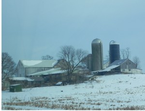
Photo of Pennsylvania Farm taken from car window

Photo of Pennsylvania Farm taken from car window

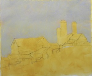
Pencil drawing and first layers of sky color

Pencil drawing and first layers of sky color

Farm buildings done with hard pastels

Farm buildings done with hard pastels

I know that many of you are in the deep freeze and it’s coming this way. The wind has picked up and I’ve decided to spend the day at home doing a painting I’ve been thinking about for several weeks. The photo was taken from the car window near Kutztown, PA on our recent trip to New England. The day was bright and sunny and there was a lot of yellow light infusing the sky. This doesn’t show particularly well in the photo but I wanted to try doing something with it. One of the things I love about farms are the various sizes and shapes of buildings that seem to multiply over time. I loved the way this one hugged the hill and decided to emphasize it.  I also wanted to try using the Rives paper for buildings, something I haven’t yet done. The second image shows the pencil drawing and the initial colors of sky. I used several blues, violet, greens, and a light almond color. It’s probably too light!  And it’s becoming a little gray, so this is going to be a challenge. In the third image, I’ve added hard pastel to all the buildings in varying combinations of colors, and used an Art Spectrum tinted white (cool gray) for the initial layers of snow.   I’ve decided to be brave and do this as a demonstration for you, not knowing whether I’m going to ruin it or not!  I started a blog post after finishing the sky but chickened out!  Now that the buildings have been added, I’m feeling better about it. But I have to decide a number of things: what to do with the sky; what to do with the snowy field–add the pieces of vegetation or not?  And how much to go into the soft pastels (which I’m dying to do!) I used primarily the Caran d’ache for everything so far and found myself actually doing cross hatching because they are so hard!  (This is something I used to pooh-pooh because it was all you could find in the pastel books!!!).  I plan to add more trees, etc., but decided I needed to get the sky the way I want it before I do much more.  I’m liking the combination of colors in the buildings. I used a mix of violets, greens, green golds, and a blue. By using the same colors, but in varying orders, and combinations, I think I’ve been able to maintain some continuity while also providing variety and interest.  We’ll see what happens next!

Colorado Sunrise No. 1

Colorado Sunrise, no. 1, Fischer 500, 12 x 12

Colorado Sunrise, no. 1, Fischer 500, 12 x 12

Underpainting with Caran d'ache hard pastels

Underpainting with Caran d’ache hard pastels

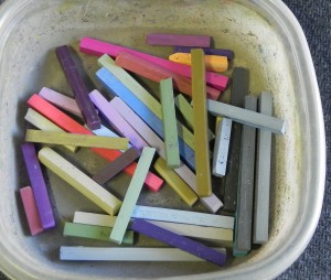
Caran d'ache cubes

Caran d’ache cubes

Happy New Years dear friends!!!  I’ve been without an internet connection since Dec. 14th, my printer isn’t working well, and now Photoshop won’t open. BUT–I now have time to paint!!!  Yesterday I did my first painting (and we got the Comcast connection restored) and I’m happy to be able to share with you once again.  It’s been one year since I started this blog and I can truly say that it was one of the things that gave me the most joy in 2013. So I’m happy to be back online again.  Since my printer isn’t working, I used a black and white photo that I had printed earlier from our Colorado trip in June. I decided to do a square using the Fisher 500 paper. I also plan to do this as a 16 x 20 for an upcoming demo on UART 500 and will then do a larger version on Rives. (I got to see the Van Gogh Repetitions show in December. If Van Gogh can do it, so can I!!!).  For Christmas, I got a selection of the new Caran d’ache “cubes” (photo included). I like the colors very much–some much needed lighter shades of violets and greens, and beautiful green gold colors. They are hard though. Definitely harder than the NuPastel and Faber Castell, and I was working on a very soft sanded surface. Not sure what they’ll be like on the Rives. I did an underpainting using mineral spirits and this definitely worked better than the alcohol.  I was most interested in the value shapes.  What you’ll see from the two images is that the tree on the left was not part of the original design.  I added that later (it was much further to the left in the photo) and I think it provides much needed balance.  In my compositional sketches, I played with making the central tree go above the mountain, but decided I liked the backdrop as it was and made sure that the top of the tree didn’t touch the top of the mountain.  Colorwise, I began with violets and greens, as you can see from the underpainting and continued with these colors when going to the soft pastels. I used a mix of Girault and softer sticks, using a very soft yellow green at the end in the sunlit field. I added warmer oranges and reds towards the end and this made the painting come alive. The photo doesn’t clearly show the orange light on the background mountain or the variety of colors in the sky, I’m afraid. The piece of orangey-red in the center may be a bit strong, I think.  But I was reluctant to get rid of it! I brought this painting to our opening at the Capitol Arts Network last night and people really liked it. I now want to do it larger.  But I love the square format and want to keep doing a number of 12 x 12 squares. Some day I might do a whole show of them!  Who knows. I hope that 2014 is starting well for you all. We have very cold temperatures and bright blue skies with snow covering the trees and roof tops. So it’s quite lovely. But tomorrow we will  have ice and rain–sigh!  It’s January, not the best month for weather, but one of my favorite months of the year painting-wise.  Enjoy!  And share your questions and successes with us all.

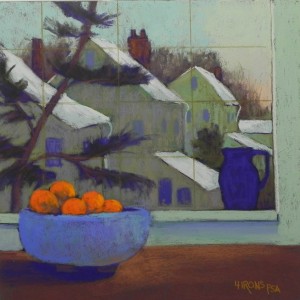
Morning View, After the Snow

Morning View, After the Snow, 12 x 12, pastelbord

Morning View, After the Snow, 12 x 12, pastelbord

I’m having company for dinner tonight but got the cooking done this morning and gave myself permission to paint this afternoon. We had a lovely snowfall  on Tuesday and on Wednesday morning, I looked out at the nearby houses with snow on their rooves and the day dawning. One of the things I love about snow is how light it is compared to everything else, even when the light isn’t on it. So the pattern of snowy rooves was what excited me, along with the muted colors of the houses (white in shadow), and the bright colors of the tangerines. Filming this was useless, so I did a sketch. I’ve been wanting to work more from sketches anyway, in an attempt to achieve more style and fewer details. The bowl of tangerines and the pitcher were there.  (John said I really should have had a cat where the pitcher is! But, alas, there is no longer a cat, and when there was, he never sat there.)  I liked the flat dark shape of the pitcher and tried to balance it with the same dark purple under the bowl.  I wasn’t trying for reality here, but more for shapes and interesting color, as well as a balance of color. I did the three chimneys in dark purple, then added some of the red orange on top.  The distant house may be too bright. I found a Ludwig soft grayed violet and used it on the nearer houses, over shades of warm and cool greens.  This may have dulled them too much? I put the tree in carefully, not wanting it to overwhelm, but it needed to be there. (The position and shape are completely different). The last thing I did was to add lines with a pastel pencil to indicate softly the divisions in the window (there aren’t any in real life, but it needed something!).   The painting was done using direct application on gray Pastelbord. I find this the perfect surface for this type of immediate painting, where one doesn’t want to get into an underpainting.  (It’s snowing again now, but no where near as pretty as it was on Tuesday.)   For any of you who know my gallery, the bowl is Scottie Allen’s and the pitcher is Ann Leonard’s. They are original members of the gallery and wonderful women, so having both of their pieces in the same painting is fun, even if I didn’t render them very realistically!