Wide Water Demo–4 Rocks and start of water

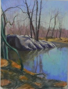
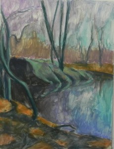
Rocks painted with lots of neutrals and first lay-in of water

Rocks painted with lots of neutrals and first lay-in of water

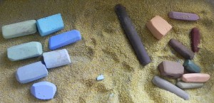
I’ve just worked on the rocks and more quickly put in some of the beautiful colors in the water. None of this is done. It’s interested, looking at the image  as I’m typing this, at how “gray” the rocks turned out! I used grayed colors for sure. They will be refined further, but I need to complete the water and reflections to get a sense of their color. I started them out with various violets, but soon added grayed blues. They didn’t really work at all until I started adding some warmer browns and a bit of very light grayed yellow.  I can see that one area is now reading like a tree reflection and doesn’t work because it doesn’t continue.

But now it’s time for lunch and a break. And, to be honest, I’m really rather glad that I’m not doing this painting in front of my class!! It takes a lot of careful thought and selection of color. I was concerned that I was doing something a little too complex. But who knows, mayber the interaction would have made it a lot better!  We’ll see.

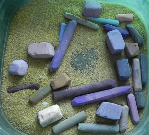
Pastels used for the rocks--a mix of grayed violets, greens, blues, and browns

Pastels used for the rocks–a mix of grayed violets, greens, blues, and browns

Wide Water Demo–3 Sky and trees

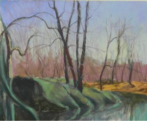
"Completed" area of sky and trees against it, along with back piece of land

“Completed” area of sky and trees against it, along with back piece of land

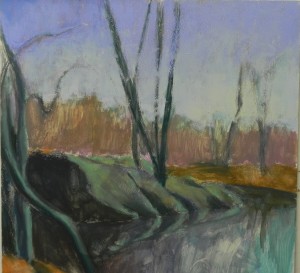
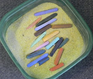
It’s snowing again, rather seriously! So I’m not feeling guilty for cancelling the class!  I’ve just done the first, perhaps complete pass at the sky and trees. For the sky, I used all softer pastels: Ludwigs, Unisons, and Great American. I began with the blue violets at the top, with a darker color in the upper left. I worked down to warmer, lighter colors and a very light blue violet as well. Then I went back into the upper right and added a warmer, more turquoise color (you can see it in the box). For the distant band of trees, I used a combination of light majentas and browns and carried these colors into the branches over the sky. For the more solid, darker trees, I began with a dark grayed red violet Girault.  (Note: the trees have mainly been done with Girault, the sky with softer. It’s a matter of the available colors and the ability to get more detail.)  I mixed a little green and some warmer reddish brown into the grouping of trees in the center. There are four of them and I added a fifth to the right, which is in the picture but omitted from my original drawing.  I’ve added some warm and cool browns to the distant piece of land. This may turn out to be too bright and need toning down,  but for now, it’s fine.

Initial lay-in of sky colors

Initial lay-in of sky colors

Pastels for sky (left) and trees (right)

Pastels for sky (left) and trees (right)

Wide Water Demo–2 Underpainting

Hard pastel underpainting

Hard pastel underpainting

The color decisions for this piece were a little tricky. The rocks are basically gray–not a color I relate to very well! I like the warmth of the sky and violets in upper left, and the warm color reflecting in the water. I also like the opportunity to introduce warmer, richer color in the foreground. For the rocks, I decided to use a light cool green to represent the warm sunlit areas, with some light brown added. This will give me a lovely darker, cooler surface over which to apply the warmer lighter pastel. I also used blue greens in the trees. Basically the underpainting is in blue green, blue violet, and warm orangy browns.

In order to maintain my composition, I lay the board flat and applied the alcohol with a smallish brush. I was basically trying to tone the surface. Sometimes it washed away!  However, I think I’ve retained the basic structure and feel of the painting and now can take my time with applying the pastel, beginning at the top and working down.  I will work both from the black and white and color photos, as needed.

Students have asked me about whether they should be working on all parts at once. I think it depends on the painting. However, when I’ve done an underpainting like this, I know where I’m going and I feel comfortable working slowly in one area. Then I’ll go back and add colors, as needed, to avoid isolated color (this is the fun part!).  But, I think that if you rush at this point, you may jeopardize the success of the painting. We’ll see!!!


Hard pastels in violets, greens and browns. Brands: Polychromos, Richeson, NuPastel

Hard pastels in violets, greens and browns. Brands: Polychromos, Richeson, NuPastel

Wide Water Demo–1

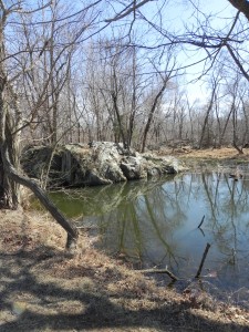
Color photo reference

Color photo reference

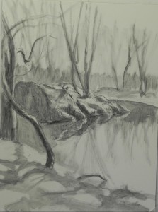
This demo was supposed to be a painting from B&W photo using the BFK Rives surface. However, I decided I wanted to do some paintings from the C&O Canal and realized that there was a lot of drawing involved and the Pastelbord might be better. I also did some quick color studies on the Rives and the surface just didn’t work for me. It’s good to have alternatives!  Because this was to be a demo and required a lot of drawing, I like being able to do a fairly detailed lay in, using either charcoal or graphite. I decided to use graphite (4B and 6B) in this case as I could produce finer lines and detail.

I will be using both a black and white and color photo. I like the colors in the photo and want to maintain them to some extent. However, as you’ll see in the next post, I’ll be using more color in the underpainting.

I like the composition in the photo, which consists of three diagonal shapes plus that wonderful tree at the left. What I like about the tree is that it curves back to the right at the top so it doesn’t lead the eye out of the picture plane.  So I’m not making any major changes to the composition, just simplifying a bit here and there.

Technique was the next thing I had to decided. With so much drawing, I was concerned about doing a hard pastel underpainting and considered watercolor. But, I don’t have great luck with water color and decided to stick with the hard pastel, which produces a much richer wash. Will show the color choices in the next post.

In the initial lay in, there is a large shape of rock to the left that doesn’t look good. However, I plan to modulate the color in it and place pieces of sunlit twigs, etc. over it, so I think it will be OK.  What I really love is the reflections of the rock in the water with the sunlit edges. Will focus on that in the painting.

Lay in with graphite on white 12 x 16 Pastelbord

Lay in with graphite on white 12 x 16 Pastelbord

IAPS and a demo

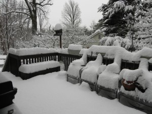
Our back porch. This is a color photo!

Our back porch. This is a color photo!

Happy St. Patrick’s Day!  Here in Rockville, we have a fresh 8″ of snow. No more crocuses and no class today. So instead I’ll be doing a demo on my blog. Stay posted.

There is good news, however!  At the next IAPS convention in June 2015, I’ll be giving an all day workshop on the use of intuitive color. Participants will bring B&W photos and their pastels and surfaces and we’ll do color studies and paint. This is my first opportunity to teach at IAPS and I’m really pleased about it. AND–I’m hoping that some of you blog followers will be there and introduce yourselves to me. It’s so much fun sharing with others.  The dates of the convention are June 2-7, so my workshop will be on the 7th. IAPS is a fantastic convention with so many friendly people and such great displays of pastels. It grows every year and I just hope we never become too big to keep the spirit of the event.

Now on to my demonstration.

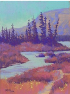
On the Athabaska

On the Athabaska, 16 x 12, pastelmat

On the Athabaska, 16 x 12, pastelmat

I did this painting in the CAN studio this week, using a color palette that was inspired by the clothes that I wore to Annapolis last Saturday!!!  I didn’t have any aqua on, but knew that would work too.  So I went looking for a photo that I might use and found this one of the Athabaska River, near Jaspar, Alberta, that I painted  more realistically and sold some years ago.

My color palette was violets (blue and red), greyed reds, and aqua/turquoise. I used the “sienna” Pastelmat, which is a great color as it fit right into the color palette.  And I worked from a black and white photo, of course. Had to make up the foreground.

I just put this painting on Facebook with my new motto: “Life is short, paint with the colors you love”!  It was also fun to work on pastelmat again after working on the textured surface. I’m not giving up on texture, but putting soft pastels on this surface is sooooo seductive!

While doing this painting,  I learned of the sudden death of a librarian from the University of Vermont who was such a lovely, happy, giving person–Birdie McLennan. We never know, do we. So don’t put things off. Do what inspires you now!  Give yourself permission to be happy while you are painting!

Sky Studies

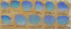
Studies on BFK Rives using various pastels

Studies on BFK Rives using various pastels

 I’ve just been playing in my studio with a scrap of Rives and my favorite color gel (burnt umber light) to see what combinations of pastels will produce the best results for skies.  This has often been the most difficult aspect of using a textured surface. Foliage is textured, the sky isn’t!  However, we have to get over our desire to have everything exactly as it looks in nature–I’ve discovered. If you are going to have texture in a picture, it must be everywhere. However, how to avoid a gummy look is what I’m after, as well as not overdoing it and losing the color of the surface.  With this in mind I first started out with just hard pastels, then just Girault, then some combinations using the soft pastels I have used in the past on this and other surfaces: Ludwig, Unison, Great American and Blue Earth.  I started with the hard pastel (these are the Polychromos, which are no where as hard as the Caran d’ache) layering them on their sides. Later, in the bottom row, I made a scribbling stroke, so as not to fill in the surface.  I tried using a progression of colors and values and the using just one or two colors.  What excites me the most, I think, is the scribbled hard pastel with one or two Ludwigs on top. (I ruled out the Great Americans and Blue Earth, which I loved on sanded surfaces. )  It allows for a lot of the “gold” surface to show through, and the soft pastel glows rather than looking gummy.  (You’ll have to double click on the image to be able to see this).    This has been fun!  I’ve probably not resolved it all yet, but I’m liking the results so far.  


AND now for spring!!!  65 on Tuesday they say. We are all ready for this!  Happy weekend.  You’ll also note that I figured out how to add the image and then the text (it was as simple as hitting the enter key!)

Hill Farm — Final

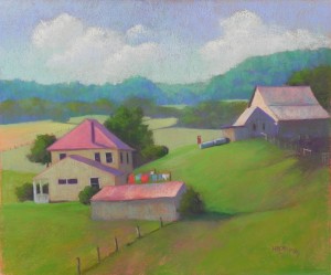
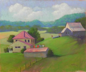
I’ve just been revising the picture and nitpicking it to death!  I first attacked the clouds on the right. I had two identical cloud shapes which I really didn’t like. I removed a small chimney from back of the house roof that was confusing. I also decided to darken the roofs and back of house that were away from the sun. Add cooler blue violets to the roofs, then some of the original magenta back into them. I think they look better and relate better to the building on right. Another thing that was bothering me was the porch at far left. I darkened it and added only small hints of light on it, as well as straightening.  And I did a lot of other little stuff! This is what finishing a picture is like. It’s never really done until it’s framed, but I do try not to play with them too much once I consider them done. What’s interesting is how easy it is to see things I don’t like once I film them. When I’m trying to decide when a piece is done, I ask myself honestly whether anything is bothering me. If I was about to sell it would I be embarrassed by anything?  Too often I haven’t done this and have been sorry once the painting was framed.  Hopefully, I’ve caught the problem areas in this piece. Note: there is actually more room on the right–the roof isn’t touching the edge but every time I film it it seems to come out this way!  I give up!!!

Hill Farm, 20 x 24, Rives and Colourfix liquid primer

Hill Farm, 20 x 24, Rives and Colourfix liquid primer

Hill Farm demo–4

I’m done for today. The sun is out and now we have frigid weather–in March. Sigh.  HOWEVER, I’m pretty happy with the picture. There are still things I’ll tweak, I’m sure, but I decided to be done with it for today, sign it and share it with you. When I did the building on the right, I started using different colors than the houses and it looked too disjointed. But it is a barn/shed and not a house. I tried to resolve the problem by adding majenta to the roof and some of the warm blue green to the shadowed sides of the buildings. The grass was quite simple–just slightly different layers of green Giraults. I added some majenta and browns to the lower grass to give the sense of something in the grass, such as bugle. I also added the fence posts leading that lead into the long building.  I’m really happy with the composition. The lesson to learn from this is that even if you aren’t completely happy with the colors or the way the pastels are going on the surface, it’s probably all fixable as long as the composition is OK!  I’m still not completely happy with the clouds, but they are easy to fix.  And now to the piano and the beef shank that’s been cooking all afternoon and smells wonderful!  I hope those of you in MD have enjoyed your snow day!

Hill Farm, 20 x 24, BFK Rives and Colourfix liquid primer

Hill Farm, 20 x 24, BFK Rives and Colourfix liquid primer

Hill Farm Demo–3

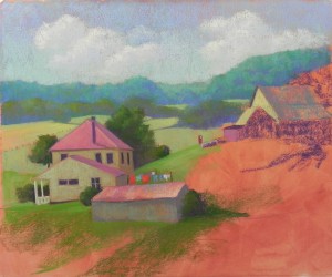
OK!  The snow has stopped, a nice man just shoveled out the driveway and the walk and I am doing much better with the picture!  Here’s what I’ve done. First, in the sky, I went back with two light shades of Girault and using an up and down stroke, I lightened and unified it and softened the lights of the clouds. I think it looks a lot better. Also used the vertical stroke in the background trees and added some violet to the darker areas.  The buildings on the left were done primarily with Terry Ludwig pastels, using my warm and cool reds from the “vibrants” set, and various neutral greens and blues.  In the fields, I’m trying to keep the color loose and gestural.  I’ve added the clothesline with some bright pieces of color and the red gas pump on the hill near the shed.  If the surface wasn’t red, I’d be tempted to leave it uncovered in places. I like the effect at the bottom. If I was working on a surface with watercolor underpainting or Wallis brown, I’d  consider leaving as it is. I don’t think I can do this with this picture. Maybe I’ll do it again on UART and see!  I did think about using the UART rather than the Rives as I thought that more saturated pieces of color in the fields might be a real asset.  But I’ll finish this and see how I like it.

Almost completed right side and background

Almost completed right side and background