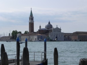
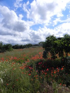
Friends–it’s been so long since I’ve sent out a post. John and I had a great two weeks in Italy and I’ll be posting some paintings soon. I’m currently working on a 20 x 24 of San Giorgio Maggiore, working from a similar view to the one I’ve included. I think this is one of the most beautiful buildings in the world. It’s on a small island just across from the Piazza San Marco in Venice. And next Saturday I’ll be do a demonstration using the photo of a poppy field. This was in Polignano a Mare, in Puglia (Italy’s heel), where we stayed for 7 nights. I first saw it from the bus as we were heading out for a trip and was so happy when I realized it was in close proximity to our hotel. It’s a beautiful town and I got a number of great views of the Adriatic. Venice is something else altogether! The canals and beautiful buildings reflecting in them are really magical. The crowds, huge cruise ships, and smell of the water is not so magical and we were glad not to be there in hot weather. But it is a place truly worth seeing at least once. Hope to do a number of paintings from the trip.
Category Archives: Uncategorized
Spring Azaleas
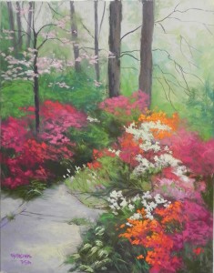
I’m really not a spring painter– I’m not a big fan of pink! But after this past winter, spring is very much appreciated. We had an opening at Capitol Arts Network last Friday for the show “A Burst of Color”. I needed to work on something while I was there, so I took a photo of my front walk and painted it. (Some of my students will have seen this view before). I took some liberties. There is no bush in the foreground (we lost that one). I had it painted in with deep reddish pinks, then realized it was identical to the bushes on the left. So I added oranges to it. Then added some orange in the background to balance it. I tried to make a pattern with the whites to lead the eye back into the picture, around and up into the dogwood.
Looking at this now, the paved walk seems too large for the size of the bushes. I may need to make changes in it.
I like the overall composition, however, and have filmed it a number of times. It’s the one place I can get a picture without any houses showing up. I really don’t live in the middle of an azalea preserve!
We leave for Italy next Tues. so I don’t expect any more blog posts for awhile. For anyone in the area, I’ll be giving a demonstration (probably an Italy photo) at Colorwheel Gallery 65 in McLean on Saturday June 7, 2-4. I’d love to see you!!!
Happy spring. The 80’s are coming tomorrow and this may be the end of it.
First Plein Air
It was a lovely sunny day when I was grocery shopping this morning and I looked forward to getting outside for the first time. But, alas, by the time I’d found something to paint, the sky was totally overcast. I did as I often do, driving out of the driveway, having no idea of my destination! I ended up in Clarksburg on Burnt Hill Rd–a lovely rural area with a humongous housing development 1 mile away!
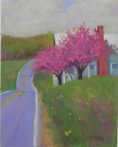
I drove over a hill and saw this and knew this was my subject. I wanted to do something with spring colors, and I loved the flow of the road and the shape of the roof. The big challenge was the two cherry trees because they could become very isolated color. To offset this, I added magenta in the foregrounds grasses, the road, the background trees and in the shadow areas of the house. Also used come cool reds in the chimney, so that it would be more compatible. The greens looked so bright outside, but became duller when I brought the picture inside, which was fine with me. I wanted it to have a painterly look and not be too shocking. I see some things I probably should have changed, such as the background trees and roof being at the same level. The greens in the foreground also look quite similar to those in the background. However, I was freezing and I didn’t have a pencil and (can I find any more excuses???). Ah well. Not too bad for the first one.
June Morning, Goodspeed Island
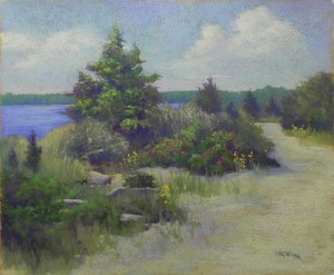
Here is my latest studio picture, begun last weekend and completed during the two day workshop. I worked again from black and white. Had to make up the clouds as there was too much sky. And I was challenged by the expanse of sandy road, but tried to vary it with soft shadows and differing colors. Interestingly, I tried to do the same picture as a demo last August using this surface, but a 16 x 20 size, and it was a disaster! I did a partial underpainting and i think that was part of the problem. No underpainting on this one. Got the tree too big and I hated it. So this time I took my time in getting the composition the way I wanted it. In the photo there is a spit of land extended from the left side of the tree. I put it in at first, then added a boat, then took it all out! I like it much better without as I like the shape of the water, which extends in a small piece to the right of the tree (not in the photo).
Goodspeed Island is an area in Mattapoisett where I always walk in the summer (or any season). I’ve painted it many times, so using the black and white wasn’t difficult as I could really “feel” the colors. I like the 20 x 24 format for this a lot. There’s a lot of detail in here, but also a lot of areas without it, such as sky, water, and road, so I think it is balanced. Now, am hoping to get some new material and be able to paint outside at last! I’ve exhausted my photos for now!!! Happy Easter and Passover to you all.
Abstracting the Landscape Workshop 2
Yesterday and today I gave my second Abstracting the Landscape workshop for 4 participants, 3 or whom had originally scheduled for the workshop in January, postponed by snow. It worked out very well as we picked up a fourth person. For this workshop, each of the participants was asked to find 2-3 artists whose work they like and and would like to emulate in some way. We spent time looking at the paintings and talking about the characteristics and then looked at the photos they had brought to work from, most in black and white. My definition of “abstracting” is very loose and up to each individual. It can be hard to pinpoint just exactly what each artists aspires to, but one said something that resonated with me: I’d like to paint the kind of paintings I would buy! Some were happier with their paintings than others, but I thought all were really good and frame-worthy. Each person has to decide where they want to go with their work. My goal is to help them identify the characteristics they are aiming for and to suggest materials and techniques that will get them there. I think that all of the paintings are successful, regardless of how “abstract” they are.
Lock House Reflection
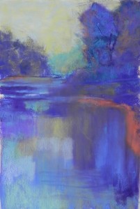
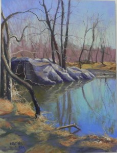
This is a very different picture from what I normally do! It’s in the woods and most of the values are in the mid range. But I loved the way the building and it’s reflection created a rather ghostly image amid the trees and water of mid-March. I will admit that I upped the saturation a bit when printing the color photo in order to get the color of the water and ANY color! I didn’t use a black and white photo for this, as I felt it would look like nothing! The subject is a small building near Wide Water and Old Angler’s Inn, on the C&O Canal. The upper woodland path shows just to the left of the building.
I wasn’t sure how to begin this picture, so I decided to just lay in colors. I’m including the underpainting before I added any alcohol to it, so you can see how it looked (pretty awful actually!!!) (This is one of the Dakota-mounted boards and I find they have a definite texture to them that makes it hard to smoothly lay in the pastel. Any one else notice this?) The alcohol helped, of course. But the applications of water had to be finger-blended to provide the smooth surface of the water. I added some more turquoise pastel after blending. I was also concerned about this being isolated color and I added various values of blues and blue greens to other places in the water, rocks, and the windows of the building. This is not a subject I’ll probably pursue, but it was fun to challenge myself.
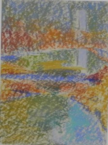
- Initial underpainting of hard pastel
June Workshops
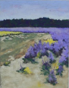
I’m sharing the painting I did in the studio last week from a B&W photo, taken in Mattapoisett last June. The composition in the photo was not good and I had to simplify a lot. I find this to be a quiet picture that gave me the opportunity to play with some different colors and details in the foreground.
In June, I have two workshops scheduled in New England. The first is sponsored by the Falmouth Art Organization and will be held June 16-18 in and around Falmouth (Cape Cod). The focus is on color approaches with each day featuring a different approach: observed, interpreted, intuitive. One day will be in the studio, unless all days are absolutely gorgeous! I’ll be flexible. I just really hope that all days won’t be in the studio! I want to get outside to paint and the middle of June should be a good time. For more information, contact Suzy Bergmann (director@falmouthart.org).
June 23-25 I’ll be giving a workshop in Tiverton, RI, using the new Sandywoods facility as our home base. This workshop will include demos and help at the easel. We’ll focus on how to find a composition and how to deal with greens. I’m hoping not to work from photographs, even if we have to be inside. Contact me directly about this one (jeanhirons48@gmail.com).
September 20-21, I will be giving a workshop in Chambersburg, PA, but the details are not finalized. More later.
Would love to meet some new people and work together in these beautiful venues.
Wide Water Reflections–Rockville demo
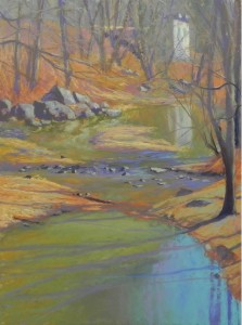
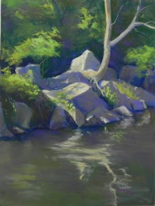
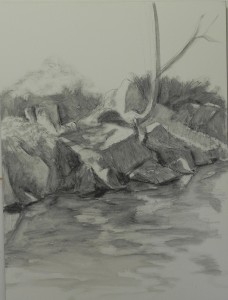
This is the demonstration that I did for my class last Wednesday just before flying to Providence. I began with a graphite drawing and wash (below), which made the demo much easier. I didn’t have my camera, so have no intermediate photos. I did a hard pastel and alcohol underpainting. I used a lot of blues and greens in the underpainting, using an aqua for the light areas of the rocks. I lost some of the detail, but was able to get it back. I was working from a black and white photo only as I no longer had the color version. I used a lot of violets in the rocks and the painting didn’t come together until I started adding darker red violets to the trees and water reflections. I used hard pastels for the underpainting, Giraults for the background trees, rocks and water, and soft pastels for the highlighted greens, reflection in the water, and lights on the rocks. I did this painting years ago for demonstration and I know that this one is much better! I looked at the painting in the studio yesterday and added a little more to the top and bottom but this is pretty much the way it was done at the end of the demo.
Beach Trees–Tiverton Demo
Another week, another snow event! We will get up to 3″ today; New England will be hit much harder. I”m thankful I went last week! Enough!!!!
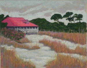
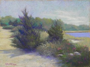
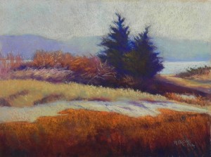
I’m sharing with you all the demo that I did for a wonderful group of ladies in Tiverton. The top image is the painting, completed in my studio yesterday with full light and pastel set. One of the participants said she never got to see a finished demo. As someone with a lot of experience, I can understand why. Doing a demo is a performance for me. I talk, take questions, consider changes, and try not to take more time than I should or bore people. In order to finish the painting, I need quiet time alone in perfect conditions that enable me to see what is needed. I did the final picture without the photograph and really didn’t need it. I’ve painted this scene a number of times before and i knew what was needed.
Here are some of the major changes from the bottom image and the top. The first thing you will see is that the colors are not as refined in the original demo–the trees are too blue, the light grasses are too light. The bottom lacks the color of the final image. I began with the sky and background trees, adding more yellow (sky) and blue green (trees) on right. Added a little violet to trees on left. I also added more light to the water. I did a lot of work on the trees and grasses around them, adding more warm sienna colors and a more nuanced transition of color. On the far right background, I added a hint of a bush that broke up the curved line, which I didn’t like. I darkened the light band of grasses and tried to refine the darker spots. And I added more light to the sand, particularly in the area of the trees, along with some roots. Then I got out the red oranges–really bright!–and added them very carefully at the bottom. I could immediately see how lovely the blue green in the background read with the red orange, so I added darker pieces of blue green to the bottom and mid sections to carry it through the piece. I think it’s done and I’m very happy with it. Might enter it into a show.
Wide Water Demo–Completed
I’m done! At least for today. But I think I’m pretty happy with it. This turned out to be pretty much observed color, rather than intutive; however, I believe in using whatever tools work for each individual painting. The goal is to create a successful painting, whatever it takes!
Some color notes: I did tone down the background warms with the use of grayed greens; however, I like the fact that there is warm color in the background that relates to the foreground. I also took the darkest of the cool blues that is in the sky and introduced this color into the rocks. It immediately helped tie the piece together. I put some deeper blue at the lower part of the pool and love the way it looks against the warm browns.
This was a complicated picture. Good for an online demo, but not for one in person, I don’t think! Wednesday’s to be done in the class room is a little simpler–I hope!
Hope you have enjoyed the demo. Now on the to getting ready for my trip!

