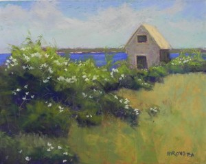
On our second day in Little Compton, Sarah, Lindsay and I ventured down a long road, over sea shells, and through a cow gate, to a spot near the water, with a herd of cattle near by. Also near by was this funny little building, which I assume to be a boat house. The windows are uncovered and on both sides. When looking straight on, you can see the lovely church across the water near Newport. As I walked around the building, I found a sign on the front that read “The Watusi Hotel”! This must date from the 60’s!!! I couldn’t believe it. Had to include it in my painting. I used more contrast in the colors in this painting–more color in the sky and deep blues for the water, which truly was a very deep blue. Also used a lot of dark blue for the shadows of the rose bushes. I was going to soften them, but decided not to. I loved the pattern and flow of the bushes and the comparison with the light green grasses. You can see what a heavenly place this was to paint! On the drive down the dirt road, we passed a flock of glossy ibis, the first I’ve seen in New England. Now for summer in Washington and time in my studio with almost 400 photos. Then a trip to the Oregon Coast at the end of the month. More climate and scenery changes for sure! Happy July 4th to you all.
Category Archives: Uncategorized
June Plein Air–Part 2
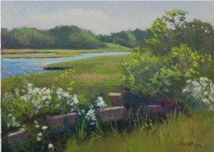
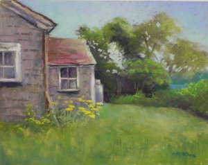
These two paintings are from my time painting in Little Compton and Tiverton, RI. I was supposed to give a workshop, but cancelled it due to my mother’s condition. However, a friend came from Maryland and I got to paint with other friends in Mass. and was very happy for their company. With so much beautiful weather, not painting would have been a sin! In the first painting, I used my light Blue Earth pastels in the sky and I find it to be a little too light and washed out. Both were done over hard pastel underpaintings. The white roses were amazing and the air was filled with their fragrance. I particularly liked the fence in this painting as it added form and structure to the mass of plants. The second painting was done in Little Compton on a private farm, where we painted with a local plein air group for two days. (Will share another painting from that area). I got to work with a weather-beaten house and was in my element! Made some serious changes, however. The window at right was not like this at all. The gas tank was around the corner. And there was no yarrow in the yard–just an old wire fence! I also added a hint of water to the right. I was really using my artistic license in this one!
June Plein Air from New England
Hello Friends–I’m back in Maryland where it is hot and humid after two of the most remarkable weeks that I can remember in Massachusetts in June. Everyone said “this is the way we always remember June being.” Cool, clear, 70’s, gorgeous! Not every day, but almost. I spent many of the mornings outside painting, filming, walking, and the afternoons at the hospital, then rehab center, visiting my mother. Yesterday she was moved to her new apartment in a very nice assisted living facility and I’m hoping that her cat will be joining her today! It was a remarkable visit. My mother is a very strong woman and is making remarkable progress. But she can’t read nor tell time and has a ways to go.
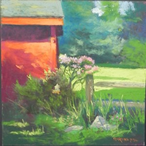
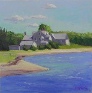
I’m sharing 4 paintings with you, the first two in this post. None of the these are great paintings, but I wanted to share them anyway. These first two have personal significance to me. The one with the garage is my mother’s yard. I began a painting of the yard in the morning but hated it. So later in the day I brushed off as much pastel as I could and did a completely different painting over it! I had to use soft pastels to make it work and really liked the effect. The second, Shining Tides, is unusual for me as I did it with no underpainting, using nothing but local color. It was the second of two paintings done in a morning. I sold the first one off the easel to a former neighbor! This house was the manor house for the 300 year old farm house that we rented when we first moved to Mattapoisett. When we moved there it was red and it was always called The Shining Tides. It was a Y camp for some years, but now seems to be a rental facility for weddings. As you can see, it’s been added to over time, creating a mass of small planes! I couldn’t resist painting it–done in about an hour with a little more work in the studio.
Poppies and Figs
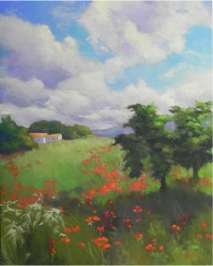
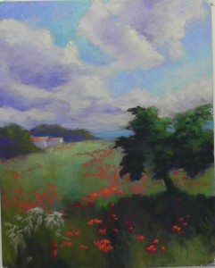
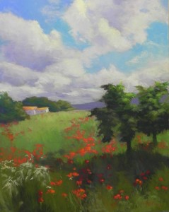
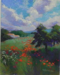
I did some more work on this picture and decided to share the final version with you. I took it too the framers this morning, so now it really is final. I worked more on the sky, particularly the lower left to break up a rather strong diagonal line. I also did a lot more with the trees and lightened the shadow beneath. And of course, did some more work on the poppies.
I thought I’d share what I’ve been going through since last Saturday morning, the day I did the demo. I learned in the morning that my mother had collapsed, probably from a stroke and was in the hospital. I did this demo, not having a clue as to her status, and it all seemed so unreal. When I got home that day, there was a message from my sister Marcia saying that the hospital told her my mother was “brain dead.” But then my sister Carol called and said that my mother knew them, thanked them, and was certainly not brain dead! On Sunday Marcia went in and my mother was cheerful and had regained the use of her right hand. That cheered me up.
Then on Monday, Carol called to say that my mother would have to go to a nursing home. This was the worst thing I could imagine. My mother is 95, but very intelligent, vibrant, and interested in life. I cried all day. But my mother has made wonderful progress and will be going to rehab, then to assisted living. This means having her own apartment AND her cat! She is very happy about it and so are all of us. What a relief. I never thought that the words “assisted living” would sound so good!!!
I will be driving up on Saturday and will visit her most days. I am so thankful for her strength and good nature. She has a lot of therapy ahead of her, but she’s already able to string together many more words. AND –they have equipped her with a hearing device so that now she can hear much more normally. Deafness was the most serious problem she had prior to this. Thanks for “listening” and for all of your support. I wanted to share this with you.
Grand Canal Houses
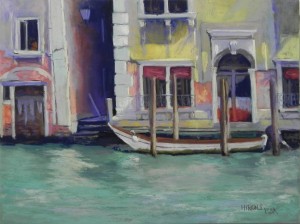
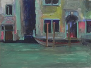
Here is the other painting I’ve done–most of Friday and Saturday morning. It’s much more detailed and I spent a lot of time on it. The entire top is nothing but Giraults and they went on beautifully. The bottom is a mix of softer colors. As you can see from the underpainting, I used a lot of blue green in it, hoping to the buildings to the water. I left some of the underpainting peaking through the yellow walls and also added greens to the shadows. Also put some yellows and pinks in the water. The water was fast moving and didn’t really have an reflections, just a hint of colors. I really enjoyed doing this picture and hope to do more. I love the colors of the buildings in Italy. The pealing plaster and muck along the water line give it a real sense of age, as well. I may work some more on this one, but probably not any time soon, so thought I’d share it with you. Not happy with the title either!
Poppy Field
I just finished the painting that I began as a demonstration on Saturday. I’ve made alot of changes, even though it may not be immediately obvious. I darkened and brightened the sky and work a lot on the clouds, trying to improve their shape and subtlety. I also changed the background mountain to a violet, after realizing that it was much too light. Did a lot of work on the foreground trees and shadows. The large mass in the demo is too much and too dark. I made two trees and added shadow, then broke up the large shadow at bottom. I also added more of the white on the lower left, to improve the shape of it. And, of course, I did more work on the poppies. I think I’m happy with it now, at last.
San Giorgio Maggiore–final
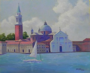
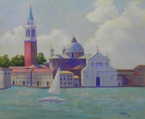
I’ve just done a lot more work on the picture I shared with you earlier this week. One friend suggested that the water was too much the same, and I agreed. I was lazy before! This time, after brushing a lot of it off, I added some darker colors in the foreground and lighter in the back, and used a mix of warm and cooler blues. I also added a lot of pastel to the buildings, using softer pastels and aiming for softer edges. I particularly like the way the right side came out. Also used some of my AS extra soft tinted whites in the clouds and put more color in the sky. I’m satisfied with it now and ready to post on Facebook.
Towpath, Swain’s Lock
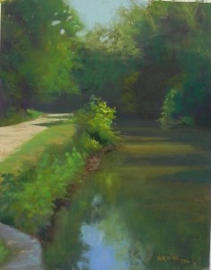
I got outside to paint this morning. I arrived at Swain’s Lock fairly early and painted in bright sunshine, with the sun behind me. Thus, this picture is fairly dark. But then, most of what I was looking at WAS dark! The only light was on the towpath and the nearby bushes, and I like the composition. I also liked the way the light shone off the canal. I did some work on this at home, as it was much too dark. Painting in the sun is hard. All of the colors I was using for the underpainting looked terrible! After this, I did a painting in the shade, which was more comfortable. But I don’t like the painting, so you aren’t going to see it!!! I’ve heard that people are having a hard time with comments. Please let me know if you’ve tried to comment and couldn’t–you can email me at jeanhirons48@gmail.com.
Puglia Poppies color study
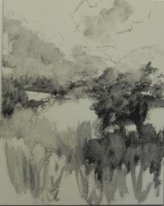
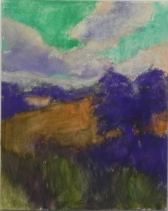
I’m doing a 16 x 20 demonstration this coming Saturday in McLean and spent this morning working out the composition and colors. When I do a formal demo like this, I like to paint the picture first, using a small version. This is really a small painting, not just a color study. One of the challenges of the picture is that it’s beautiful, so not a lot to add to make it a better painting. Me being me, I added a building! I like the opportunity to add something of interest in the background and a little warm color in the roof. I also added a mountain that wasn’t there. Otherwise, followed the photo pretty closely. I really liked the way the charcoal wash came out and thought about leaving the light triangle on left as a field. But stayed with my idea of the building. For the underpainting, I decided to try to use colors that would tie the sky and land together. Because one is blue-violet, the other green-red, I decided to start the sky with greens and use violet in the darks of the tree and shadowed grass. I also used warm pinks in the louds, along with violets. For the grass, I used a combination of warm sienna and greens. I was concerned about putting the red poppies over the green grasses, but by using Giraults for the grasses and softer Schminckes for the poppies, there was no problem. I’ve done the charcoal layin for the big picture. Have no idea how close it will look to this one! But at least I identified the pastels in my travel box and know that i have what I need to do the painting.
San Giorgio Maggiore
I’m sharing two post with you today. I finished this large picture of my favorite building in Venice. If you saw the last post, you’ll notice how dark and blue it was. Most of the pictures you see of this are taken in late afternoon with the west light hitting the marble front of the building. Alas, we were only there in the morning, so the light was quite different. As it is, I’ve added a lot more light than there actually was. I also removed the vaporettos and other miscellaneous boats and added a sailboat that I filmed sailing near here. I used a light yellow base color and really hated it! It left all those little light holes everywhere, particularly in the buildings buildings. I really don’t like working on a light surface, even though it was good for the sky. Speaking of which, I made up the clouds. They were there on the third day, but I added these from my imagination. What I loved when there was seeing the light blue violet of the sky and the blue green of the water. I tried to capture this, but not sure how successful. Would love any feedback!

