Morning Light, Venetian Canal

Just before doing the second fog picture, I completed this very different and much more difficult picture from our May trip to Venice. I took a lot of pictures of the canals and their reflections and envisioned doing a whole series of 12 x 16s.  I’ve done 2, that might be enough!  For this one, I made a very important compositional change: I removed the brown side of a church behind the roof in the upper right corner. This opened up the picture to the sky and also allowed the shape of the roof to be more prominent.  I used brown Pastelbord and began with a light charcoal drawing, then hard pastels. I did everything with hard pastel, layering and redrawing as I went. I used local color, as much as possible, but generally brighter or darker, given the colors available in the hard sticks. (I have at least four brands: NuPastel, Faber-Castell, Caran d’Ache, and Richeson.)  The second layer consisted of all Giraults for the buildings and boats, and soft pastels for the sky and water reflections. The picture was taken on an early morning walk, with light dappling the warm brick walls. Venice IS a gorgeous city!  I purposely didn’t take pictures of the gondolas, favoring the small boats owned by the home owners.

This painting was somewhat tedious–particularly compared to my fog paintings. But I do love painting buildings and I had fun with the composition on this one.

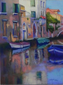
Morning Light, Venetian Canal, 16" x 12", Pastelbord (brown)

Morning Light, Venetian Canal, 16″ x 12″, Pastelbord (brown)

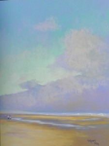
Lifting Fog Bank

Yesterday, I spent the afternoon in my studio with two fellow pastel artists and decided to do another “finger painting” from the Oregon coast. I thought I had used the same pastels that I used in the first one, but was surprised at how light this one came out. In this one, there are two small figures at the point of a large triangle, created by the fog bank and the water on the sand. I loved this!  Did the figures very quickly with hard pastels and didn’t belabor them.  It was fun to do another of these paintings–they seem to be very popular on Facebook!  But it’s not the way I’d want to work. I found that after I’d smudged several layers in the sky, it was piling up and not working as well.  The final layers of the fog were not smudged at all.  I used my Blue Earth pastels for much of the fog and Giraults for the sand. (My husband told me that if I practiced doing the figures, some day I’d be able to make them really big!!!)

Lifting Fog Bank, 24" x 18", Wallis Museum Grade

Lifting Fog Bank, 24″ x 18″, Wallis Museum Grade

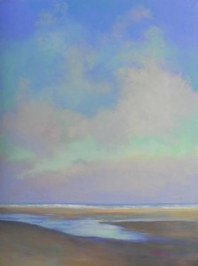
Morning Fog

And now for something completely different!  I was in the studio on Wednesday with extra time and decided to work with a photo from the beach in Oregon. I had a mounted sheet of 18 x 24 white Wallis.  There was almost no detail in the photo–shape-wise. All amorphous fog lifting with some beautiful pieces of sky behind. I decided to just lay in some hard pastels in blues and aquas and do a dry underpainting with my hand. However, it was so much fun that I just kept on going!  Last Saturday I was at the demonstration by John Held at my gallery in Bethesda. Some of you know John, or will have seen his work in my book. John works completely out of his head, putting down pastel and seeing where that takes him.  And he smooshes it all!  I have always taught my classes not to use their hands in order not to kill the pastel. However, I can see that for clouds and sky it can be a really useful technique.

Compare this painting to the one of the Newport light house. In that painting, I put in a solid layer of hard pastel, then used soft pastels on top with no finger blending. Given the strokes and rough nature of the bottom of the picture, I think this works well. However, in this picture, the bottom is also blended. However, I did this with pastels and very little finger interaction.

I broke two of my own rules doing this painting: not to use my hands too much and not to work directly on white. And it worked just fine!  But it’s not the look that I want to create on a regular basis.  However, after the tedious detail of the house and hydrangea picture, this freely-applied pastel was really fun!  And the visitors to my studio at last night’s opening really liked it as well. I thought it needed some gulls, but two men agreed that that would make it trite and that I should leave them out. Fine with me!

Morning Fog, 24 x 18, Wallis Museum grade

Morning Fog, 24 x 18, Wallis Museum grade

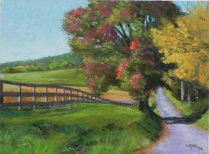
Country Road Near Sugar Loaf

I had another small class this morning and began a tree demo for them and finished it this afternoon. In this picture, the tree is green, turning to red, so a little more complicated than Monday’s.  I decided to begin with red violets, dark purples and greens. I used warm greens under the yellow tree to the right. I worked up the main tree with green Giraults first, then went to softer reds to add over. I reserved the warmest for the central part of the tree.  I think that the shadow on the road needs to be softened.  I really liked the way the fence and the road lead the eye into the picture.

Country Road Near Sugar Loaf, 12 x 16, UART 400

Country Road Near Sugar Loaf, 12 x 16, UART 400

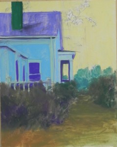
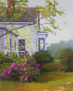
House with Purple Hydrangeas

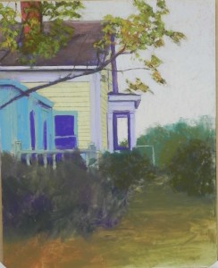
I spent today in the studio completing a painting I began working on last Saturday. I took a long time on the drawing and getting it right on the paper. Yesterday I did the underpainting and lost some of it!  But it was OK, I could still see the lines.  Painting something like this is complicated because it’s hard to know where to begin.  I decided that I needed to rough in the tree branch before doing the sky. But I needed to do the chimney and roof before the tree!  I worked back and forth for awhile.  In the second image, you can see the initial work on the house.  I used light red violets in the trim and several soft yellows for the house. I was happy when I had covered up all of the blue!  The hydrangeas were fun to do, as they were the only things catching any light. I decided to keep the sky in the grayed violet spectrum, to give the sense of an overcast day or fog (this is another Mattapoisett house).

The photo has a large tree/bush going up the entire right side of the picture. I didn’t want that. Instead, I added another, smaller and duller hydrangea, then a bit of lawn and some background trees. I struggled with the background a bit, but when I added violet over the cool greens and some very dull orange, it came together.  I may work on the leaves some more, but for now I’m happy with it and thought I’d share it with you.

Hard pastel underpainting

Hard pastel underpainting

Partial completion of house

Partial completion of house

House with Purple Hydrangea, 20 x 16, UART 500

House with Purple Hydrangea, 20 x 16, UART 500

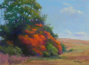
Autumnal Awakening

I began teaching my regular classes this week at Washington ArtWorks and started out with a demo of trees. I wanted to cover both green and fall trees and found a photo with both. I did an underpainting with hard pastel. Under the greens, I used violets; and under the warm colors, I used greens.  This worked out pretty well and I mixed both violet and green pastel into the painting as I progressed with it.  I began with Giraults and added soft pastels only at the end, and in the sky.  This was a one hour demo that was not completed until the afternoon.  I had a lot of fun doing this painting. Now I have to find another photo to use for tomorrow’s class.

Autumnal Awakening, 12 x 19, UART 400

Autumnal Awakening, 12 x 19, UART 400

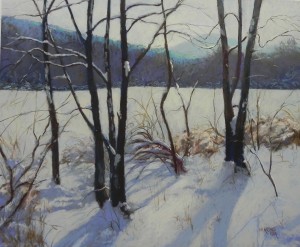
Winter Light

Just finished this painting today and will be taking it to my framer tomorrow for the gallery in McLean. It was done from an old 4 x 6 color photo that I painted from some years ago.  Unfortunately, I never was able to get good pictures of all that snow we had last year–so I was relegated to looking into old references. The photo was narrower and didn’t have as many shadows at the bottom.  I wanted to increase the shadows to lead the eye into the picture.  Used grayed blues, a few violets, browns, and peaches for the light. Also used a light gray from my new turquoise Blue Earth set, which turned out to be quite nice. I prefer to paint more seasonally, but gallery requests are hard to turn down!  The painting was begun with a charcoal wash and hard pastel underpainting.

Winter Light, 20 x 24, UART 400

Winter Light, 20 x 24, UART 400

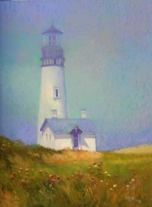
Newport Light in Fog

I’m not usually one to paint light houses, but I couldn’t resist this one form Newport, Oregon. It was REALLY cold and blowing like crazy, but I loved the buildings and knew I’d want to paint them. I particularly like the way the sun is hitting the small building, despite the fog. I started this out with watercolor for a change. It was not good!  I then took 4 blue and aqua hard pastels and covered up the sky completely, smoothing it with my fingers. Then lightly brushed soft pastels over–Blue Earth and some Ludwigs, mainly.  I put the color over the top of the lighthouse as well. What I loved was the light coming through in the middle of the sky.  I used with my new set of “turquoise” Blue Earth (which I would describe more as cool green or jade).  I just remembered that there was a seagull flying to the right of the upper part and I might add him. Would give a bit more interest.

Newport Light in Fog, 24 x 18, Wallis Museum grade

Newport Light in Fog, 24 x 18, Wallis Museum grade

A New Website and Random Thoughts

In case you aren’t on one of my many email lists, I now have a brand new website, but at the same URL: www.jeanhirons.com.  I created it using FASO–Fine Art Studios Online, and I couldn’t be happier with it.  It took less than a week and it wasn’t difficult. When I ran into a snag, I was able to ask for tech support and received timely, easy to follow responses.  It costs me $28 a month.  Being able to quickly and easily update it any time I want is such a plus.  My original site was developed for me in 2001 and my husband took it over some years later. He took classes in html and Dreamweaver in order to do it. You no longer need any of this knowledge.  So, if you have been thinking about creating your own site, do it!

One of the pluses of the site is the ability to create an email newsletter with images. I will put in this what used to be in the What’s New section of my old site–upcoming shows, awards, and other events.  If you’d like to receive it,  go to the site and add your email in the lower right corner box.

Over the past weekend, I sold 3 paintings and had an expression of interest for a 4th. (Part of this, I think, was due to the announcement of the new website.)  This got me thinking about the ups and downs of being an artist. I can’t tell you the hours I’ve lain awake worrying about the huge number of paintings that have taken over what used to be a spacious guest room. Or the cost of framing and wishing I could do it myself. But now that I’m in one commercial gallery and thinking about trying to get into others, I fear I don’t have enough paintings!  Of course, what I know is that I don’t have enough really GOOD paintings.

However, for the moment, I want to basque in the joy of knowing that people want my paintings.  The money is nice, but it’s quickly spent on more frames and supplies. And getting them out of the guest room is another big plus. But the real joy in selling is that it validates us as artists.  I was recently told that Gauguin never sold a single painting and Van Gogh sold only one (to Theo).  I don’t think I could exist with this sales rate!  When people tell me they love my work, I paint  better. I assume it is the same with you too?  We all need positive feedback from time to time.

There haven’t been any comments on the site lately, and I hope it isn’t because it’s too difficult to get past the spam blocker. Would love to hear how you deal with all of this!  I know that I’m happiest when I’m painting well–regardless of the fact that I’ll have more to frame and store–and I look forward to getting back in the studio tomorrow to work on my latest painting.

Hope you like my website! Cheers!!!


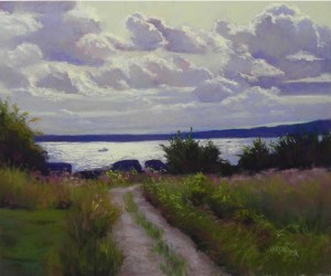
Harbor Light

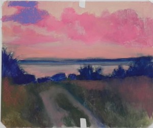
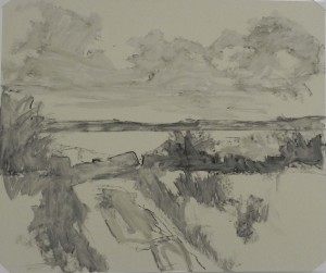
I spent several days last week working on this painting from my recent trip to Mattapoisett. I decided on the 20 x 24 format because it’s a grand subject and needs a lot of space!  I took the picture on the first day I was there, driving my mother through town. We went to Crescent Beach and got this beautiful view of the harbor in late afternoon. It wasn’t  sunset, but the light was quite special.

I began with a charcoal drawing and wash.  I did the bottom half as an underpainting, thinking I’d work directly on the top without any color. But I couldn’t do it!  So I took three values of a pinkish red and created shapes of color. This made it much easier for me to begin laying in the color (which you can see at top left–almost forgot to film it first!).

I had issues with the color in the grasses. In the underpainting, I added some reds that I liked a lot. But when I started adding the pastel, I used siennas and other more orangey colors. Didn’t like it at all! So I got rid of it and used magentas and pinks, along with a variety of greens, keeping it all fairly dark. Really liked it as it picked up the reddish violet tones in the sky (a lot of the pink underpainting shows through). In the path, I used a variety of violets and browns, to pick up the color of the sky.

The sky (except for the lightest parts) is all Girault and Roche. The flat part of the sky at top is a combination of an aqua and a light warm grayed green Roche. They combined beautifully. The light is a lemon yellow Art Spectrum tinted white and  a little Schmincke yellow.  I used the lemon yellow pastel alone for the light on the water. I find it very hard to find a yellow that is light enough for the sky and clouds and this one is really good.

I really enjoyed working on this. So many of my pictures are taken on bright sunny days. Would like to do more atmospheric work, if I can get the right shots.  I work from both a black and white photo (that was taken closer up and used for the composition) and a color photo (that gave the color but a poor composition).  Neither was perfect and that was just fine. I changed the bottom left completely and changed what was a wider road to more of a path.  Am happy with this now.

Hard pastel underpainting

Hard pastel underpainting

Charcoal wash

Charcoal wash

Harbor Light, 20 x 24, UART 400

Harbor Light, 20 x 24, UART 400