Canal Boat (Venice)

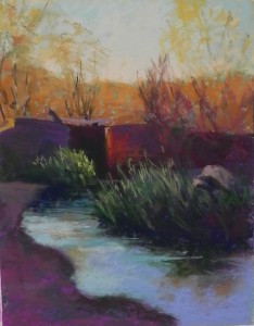
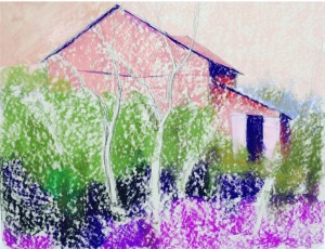
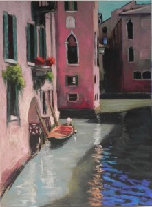
I had a little free time this afternoon, so decided to work more on this picture that is in the last post. (Got to listen to the Marriage of Figaro from the Met and think about Venice–devine!)  The colors in this photo surprise me a bit–like the dark purple at the bottom right that looked very blue to me!  And the wall in the middle is definitely too pink!  But it’s not signed, so I’ll do more to it. But thought I’d send this to you before we leave for the week. The water was quite easy to do on this paper.  Interestingly, the color of the paper is very similar to that of the brown Pastelmat, but the two papers are completely different.  Where Pastelmat resists smudging, this paper makes it extremely easy–too easy sometimes!  But if you want really soft edges and the ability to blend, it’s great. I really want to try this next on something a little more abstracted and less detailed to see how I like it. I wanted to take the offer from Dakota and purchase a package of the larger paper, but I can’t decide between the Italian clay and the white!  Wish I could get 5 of each!  Happy holidays!

Canal Boat (Venice), 16 x 12, Pastel Premiere “Italian clay”

Canal Boat (Venice) sm

A New Surface–Pastel Premiere!

It’s that time of year again and I have very little time for painting. But last week I received the 12 x 16 packet of Pastel Premiere in the gray-brown “Italian clay” (I think that’s the name). I’ve been dying to try it out. Today, in between getting ready for a dinner party, raking leaves, and editing the Christmas letter, I actually found an hour to paint!  Thought I’d share my initial reactions with you.

I’ve always loved Wallis Belgian mist and this is the closest anyone has come to it. It might be even better, given how uncertain the color was in the Wallis.  The grit is 320, the white comes in 400, closer to the UART I’ve been using.  But I like this rougher grit and there is no pattern in it, like the UART.  (I know some people really dislike that.)  It’s the perfect color and value for working directly on the paper without an underpainting. I decided to skip using hard pastels and go directly to the soft pastels and Giraults.  Not having any problem.  I don’t want to get too picky with this, but there is a certain amount of detail needed and I’m finding I can achieve it with the Giraults.

I began this painting last Friday during an opening at my studio. Spent most of the time drawing, but when I went for the color, it all ended up purple!  And I REALLY didn’t want purple in this picture!  It’s red and green.  So today, I brushed down as much of the purple (in building on right) as possible and painted over it. No problem. (For some reason, I’m working from right to left with this picture, which probably isn’t a great idea!)

This is Venice, of course, and the buildings  have lots of age, dirt and complexity. I’m finding it easy to lightly layer colors over each other.  (The middle building is just getting going, but the buildings in the back are close to complete.) I think you could use any kind of pastels very successfully with this paper.

It’s not cheap. $5 a sheet on sale.  But I think it’s worth it. The 12 x 16 size is great to try out–$30 a package. I will purchase larger sheets later and have my framer dry mount them for me. I’ll definitely try the white and probably get more of this lovely brown.  It’s amazing what’s available to us these days!

They are promising another bad winter, but it hasn’t hit here yet (we won’t mention Buffalo!).  Whatever the weather, I hope to be painting a lot, either in the studio or here at home. Look forward to sharing with you. Happy holidays to you all and a creative New Year!
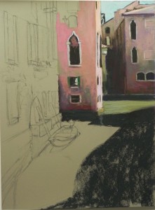
Beginnings of painting on  Pastel Premiere gray-brown

Beginnings of painting on Pastel Premiere gray-brown
Two more canal pictures

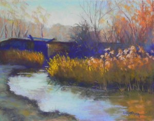
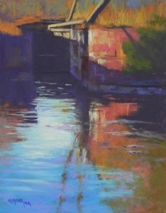
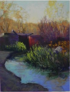
Here are two more pictures from the C&O Canal series. The left picture was done in Massachusetts as a demo for an old friend who has taken up pastel. It’s from the same photo as the earlier painting. I changed the orientation and the color scheme. I also got rid of the rock (actually a piece of cement, I think). I like the colors and flow of this one. The blue violet seemed a little too bright, and I layered a dark brown over it. It’s still more vivid than the dark grayed red violet that I used in the earlier version, but I like the contrast with the yellow oranges.  The second painting was one I’ve been wanting to do since taking the picture. I really liked the abstract shapes in the lock and its reflections. I did an underpainting of primarily local color. The most successful think was adding some blue greens into the upper part of the painting to push it back and give the sense of distance. This is it! I’ll have these paintings in my studio for the Friday night opening of the December show.  Now, on to snow–which is promised for tomorrow!  Happy Thanksgiving to you all.

Late Day Light, C&O Canal, #2, 11 x 14, UART 400

Late Day Light, C&O Canal, #2, 11 x 14, UART 400

Lock Reflections, 14 x 11, UART 400

Lock Reflections, 14 x 11, UART 400

Rock Reflections, C&O Canal

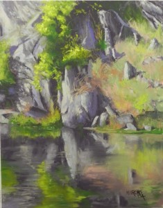
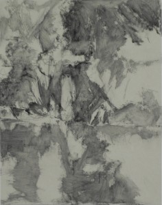
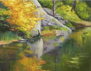
So here is the picture I originally  planned to do as a demo for the university women last Saturday. Boy–was I NUTS!!!  Given the way I ended up painting this, there is NO way I could have done this as a demo.  So thanks to all of my students who kept telling me to just frame the charcoal and do something else!  Anyway,  this painting is a departure from other pictures. It’s not a big shape picture–it’s a really DETAILED center of interest picture.  I decided to start it out with charcoal and water to get the dark pattern set.  Everyone loved it!  However, I really didn’t want to frame a charcoal drawing, so I spent Monday and this afternoons painting it.  I didn’t do an underpainting–just went directly from the charcoal to Giraults.  I used a lot of grayed violets in the rocks. I really didn’t want these to appear too purple.  So the color is pretty much what I call “observed”.   The highlights in the rocks were done with warm neutrals in soft pastel. The only real color is the greens and oranges of the grasses and bushes.  I really do love doing paintings like this from time-to-time. It’s close to doing a still life. And I love working with reflections.  I wanted to get more on my recent trip to the canal but there wasn’t much.

Just registered for IAPS.  My workshop is full!!!  Can’t believe it. Most everything is already full. It’s going to be the biggest convention yet, I’m sure. If you aren’t going and live in Massachusetts, I’ll be doing a similar one day workshop on Cape Cod some Saturday in April. We haven’t set the date yet.  It’s for the Pastel Painter’s Society of Cape Cod.  And I’ve been invited to give  aworkshop next October in Marlborough, MA, so I might be back then.

I go to Massachusetts tomorrow for a quick trip and private demo/lesson. May report back.

Rock Reflections, C&O Canal, 14 x 11, UART 400

Rock Reflections, C&O Canal, 14 x 11, UART 400

Charcoal wash lay-in

Charcoal wash lay-in

Late Day Light, C&O Canal

This painting began as a demonstration for the Chevy Chase chapter of the American Association of University Women. Some of you will have seen the post on Facebook.  However, I did more work on the picture so the second image here is different!  When I went to post it, I wasn’t happy with the water and the amount of darkness in the painting.  The painting was begun from a black and white photo but I used the color image at home. I did two small color studies, playing with green grass (what was actually there) and red violets in the first, and yellow orange grasses with blue violets in the lock and dark areas. I really liked the red violet best and went with it. The initial painting was done very quickly while talking a lot!  I used opposite colors in the underpaintings–orange in the sky, dark greens in the lock, and red violets in the grasses.  Not sure what I used in the water! Probably a darker aqua.  My enhancements at home included adding an additional post of the lock (on the right), adding brighter greens to the grasses, as well as some orange grasses on the far right, improving the rock, and doing a lot more with the background and water. I’m still not completely happy with the water!  I think the light color in the initial picture looks better than the brighter, but darker greens in the finished image.  However, I have to go off to class and have decided to call this one quits!  Will be doing another version of it (horizontal) for a demo on Friday in Massachusetts.  We’ll see how that one comes out!

I decided to do a series of 11 x 14 paintings of the canal at Great Falls as I think they make nice studies of an area that people here really love. In the past, I did not paint the river or the canal, feeling it was overdone. But I like the challenge of finding new views and small details to bring out.  There is another on the easel now, that I hope to finish today.

And–I see that the IAPS site is finally up for registration!  I hope that some of you who are going will consider taking my Sunday workshop. This is my first workshop at IAPS and I’m excited, but a little nervous too!!!

Late Day Light, C&O Canal, 14 x 11, UART 400

Late Day Light, C&O Canal, 14 x 11, UART 400

Late Day Light, C&O Canal, 14 x 11, UART 400

Late Day Light, C&O Canal, 14 x 11, UART 400

Potomac Gorge, Early October

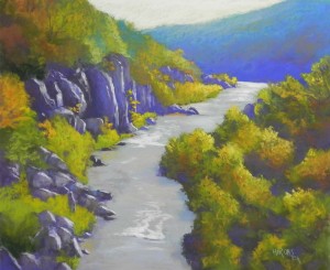
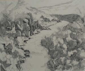
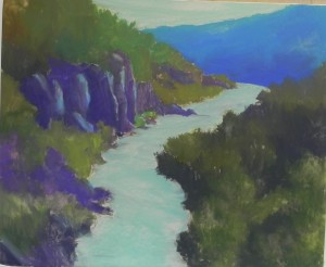
I did this 20 x 24 painting over the course of our open studios weekend, which began on Friday night and ended Sunday afternoon. I finished it in the studio today. It was a VERY busy weekend (I’m happy to say!).  I began with a charcoal wash, which was very useful in setting the overall shapes and placement of the rocks and tree shapes. I then moved on to hard pastels, using pretty much local color, as this was a fairly complicated picture.  The addition of alcohol darkened the shapes and solidified them. I then worked primarily with Giraults for a first pass of color and went back with some softer pastels and more Giraults.  I began the rocks with a dark blue violet, which was too prevalent. Today, I used grayed violets and browns to lighten and diversify them.  I also added dark blue violet into the trees and added some of the blue from the background land shape to the rocks and foliage on the left.   Yesterday we went back to this site and it was altogether different, being a month or so later. The water was much lower and darker and there were no greens. I may do another vertical picture from the same vantage point. I decided that what I was seeing yesterday could not be integrated into this painting, given the month difference in foliage and water levels. I changed the background piece of land by simplifying it and making it much bluer than it was in the photo.  This is an oxbow of the Potomac, visible from the C&O Canal towpath at Great Falls, MD.  It’s a very popular site. Yesterday, being beautiful and a federal holiday, it was mobbed!  It was fun doing it and explaining the process to so many people who visited the studio over the weekend.

Potomac Gorge, Early October, 20 x 24, UART 400

Potomac Gorge, Early October, 20 x 24, UART 400

Charcoal wash lay-in

Charcoal wash lay-in

Hard pastel application, before alcohol

Hard pastel application, before alcohol

Underpainting

Underpainting

Virginia Creeper

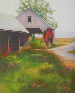
This is another Pennsylvania painting–you can tell by the overcast sky.  The original photo had a very uninteresting building to the right and a lot more road. When I cropped it, it became something much more interesting.  My primary challenge was that in the photo the only reds were on the barn in back. I tried to make up for this with some pink flowers in foreground (there actually was some pink clover in the photo).  But it wasn’t enough. So I added some more of the creeper vine to the post at left. This seemed to balance the heavy concentration of red on the open building. There is a distance hill, visible above the corn field–just a little darker than the sky. I did an underpainting, using mainly warm colors–browns under the violet and pinks under the roof at left. Used siennas under the foreground grasses.  I’ve just found another image to paint from tomorrow from the view right across the street from this!

Virginia Creeper, 20 x 16, UART 500

Virginia Creeper, 20 x 16, UART 500

Autumn Reds

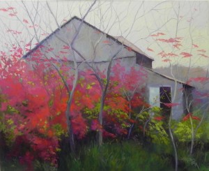
This was a fairly complicated picture for me and not what I usually do. The photo was similar, but the barn was less defined and the reds were all cool and rather dull. I began the underpainting with a drawing of the barn and some basic colors.  Warm under the barn, pale orange under the sky, warm greens under the reds, and cool magenta under the grass in foreground.  In the photo, the other color along with the reds was a yellow orange. I decided that I didn’t like this and went with a warm green instead. By using the warm greens  in the underpainting, I had the background color that I wanted. I covered most of it, but it was still a help.

You will notice that in the underpainting, I have doors on both sides of the opening at right. I realized that this didn’t work at all and got rid of the one on the right. What I’m not seeing in my photo is the turquoises in the barn and the aquas in the door.  I didn’t think that the painting was working at all until I added the warmer red oranges to the red areas. Suddenly it came alive!  I wanted the reds to be more concentrated on the left and fade off to more greens on the right.  The sky is the same light red violet that I used in my painting House with Golden Roof.  Both of these photos were taken on the same day within a very close proximity of one another. I made up the pale background on the right, feeling that it needed more distance, and I kept the edges of the barn very soft, except in a few places.  What I think works here is the dark, rich greens against the variety of reds in the bushes, moving up to the more lacy sumac leaves at top.  I really had no idea whether this painting would work or not!  I did no studies for it, but I had an idea of what I wanted to do and I think it worked.  The image of the underpainting is before I had added the alcohol, except in upper left corner (thanks Sunny!).

Autumn Reds, 20 x 24, UART 400

Autumn Reds, 20 x 24, UART 400

Initial underpainting

Initial underpainting

Water and Reflection Demos

I’m sharing with you this week’s demos for my two classes. I didn’t have my camera and don’t have pictures of the underpaintings, unfortunately, but I’ll discuss them.  The one on the left is today’s demo.  I decided to use local color in the underpainting, using colors of hard pastels that were a little darker and duller, but that would provide a good undercolor of similar hue.  I used a violet and aqua for the rocks.  Then I did the entire first pass using Giraults.  Finally, I went back to the soft pastels for the yellow bush and colors in the rocks.  I think this is the more successful of the two paintings.  The composition was fairly straightforward and getting the water and reflections was not too difficult. I did everything in a vertical stroke to begin with, then used some horizontals and diagonals to get the surface of the water.

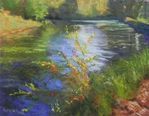
The second painting (on the right) was done on Monday. In the photo, the bush in foreground was all green. I decided to turn it into fall colors to give it more life.  I really liked the shine on the water and shape of the bush.  I did the water first. I did a light drawing of the bush to begin with, but did not include it in my underpainting.  I really wanted to be able to focus on the water, which was rippling nicely and had such lovely lights and darks. Having done that, I put the bush in on top, using Giraults and soft pastels. I had only the color photo so nothing to really reference, except for the values of the greens. I found it difficult not to want to use the colors in front of me, and wished I’d also brought a B&W. I didn’t want to over do it. I do think that the warm fall colors are more interesting against the blues in the water than the dull greens of the photo.  The spot of light on water is a Roche whitish yellow green.  In the underpainting of the water, I used a variety of values of blue, with a light aqua in the lightest spot. I’m still not happy with the background, which i have tried to soften a number of times!  The dark shaoe of trees is too prominent and needs to be less defined, I think.

Both pictures are from the C&O Canal at Great Falls, Maryland. John and I went last Friday on a perfect fall afternoon and I shot 100 pictures.  Tomorrow we leave for a weekend in Iowa, where on Saturday we will be touring the bridges of Madison County!!!  Who knew that these were south of Des Moines!  Expect to see Meryl Streep.

Canal Reflections, 11 x 14, UART 400

Canal Reflections, 11 x 14, UART 400

Canal Light, 11 x 14, UART 400

Canal Light, 11 x 14, UART 400

House with Golden Roof

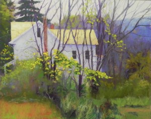
I’m back to what I really love to paint–houses!  I saw this one in rural Pennsylvania last Friday and painted it on Wednesday.  The color of the roof was what I can only call butterscotch!  But the photo of it came out white. So I had to try to remember what I saw. I took a number of shots from different perspectives and liked this one best because it gave me enough foreground, plus the distance in the upper right corner.  What excited me, in addition to the roof, was the array of leaves both in front of the house and to the upper right.

Doing a picture like this is complicated because of the layers. I actually used a lot of local color in the underpainting on this one. But I used aqua under the roof and blue under the house. The sky and house are two values of red violet. I added some warm blue into it in spots and into the bushes to pick up the blue in the distant hills.  I used my softest pastels for the leaves, progressing from greens to yellow greens and several values of yellow.  I softened the background to the right of the house with various blue and red violets and added hints of orange and green to give it depth.

House with Golden Roof, 16 x 20, UART 500

House with Golden Roof, 16 x 20, UART 500