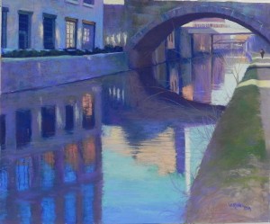
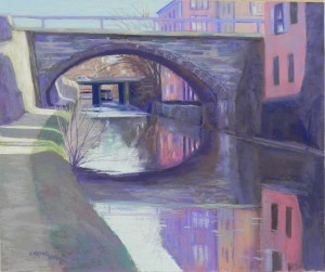
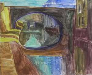
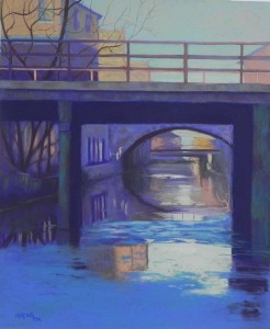
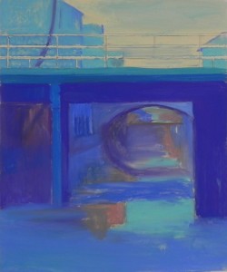
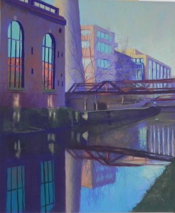
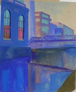
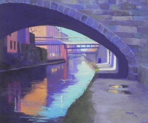
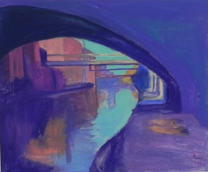
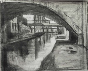
I completed my 5th painting of the canal on Friday night and have done drawings for the 6th. I’ve really enjoyed working on this series. To begin with I thought I’d do 4 pictures. Then I found two more. The lines and shapes in this one are so strong, I don’t know how I could have missed it! What’s so interesting is the way various places show up in the paintings, highlighted in some, as distant features in others. The bridges are fascination and most of the paintings have 2-3 of them. I also love the pieces of light reflecting off the walls. The windows and their reflections are completely different! I just have to trust the photo to be right. I liked working on the white Pastel Premiere. I used a fairly dark underpainting and found that lightly brushing Giraults on top left little pieces of the dark showing through that was effective in the wall and building on right, as well as the bridge. I used a variety of blues-blue violets and blue greens, along with deep red violet in the underside of the bridge, and a progression of oranges that goes the length of the canal. I was happy to be able to put another small figure in this one to break up the expanse of the towpath.
Category Archives: Uncategorized
C & O Canal, Georgetown, #4
Here is the completed fourth painting in my Georgetown Canal series. This one is different in that it is on the new pastel premiere 400 grade white, rather than the 400 UART that I used for the first three. The sheets come in 20 x 26 and have a good coating on the back. I ruled off two inches and decided to try using them unmounted. It worked great. I hope they won’t be a problem to frame, but they didn’t have the warp in them that the mounted ones had (I had my framer dry-mount the UART.) However, the paper doesn’t seem to like hard pastel very much! I applied one color, then when adding another over it, it frequently brushed off the first! And the alcohol underpainting was not as satisfying as that on UART and Pastelbord. I found it too easy to brush off the color altogether. But once I started working on top with Giraults, I found that the paper had a really nice tooth and it was possible to let some of the underpainting show through–something I really like in buildings. I decided to do a warm under cool/cool under warm underpainting (except for that horrid yellow green on the left!!!). I liked putting browns under the mostly cool grays of the bridge. So the paper has pluses and minuses, but on the whole, I was very pleased with it. If I can use it unmounted, it will save me a lot of money ($18 for 20 x 24).
For this painting, I removed a bridge at the top of the photo in order to not block the distant buildings (which I had to make up!). I also wanted the focus to be on the arched bridge, but liked that there were two more behind it. In this painting, the canal boat is in the distance and there is a car coming across the bridge to the left. In the photo, the car was heading off the right side and I wanted it to be coming into the picture, not going out of it. I also like the small bushes that are in light and shadow on the left side. Color-wise, the picture started coming together when I brought the magenta from the buildings on right into the greens on the left to gray them down. The picture had much more color balance at that point, and the green (a cool green) was too strong anyway. I played with the yellow light on the wall at left. I didn’t want it to steal the show, and I had to really tamp down the light on the far distant wall, which I had too strong initially. I used some mid-light beige colors to begin the wall, then added a few saturated strokes of light yellow, but left most of it more neutral.
I’ve just completed the drawing for #5. So much perspective, so many lines and arches! I think I’ll be ready for pure landscape when this series is done!
Snow Demos, pt. 2
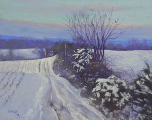
This is Monday’s demo. I knew when I saw the photo that I wanted it to be a 16 x 20 and the only surface I had was white pastelbord, which is a favorite anyway. I love the fact that it can’t warp!!! (Speaking of which, one of the boards I purchased from Pro Art panels last fall warped so much it’s unusable, and another came completely unglued. Need to ship them back and probably won’t order from them anymore). Back to the demo–I did a hard pastel underpainting using base colors. I used a cool green in the upper sky and a light yellow green in the snow-lit field. For the dark areas, I used a combination of violets and browns. I started it out with a charcoal layin mixed with water. You’ll see that the tree doesn’t really appear in the underpainting, except for the lower trunks. I painted the sky first, then added the tree on over it using Girault and hard pastels. When painting the sky, I used a light grayed blue over the green, allowing the underpainting to show through. It really worked–giving me just the right amount of warmth and greenness. I lightened the cloud bank below and then added clouds above with warmer violets and added pinks and oranges above the cloud bank. I basically did one pass on the sky and never went back to it. For the snow, I used a combination of blue and violet Giraults and then softer pastels. For the sunlit field, I used my lemon yellow Art Spectrum extra soft tinted white. I think this is one of the most useful pastels I own! So many of the yellows are just too yellow. The road in the foreground and the foreground bushes were all done in my studio after the demo. I really needed to take time on them and used a lot of nuanced blues, violets, and pinkish colors. The bird–which I love–began as a mistaken piece of purple pastel on the branch. I immediately saw the benefit of having him there and added a little more to him. He’s right above the orange light in the sky and I think he balances the painting well. I teach people to “let the painting speak to you” and this was one case of that. The overall effect is of a cold snowy day, but I hope that the light in the sky, the bird, and the sunlit field give warmth and interest to the painting.
Snow demos, pt. 1
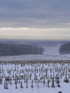
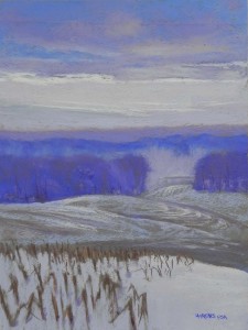
I have just completed doing three demos for my Sunday, Monday, and Wednesday classes. This demo was done for the Sunday class. All of them are from photos that I took last Friday morning in Boyds, Maryland, early in the morning. We had snow on Wed. and it was gone in Rockville, but I knew there was more further west. It was foggy when I got up but I knew the sun was coming out and decided this might prove to be great for pictures. It was! This first one is of corn fields with distant fog and a cloud bank overhead with light below. The composition is close to that in the picture, but I didn’t like the corn stalks going straight across the bottom. So I broke them off so as to have some area of just snow, in differing colors of close value. I also widened the area of fields in the middle, because I thought that was more interesting. I used a very light touch on the paper and let some of it show through to suggest rows of corn stalks. I thought it worked pretty nicely! In the sky, I used primarly Giraults, but then added a pinkish Mt. Vision color to indicate the lighted clouds and really liked that. I smoothed it out with a Girault. The distant trees are much more violet than the photo, which is farily dull. I did this demo after giving short lectures on composition and the use of color characteristics to provide dominance, contrast, and nuance. The dominant hue is blue violet, the dominant values are in the mid range; the temperature is cool and the choma is pretty grayed. The contrast is in the light of the sky, and there is lots of nuance! Will share the other two in the coming days.
C&O Canal, Georgetown, #3
I completed my third painting in the series today. I once again had a challenge with the paper size as it was wider than the photo. I also had to crop down the top. It might have been better as an 18 x 24, but I want to keep these all in the same size. The column on right was all one dark, but became very wide in my picture. I resolved this by adding some of the green color from the post on left. I really liked the subtle colors in it and wanted more of it anyway! I really enjoyed the colors in this painting: a mix of blue violets and blue greens, along with subtle oranges. Also like the two ducks swimming up the middle and creating a nice light wake! The part under the arched bridge is very abstract and I tried to keep it very painterly. While there are a lot of straight lines and hard edges in these paintings, I keep looking for opportunities to make the picture more painterly and perhaps a little more mysterious. I’ve only got one more photo that I really like, so i may be ending this series soon. Or perhaps I’ll go back! We’ll see. I started teaching today and will be doing demos for my classes, so it will be back to 11 x 14s for a bit.
C & O Canal, Georgetown, #2
I completed a second painting from the canal in Georgetown this week and have begun my third. This one posed some compositional challenges to begin with. The tower was right in the middle of the picture and it didn’t go off the top. I decided to move it to the left and liked the composition much better. But then I had to make up much of the building to its right! There were other challenges as well. The windows on the left were very detailed and I decided to put them in with hard pastel and not apply any alcohol. So these were primarily done with hard pastel alone. The reflection of the windows at bottom gave me real problems. They were quite dark and blue looking and didn’t show any of the building reflected in the windows at top. I tried various blues that just didn’t work. Finally, I found the one dark teal pastel that I had in my box and voila! It looked great! It was a darker version of the aqua at top and now makes sense. And I love the combination of the red violet and the dark teal green.
The reflected light under the windows is a really nice feature of the photo and I tried to get it and its reflections as accurate as possible. This painting is more industrial and doesn’t feature any of the tow path, but I like the revised composition and the color scheme. I’m finding this series to be demanding but interesting and a good challenge for winter, when the landscape is not so exciting.
C&O Canal, Georgetown, #1
I’ve begun working on a new series of pictures of the C&O Canal, this time in Georgetown. This is completely different from the canal in other places as it is lined with buildings and crossed with many bridges. I went to the canal early on New Year’s Day to film. This was one of my favorite views but I have a number of others. Will do at least four in this size, I hope. The composition was a challenge for me as the photograph was cropped to a square and I decided to do it as a 20 x 24. So I had to elongate the arch and add more inside it! I began with a charcoal sketch on newsprint, adding white pastel for the lights. I was particularly interested in the design qualities of this picture. One of the changes I made was to add roof lines and a tower, just under the arch, that weren’t visible in the photo. I liked this much better. The wall was done with my new set of Mt. Vision thunderstorm grays–a lovely combination of colors. I found them large and a little unwieldy to use, adding Giraults and Schminckes to smooth the color. I’m finding this a good series of pictures for winter, as they focus on buildings, water, and reflections, and have more color than the average landscape does right now! We have snow now but it’s been too cold to go out and film. So I’ll stick with these for awhile.
Delaware Water Gap Farm
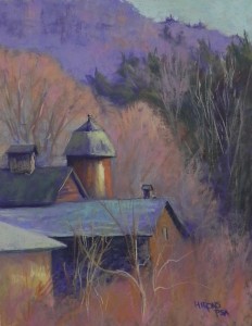
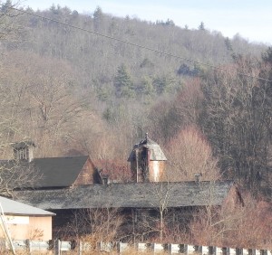
I spent yesterday in the studio giving a workshop to a friend and colleague at Washington ArtWorks. I decided on this photo from our recent trip north, as it included buildings in the landscape, as well as a chance to work on the composition and enhance the color. Ellyn was particularly interested in knowing my process of painting so I typed up a 10 step process, based on my book, but in the order that I think I make decisions. I then worked on changing the composition. [I mistakenly cropped the bottom off the photo, leaving the buildings too close to the edge. However, there were ugly fences in the way.] I wanted to have some sky and the background hill, so I decided to do a vertical and shorten the length of the long roof. The most important change was in moving the silo to the left so that it wouldn’t be standing on its own, right in the middle of the picture! Once the composition was finalized, I could focus on color. I went with my typical secondary triad of violet, orange and green, using off greens in the roofs and in the background evergreens. I like the way the buildings emerge from the leaf-less bushes and the shapes created by the sunlit trees. This painting came out much better than I expected and it proved to be a very good demonstration for a talented new student!
Commissioned Painting
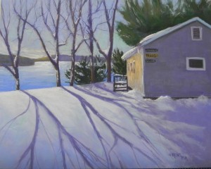
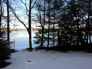
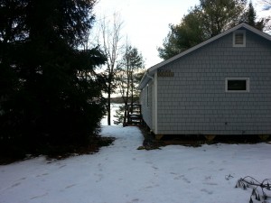
I’ve just shipped this painting to Kira Maas, the daughter of an old friend of mine for her wedding present from her mother. Sharon and I worked together in our very first library jobs in Massachusetts. They now live in Maine and Kira wanted a picture of their camp house with the lake in snow. There was too much at Thanksgiving and not enough at Christmas, but the reference photos gave me something to work from. As you will see, I had to make some serious adjustments! First, I decided to place the cabin closer to the lake and took out the large evergreen that is blocking the view. Then I changed the time of day and lighting so as to provide more interest and drama. The building is a light gray, not a color I use! So, by changing it to late afternoon light, I could use darker gray violets, and warm orange browns on the front. I also made up the shadows of the trees and added more snow! Making up shadows isn’t easy! I wanted it to look like the trees are below the ridge of a hill, rather than at ground level, as in the photo, since the cabin appears to be perched above the lake. The shadows are somewhat stylized, being made up, but I like the effect. The last addition was the signs on the left side of the house, with three names (one of which isn’t even there yet!). What really pleased me was that the sign for “Maas” has a yellow background, so I was able to carry some of the same color from the sunlit side of the house to the shadowed side! A small detail, but it keeps the color from being isolated. Best wishes to Kira and her husband and to all of you for a healthy and productive new years!
Frosted Morning Sunrise
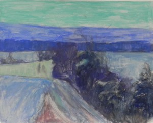
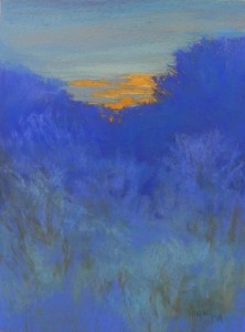
I”m home from our brief trip to Massachusetts. Never even saw Mattapoisett center! We had a nor’easter on Christmas Eve and it was miserable. But a beautiful day on the Cape at my sister’s on Christmas. And a good time visiting with my mother. We stayed overnight on the way home near Milford, PA, at the top of the Delaware Water Gap. While eating breakfast, the sun started coming up over the frosted trees and it was beautiful. The camera wasn’t handy so I just looked at it and tried to remember the shapes of the orange and colors and values of the surrounding sky and trees. This morning I decided to play with my new Pastel Premiere paper and do a painting from memory. I like doing this every now and then — it’s a great exercise in color usage. I knew I wanted to stick to blues–no purples! I used only soft pastels and Giraults for this and didn’t do any drawing on the paper. Just laid in shapes with the side of a blue Girault. I played with cool blue violets and warmer blue greens in the bushes in foreground, and I used some of the same blue green in the sky. I also introduced some warm browns in the foreground to relate to the orange at top. I think it adds balance to the picture. The orange is from my box of Blue Earth oranges. I also used a few of the new Mt. Vision storm grays that I got for Christmas. They are more for clouds and I look forward to using them more. I enjoyed building up layers on the paper, putting down rough pieces of Unison and smoothing them with Girault. This is a great paper for doing this kind of abstracted work.
Happy New Year to you all. I hope that 2015 will be a healthy and productive year for all of us!

