Making Your Own Surface and Saving a Surface When the Painting Fails

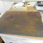
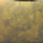
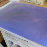
Surface after being washed off

Surface after being washed off

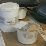
Colourfix Liquid primer in original tub and plastic container

Colourfix Liquid primer in original tub and plastic container

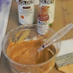
Liquid acrylic added to the clear primer

Liquid acrylic added to the clear primer

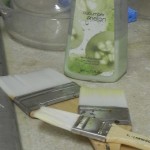
Brushes with hand soap for cleaning

Brushes with hand soap for cleaning

Surface after one coat of primer

Surface after one coat of primer

Final surface

Final surface

I recently promised to explain my process of preparing my own surfaces. I often use the same process when a painting fails and I want to save the surface. I had a 20 x 24 painting that I really disliked on a mounted sheet of UART. The mounting alone cost $18!  So I didn’t want to throw this out.  Working in my home studio, I took the painting outside (it’s a gorgeous day!) and using an old bristle brush, I removed as much of the pastel as I could.  Then I took a sponge and a bowl of water, and washed off as much as possible. By doing this, the violets and blues mixed together and covered the paper, eliminating the original underpainting, which I definitely didn’t want showing through!   I could have tried to get rid of more pastel if I wanted to keep the sanded surface of the UART. But I find that the pastel fills in too much of the tooth and it’s better to apply a new surface. Instead, I prepared some Colourfix Liquid Primer to brush on. I use a separate plastic container (saved from the grocery store) to spoon out enough primer that will be toned. The primer is clear–this is critical!  The already toned primers cannot be further colored.  To this, I add liquid acrylic, usually raw sienna, burnt umber, and some quinacrydone gold. Using a plastic spoon, I mix the primer well until I have a good blend and shade. (Note, if it’s too light it won’t look like much.) I use Loew-Cornell acrylic brushes to brush on the primer.  I wash out the brushes thoroughly using my hand soap so that none of the primer stays in the brush (which will ruin it for future use).  (Note: I’ve been using these brushes for many years. They come in packages of 3: 1″, 2″ and 3″ which I use according to the size of the paper or board.  I have always liked them because they didn’t leave large ridges in the surface. However, lately, their quality has gone down and they continually leave bristles on the surface that have to be removed. This is a pain and can destroy the surface as well.  Not sure what to do about this! If you click on the final surface you’ll see some of the problem areas that resulted from removing bristles.)

I apply one layer, brushing in different directions, trying to get the surface as smooth as possible. Then I dry it well with a hair dryer. Test with fingers very lightly!  If too sticky dry some more or wait. Then apply a second coat and dry again.  The resulting surface will be very different from the original, but can be used to create wonderful paintings!  This is a great way of reusing Pastelbord particularly, since it’s so hard and can take the liquid primer applications.  When preparing a surface such as Rives that might buckle, I make sure it is completely dry, put a clean sheet of paper or glassine over it, then weight it down with magazines. This helps it lay as flat as possible.

To be clear, I create my own surfaces using various substrates, such as BFK Rives printmaking paper, heavy smooth mat board, museum board or gatorfoam (I used this in the past).  I also use this method for reused surfaces that are either very sturdy (e.g., Pastelbord) or have been premounted (UART, Wallis, etc.)

Here is a list of supplies that you need:

A pastel gel. I use Colourfix Liquid Primer clear, bought in a tub from Dakota Pastels. You can also use Golden acrylic gel for pastels. Or make your own (there are many recipes but I don’t do this).

A plastic disposable container or other such container. One with a lid is handy to retain unused gel. Save containers from the grocery store!

Plastic spoons (I buy a bag of 100)

Brushes of various sizes. I use Loew-Cornell acrylic white brushes. Try to get something that won’t shed.

Soap to clean the brushes.  Note: I have a sink in my home studio. Be careful to clean the sink. The primer will harden and make a mess of your kitchen sink!!!

A clean new substrate or brushed off painting: printmaking paper, mat board, museum or illustration board, etc.  Note: the texture of the substrate will determine the final look of your painting. You might want to try several different substrates to see what you like best.

To those in the Rockville area, I will be including this in the upcoming Exploring Pastel class at Washington Art Works, beginning at the end of Sept. AND: all of this is included in Appendix D of Finding Your Style in Pastel! I hope this has been useful. Feel free to ask questions or let me know what needs clarification.

Two Paintings From Chincoteague

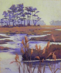
Misty Day, Chincoteague, 24" x 20", BFK Rives and Colourfix Liquid Primer

Misty Day, Chincoteague, 24″ x 20″, BFK Rives and Colourfix Liquid Primer

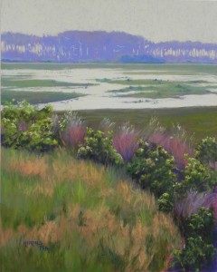
Quiet Flight, 20" x 16", UART 400

Quiet Flight, 20″ x 16″, UART 400

I spent today in the studio completing my third painting from our May trip to Chincoteague. Last week I completed a 20 x 24; today’s is a 20 x 16.  They were done on different surfaces using different approaches to color and technique.  The first, Misty Day, was done on Rives using a gold-toned Colourfix liquid primer base. I used direct application of pastel onto the toned and textured surface. I like the soft edges that are produced and it fits this subject matter very nicely.  For this painting, I used 3 black and white photos, finally settling on one to use as the primary image. I added three small ponies in the back right from one of the other photos.  I chose not to use greens, instead, making this more of a fall scene.

The painting I did today was done on UART using an underpainting and the color photo. The colors pretty much match those in the photo, but I pushed the foreground grasses a bit. I added egrets in the far distance and a hint of birds in the water–it needed them and there were many birds everywhere–just not in my photo!  For the underpainting, I used violets, pinks, oranges, and reds from a new Holbein set. I like using these pastels for underpaintings–the colors are really gorgeous. The bushes were done with Blue Earth greens and the foreground grasses are all Girault.

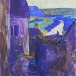
Valley of the Dordogne

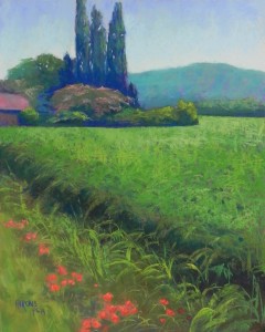
Valley of the Dordogne, 20 x 16, UART 400

Valley of the Dordogne, 20 x 16, UART 400

Underpainting

Underpainting

Painted completed during demonstraction

Painted completed during demonstraction

This is a painting that I began yesterday as a demonstration for a three day workshop that I’m giving in Rockville.  I’ve also included the underpainting and the painting as it was completed during the demo.  Interestingly, I used something different for the underpainting.  All of my really light hard pastels are down to nothing!  One of the participants mentioned pan pastels, which just happened to be on my cart. So I opened them up, and chose a yellow of the right value and sponged it on. It worked great, as you can see in the image of the underpainting. I may use these more often–a revelation!!!  When I began the painting, I talked about the challenges of the photo, the main one being the large corn field. However, it turned out to be a lot easier than we thought. I used violets in the underpainting and when I brushed several Blue Earth greens on over it, the surface left little pockets of the violet showing. The class was amazed at the result and how little time it took!  However, I wasn’t completely satisfied. I wished I’d put some darker color in the lower right corner, above the dark border of the field. I ended up adding some dark pieces of color into it, and I used more greens and varied strokes to give it interest.  I’m happy with it now.  When the photo was taken, it was an overcast day with white and gray clouds. I chose to give it a more cheery blue sky. But then I had to think about the trees and bushes. Today, I added more darks and lights to the poplars and the bushes in front of it, as well as some lighter yellow green on top of the corn.  Another change from the photo was the positioning of the poppies. In the forefront, I had them spill to the left out of the bottom. This gave a more interesting progression to my eye.  This picture was really fun to do and it was a lovely remembrance of the walk John and I took on our last day in this beautiful part of France.

A new adventure!

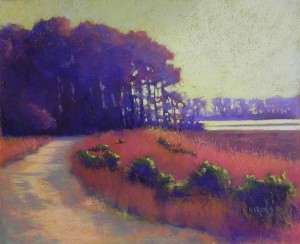
Marsh Walk, 20 x 24, BFK Rives and Colourfix Liquid Primer

Marsh Walk, 20 x 24, BFK Rives and Colourfix Liquid Primer

This week has been an exciting week for me and I want to share it with you.  I am going to become a member artist at ArtBlend Gallery in Fort Lauderdale, FL and next summer I hope to be showing at the Art Hamptons Art Fair!!! I received a message from one of the staff while in France and told her I’d have to get back to her. Then I forgot all about it!  She wrote me back and I finally took the time to look into it, and realized that this could really be something–not another vanity gallery in New York.  They are looking for a variety of artists and somehow found me and love my work. How nice. And they are in a place where people might actually buy art!!! They have a very large, beautiful gallery, plus do a magazine called ArtBlend and they participate in some of the major art fairs.  This is all pretty new for me, having just left the co-op gallery in Bethesda that I’ve been a part of for 11 years.  However, I’m also in a very nice commercial gallery in McLean, VA, so I have a little experience with showing in this environment and it’s where I want to be.  I do not want to try to sell my work, other than in my studio, and am very happy to pay commissions so others will do it!  This isn’t cheap. There is upfront cost, plus shipping, but their model is somewhat unique and they pay 75% commission on sales, which is great. So I’m taking the plunge.  I’ll be shipping 6 paintings to them in the coming weeks, one of which is Marsh Walk, which I just revised. I thought I’d include it in this post.  (Yesterday I ended up brushing off the path and redoing it, then did more work this morning. It’s at the framer’s now so it is done!)  I’ll also be sending the second poplar painting, and several from the west. I’ll be focusing on the New England pictures for the Hamptons (if indeed I am actually there!).  So wish me luck!

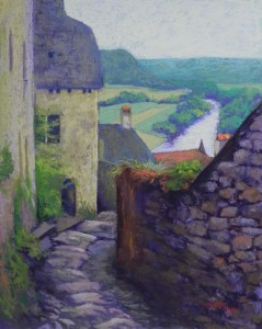
Above the Dordogne (Beynac)

Above the Dordogne (Beynac), 16 x 20

Above the Dordogne (Beynac), 16 x 20

Underpainting before liquid primer was added

Underpainting before liquid primer was added

Today I finished my fourth painting from France. This is from our morning climb to the castle at Beynac, high above the Dordogne River. We climbed endlessly, it seemed. What is beautiful though, are the views from the walls, as well as the old stones that people have walked on for hundreds of years. This painting is all about texture.  I did a compositional sketch in order to change the shape of the river. It was leading off to the right and I wanted to turn it back into the picture. I also wanted to make more of the stone path leading down into the  picture.  I used a 16 x 20 sheet of mounted Pastel Premiere white 400. I thought it would have more texture than the UART that I’ve also got mounted. I did the underpainting with hard pastels and added alcohol. It was very dark and looked fine.

However, once I added soft pastel into the sky, it was completely flat!  I knew  this wasn’t going to work for the buildings and wall. So I brushed off  the sky and added two coats of Colourfix liquid primer over the entire underpainting.  This gave me a great surface to work on (but I wouldn’t do this on a regular basis with purchased papers!). Now when I laid in color in the sky, I got a more irregular layer of color which works better with the texture in the rest of the painting.

I worked from the color photo this time around as I wanted to see the nuanced colors in the buildings and wall, and I liked the colors overall, particularly the cool greens of the distance. The color scheme is a double complement–blue greens and oranges, yellow ochres and violets. I enjoyed putting small pieces of brighter orange into the chim

Playing with Abstraction

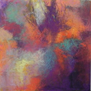
Abstract #1, 12 x 12, mat board with AS liquid primer

Abstract #1, 12 x 12, mat board with AS liquid primer

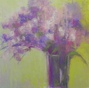
Floral abstract, 12 x 12, mat board with AS liquid primer

Floral abstract, 12 x 12, mat board with AS liquid primer

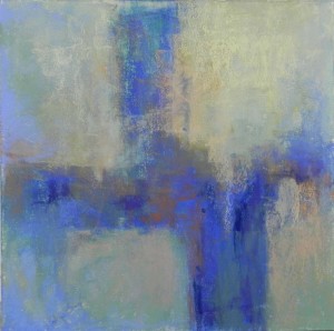
Blue-green Abstract, 12 x 12

Blue-green Abstract, 12 x 12

I spent a very enjoyable day in the studio today playing!  My friend and fellow resident artist, Julie Smith, joined me and we referred to Debora Stewart’s new book on Abstract Painting.  Before Julie arrived, I did a number of drawing exercises on newsprint using charcoal. First I drew with my left hand, then did some drawings that were based on photos with strong shapes.  Nothing appealed to me.  So I decided to just jump in.  I used 8-ply mat board given to me by my framer (holes!) cut to 12 x 12.  It’s a great size and shape to work on and it’s nice having inexpensive surfaces on which to work.

For the first painting, I used purple, gold, and black liquid acrylic and painted it on the board with brush and water. Once dry, I layered two coats of clear Art Spectrum liquid primer over the top.  I began with Holbein pastels in violets, oranges, and cool greens, laying in color, paying some attention to the acrylic underpainting. Then moved on to softer pastels, using a lot of the Blue Earth and Schminckes. I had fun with this piece, but it came out rather dark and it isn’t particularly good, I don’t think.

For the second painting, I decided to use Debora’s method of putting down color with charcoal and adding the gel on over it. This wasn’t sand paper, however, and the plain mat board doesn’t take much pastel. However, I wanted a light palette. I decided to do flowers based on a bouquet I have at home (but not at the studio).  I laid in color with the Holbeins, then put the liquid primer on over it. It spread the color a little, but not a lot. I dried it, added some more color and another layer of liquid primer, then painted over it. Was quite happy with the results. (I have no patience for detailed flower pictures!)

For my third and final painting of the day, I used the same technique but went with a non-objective cruciform shape. I wanted to use blue greens with oranges, a favorite color palette that I don’t often get to use for my landscapes.  I think this was the most satisfying of the three!

Julie will be back tomorrow. She is a marvelous acrylic and collage artist and is working on a diptych inspired by a painting in Debora’s book.  I think tomorrow I’ll be painting a picture from France, but I might try using one of these techniques.  July is a great time for trying something new!


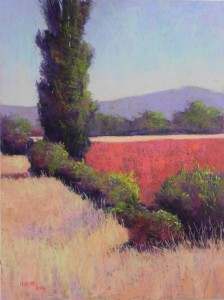
Poplar en Perigord #2

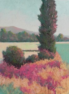
Poplar en Perigord, #2, 24" x 18", Wallis museum grade

Poplar en Perigord, #2, 24″ x 18″, Wallis museum grade

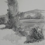
Charcoal lay-in

Charcoal lay-in

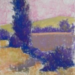
Underpainting before alcohol

Underpainting before alcohol

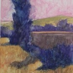
Underpainting with alcohol

Underpainting with alcohol

I completed my second 18 x 24 painting today. I used the second black and white photo and decided to use a color scheme of violets, reds, and oranges. Went with a cooler sky, using a blue violet at top, turquoise in the middle, and a light pink at the base of the sky.  I’m including the underpainting with and without alcohol so you can see what it looks like. I began with a violet in the field to right, then added a brown over it which basically turned it to a muddy color in the underpainting. But it worked fine once I added the reds on top.  My plan was to use oranges in the sunlit areas of the tree and bushes, but the red field killed that!  So I used yellow greens, which really popped out.  I wanted this to have a summery feel and the green does that. I really worked on the shapes, particularly of the bushes. I ended up with a huge bush in the lower right, so I made up a small one in front, then lowered the reds in to separate the bushes. Also brought a small piece of the distant field to the left of the tree and I think this is important to the balance of the painting. I like the way the real darks in the tree work (Terry Ludwig eggplant, of course!). The value is more striking in this picture than in the first. The red field is a combination of warm orangy and cool pinkish reds that I like a lot (Schminckes). I used a dark reddish brown in the tree and bushes to bring the red into other areas of the picture. The last thing I did was to add a few pieces of turquoise into the bushes and grasses to bring the sky color down.

Poplar en Perigord, #1

Poplar en Perigord, #1, Wallis museum grade, 18 x 24

Poplar en Perigord, #1, Wallis museum grade, 18 x 24

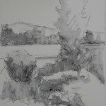
Charcoal lay-in

Charcoal lay-in

DSCN2422Here is the 18 x 24 painting based on my favorite of the studies. This was done on Wallis museum grade mounted white paper. I have one sheet left!  I did the under painting with hard pastel and used alcohol on it, forgetting about the potential problems of alcohol on Wallis. It did change the surface a bit, I think, but it was OK. I used my Blue Earth pastels to lay in the colors and the Giraults to soften them and fill in more of the background.  I kept to the colors in the study (or at least tried to!). Given the differences in the surface, the pastel didn’t go on the same way. I resorted to using a lot more strokes, rather than relying on the texture of the surface. But then, this is France and it should probably have a lot of impressionist strokes anyway!

I began the painting with a charcoal and water sketch on the paper to lay out the composition. I didn’t want a lot of charcoal, just wanted to be sure about the composition. Somehow, I forgot to film the underpainting but I used combinations of reds and greens in varying values that provided enough rich color to work over. My main concern was in the flow of shapes, particularly the reds in the foreground, the green shape on the right, and the shape of the mountain in the background, which I later changed.

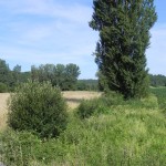
I’ve included the original color photo so you can see what it looked like in France. I worked from a black and white and found it much more inspiring!  Hope to do the second one tomorrow and see where that one takes me!

Poplar Color Studies

Set 1. 7 x 5 on Richeson white

Set 1. 7 x 5 on Richeson white

Set 2. 7 x 5 on Richeson white

Set 2. 7 x 5 on Richeson white

Set 3 7 x 5, Richeson white

Set 3 7 x 5, Richeson white

Initial sketches

Initial sketches

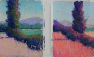
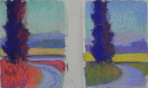
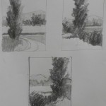
The weather is abysmal here in the DC area and I’m planning to spend as much time as possible painting, experimenting, and playing in my studio!  Today I decided to print out three black and white photos of poplar trees that I took in France. I began by doing a number of drawings. The last three are on the same page and I’m including them. The major issue is the placement of the tree. In all of them, I’ve added a mountain in the background to give a little added interest.  I’ve decided that the one with the road is my least favorite, and you’ll see the results in the color studies.

For the color studies, I used 6 5″x 7″ sheets of white Richeson paper that I acquired some time ago. They were perfect!  I was afraid they’d buckle with an underpainting, but they were fine with alcohol. I used a variety of hard pastels and Holbein sticks to do the underpaintings, primarily looking for different darks. Got tired after awhile and just used the same colors to establish the shapes (blues and violets), then played with different colors on top.

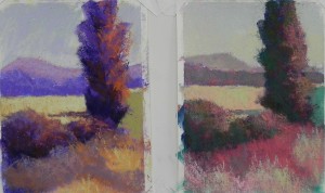
My favorite set is the first. I began with a dark red violet and used browns and oranges in the first study. This is a fairly typical palette. I liked the darks and the composition but wanted to get beyond violet. The second of these is my favorite. I used my Blue Earth pastels: cool greens (turquoise), cool reds (quindo), and green. Also used some oranges. The texture of the Richeson paper was great for layering (unfortunately, I won’t be using it for the large paintings). I loved the way the warm and cool greens combined on the tree and the color of the red in the foreground. Mixed complements for the mountain and used light values of the greens for the sky.  This was fun!

Moved to the next composition and played with more real colors in the first one. I used a very dark blue for the basis of the trees, then other blues and greens on top, as well as oranges. The field was very light in the photo, so kept it light in this one. For the second, I made the field darker and completely unreal. Also changed the composition (like the first one better). I really wanted to used reds and oranges and play with shapes of different values, so I liked all four of these studies.

When I got to the last photo, I was tired. I ran out of inspiration and by the sixth study, I’d had it!  My plan, at the moment, is to do 18 x 24 paintings of the first two compositions, using mounted Wallace (the last of my stock). I’m hoping that the lack of texture won’t be a problem. I’m not sure where I’ll go with the color, probably use the second study of the first set, and the first study of the second, but who knows! It will be a different day!

Farm Village, Perigord Noir

Farm Village, Perigord Noir, 16 x 20 400 UART

Farm Village, Perigord Noir, 16 x 20 400 UART

Underpainting with partially completed painting

Underpainting with partially completed painting

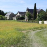
Reference photo

Reference photo

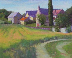
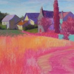
I’ve just completed my first painting from France. I decided to begin with a relatively easy one, for which I made only smalle compositional changes. Felt like I needed to just get back to painting again. I began with a pencil drawing on 400 mounted UART. I worked from the color photo as I wanted to retain the feel of the place. But I decided to start the underpainting with all warm colors: pinks, oranges, reds, with aqua in the areas that would be hit with light. I used a pale pink and orange for the sky.  I didn’t have my camera yesterday. Took pictures with my cell phone but they came out with very exaggerated color. However, I think there is enough of the underpainting showing to give you an idea of the colors used.  For the painting, I used my new box of Blue Earth greens that I bought at IAPS. A great set!  Can’t believe it’s taken me so long to get them!  I guess it’s because I like the green Giraults, which I also used. I decided to give more emphasis to the oranges in the roof and door. Many of the roofs in the Perigord are orange and are quite beautiful when the light hits them. I did the field last and used a combination of duller greens, yellow green, dull reds and oranges.

The warmth of the field and the shapes of the buildings were what drew me to this scene.  This was a small village north of Sarlat that was having an art fair when we arrived on a Sunday morning.  Everyone seemed to be having a good time but we were disappointed in the quality of the work shown.  The “art” for me was in the scenery, which I’m sure they are very used to!

(Note: I decided to add the text first and then the images and I’ve succeeded in getting them at the top!!!)