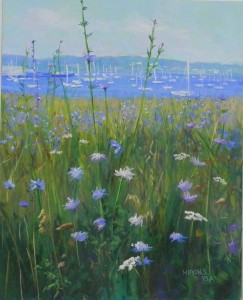
Harbor Days

Harbor Days, 20" x 16" Pastelbord

Harbor Days, 20″ x 16″ Pastelbord

And here is the third painting, completed today.  This one was more of a challenge than the first two as there is no real focal point or composition!  It’s pretty much about a field of chicory with little white boats behind it!  I did it some years ago as a 7 x 5 miniature and it came out very nicely. But I had no idea what it would be like to do it larger. The boats in this picture are all white and small. I decided to keep them very loose. I added in the pier on the left and felt that added a lot to the picture. I also added pinkish clouds in the sky, which I really like.  The bottom was the challenge!  I did another watercolor underpainting (and forgot to film it). I used a combination of blue violet and red violets for the chicory. The most important change was to add in Queen Anne’s lace into the painting (rather than the poisonous flower in the previous painting!).  I love the shape and texture of Queen Anne’s lace and I think this was a good addition, particularly the one at the center bottom which draws the eye into the picture and then up (hopefully!).

I named this Harbor Days, which is the name of the July festival held every year in Mattapoisett. However, this is Rockland, MD. I just liked the sound of it!

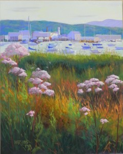
Harbor Sundown

Harbor Sundown, 20" x 16", Pastelbord

Harbor Sundown, 20″ x 16″, Pastelbord

Watercolor underpainting with graphite added over top

Watercolor underpainting with graphite added over top

I’m continuing working on a series of 20 x 16 paintings for the Hamptons. This second one was originally a horizontal that I cropped into a vertical. It’s Rockland, Maine around sundown. I really liked the colors in this picture and the shapes of the buildings in the harbor. The boats were fairly distinctive so I spent a lot of time drawing and painting them.  I did a light layer of watercolor at the top so as not to completely lose my initial drawing. Then spent a lot more time putting in several coats of watercolor at the bottom.  You’ll see from the underpainting that I redrew the buildings and boats after putting on the wash.  The flowers are something you see in Rockland. They aren’t Joe Pyeweed nor Queen Anne’s Lace. A friend tells me they are poisonous!  But I liked the shape and the pink tint to them. While the picture is clearly about the foreground, the background is pretty important as well and I like the way the flowers lead the eye up to it and to the building with light and shadow near the top.  The mountain is the hill behind Camden.  I really liked the added depth that it gives to the painting.

Shore House with Loosestrife

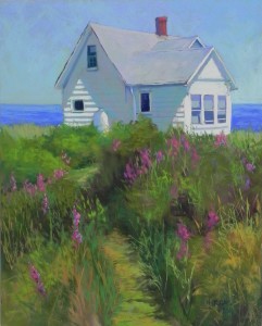
Shore House with Loosestrife, 20" x 16", Pastelbord

Shore House with Loosestrife, 20″ x 16″, Pastelbord

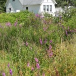
Reference photo

Reference photo

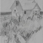
Graphite sketch, 10" x 8"

Graphite sketch, 10″ x 8″

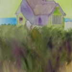
Watercolor underpainting

Watercolor underpainting

I’ve just completed my first painting of 2016. This is one of four that I plan to do for the summer ArtHamptons fair on Long Island.  I’m including the original photo (taken in Port Clyde, Maine), along with my drawing and underpainting.  There were significant compositional changes that occurred at various  stages, that I wanted to show.  I liked the house in light and shadow, but not the fact that the roof was cropped in the photo and that the background was just trees. The dark green would provide nice contrast, but not a lot of interest.  So I decided to open it up with sky and water.  You can see from my original sketch that my plan was to have the field take up the entire foreground with a swath of dark leading the eye into the picture. I began with watercolor underpainting because I like this on Pastelbord. But I’m having a hard time getting it dark enough. (Today I bought a couple tubes of gouache to see if that will be better and still retain the tooth of the surface.)  I wasn’t too concerned with the colors of the underpainting, just wanted to cover up the white.  I do like using the yellow green under the sky and this has become something I’m using more and more.  I finished the house and the top part of the field on Monday.  Yesterday I went in and sat and looked at it. I saw the small piece of grass showing just below the gas tank (also added by me!) and realized that what this painting needed was a path!  I converted the patch of dark to a path and immediately loved the effect. I’m glad that the path is broken up by the bushes. But it serves to lead the eye into the picture.

Some other observations. I did a painting of a white house and loosestrife years ago as a demo in Mass. There wasn’t much sky in that one and I used greens and magentas of the same value to create the shadows in the house. I tried to do that this time and it didn’t work. So I added some warm blue green over it and it was just right. There was so much blue around the house that it had to be in the shadows as well.  The roof is a combination of light pink, cool green and violet.  I had to make up the chimney!  I was thinking of adding the white fence from the photo in to carry the house over to the right, but decided it wasn’t needed. Fortunately, the spaces to the right and left of the house are not even!  So I’m happy with my first painting. Hopefully, it will find a home in some beach house somewhere up north!

Happy new years to you all.

Holiday Greetings

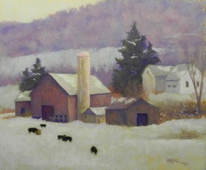
A Winter's Day, 20 x 24, Rives and Art Spectrum liquid primer

A Winter’s Day, 20 x 24, Rives and Art Spectrum liquid primer

Dear Friends,

I want to take a few minutes to send you all my best for the holidays and the coming year of 2016.  I’m including my painting from 2014, A Winter’s Day, that depicts a farm in Pennsylvania.  I made up the snow and so far this “winter” it looks like I’ll have to make up more!  Christmas in Massachusetts is supposed to be warm and rainy, for the second year in a row. (But look what they got last winter–9′ of snow in Boston!)  So we’ll all hope for the best in the winter to come, with perhaps a lovely snowfall or two that won’t be too disruptive.  Thank you for reading and sometimes commenting. It’s great to share my trials and experiments with you. I hope you will  continue to enjoy your painting endeavors in the coming year.

Best wishes,

Jean

Moon Rise with Crows

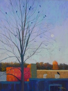
Moon Rise with Crows, 24 x 18, Pastelbord

Moon Rise with Crows, 24 x 18, Pastelbord

Underpainting prior to the alcohol

Underpainting prior to the alcohol

And now, for something completely different!  On Wed. morning, I went to the studio with an 18 x 24 white Pastelbord and three photos that I took late in the day on Monday, looking out the front window of our building.  The light was hitting a brick building making it glow and I loved the shape of the tree and the many crows coming in to roost. The moon was further to the right in a different picture.  But I knew it was critical.

I decided to do a quick, light underpainting using my Holbein sticks and alcohol. This turned out to be something of a disaster that I then made use of!  The alcohol didn’t melt the pastel into the board. Instead, the brush just pushed it around in streaks, that left noticeable ridges–like a brushed on gel!  I was disgusted with it. But I decided to carry on and that soft pastels would be what was needed.  So this painting is almost entirely soft pastel–crows were done with Girault. I used a lot of my Blue Earth pastels, particularly in the buildings. It was so much fun to layer color on loosely, and to see the effects of the underpainting (note in the brown building to right if you can).  Also, the light aqua pieces in the sky show the effect of the surface.  I won’t do this again–it will be nothing but watercolor or really watered down liquid acrylic when I’m working with Pastelbord.  However, I really enjoyed doing this painting and was happy at the results.

Hope you all had a lovely Thanksgiving. Such a lovely day here in the Mid Atlantic. We drove to the countryside in Loudon County, VA for dinner with good friends in a beautiful sunlit house amid fields and trees.  Very nice!  Making a dinner tomorrow for my ex!  Cheers!!!

Sunlit Vines

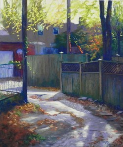
Sunlit Vines, 24" x 20" UART 400

Sunlit Vines, 24″ x 20″ UART 400
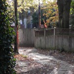
Reference photo

Reference photo

This is probably one of the most complicated paintings I’ve done!  I saw this scene with my friend Sunny and we were both entranced with the light hitting the red leaves of the vines. But the rest of the scene was filled with pavement and dead leaves!  As you can see from the photo, the entire left side is covered with a large green tree or vine. I had another photo that showed what was behind it. I used that for the fence and garage, but I made up the pile of leaves in the bottom left. Really like the way that came out!  I also reduced the size of the tree at right, which was much larger. I thinned it down and put some space between the two large branches.  This meant that the shadows on the walk had to be adjusted.

When I did the underpainting, I brushed the color of the buildings up into the sky, trying not to have hard edges. I really wanted the background to be as abstract as possible. I used a lot of local color in the underpainting, using yellow for the sky and all the sunlit areas below.  I started with the sky more yellow, but decided there was too much of a discrepancy with the light below, which is cooler. I added more whited yellow to the sky, then added the same yellow below, but it still looks quite different. However, it would be!  And it is in the photo, as you can see.  The lattice work on the fence was something I’ve never done. I started with dark blue behind. In the two left portions of the fence, I just used a diagonal stroke of brown going in one direction. For the part at right, it was more head on and I could see both foreground and back pieces. So I added strokes in one direction, further apart than the others. Then I added some of the back pieces going in the opposite direction. I added small pieces of light to indicate openings.  For the shadow with light pieces at bottom, I just added the light dots and smudged them a bit. I couldn’t make the little triangular shapes I saw in the photo!

I do NOT want to be a hyperrealist (this seems to be the new fad).  But I felt that this painting deserved really careful attention in the fence, walkway and leaves. I’m very happy with the way it came out. (And I finally got the basketball hoop the right shape!)  Thanks to my students who gave me advice, including Sunny, who also had the same set of photos!

A very happy Thanksgiving to you all. I’m so thankful to be an artist and to be surrounded by the wonderful folks who take classes with me and have studios at Washington ArtWorks.

Autumn Alley

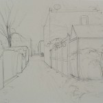
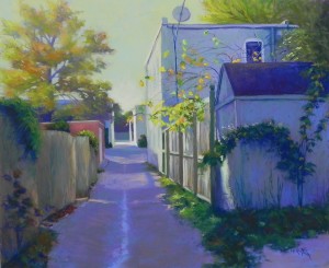
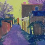
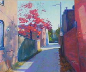
Here is my fifth alley picture from Capitol Hill. I knew I’d paint this one the minute I took the picture!  I loved the cool violet color of the shadowed sides and the light hitting the buildings and leaves at right. I decided to include the drawing in this post who you can see how I began the picture. I loved the drawing–particularly the shape of the alley, with the extension to the right. Doing the initial drawings on these paintings can be very time-consuming, but I measured off the photo and the paper with marks for half and half way and half again in between those and that really helped. I made several compositional decisions right away. In the original photo, the left side is completely covered by a dark green bush–very boring!  There was also a pointed tree behind the branches coming on the right side that I decided to omit. I added the small bush at lower left and made up hanging vines to replace the large bush. Color-wise, the major decision was the color of the sky. I made it green using various green Giraults. I liked the contrast with violets and the warmth of the tree. The green is cooler than the tree, but still reads as warm light. The photo was taken in the morning but it has the sense of late day light. I used hard pastels for the bush in the right foreground–dark blue, dark green and Prussion blue. The small square pieces were just right for creating the leaves. The branches of leaves coming in between the buildings were done with Schminckes. Everything else is Girault.  I kept the satellite dish from the photo–after all, there were no telephone poles or trash cans, so I had to have something!  Really like it.  My underpainting was kind of a hodgepodge of warm under cool and local color. I used the same yellow green for the sky that I used in the last alley painting. Obviously, I like this!

In the photo there is a car at the end of the alley, which I decided to omit. I left it rather abstract with two values of color and the interesting box of light around it. I brought one of the branches into it with small orange leaves. My most exciting moments were in adding the light to the garage at right and adding the violet streak up the middle of the alley!  These are the things that make painting in pastel such a joy!

Initial graphite drawing

Initial graphite drawing

Autumn Alley, 20 x 24, UART 400

Autumn Alley, 20 x 24, UART 400

Underpainting (hard pastel and alcohol)

Underpainting (hard pastel and alcohol)

Alley With Red Dogwood

This weekend was Open Studios weekend at Washington ArtWorks and I chose to work on my fourth Capitol Hill Alley picture.  I went to Capitol Hill the weekend before with a friend and it was bright and sunny and beautiful. I have enough photos to finish the series, I’m happy to say!  I did the underpainting prior to the weekend so as to have something concrete to work with, in between greeting guests (1300 of them!!!).  I chose a bright yellow green for the sky and sunlit areas of the alley.  I wanted little pieces of it to show through in the sky and give a glow. I used dark green and blue green NuPastels for the fence and buildings at right, which I thought would be good under the reds to come. I did a partial underpainting of the tree, using red so it wouldn’t be a problem if it showed through. I began with a brown for the shadowed part of the alley, but then added a cool green over it and it was so much better!  Now it related to the fence and building.  In doing the drawing, I made one critical change. The light post went off the top of the picture and I shortened it so that the light would be in the picture plane. I think this is really a crucial part of the composition and was very happy when I drew it in.

At one point, a woman looked at the photo and at my painting (which still had most of the underpainting showing) and she said “I’d much rather live in that alley” pointing to the picture!  Of course, I didn’t retain the colors of the underpainting, but I was happy she liked it.

For the painting, I used soft pastels in the sky and tree,  primarily Giraults in the buildings, poles, and alley.  The shadowed alley in foreground is a large expanse and I added a little detail of the bricks, but I didn’t want to add a lot.  I loved the piece of light on the left and the shadow on the fence, which form a strong zig-zag line that leads the eye to the tree.  For the far background, I just put some color in to represent a house and window and I indicated a car simply with its windows. I liked the approach a lot!  The right side was the real challenge. I had more of it showing in my painting than in the photo, but I liked the rich reds in the brick and the pole with sign. I didn’t want to paint in all the lines or every brick, but I put in enough indication of line to create perspective.

These pictures are both a challenge and a joy.  But I’m happy to report that people  really like them (I may have sold 3 out of the 4 I’ve done so far!)

Alley with Red Dogwood, 20 x 24, UART 400

Alley with Red Dogwood, 20 x 24, UART 400

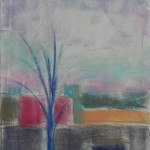
Underpainting

Underpainting

A Maine Summer

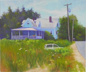
One more!  I completed this one before A Working Harbor and posted it to my Facebook page.  Got an email from Duane Wakeham saying that I should deal with the roof!!!  Duane is my mentor and a really wonderful guy!  I was surprised because normally he only sees painting I post to the PSA page. He went looking for this one!  In the original version, the roof and sky were the same value and he suggested that I change one or the other. I didn’t want to darken the roof a lot or the sky. But I resolved it but bringing some of the cloud color against the roof, and adding a slightly darker blue at the edge.

Compositionally, I made several changes in this one that I think helped it a lot. The tree line at left was at the same height as the house, so I raised it. And there was a lot more greenery to the right of the house, which I condensed. The final change was to open up the field at bottom with some of the sand color from the roadway, which kept the field from being a large block!  I thought about leaving the field unfinished, but the underpainting wasn’t that inspiring.  I used watercolor again, thinking it might work, but ended up covering it.

This picture was taken on our trip to Maine in 2009. I loved the house and porch, but also the car sitting in the field. Does it run?  Is there a driveway there?  It’s a little mysterious and soooo Maine!  I really liked the telephone poles and the mail box, as well, which ass some more interest to the picture.  These paintings are potentially for the gallery in Blue Hill for next summer.  I haven’t been doing anything with fall color!  Finally got to the Canal and Capitol Hill on Friday and Saturday, so perhaps a few fallish paintings are on their way!

A Maine Summer, 20 x 24, UART 400

A Maine Summer, 20 x 24, UART 400

A Working Harbor (Stonington)

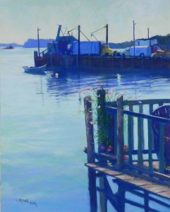
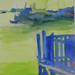
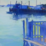
I’ve been remiss with my postings!  Here is a painting I just finished yesterday that I began a week ago. It’s from Stonington, ME. I loved the scene when I took the photo: the horizontal pier with boats and poles and three trucks!  The vertical porch at bottom with flowers and a neat pattern of darks underneath. But even more so: the boat against the pier!  It had everything and I basically copied the photo!!!  There really wasn’t much I changed in this one, but I did try to make it more interesting and a little more painterly, particularly when doing the trucks and the water. I began it with watercolor, using a warm green for the sky and water that I hoped would give some glow. It worked nicely in the sky.  As you can see, the watercolor ran all over the place in the pier. But I could see my drawing well enough to recoup it.  The photo was really dark and I started it out really dark.  Afterwards I brushed a lighter grayed red violet on over the dark part of the pier to give it more of a sense of light.  Perhaps you can see the difference if you look at the final and the partial version.

In this painting I used both pastel pencils and hard pastels to achieve some of the detail in the pier. The Carbo-Othello pencils are soft enough to work nicely and I used them to blend the colors in the water and pier and for some of the finer lines in the poles and lines. For the pier in the foreground, I began it with a lot of blue violets, then warmed it up with warm neutrals.

A Working Harbor, 20 x 16, Pastelbord

A Working Harbor, 20 x 16, Pastelbord

Watercolor underpainting

Watercolor underpainting

Partially painted

Partially painted