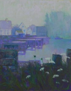
Fog Study in Violet

Fog Study in Violet, 14" x 11" UART 400

Fog Study in Violet, 14″ x 11″ UART 400

Four-color underpainting

Four-color underpainting

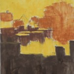
Today I finally got to do the demonstration for my Monday class. Several people had requested that I paint fog and there was interest in working from black and white. So I printed out a black and white photo from my 2012 trip to Port Clyde, Maine.  I painted this in 2012 as Fog Study in Blue.  I thought today’s might become Fog Study in Blue Green, but alas, violet REALLY works for fog! So violet it is. But the entire painting is done in analogous colors of blues, violets and cool blue greens.

For the underpainting, however, I decided to use warm browns and gold. The brown proved to be quite useful in the bottom and the gold came through in the sky and warmed it. In looking at the photo, I could see four values and decided that a monochromatic underpainting in the four values would work. So I kept it simple.

Establishing the color on top wasn’t quite as simple!  But I had lots of help from my class and many good suggestions. To begin with, I had made the sky and water the same value (except where there was reflection).  This really didn’t work.  So I brushed it off and went in with a more mid-light violet. The water now reads cooler than the sky, but I think that reads right.  The buildings and large clump of trees were a problem. It helped a lot when I brought sky color down over them, added a little building in front of trees at the left, and broke up the clump of trees.

The mid-ground is a group of piers with reflection in the water. I used violets, a deep blue green and a lighter violet for the top.

The foreground consists of stacked lobster traps with grasses and Queen Anne’s Lace in front of them. I started with them fairly dark, then worked lighter colors on over to give more shape to the traps. I added warm greens into the foreground, the only warm color in the painting.  The last thing I did was to add a small lobster boat in the distance to further break up the large tree mass.

It was fun doing the demo in my studio and having such great engagement from my class. But now I’m back to rocks!

Terra Cotta Leaves

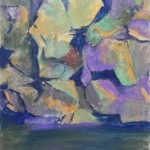
Terra Cotta Leaves, 14" x 11", UART 400

Terra Cotta Leaves, 14″ x 11″, UART 400

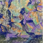
Underpainting, stage 1

Underpainting, stage 1

Underpainting with alcohol

Underpainting with alcohol

Painting as it was done at the end of the demo

Painting as it was done at the end of the demo

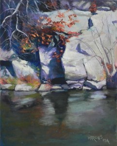
I’m really excited about this new set of rock photos that I’ve found. I’ve decided to make these the next series in my Insider’s Washington series. This is Maryland, but the C & O Canal is the favorite walking place of many people from the entire area. These rocks are at an area where the canal becomes a small lake, called Wide Water.  The rocks here are particularly wonderful in shape and color and the fall foliage with these was quite spectacular.  So today I did another 14 x 11 painting as a demo for my Wed. class, this time in person. It’s not easy doing such detailed work in front of people who are so enthusiastic and want to know everything!  But I somehow persevered.

I’m showing the initial underpainting with and without the alcohol and the painting as it was at the time that my students left. I spent two more hours in the studio afterwards working on it, so the total time was about 5 hours.

My initial concerns were the composition as the photo showed pretty much half rocks and half water. I resolved it by making the rocks just a little larger than half (about 8″) and felt that the amount of water and rock was just right. My next concern was color. As I knew I’d be adding the warm red orange oak leaves, I wanted to use a lot of blue greens and neutrals. For my underpainting, I chose three values of a pinkish orange for the rocks and a combination of dark blues and blue greens for the shadows and water.  The dark and light in this picture is what makes it.

I began with the rocks, laying in very light blue greens and warm neutrals. However, since I was working with a color photo, I couldn’t get past the fact that the rocks had a lot of violet in them and out came the violets!  It looked better once I added them, but I tried to use greens as well.  This painting is a complicated one, with many things in front of others. To begin with, I focused on the large shapes of dark and light created by the rocks.  I filled in the area at upper left with blues and violets of slightly varying values to imply rocks behind the dead branches that were to come. I kept even the light areas on the cool side until very late in the demo when I added a light yellow to the sunlit areas. They really popped, particularly with the darks and hard edges of the rocks. I then added the tree on the right and it’s shadows, which helped make a large boring space more interesting.  (And note, Deborah, that I got rid of the gorrilla face!)

Work done after the demo included finishing the bottom of the rocks at right and the water, adding the leaves and more small branches, finishing the top of the painting, and a lot of little stuff.

I’m thinking about redoing these in a larger format, or I could just have them reproduced larger. Not sure yet. I just know that I’m really enjoying this!

Snowy Day Demo (Finale)

Red in the Middle, 14" x 11", UART 400

Red in the Middle, 14″ x 11″, UART 400

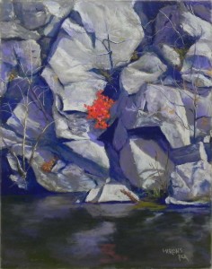
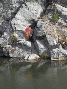
Here is the final picture (as of now).  While it may seem that I just copied the photo, there are several changes. There is a little green pine in the upper right (in the photo) that I decided to omit so that it wouldn’t compete with the red tree.  Also, the tree on the right, in the photo, has a lot of yelllow leaves on it. I thought they would also compete and only put in a slight suggestion of them.

I’m not sure if the red is too red? I used four different reds, including a pink and red orange.    But I like the abstract quality of the composition. And the water came out pretty good. A big, very ugly green Ludwig did a lot of it. But I couldn’t have it all be green, so I used red violet and some blue violet over that. The last thing was the reflection of the red tree in the water and bottom center.

Edges are really important and a potential problem in this image. There are a lot of hard edges, but then rocks DO have hard edges. I tried to keep the sharpest ones in the center leading to and from the tree and to keep those on the edges a little softer. One thing I did was to use cooler or slightly darker lights in the areas further from the middle.

It’s been a good day to stay in. And now my dark blue Girault is completely exhausted!  So it’s time to quit and move on to other things. But I’ve enjoyed working on rocks. Expect more to come!

Snowy Day Demo part 2

Red in the Middle, first stage of pastel application

Red in the Middle, first stage of pastel application

I’m stopping for lunch and decided this is a good time for a photo. I’ve worked primarily on the upper left and the large rock to the left of the red tree. I’m using a combination of violets, grayed violets, and warm neutrals, and a little grayed green. Using Giraults, Schminckes, and some Daler-Rowneys–whatever I can find that works! But I like the control of the Giraults best. Obviously, I’m adding more color than I’m seeing. May have to tone it down to get the affect I want. Not sure at this point. I’m holding off on the red tree until what is around it is complete.

While the surface is sanded, and not textured, I’m enjoying lightly brushing the pastel on it and layering colors. I’m adding small amounts of warm browns and oranges that I think are quite helpful.  Really enjoying this!

Snowy Day Demo

Reference photo

Red in the Middle, underpainting stage 1

Red in the Middle, underpainting stage 1

Red in the Middle, underpainting, stage 2

Red in the Middle, underpainting, stage 2

It’s snowing here all day and ending in the wonderful “wintry mix” so my class is cancelled and I’m painting in my home studio. Decided to do a “demo” using the blog all interested in watching.  Yesterday I finally found the pictures I took last Oct. from Great Falls and Wide Water on the C&O canal. (My computer is putting them in a strange place!).  I knew I had some great shots of the rocks at Wide Water and seeing the pictures was so exciting! I’m hoping to do a series of 11 x 14 paintings and this is the first.  I love the angularity of the rocks and the bright bit of red tree among all the gray and almost smack in the middle of the picture. I decided to leave it there and break the rules of composition!  Why not.

In this post, I’m showing the reference photo and two stages of the hard pastel underpainting–the first with four colors of hard pastels and the second after the alcohol has been applied. The surface is an 11 x 14 UART 400 board purchased from True Grit pastel panels (www.Frenchcanvas.com).  These are quite nice and come in many sizes, so if you like UART and working on a mounted surface, you might consider this source.

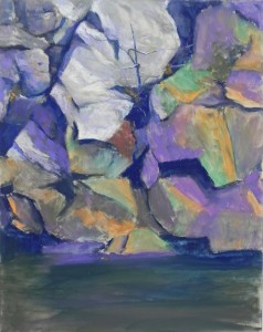
I’m limited in my hard pastels at home. Fortunately, I found a small piece of very dark blue (almost gone now!). I chose a violet and olive green for the mid darks, a brighter green and two shades of orange for the mid and light lights. I added a little aqua over this at the end. For the red tree, I used some reddish brown, not wanting to go to the red too soon.  I began with a pencil sketch on the paper, quite detailed. So I used the colors as a code for what’s what!  I lay the piece flat and used a very small rush to apply the alcohol, so as not to lose my shapes. I think the final underpainting is going to be quite helpful.  Because this is such a complicated picture, I decided to use a warm under warm, cool under cool approach so as not to get too confused.

The rocks are gray, but they have a greenish tint to them at Wide Water. I envision using grayed greens and violets but I want them to be subdued so that the little red tree really shines. I love the pattern of dark lines and shapes leading to it and need to be sure that that comes out in the painting.

Morning Walk in a French Village

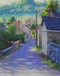
Morning Walk in a French Village, 20" x 16", Pastel Premiere 400

Morning Walk in a French Village, 20″ x 16″, Pastel Premiere 400

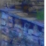
Detail of wall

Detail of wall

This is my latest painting. I began it on unmounted white 400 pastel premiere as an experiment. I want to do some new paintings for the Pastels en Perigord show since I am one of the jurors. I didn’t know whether I’d really like this one and decided to do it to have something to paint.  I used watercolor to begin with as an underpainting. It was too light AND it warped the paper. But I carried on. And I decided that I liked the surface and promptly ordered 5 mounted boards from ProArt Panels.  I’m including a detail from the wall at lower right. I added hard pastel and alcohol to the dark areas and loved working in this area. The grit of the paper is quite lovely and allows for very light brushing of color over the underpainting. I used 99% Giraults in this!  The only soft pastel is the salmon color in the roofs and lit grasses on the wall at left. I really enjoyed painting the background with a combination of warm and cool greens and blues.

This is the town of Crayssac, which is near Cahors in the valley of the Lot River. A very lovely area and no where near as touristy as the Dordogne. The morning and evening light in the town was really beautiful.

Lighthouse with Delphinium

Lighthouse with Delphiniums, 20" x 16", pastelbord

Lighthouse with Delphiniums, 20″ x 16″, pastelbord

Reference photo

Reference photo

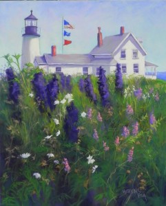
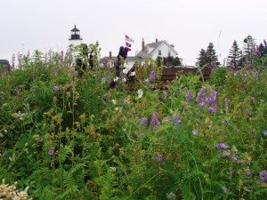
This is painting number five.  I’m including the original photo so you can see the changes I made. This is Pemaquid Light in Maine. I must have bent down in order to get the tops of the lighthouse and adjoining buildings with the delphiniums rising about it. I really liked the buildings, but knew that I wanted to make this a vertical to go with the others. So I had to make some compositional changes. I shortened the back building to the right of the lighthouse, and moved the lighthouse behind it.  Liked this much better. Then, I decided to show some of the water and lawn so as to provide some distance.  I removed the large brown structure that might be a raised garden bed.  But the key change was to make the sky blue and to add light and shadow to the painting!  This was not easy!  I used a picture of a lighthouse on Cape Cod that had light and shadow on it and went from there, adding it to the house and roof. Then, I decided that I really didn’t like the delphiniums the way they were in the photo, so I placed them more at random. I also removed the pine trees on the side of the house, moved the flag pole, a removed the dormer as well!  Hopper made changes; so can I!!!  But, you notice, I decided not to call it Pemaquid Light.

I did a watercolor underpainting on this one as well, using warm yellow green under sky and house and lots of dark greens below. I liked the pinks in the sweat peas.  The white flowers in the photo turned out to be petunias!  But I couldn’t have petunias in this location!  So I made them into something more generic.  I tried to place them strategically so as to lead the eye into the picture.

I looked at a lot of photos of Pemaquid Light on the internet. Not one of them was taken from this perspective with a flower garden. So I think this is somewhat unique!

Harbor Lace

Harbor Lace, 20" x 16", Pastelbord

Harbor Lace, 20″ x 16″, Pastelbord

Version 1

Version 1

Version 2

Version 2

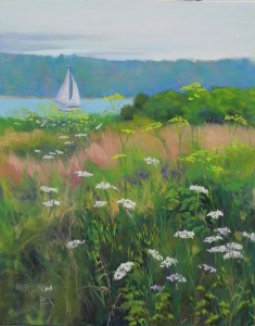
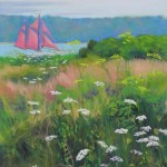
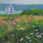
I got to the studio today and was able to finish off two more potential paintings for the Hamptons art fair.  This one was supposed to be the last painting in a series of 4, but I didn’t like the boat in the first version of the picture. I found another photo and did a fifth painting which I’ll post next.  This is Rockland, ME and there  is a red windjammer that sails there regularly. I took a photo of it in 2009 and thought it might make a good painting for this series. But the red in the photo was quite dull and I pushed it, then decided I didn’t like it.It looked hoakey to me!  So I brushed off the red and change it to white with shadows in violet (version 2).  I still didn’t like it. My neighbors at Washington ArtWorks really liked the foreground and felt it should be about that and not about the boat. I agreed. So today, I brushed off the entire boat and put in a much smaller, simpler sail boat.  I like the picture better now. But it’s probably my least favorite of the group.  I thought you might like to see the progression of this painting. It went from being about the boat to being about the Queen Anne’s lace in the foreground–which actually was a different flower!

Spring Walk in Kew

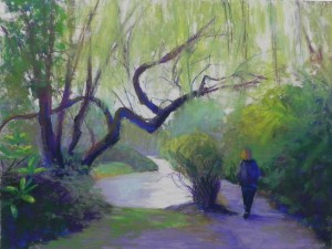
Spring Walk in Kew, 16" x 20", UART 400

Spring Walk in Kew, 16″ x 20″, UART 400

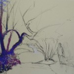
First application of pastel over graphite drawing

First application of pastel over graphite drawing

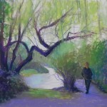
Painting after application of  workable fixative

Painting after application of workable fixative

Being snowed in, you never know what will happen!  John’s been going through old photos and came upon a stack of 4 x 6’s from our March 2005 trip to London.  One of the pictures is of me walking in Kew Gardens with hanging willows.  I really liked the picture and decided it would give me something different to do. There are many “different” things about this picture. First, of course, it has a figure, something I rarely include. Second, there is no wet underpainting.  And third, I got out pastels I haven’t used in a long time, such as Holbeins and Dailer-Rowneys.  Most of my hard pastels are in my public studio, but I wanted to work on UART.  So I decided to do a dry “underpainting” or at least to just begin directly with the harder pastels that I had and then spray it with workable fixative.  I discussed this form of painting in my Wednesday class last week. It’s something I don’t normally do because I won’t use the fixative at Washington ArtWorks.  But here I can open the doors and stick the painting out over the snow (trying to avoid the drips from the icicles!) and spray away.  Kind of stinky afterwards but it was a good time for a lunch break.

In addition to using different pastels, I used a rubber tip blender to smooth out some of the areas and get rid of the light specks, particularly in the lower left and right.  I used a lot of colors in the tree but I’m not sure how well it’s showing.  It was an overcast day but there was light on the left side of the figure, so I added warm colors to the left side of the branches.  The sky was done with two colors of very light Daler-Rowney, a violet and a cream. I bought a set of neutrals many years ago after they changed their format and I’ve hardly used them. They were quite soft on the UART, but I think of them as being a medium hard pastel, like Rembrandt.

This isn’t a great painting, (the figure and bush are too close in size, for one thing) but it was fun playing with different materials and techniques and remembering a visit that was 11 years ago. And, in the meantime, the plow came and our little court is now plowed and my new Subaru is ready and waiting to deal with the snow! Hoping that the Wed. class can go ahead.

Snowy Day Painting (Chincoteague Morning)

Chincoteague Morning, 20" x 24" Rives with AS liquid primer and oil wash

Chincoteague Morning, 20″ x 24″ Rives with AS liquid primer and oil wash

Oil wash underpainting

Oil wash underpainting

Partially painted with charcoal redrwaing

Partially painted with charcoal redrwaing

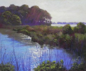
Hello Friends. We’ve have between 2 and 3 feet of snow here in Rockville, MD.  Yesterday I decided to try something a little different, given that I’d be working in my home studio.  I’ve been wanting to get back to the Rives again.  But I decided this time not to tone it and to try an oil wash underpainting instead.  I have oil paints that I bought some years ago and Gamsol.  I used a lot of Gamsol to avoid applying the oil too heavily that won’t dry.  The result was a rather subdued underpainting–not as lovely as I thought it might be. But it was OK.  I ended up using charcoal to redraw the clumps of grasses.  I made the decision to include the rays of sun coming over and through the trees, which showed up on the photo as a bright violet.  I thought it added some drama to to the picture and I loved the light sparkling on the water.

This is my second 20 x 24 from the “Marsh Walk” in Chincoteague. For the first one, I used a B&W photo and used a lot of warm colors. This time I decided to use the color photo and stick with the greens. But I added a lot of cool red magenta over the greens. At the end I added some orange into the grasses to liven it up a bit. The sky is a mishmash of blues, violets, aquas, with pink and yellow lights.

I expect to be stuck here for several days, missing my classes and exercise and eating like crazy!  I hope that those of you in the DC area are keeping warm and safe. If you do any painting, share it with me!