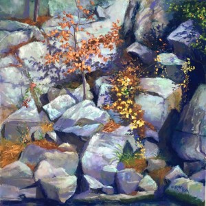
Orange on the Rocks

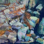
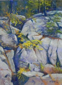
Orange on the Rocks, 16 x 16, UART 400

Orange on the Rocks, 16 x 16, UART 400

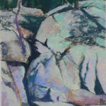
Partially painted, showing dry underpainting

Partially painted, showing dry underpainting

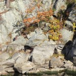
Reference photo

Reference photo

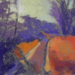
Happy Thanksgiving to everyone.  I finished clean up today, got a few Christmas things done, then went off to the studio to finish up a painting I’ve worked on this past week. It’s another rock portrait from Great Falls.  This is a very busy picture!  I wanted the focus to be on the small tree with orange leaves casting a shadow against the whitish rocks. There are a LOT of rocks in this one!  I’m including the reference photo as well, so you can see the original color.

I began this again with hard pastel over graphite and decided to spray rather than use alcohol. The original colors had a lot of aqua and blues in them. For the final, I used grayed violets, browns and greens.  I also made some compositional changes to play more with the dark crevices and the pattern of darks in the picture. The original photo was not a square, so I had to make some change at the top, where I had more room. I decided to use a small tree surrounded by orange leaves, rather than the thicker tree in the photo, which is surrounded by rocks.

From the initial image (partially done), you can see that I started out the cast shadow of the small tree in a lighter violet. I realized that it was too close in value to the leaves. So I darkened the shadow.  Then I added more darks to the leaves and more saturated strokes of a medium light Schmincke orange to make them standout. I had a challenge with the yellow leaves that are leading up the rocks to the right. At first I had them too bright and they detracted from the tree.  I tamed them down with yellow greens on top of the yellow.  I’m hoping that the oranges of the grasses and leaves also create a path through the picture, along with the darks. I used some finger smudging to try to lose hard edges but there is still alot of contrast, so I”m not sure how well the center of interest stands out.

I didn’t have quite the same tooth in this painting because the surface is 400 and not 320. But I still enjoyed layering color and coming up with something more colorful than the original.

The perfect surface???

Cascading Gold, 16 x 12, UART 320

Cascading Gold, 16 x 12, UART 320

I have just completed my first painting on UART 320. I ordered 11 x 14 and 12 x 16 boards from True Grit Pastel Panels and I am VERY pleased! First, I ordered them on Friday and they came on Saturday. Prior to this fall, the company only mounted 400 UART, but after talking to people at the PSA trade show, Robert Mogul decided to expand and cover all or most of the grits. He urged me to try the 320 and I did. I really, really like it!  Here is why: 1) it has wonderful tooth but without the patterning that is found in the 400; 2) it takes multiple layers of hard pastel without them falling off, including the really hard Caran d’ache.  So I’m hooked!

Underpainting and initial layers of hard pastel with fixative

Underpainting and initial layers of hard pastel with fixative

I began the picture with a graphite drawing and put a lot of effort into it. I then added the hard pastel and I realized that I didn’t want to lose the drawing or the color of the underpainting. So I decided to add alcohol only to the background and line of shadow moving down the rocks.  I took the board home and sprayed it with workable fixative.

I then took my time painting the rocks first, then the leaves. In the photo, the yellows were only in the middle of the picture. One of the last things I did was to add the splash of yellow at the bottom and it improved the composition tremendously!

I used many colors in the rocks, violet, blues, and a lot of light grayed greens, which is the actual color one sees due to the lichen on the rocks.  But I wanted the color to have more interest than what was in the photo.

I love doing these “rock portraits” particularly with the various colors of fall leaves. I have begun another and have two more that I may do.  It feels good right now to emerse myself in nature and art. I am mourning the death of Gwen Ifful, along with the recent election and trying to find joy again.

The True Grit panels are sold through the company French Canvas. I highly recommend them! Lots of different sizes and they don’t warp.

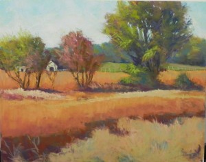
Autumn Fields

Autumn Fields, as initially painted

Autumn Fields, as initially painted

Dear Friends–It’s been a hard week!  I join millions of others in feeling devastated and worrying about the future of my country. However, I have decided to try to do good things for people and continue to live my life as an artist to the best of my abilities. So, with that in mind, I thought I’d share this recent painting and its ups and downs with you.

I started working on it several weeks ago. It’s a scene from Montgomery County and its soy bean fields.  I really wanted it to be painterly but I struggled with it. Initially, I was excited about a large yellow barn that was in one of the pictures. But I decided that the barn would fight with the tree for prominence and decided to add the small buildings from other photos.  I liked the fact that the foreground had several different plants in it and the way it was broken up, but I couldn’t get the color right.  So I brought it to a critique session with several of my friends.

They loved the tree on the left and the sky, but definitely not the reddish tree in the middle. Nor did they like the foreground.  One friend kept saying “you have your work cut out for you!”

Close up of sprayed area

Close up of sprayed area

I took the painting outside and brushed off the entire bottom and as much of the red tree as I could. Then I washed it with a sponge and sprayed it with workable fixative. One of my challenges was that this is pastelbord and it seemed to have no tooth (what happens when I use hard pastel instead of watercolor for the underpainting). I hoped that the spray would give the foreground some texture that I could play with.   So here is an image of part of the foreground after I added some pastel to it. You can see that the underpainting is coming through rather nicely.

I filled in the sky and background trees where the red tree had been and redid the shed, giving it a lighter roof and nice form. I was really happy with it!  But then I had to attack the middle, whose straight line of trees I’d been unhappy with.  I wanted to give it more interest, so I added bushes in front of the left hand trees, added small leaves and bushes, and worked on making the shapes more interesting.  I simplified the area of fields just below, then worked on the bottom part, adding more greens to the dark area and keeping the bottom simple and closer in value to the soy bean field, but making sure there were some darks and more individual strokes.

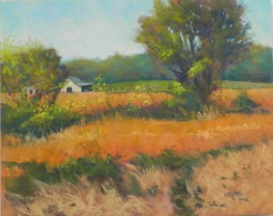
Soy Bean Fields, 16" x 20", Pastelbord

Soy Bean Fields, 16″ x 20″, Pastelbord

So here is the finished picture.  There is no evidence of the red tree and I think that the lines of dark work better, as does the foreground. I’m quite happy with this picture now. Not my greatest effort, but certainly something I’m OK with.

I wish you all peace and love and happy painting times and I sincerely hope that our blessed country will survive!

Autumn Shadows

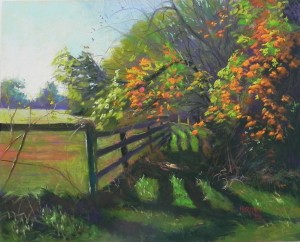
Autumn Shadows, 16" x 20", pastelbord

Autumn Shadows, 16″ x 20″, pastelbord

Charcoal and water lay-in

Charcoal and water lay-in

Hard pastel and alcohot underpainting

Hard pastel and alcohot underpainting

Today I did a demo for my Wednesday class. We discussed shadows briefly, and then discussed this painting, which is certainly all about the shadows.  I went for a drive in Montgomery County yesterday and got several shots that I liked, but was really taken with this one. If it looks familiar, it’s  the same group of trees that I painted in the spring for the paintings called “Spring Apples”.  I was particularly taken with the bright green grass with wavy fence shadows, and the brightness of the leaves against the more subdued background trees.  It was a beautiful, sun-filled day and I wanted to say that in the picture.

I began by using water-soluble graphite and charcoal on a 16 x 20 white pastelbord. As I have in the past, I chose to use a bright yellow green under the sky and I allowed some of it to show through. It provides such a sense of light!  I used some blue violet in the upper center, then greenish aquas in the sky to the left. The bottom of  the sky at left is my favorite Ludwig yellow.  I began with the distant trees and the field, which I toned down with pink. I liked having some of the orangy earth showing through as it ties to the oranges in the trees.  I began the distant trees on the right with greens in the underpainting so that I wouldn’t have to cover them up.  The distant trees were done quickly and lightly with various greens and violets. The foreground leaves were done with soft Schminckes and Great Americans, hitting the pastels against the board to create marks.

The distant path and shadows gave me some problems and i kept changing the value and the size of the shadow until I was happy with it. I began the dark shadows with a Unison dark violet and dark green, then brushed some lighter green over. In the left foreground, I added some warm brown to the shadow to give it more depth.

I was concerned about having two groups of orange leaves and liked the painting much better when I added leaves over the distant path and in the upper center.

This painting was more difficult than Monday’s, but having painted the subject before (although at a completely different time of year!), I felt like I had an idea of where to begin and how to make it work.

Long Shadows

Underpainting

Underpainting

Long Shadows, 12 x 16, UART 400

Long Shadows, 12 x 16, UART 400

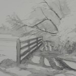
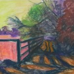
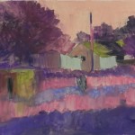
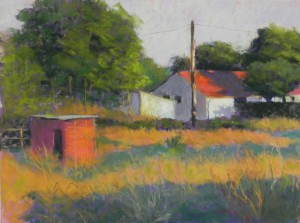
Today I did a second demo for my Monday class. I gave a brief lecture at the beginning on the different types of shadows: cast, half, and occulsion.  All are found in this image (sort of!), but the cast shadows are the main story. This is another painting from France. The morning light there was truly amazing and I’ll be doing another demo on Wed. based on a similar subject.  For this picture, I decided that the color scheme would be orange, violet and green. The photo was primarily orange and green but I wanted the violets to balance the warmth.  I began with a relatively cool underpainting of greens and violets, with orange in the sky. I used a cool red under the oranges, violet under the shadows, and cooler greens in the lit areas of the house. I really didn’t like the looks of this underpainting!  But it made me want to work quickly to cover it.

For the sky, I used a light violet, then a very whitish violet, then light yellow to give it a bit of glow.  I painted the large tree very quickly, trying to achieve the direction of the leaf clusters and adding in the trunks and branches at the end. The telephone pole was supposed to be an example of a “half shadow” –something that is partially in shadow and light. But I wasn’t sure that could be accurately achieved, so I just added light to the right sides in several places. The little building in the foreground was done very simply with a majenta on the left and red oranges on the right, and a cool violet on the top.  The shadows were a bit more troublesome, trying to get the color right. I started with a blue green, but didn’t like it and added violet, then green, then –who knows what!  They got better when I added the orange grasses over them.

This demo took 1 1/2 hours, followed by critique and discussion and a few changes.  Working quickly allowed me to keep the painting fresh and not overworked and I was pretty happy with it. By the way, the occlusion shadows are the dark shadows within the trees, just in case you didn’t know!

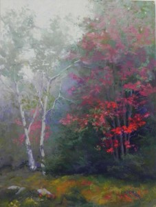
Red Emerging

Watercolor underpainting

Watercolor underpainting

Pastel applications before reds were added

Pastel applications before reds were added

Red Emerging, 16" x 12", mounted Pastel Premiere

Red Emerging, 16″ x 12″, mounted Pastel Premiere

It’s a very busy month of October, as it always seems to be.  But I had time over the past couple of days to do a painting from our trip to Vermont.  It’s really interesting that I was so happy to have sunny weather most of the time, but the best pictures came from the day with fog and no sun!  We drove to the top of Mt. Ascutney, which was completely enveloped in fog. As we were starting to drive down, I saw this red maple and stopped to get some photos.  I loved the way the fog was enveloping the top of the trees, but the reds at lower right were quite vibrant.  I knew right away that I would want to do a painting of this.

I took advantage of a mounted 12 x 16 sheet of white Pastel Premiere that Robert from French Canvas sent to me as a test. I had asked him if he would mount this surface, in addition to the UART.  I like his panels very much and find that they don’t warp like others have. (These are the “True Grit” pastel panels).  One of the advantages of having a mounted board was being able to do a watercolor underpainting. Given the lack of distinction in the picture, watercolor was a great way to start.  I’ve used it on unmounted premiere and it buckles, so I won’t do it again.

The painting posed some challenges. Compositionally, it is almost divided in half. I tried to remedy this by adding a fainter red to the lower left side behind the birches. I think that this helps carry the color around the picture (there wasn’t any red there).  When I first added the birch trees, they were fairly bright, as you can see in the half-painted picture. I needed to push them back so that the reds on the right would be the clear focus of the picture. I found the perfect color in one of the Blue Earth grayed turquoise pastels.

I was also worried about painting in the greens and putting the reds on over them, but it was actually quite easy and it kept the reds from being too much. Since they are in fog, they aren’t supposed to be really bright. I also used softer pastels, mainly Schminckes for the brightest pieces, along with Ludwigs and Girault.  The grayed Blue Earth quinacrodone red were also very useful.  For the background trees and foreground, I used various greens, Ludwig “eggplant” and lighter colors, but kept the values fairly close.  I changed the rocks at lower left from the original start to have three and trying to position them in an interesting way.

I really enjoyed doing this painting. It wasn’t about drawing but about “painting”!

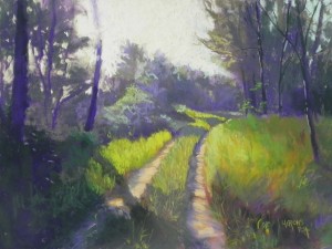
Sunny Path, St.-Aulaye

Sunny Path, St-Aulaye, 12" x 16", Pastel Premiere "Italian clay"

Sunny Path, St-Aulaye, 12″ x 16″, Pastel Premiere “Italian clay”

First application of pastel

First application of pastel

Here is Wednesday’s demo of a sunlit path down the road from our B&B in St.-Aulaye, France. It was a lovely morning and the light was quite beautiful.  I didn’t make any significant compositional changes to this picture until near the end, when I added the small tree on the right, which we all liked.

Since this picture is all green, I decided to start it using violets for the shady areas and oranges for the sunlit grasses.  I wasn’t sure how this was going to work but it turned out to be quite nice.  Some of the orange shows through on the right and gives the grasses more interest and depth.

This was an example of shooting into the sun and the sunlight almost wiping out the tree on the left!  The picture doesn’t quite show the sky correctly. I used an aqua on the right and brought some of it into the sky to the left of the trees at right back.  I used several yellows and a light orange in the center and left part of sky with the whitest Ludwig yellow directly behind the tree.

The most challenging part was the trees in center. I used various Unison grayed greens for the lit tops of the bushes and I changed the shape of the tree in the middle (you can see some of original tree shape in the initial layers. The trees at left have a lot of red violet in them, which worked well.

One of my students was having a problem with the shape of the grasses on the right and I added in the tree on a whim.  We were all surprised at how effective this was. It provides a triangle between it, the trees in rear right and the tree on the left.

I found this painting to be much more difficult than the one I did on Monday, perhaps because the shapes and values were so critical. But I had a lot of very useful help from my students!

September Light, Rockville

Reference photo

Reference photo

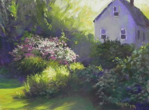
September Light, Rockville, pastel premiere Italian clay, 12" x 16"

September Light, Rockville, pastel premiere Italian clay, 12″ x 16″

I began teaching this week and have done two demonstrations that I will share with you in different posts.  Both were examples of “direct application of pastel on a toned surface” (as opposed to doing a wet underpainting).  Both were done on Pastel Premiere “Italian clay”, like the painting I did in August of the sunlit field.

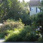
I am including the photographic reference so you can see the difference in the house!  I really didn’t like the house in the picture (too much like Rockville), so I substituted a simple house (more like New England).  My other change was at the bottom. Instead of a driveway, I made it lawn, and then brought the bush down to the bottom of the picture. I liked this composition much better.

I began by blocking out the darks using a Ludwig “eggplant” and the first thing I noticed was how much of it was falling off the paper!  This paper really doesn’t accept pastel very well, unless its really soft.  So I got into the soft pastels fairly soon and I think you can see that in the types of strokes.

Our focus this fall is on light and this picture is about the dramatic affect of the light coming from behind the house and to it’s right and streaming across the bush in foreground.  My first I used yellow greens and oranges to paint the trees nearest the sunlit sky.  My first thought was to use deep reds for the darks (because of the bush), but because I wasn’t doing a wet underpainting, I chose violet–always safer!  And for the house I used a mixture of violets and cool greens.

I tried to keep this painting loose and painterly, but I am not very happy with the flowered bush, which was one of the things I really liked in the photo. I think it is over done, and I’m tempted to brush it off and start over again!  What do you think?

Belfast & Moosehead Lake Railway

Hard pastel underpainting

Hard pastel underpainting

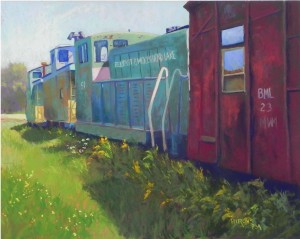
Belfast & Moosehead Lake Railway, 16" x 20", UART 400

Belfast & Moosehead Lake Railway, 16″ x 20″, UART 400

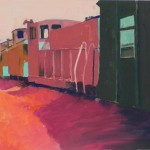
This is a painting from last summer’s trip to Maine. It’s one I’ve been wanting to do for some time. It’s a still life, as it’s about the rail cars with light and shadow on them.  I knew that I wanted to do an underpainting with warm under cool, etc., but I spent a lot of time on the drawing.  So I went to the local art store and bought much smaller brushes than I normally use to do the rail cars at the left.  This worked pretty well and I didn’t lose the drawing.

Colorwise, the painting was a challenge because of the large amount of red on the right.  Also the middle car with the lettering was not the same blue green as the first two cars, but actually a darker, truer green.  But I couldn’t find a color that worked (and I DO have a lot of pastels!) There are little bits of red in the left part of the train, a smoke tower and rust spots, but it’s still a lot of red on the right.  I did like the fact that there was a piece of pink in light and shadow, which also helps with the red, but I’m still not sure it is balanced enough.

I simplified the background, putting in some trees in violet, then some soft green over. And I added some very light yellow to the sky to give a dynamic quality to it.  But the real problem was the lettering!  It was really hard fitting all those letters in! I began by painting in the green in the upper part of the car, then put the letters in, resting my hand on the unpainted lower part. In the photo they are much more compact than this, but this was the best I could do.  Putting in the letters and numbers on the other cars was quite easy, by comparison.

The cars are sitting in a “railway museum” in Belfast, Maine–a field full of old train cars. I think that this is a happy, if nostalgic, picture.  And it was one I really enjoyed painting.

Georgetown Canal in Summer

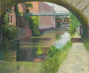
Georgetown Canal in Summer, 20" x 24", Pastel Premiere white

Georgetown Canal in Summer, 20″ x 24″, Pastel Premiere white

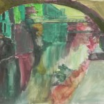
Underpainting

Underpainting

Last Tuesday, an artist friend and I met in Georgetown to find and film alleys.  And we DID do that. But on the way back, we did  a little walking on the canal, and it was the images from that walk that made me know I had to paint it–again!  You may recall that I did a series of six paintings from the first of January 2015. Because the light was so different, those pictures are all in blue/violet color palettes, whereas this one is definitely dominated by the greens and oranges of the buildings. As a result, this seems softer than the winter pictures.

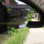
I used two photos, taken seconds apart, but very different in values.  The composition was developed from both of them and doesn’t match either as to the bridge.  In one the foreground was washed out; in the other the underside of the bridge was too black. So I used the lighter one primarily, but referred to the darker one for the foreground.

Photo reference 2

Photo reference 2

Photo reference 1

Photo reference 1

I did a basic drawing and redid it many times, trying to fit things in correctly. Then I did a hard pastel underpainting and lost a lot of it!  I’m thinking that maybe I should work on the Italian clay. But I do like the way the under color shows through on the premiere paper. It’s grittier than UART and is very nice for buildings, paths, etc.

Getting the reflections right was the most challenging part of the painting, particularly having the light and darker parts in right places!  I began with what was underneath, using darker values and vertical strokes. Then used a variety of Girault greens and grayed greens to brush over the water and give the light effects.  It didn’t really come alive, however, until the blue green was added into the sky and water. At first I had the sky all in pale orange; but then I added some blue to the left of the tower and it felt really right!  I had to up the value of it to make it come out in the photograph.

The path was also a potential problem as it was so one-dimensional in the photo. I began with dark colors, including a grayed blue, and let some of it show through when I added the warm tones, so that there is a pattern of dark leading into the picture.

One other challenge was that the paper wasn’t mounted, and, while I had it fairly well taped, it buckled everywhere. I will have my framer mount it from now one or buy it mounted from Dakota. (It’s too bad that True Grit Pastel Panels only come in UART.)

I will be having a show at the Dumbarton Church in Georgetown in mid-October, so I had an ulterior motive for doing this painting.  I’ll be showing my winter canal series and the three unsold alley pictures, and this one, along with smaller paintings. It’s Oct. 15, 6-8, followed by a concert of Italian madrigals!  If you are in the area, please come!