The Sentinel, Chincoteague

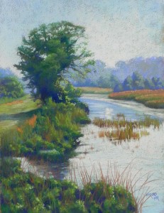
The Sentinel, Chincoteague, 24" x 18", Rives with liquid primer

The Sentinel, Chincoteague, 24″ x 18″, Rives with liquid primer

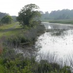
Cropped color photo reference

Cropped color photo reference

Over the last two days I was in the studio from 10:00-4:00 for our twice yearly open studios weekend. I decided to do yet another Chincoteague picture (probably the last!). For this one, I decided that I wanted to work on a prepared surface and I toned and brushed Colourfix liquid primer on Rives printmaking paper. I liked the way the surface allowed me to use soft pastels to create various textures.  As you can see, the color photo has very little color, so I printed it out in black and white and worked with a green/blue/orange color palette.  When I lightened the photo, I could see that there were orange grasses on the left and some orange in the grasses at right.

As is typical, the sky and water were completely whited out in the photo. I decided to add more blue green to the sky, then added a light cool green and Ludwig very light orange.  When doing the water, I added more blue greens into it to reflect the sky I had created, rather than what was in the photo.

The tree was a major challenge. It’s the most prominent feature of the picture and it was odd. I think that it had a vine on it that created a solid mass.  At first I drew the tree too large, then got it to a more reasonable size, and I was quite pleased with the way that it turned out–better than the photo, I think.

I particularly liked the path to the left of the tree and the distant trees in haze. I use Ludwig blues and Blue Earth grayed greens.  I actually used a lot of Blue Earth in this picture–most of the greens are from the green and turquoise sets. (I find that the “turquoise” is really just a cool green, which is very useful.)

The 24 by 18 shape is different from the wider reference photo and I much prefer it.  Compositionally, what I really liked was the “S” shape of the darks beginning in the foreground and moving up to the tree.

I very much enjoyed doing this painting.  And thanks Renata for the title!!!

Chincoteague #2

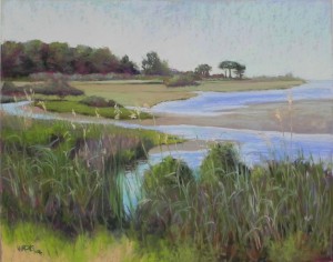
Chincoteague #2, 16 x 20, UART 320 mounted board

Chincoteague #2, 16 x 20, UART 320 mounted board

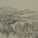
Charcoal lay-in with added graphite

Charcoal lay-in with added graphite

DSCN6410This is the second demo of the week, done in my studio.  It is a more detailed and quiet painting than the first and it took longer to complete.  The photo for this one was really boring!  I knew I was going to have to do something to make it more interesting. I decided initially on two things. One was to use a lot of reds and warm colors both in the underpainting and in the painting itself. The second was to add a red-winged blackbird in the reeds at lower left.

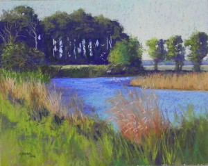
Having learned from Monday’s demo, I decided that this would be an all-hard pastel underpainting and I was quite pleased with the lovely colors!  I made an important change to the composition, by creating the triangle of water at the bottom left to help lead the eye into the picture. Otherwise, the composition is fairly close to the photo.  For the sky, I used a variety of aquas and cooler blues, then added a light green Unison and a pale red violet which warmed up the left side very nicely. For the background trees I used a combination of a deep red majenta and greens, starting fairly dark and working adding lighter greens, light cool reds, and oranges over top. I used grayed Unisons and Giraults for the background grasses and we all really liked the one piece of lighter grass that stands out near the middle of the picture in the background. Working down to the lower left grasses, I added the blackbird, but he didn’t last long!  Everyone agreed that he had to go. One person suggested putting him in the reeds above the right side, where he would have stood out more. But we decided against that as well.

For the foreground reeds, I lay in violet, reds, and oranges, then some green and used the sides of Giraults to work in the grasses, working from darker to lighter.  The last thing was to add the orange grass heads.  Following the class, I made more alterations to the background trees and changed the shape of the sand spit and water below.

I’m not sure that the photo is picking up the variety of colors in the trees and grasses. It was hard not going to the violets, but I had decided to work with a red and green palette, as much as possible and I liked the warmth that it produced.

So now, I’m going to look for perhaps yet another one from Chincoteague to work on for the upcoming Open Studios weekend at Artists and Makers. If you are in the vicinity, I hope you’ll come! March 4-5, 10-4, 12276 Wilkins Ave., studio 320.

Chincoteague #1

Chincoteague, #1, 16 x 20, UART 320 mounted board

Chincoteague, #1, 16 x 20, UART 320 mounted board

Charcoal lay-in brushed with water

Charcoal lay-in brushed with water

Underpainting with watercolor and hard pastel

Underpainting with watercolor and hard pastel

Color studies

Color studies

I did two demos this week and will be sharing them in two posts. I have no titles for these paintings yet!  So I’m calling them Chincoteague #1 and #2. If any of you have inspiration, let me know.  This one is the one I did in my Monday class. I’m sharing the initial lay-in, color studies, and the underpainting, along with the finished painting. The class focused on the decision-making process and I had a hand out with the types of decisions one makes. One of my statements was to be sure to allow the painting to speak to you during the painting process–this one did!  Several times!!!

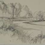
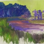
I began with a graphite drawing and two color studies. I decided to stick with the colors that were in the photo (color study above). Then I used charcoal to draw in the basic shapes. I used water and a brush to soften and set the charcoal and while doing this, I had the idea of making this into more of a vignette and leaving the bottom left corner unfinished.  In the class, I used watercolor for the sky and for the reeds and grasses at bottom. I used hard pastel and alcohol for the trees and water. It was kind of a mish-mash! Not the most impressive underpainting I’ve ever done!!!  I proceeded in painting the background trees, and the water and grasses a upper right. Then I tried to loosely put pastel in on the bottom. Pretty quickly it became obvious to all of us that this was not going to be a vignette! So I proceeded to paint in the lower left corner and the painting had much more unity.  After bringing it to my critique group on Tues., I adjusted a sky hole and the trees at right, but left the rest as it was.

Compositionally, this is pretty close to the photo with one exception. I decided to add white egrets in the water and rising into the air against the dark background trees.  This provides for a center of interest and the bright piece of yellow green field also draws the eye to that location. My original plan had been to eliminate the green tree where the egrets are. But when I did the lay-in, I realized that I needed something there. So I drew in a rather small bush. But as the painting progressed, it turned into a tree (just as it was in the photo).  I also made a change in the color of the water. In the photo there were dark pieces that reflected the green trees above. I decided to just add violet to the water in place of the green, which helped tie the water to the red violets in the trees. I also added a more aqua color to the water in the foreground. I did the water and then added the orange grasses on over, which worked pretty well.  The painting was completed in about 2 hours and I think it has the look of a painting that could have been done on sight.  I’m happy with it now, but will welcome comments.

Reservation Beach Light

Reservation Beach Light, 16 x 12, resurfaced pastelbord

Reservation Beach Light, 16 x 12, resurfaced pastelbord

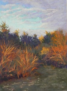
Here is another painting done on a resurfaced board. It’s from our December trip to Massachusetts.  The board was all gold and I decided that I needed to do a partial underpainting, so I used hard pastel to fill in the areas from the trees down and applied alcohol. It made it a lot easier to keep this area dark.  In the sky, I pretty much covered up the surface. But I liked working on the rough board, which made the bushes and sand in foreground quite easy to do.  I may do this larger and would make one change. There is a tree in the back between the gap in the dark trees that is about the same in size and color to the sunlit grasses just below it.  Something need to change here!  Otherwise, I was pretty happy with it.

Under a Gibbous Moon

Under a Gibbous Moon, 16" x 12" Pastelmat

Under a Gibbous Moon, 16″ x 12″ Pastelmat

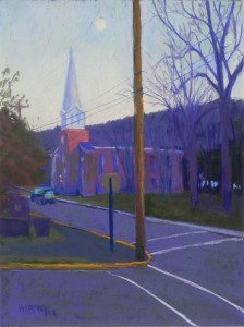
I painted in the studio on Sunday with two of my working students and I decided to paint from a cell phone image that I took in Bedford, PA last Nov. I loved the lines in it and the position of the church and moon.  I decided to use a sheet of the dark charcoal colored pastelmat (I get the pads and never use this color!). It was quite perfect for the subject.  In the photo, everything from the mountain down was a charcoal gray color. I made more hint of light on the church and used various violets, along with greens in the road, mountain, and foliage.  I wasn’t sure what to do about the trees, and thought I’d put them in first. But it wasn’t going to work. So I did the entire sky first, using various blues and light orange and yellow. The trees went on over quite easily but I tried not to overdo them. I added the car in the road and tried to give the sense of head and tale lights–not sure how successful that is. There was a car parked instead of moving that I used as a model.

I didn’t do any finger-blending–you really can’t with Pastelmat!  But I found that Ludwigs went on beautifully on the surface.

I’ve been teaching about surfaces and textures this week in my classes and it was fun to show the afternoon farm scene and this one as two paintings on very different surfaces and how well I thought each worked.

I’m back to using the resurfaced pastelbord for the painting I started today. Really DO prefer texture in most cases.

Twilight Farm

Twilight Farm, 16 x 20, resurfaced Pastelbord

Twilight Farm, 16 x 20, resurfaced Pastelbord

Board as it appeared after washing off and two coats of primer

Board as it appeared after washing off and two coats of primer

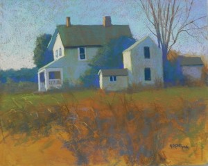
Sometime before Christmas, I got into a clean up mode and washed off or threw out a bunch of unframed paintings. This past weekend I resurfaced 10 of them with a gold-toned batch of Colourfix Liquid Primer.  One of them, in particular, really caught my eye.  It was a 16 x 20 demo on Pastelbord that I did back in 2012 for the Virginia Pastel Society. The photo was taken in the middle of the day and included snow on the ground and that is what I painted. However, when I washed it off and added the gold gel, I fell in love with the design of the houses and the blue greens of the underpainting against the golden gel that was pretty solid in areas that hadn’t been underpainting. What struck me was the relative darkness of it and the design of the buildings, which I loved (of course!)

I decided that this painting would be more of a late afternoon painting, perhaps from the fall, as the tree is bare. I didn’t have a photo to work with–only the board. I did a values study with markers, determining that the light would be hitting the left side of the three buildings, with the fourth at right totally in shadow. Also, when doing the values study, I decided not to finish the bottom and leave some of the gold surface just as it was.

Colorwise, I knew that I wanted to work with blue greens, blue violets, and ocher/earth tones and I pretty much kept to that. Beginning with the sky, I used blue violet and blue green Ludwigs, darker on the right and lighter on the left. At the bottom of the sky on left, I used a Ludwig pale orange.  I used various dark blue greens and some blue violet in the dark bushes (I decided these must be evergreen, as the tree was bare!)

For the house and buildings,  I combined an ocher, a blue green, and a blue violet and laryered them, ending with the violet. I used a pale bright yellow in the sunlit areas, trying to make the house front the main attraction.  For the area around the buildings, I quickly brushed on two shades of green, with light in the front (and on the left side of the bushes). I roughly added bare bushes around the buildings. Then, I rather quickly added the foreground. At first I had a strip at the bottom, smack in the middle, so I extended it to the right, so that the bare patches of gold would not be the same.  And I decided it was done! It took me maybe 3 hours and I loved every minute of it!  I DO love working on this kind of surface. I particularly loved the way the gold showed through in the sky, making it sparkle.

I may even have a buyer for it!!!  But that’s not so important right now as knowing that I was able to rescue a board and make something much better out of it. It gave me a real feeling of satisfaction.  I have to admit that I prefer Pastelbord resurfaced than on it’s own!

As a postscript, I have to tell you a funny story. In Jan. John and I hosted our court neighbors for an open house. A Russian couple, who have lived here 12 years but we had never met, came with their 10 year old son. It turns out that the husband is from an art dealing background and knows a lot about art. AND–it also turns out that some years back a bag of my thrown-out paintings blew out of the garbage can and onto his front yard, and my paintings have been gracing his son’s walls for years without him having any idea who had done them!!!  You just never know!!!


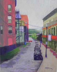
Back Street, Bellows Falls

Back Street, Bellows Falls, 20" x 16", UART 320

Back Street, Bellows Falls, 20″ x 16″, UART 320

Happy New Years (I think!)  Not sure what the coming year will be like, but at least I can spend a good part of it painting with my friends.  I recently spent time in the studio prior to beginning classes this week. Actually, I spent innauguration day in the studio doing the underpainting for this!  I decided that I needed bright cheery colors and I had two new sets of Caran d’ache hard pastel “cubes” so I used them almost exclusively for the underpainting.

A neighbor came in after I had completed the underpainting and told me I should stop right there and not do anything else. But, of course, I couldn’t do that! But I tried to keep the happy feeling of the place, even though it was an overcast day.  I also was trying to make this painting a little more stylized and not quite so real. I kept the buildings and fire escape on the left fairly simple, but had to add a lot of detail on the right. I also worked at keeping the cars blocky and undetailed.

I brought the picture to a critique session and the original photo blew away!  Then I realized that I hadn’t added the wires, which I really liked in the photo, as they connected the two buildings. So I added them with no reference. They might be a little low, but I think they work (???)

The color palate is pretty much red, green and violate with a few more neutral colors. I started with a lot of violet in the sky, then added more light yellow and orange to the bottom to brighten it up. I kind of liked the flat orange, but …

Any comments will be greatly received!

Underpainting

Underpainting

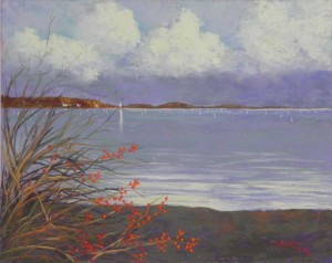
Bittersweet

Bittersweet, 16" x 20", UART 320

Bittersweet, 16″ x 20″, UART 320

Toned board

Toned board

Painting before adding the branches

Painting before adding the branches

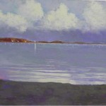
Having spent yesterday cleaning out closets and getting the guest room presentable for visitors coming for the Women’s March, today I felt that I could spend the day in my studio. I printed out a picture I took of Mattapoisett harbor last Thursday just after the rain had stopped. It was quite dramatic and I had a great time doing it. Got to use one of my new True Grit UART 320 16 x 20 panels and really liked it for something other than rocks!

I wasn’t sure what I was going to do about an underpainting and decided to tone the surface with watercolor. I used a cobalt magenta, two coats that gave a nice color to the surface.  I had hoped to leave more showing through but I think there is some in the clouds. This painting had so little drawing in it, I found it easier, to just tone the paper, then lightly draw on the horizon, clouds and land forms with graphite.  I made one compositional change, leaving out a large rock on the right hand side. I wasn’t sure that it added anything.

I found that the 320 surface worked very nicely for the clouds and the water. The added texture was quite lovely. I started the sky with blues and blue greens on the top, then went to a violet Girault for the area below the clouds. Over this I added one of the very grayed “turquoise” Blue Earth pastels, which helped approximate the colors I was seeing–a really greenish violet. I used the same colors in the water. I used a darker violet and green under the clouds in the middle to right, then went over them with the lighter violet. I wanted to give a subtle sense of the darkness not being all the same.

For the sand at bottom (dark, wet sand), I started with a darker violet, then went over it with three values of a very grayed Schmincke brownish green.

My biggest challenge was with the color of the clouds. In the photo, they were darker with more orange-yellow in them but I didn’t like this when I tried it, so I decided to stay with the lighter yellows. I used a combination of light violet and cool greens in the shadow areas.

The bushes were added after the water and sand had been completed. I used two different reds for the berries with highlights or orange. Picking bittersweet for the house is something I remember from my early days of living on Mattapoisett Neck, so its has a special significance to me.

It was nice to do the lighthouse as just a tiny big of yellow white with a long reflection. Because of the gray around it, it really stands out, even though tiny.

So this is my last painting for 2016. I am not particularly looking forward to 2017, given the state of affairs. However, I hope that we can continue to paint and that the economy won’t tank anytime too soon!!!  My best to you all for the new year, whatever it brings us.

Rock Study in Orange and Violet

Rock Study in Orange and Violet, 14" x 11", UART 320

Rock Study in Orange and Violet, 14″ x 11″, UART 320

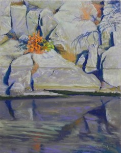
A very cold and windy day today so I chose to spend in the studio. I revised one picture and completed another.  This one is on the 320 UART and I really wanted to do it, but have been distracted with December events!   I had drawn in the composition with graphite and decided to just work directly on the picture with no underpainting. I used a combination of light violet, green and brownish green hard pastels, along with some Giraults. I intended to just start with these, but I realized that this was the painting!  I really didn’t want to use softer pastels on the rocks, but I used Schminckes in the orange bush to make it come alive.  In the photo there was an orange tuft of grass to the left of the little bush. I put it in, then took it out and moved it to the upper right. It was a real distraction next to the bush. What I loveded about the composition was the way all of the dark crevices in the rocks lead to the bush! And the shadow of the branch at righ is also leading to it. AND–the bush is not right in the middle!

I worked quite slowly and detailed on on the top, but the darker bottom water reflections went fairly quickly. I started with the grayed violets that I saw in the photo, then brushed a more colorful violet over it and the painting came alive!

I began the painting with a hard dark blue NuPastel, putting in all of the dark lines/crevices. It gave me a sense of the flow of the picture. Not sure about the serpentine shape at right but I didn’t want to make too many changes because of the reflections.

I was really happy with this picture, in its color, the balance of dark and light, and the positioning of the bush and the way it stands out.

That’s it for rocks for awhile!  Now on to snow or rain or something different!

Happy holidays to all of you. We will be driving to Mass. on Wed. and returning a week later. It’s nice that Christmas and Channukah coincide this year.  If you are in the DC area, I strongly recommend visiting the newly re-opened East Wing of the National Gallery. Went there yesterday and saw the wonderful blue rooster on the roof terrace between the two new towers. It’s really great, as are the two galleries on the first floor.

Abandoned Mill, Springfield, VT

Abandoned Mill, Springfield, VT, 20" x 24", pastelmat

Abandoned Mill, Springfield, VT, 20″ x 24″, pastelmat

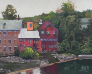
Today I finished working on a painting that I began some weeks ago. It’s from our Sept. trip to Vermont and I loved the photo and spent a lot of time on the drawing. However, I decided to do it on brown Pastelmat, which I hadn’t worked on in some time, and I found it kind of frustrating.  I got back to it this week and realized that I could do a good job with it and just did it!  It was not having an underpainting that bothered me, as I love to do buildings over underpaintings. By working straight from the drawing to the painting, I felt a little like I was coloring in the lines!

The picture was taken the same dreary day that I took the picture of the fog on Mt. Ascutney. Got the best pictures that day!  At this point, it was gray with no sun, but not raining. I took a lot of pictures of this mill complex from various points of view and chose this one. I like the way the green foliage and its reflection in the water kind of nestles the buildings.

I used dark violet and some green to begin with under the two red buildings to keep the reds from being too bright. (The digital photography of this is always a problem and i had to adjust the photo as the orange and red were really jumping off the page!Now it appears a little too dark.) I saw this as a red/green complementary painting and used a pale green and pink in the sky.

My first problem, and the reason I stopped working on it, was that the metal roof in the middle was way too bright when I first did it (copying the photo too closely). I tried to brush off as much as possible, which isn’t easy on Pastelmat, and gradually added slightly darker greens and violets into it, until I was happier with it. Adding the same color of light green into the top of the dam (at right) helped bring the color around. I also used similar colors in the roof at left and the hidden house at right. I omitted a large building behind the red building at right that looks like a school. But most other things are pretty much as I saw them. I adjusted the large tree on the right to go off the top of the page, and brought some oranges around it to bring that color into other parts of the painting.

I wanted to come up with a really great title for this but couldn’t think of anything. It reminds me of the great days of manufacturing in the 19th and early 20th century in New England (not that I was around).  So it’s rather a poignant and timely reminder of what we have lost. I hope that these buildings are or will be used for something else.  Meanwhile, perhaps I’ll start a series of old mill paintings! There are plenty of them in my home area around New Bedford and Fall River. Beautiful old stone and brick buildings that were hell to work in!