Report from IAPS 2017 pt. 1, demos

Hello Friends,

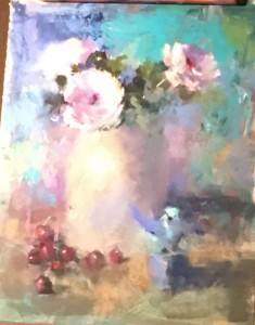
Still life by MIke Beeman, 20 x 16

Still life by Mike Beeman, 20 x 16

I’m back from a trip to Albuquerque to the 2017 IAPS (International Association of Pastel Societies) Convention and a few extra days in Santa Fe. My good friend and fellow pastelist, Sunny Alsup, was there with me–her first time.  I’ve been to every conference since 2003 (it’s biennial).  I’m thinking this may be my last, so it was rather a bittersweet experience for me. I want to share with you my impressions of the 5 demos I attended and news of new products from the trade show–always a hightlight of the conference (I’ll add this in a separate post).  I attended demos with: Mike Beeman (still life), Tony Allain (landscape), Casey Klahn (abstract), Colette Odya Smith (landscape) and Dawn Emerson (abstracted animals).  4 of the 5 were well worth being at. I was very disappointed with the Klahn demo and didn’t care for his attitude or demo. So be it!  I loved the others!!!  Mike Beeman is a friend and a wonderful artist who is a master at losing edges. His paintings are primarily still life and small birds.  He noted that years ago he NEVER would have considered painting flowers, still life, or birds!  Consider that he lives in Cheyenne, Wyoming and is a very western looking fellow!  My main interest in the demo was to find out how he was so good at losing edges. He worked on gatorboard using inexpensive acrylic paints to create a very loose underpainting for a still life with a jug and flowers. He then covered that with clear Golden gel to give it texture.  He worked over it with pastel, keeping the drawing at a minimum and developing the shapes more than the lines.  I was very inspired by this!  He also did a LOT of finger blending. Some with insulation pipe, others with his little finger, but it was a major tool for him in softening the pastel.  (As someone who rarely blends, I found this quite interesting.)

My photo is poor, due to the lights and angle of the painting, but perhaps you can get the idea. The main subjects were the flower in middle and grapes at bottom, and the head of the small bird sculpture.  I was quite intrigued with this, and I have acrylic paint, and I just might try this!

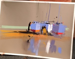
The next day I watched the Cornwall artist Tony Allain give a demo. I had met him at the previous IAPS, then again last summer in the Perigord, where he was the featured artist at the Pastels en Perigord Salon. His work is very bold and direct. He works on Colourfix toned with warm browns or grays and makes great use of the paper. In the two hour demo he did 4 large paintings! I only have a photo of one as the lights made it very difficult to film.  In this painting you can see that he left the paper at the top and bottom and used minimal strokes to represent the boats. He says he has too little time left to get into detail!  He began the painting using a large marker to put in the dark shapes that you see, including the people in the center. He then used single strokes of pastel to indicate the light and shadow. I thought his last painting was the most amazing, as he painted a lake in New Zealand with a background of rock and snow. The contrast of blue violet snow and gorgeous aqua/turquoise water and yellow snow was quite amazing.  Alas, this is not who I am. But I do admire it!

Painting of boats by Tony Allain

Painting of boats by Tony Allain

I took no pictures at the Klahn demo. He gave no thought to his composition and little to his color scheme and both Sunny and I thought it was rather a waste of time and money (I’m being very honest here!) If you like him, that’s fine.

Next there was Colette, a personal friend, and the artist most like me. Alas, my photos of her work don’t look like much. She is from Wisconsin and paints detailed paintings of close up views of streams. She showed us photos and how she cut them down, then presented a beautiful underpainting, very carefully done with watercolor. She works on museum board with Golden gel, adding the watercolor over the gel. This is a lovely surface and great if you want a thick, soft surface in whatever size you want. She spent 1.5 hours on the underpainting (prior to the conference) and I was quite impressed and understood why she didn’t try to do it in front of us. And she didn’t finish the painting either, but she shared so much. It was a lovely demo. I related to everything she said.


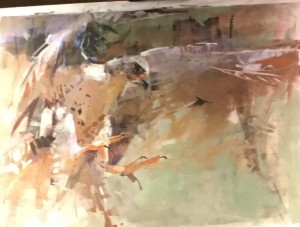
Painting of Swainson's Hawk by Dawn Emerson

Painting of Swainson’s Hawk by Dawn Emerson

And finally, there was Dawn Emerson.  I’ve seen her abstracted paintings for years but knew very little about her. Sunny and I were both there and at first we weren’t sure what to make of her. She is very much her own person and quite bold! She did two demos. She likes to use multiple types of media, not worrying much whether the result is a “pastel” or “multi-media” painting.  She particularly likes brayers!  She had two large tables full of materials, many of which she didn’t use.  The first demo began with a black ink monoprint of ravens (she used to have 5 of them and you could tell how much she loved them.)  She used pan pastel while dancing to music, putting on individual strokes with wide arm gestures.  Then she did another demo of a hawk directly on white paper. My photo doesn’t do justice to it, but perhaps you can get the idea. She was working from a photo of a hawk sitting on someone’s arm with trees behind. (It was at a center in Bend, OR that I have visited as we have a friend who works there!) She focused on the basic gesture of the head and wings and used pastel with a wide “pastel smoother”, ink with a brayer, pan pastel, and all kinds of pastels to gesturally develop the painting, all the while dancing to music!  It might have been kitchy, but it wasn’t. It was a very moving experience that we all felt and she sold the painting, not surprisingly.  I had great respect for her.  One of the most impressive parts is that she used no lines for the hawk, instead developing the shape of the wings by cutting in with the background colors. She really reduced the wing on right to just a gesture, as you can see, focusing on the face and eye and adding the talons in gestural strokes. I thought her painting was a very emotional reaction to the beauty of the hawk and I was greatly impressed with her ability to express it so freely.  It was a great way to end the demos.

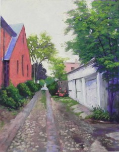
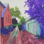
Cobblestone Alley

Cobblestone Alley, 20 x 16, UART 400

Cobblestone Alley, 20 x 16, UART 400

Underpainting with alcohol

Underpainting with alcohol

I spent a lovely day at the studio today while my car was being serviced.  Took the picture of the underpainting that I forgot last week, then worked on the painting most of the day.  I spent time at the beginning correcting the drawing of the church on the left and I was happy with it when it was done. Also made sure that the garage looked right, shortening it, and extending the roof up on the right side.  For the sky, I used a light orange to begin with, then later went back with the lightest Ludwig violet and yellow. I thought it was looking too one-dimensional and the violet helped (but I doubt that you can see it in the photo).

My Blue Earth pastels really came in handy in this picture. The tree at right is almost all the green set, and the street is mainly the warm neutrals, along with some blue and pink Giraults.

My husband suggested adding a bush in front of the wooden fence and I put in a rose bush with flowers that pick up the reds on the left.  I like to think that I would have thought of this myself, however, I want to give him credit.  (He once read a whole book on composition so as to better give me comments!)  The last thing that I changed was the building in the distance on the right. I had made it green, as it was in the photo. But I decided that reddish brick would be better to help balance the large amount of it on the left. I used a soft pastel and used it right over the soft greens that were there, which helped dull it.  I think that the picture hangs together better with it and it ties together with the rose bush as well.

I was a little intimidated by the idea of indicating both brick and cobblestones in the foreground, but it really wasn’t so hard. I used browns and violets to fill in the area first, then the lighter Blue Earth neutrals to make the stones.  I didn’t want to over do it, but I think that it’s obvious what it is and it’s much more interesting than the newly paved alley up the street!

I won’t be painting much this month. I’ll be off to the pastel convention in Albuquerque (IAPS) next Tues. and coming back on June 14. Then I leave for Mass. on the 19th where I’ll be bringing paintings to galleries, giving a one day workshop, AND celebrating my mother’s 98th birthday!!!  We have looooong genes in my family!

Tips on Underpaintings

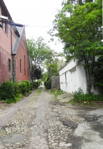
Photo reference

Photo reference

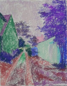
Cobblestone Alley, Underpainting, stage 1

Cobblestone Alley, Underpainting, stage 1

I spent a couple hours at the studio today working on the underpainting for a new alley picture that I drew yesterday.  While I was doing the underpainting, I thought about yesterday’s class with some new students and their questions about underpaintings–and all the questions I keep getting from my regulars!  So I thought I’d do a post with just an underpainting and really focus the discussion on that.  I took a photo before applying the alcohol, but unfortunately, got into a conversation and forgot to film it after the alcohol!  But perhaps its easier to see the color choices and amounts of pastel applied from the un-alcoholed version anyway.

I’m giving you the original color photo as well, so you can see what I was working from. I also printed out a B&W version, which I found quite inspiring.

So first, about the photo. On Tues., I had a date to meet friends at the Library of Congress and left early to take photos of alleys. Unfortunately, it was an overcast day with no interesting light at all.  But I found this alley, that I really liked and know that I’ll go back to. I liked this photo because of the richness of darks and lights and thought I could do something with it.  I was thinking of making it into an 18 x 24 but it wouldn’t work.  So I am now working on a 16 x 20 board of mounted UART 400.

The first concern that I often hear from students is:  why spend time on the drawing and then lose it in the underpainting?  This is a legitimate question, for sure. I spent a lot of time on the drawing yesterday and I didn’t stop until I was satisfied with the overall layout of the picture.  Once I have the basic shapes where I want them, it doesn’t matter whether I lose some detail. And, over time, I’ve learned not to even draw in the detail to begin with. For instance, you’ll see that I haven’t added the windows into the church or any detail into the white garage.  Also, my only concern with drawing in the foreground was the overall shapes of the brick vs. cobblestone areas and the lines. When I began, I focused first on the end of the alley and where that would be on the paper. I didn’t want it in the middle, and I wanted more space on the right and less on the left.

Once I’ve done the underpainting, I find it easier to see things that aren’t quite right and correct them. For instance, the roof on the garage is not steep enough, and I think the building needs more foreshortening.  I can correct this easily with a hard pastel.  I also don’t think that the church is quite right, but part of the problem with it is the angle of the photograph. However, I can draw over the completed underpainting, and do more underpainting, if I feel it’s necessary.  Remember that pastel is a very forgiving medium!

Another advantage to doing the underpainting is that it allows me to begin rather intuitively and quickly, not worrying about perfection.  Once I have color down, then I can focus on the level of perfection that I want to achieve.

Color choices.  It was the color choices that I started thinking about while doing this.  It’s the hardest thing for new people to grasp. I tell them that it doesn’t matter what color you use as long as you don’t begin too lightly.  Having worked for over 20 years in pastel, I know that my color choices are very intuitive, based on experience and what appeals to me at the moment.  In this picture, you’ll see a wide gamut of selections!  So I thought I’d try to explain them.  First, the sky,  I used two pastels: a light violet and a lighter whitish orange. The sky is white in the photo and it was pretty gray when I took the photo. But i still see light there, and I think I’ll want to use a warm neutral of some sort (e.g., beige, cream) for the overcolor. So I decided to start with a cooler violet, that would also tie to the violets in the trees and shrubs.  I could have used almost any color here, but I like working lighter over darker and warmer over cooler, so this should work. (I often use orange under a blue sky–warm under cool).

For the trees, I’ve used several values of violet and red violet. There is very little light on them and I didn’t want to get into the areas of light and dark in the large tree at right. So I kept them simple. I almost never use green under green, but I did use a little dark green in the bushes, and went with greens for the very small distant trees at the end of the alley. These are small details that are easier to see if the local color has been applied. For the brick building, I’ve used the complement: green under what will be red brick. This always works for me.  For the white garage, I wanted something darker and cooler than what I’ll end up with. And adding the green to the building might help tie the two buildings together (in the underpainting at least!), given their differences.  (I’m sure I went for the green because of the green on the left.)

I know that the foreground is going to be the real challenge in this picture. Unfortunately, I don’t have a textured, hand-made surface, which would make it easier.  So I wanted to begin with some richer, darker color, over which I’ll apply neutral browns and grayed violets.

The underpainting, once the alcohol was applied is darker than what you are seeing and the shapes are quite well defined. Sorry I forgot the photo!  But I hope that this will be helpful to some of you who are struggling to figure out why and how to do an underpainting and what colors to apply. I could have used a completely different palette and still come out with a successful painting, but I tend to go with the solutions that I know will work. For those new to this, it’s a matter of trial and error. Just remember to think value first, temperature second!

Doing underpaintings provides a chance to be a little free at the beginning before getting down to the more serious work!  So enjoy it!!!

A happy Memorial Day weekend to you all.

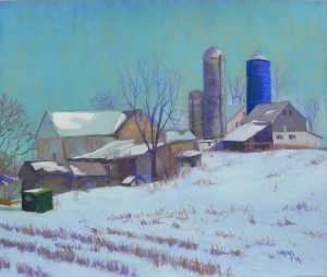
Amish Farm Revisited

Amish Farm Revisited, 20 x 24, Pastel Premiere Italian clay

Amish Farm Revisited, 20 x 24, Pastel Premiere Italian clay

I used to pride myself at being a seasonal painter. But lately, I’ve been painting whatever I wanted to in my studio and this is the latest painting–more snow!  It’s from a photo I shot from the car in Dec. 2013 on the way to Mass.  Some of you might remember seeing my earlier painting (I actually did two).  I was in an abstract mood at the time and I exaggerated the hill and worked from black and white, putting in lots of colors that weren’t there.  I also did both paintings on Reeves, so they had a much more textured broken color look to them.  Recently, I was going through photos and came across it in color and B&W and I decided that I really loved the original (real) version of the scene and that I should paint that.

I would have done an underpainting but I didn’t have any mounted light paper in 20 x 24, so I used a sheet of Pastel Premiere Italian clay. I liked the idea of working directly over the drawing.  The challenge for me was the coloring.  At the time, I remember that the sky was infused with yellow light. It was probably 10-10:30 in the morning on a winter’s day and the light was quite amazing.  I loved the fact that the sky was darker than the snow, but that the snow had lots of corn popping up in it.  So composition wasn’t an issue, but color was. I cut a small piece of the same paper and did some studies for the sky. I started with Ludwigs and immediately put them down–too soft!  I didn’t want the sky to look cakey. I went to Girault instead (of course!).  I worked with several blues, blue greens, and a wonderful grayed yellow green that brought the sense of yellow into the sky that I remembered. It’s not exact, of course, but I like the effect of it. I decided to make it pretty much the same all over, but did lighten the bottom a little on the right.

One of the color aspects that I really liked in the photo were the dark green building on the lower left and the solid blue silo on the right, both in about the same value and solidness of color.  After completing everything, I added some of the blue to the dark green, and some of the green to the dark parts of sheds going up the hill. It helped tie them together, and added more dimension to the shadows. I used Giraults exclusively for the buildings. But when I got to the snow, I instinctively went for the Ludwigs. I began with a blue violet, then two blue greens on top. They seemed perfect for the snow, which has more mass than the sky. I used hard pastels for the corn and the tree branches against the sky.

I wasn’t sure about this picture when I began it, because I really DO love working over underpaintings. But now I’m quite happy with it. And even though I worked from the photo, it’s still not all that realistic!  I mean, who has ever seen a sky this color!!!  But I really like it.

Playing in the Studio

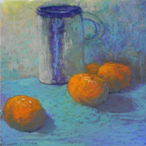
Mug with Clementines (by me)  12 x 12 Multi-media pastel board

Mug with Clementines (by me) 12 x 12 Multi-media pastel board

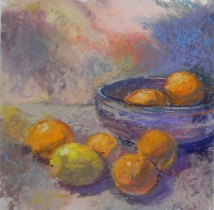
Still life by Sarah Miquelle, 12 x 12

Still life by Sarah Brown, 12 x 12

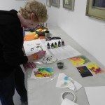
It’s been rather cold, wet and miserable for the past few days and my artist friend  Sarah (Brown) Miquelle is here from Massachuetts. After several days of museums, we decided that a day of playing in the studio would be just the thing!  We went to the local art store and bought some colored inks, which I had decided to try for toning boards. (I promised my class that I would try out something new). I bought 5 bottles of Liquitex and Daler-Rowney inks, some of which are irredescent.  I brought some small boards and 12 x 12 Multi-media pastel board–the very thin, rather textured boards.  I first tried using straight ink, but it was too thick and I decided I’d better use water. That worked better, particularly with a hair dryer. But I needed two coats and even then it dried very lightly.  I wasn’t overwhelmed with the possibilities, I have to say!!!

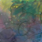
However, we both did a 12 x 12 painting from some pottery and fruit.  I began mine with a drawing using a Girault. I didn’t really set up a composition, we just had the bowl, mug and fruit sitting there!  My initial composition included two large lemons and several of the clementines.  As I worked on the painting, both Sarah and I agreed that the mug was too small. So I enlarged it.  Then I got rid of the lemons and replaced them with clementines. I liked it much better. Sarah was better at leaving her painting loose with more of the ink tone showing.  I started using irridescent pastels–Schminckes, Senneliers, and Great Americans–all soft!  It was nice because they covered up the texture of the board and it was quite sensual, actually!   I may have overdone it, but I really had fun using them.  I’ve only left a little of the undertoning showing in the upper part of the painting.  There were no real shadows (too much light in the studio), so I basically had to make them up.

It was really fun working with surfaces and pastels that have been hanging around my studio for years and a new medium of colored ink.  I wouldn’t suggest that you rush out and buy the ink, however.  Watered down liquid acrylic or gouache are just as good, if not better.

I have one sad piece of news to report. Robert Mogul wrote to tell me that he is no longer producing the True Grit Pastel Panels which I have been using. I’ve really enjoyed using these–mounted UART on Gatorfoam.  I have a lot of gatorfoam still, so I may have my framer produce some boards for me.  But I’m sorry to hear that Robert couldn’t make a go of it.

Sarah applying ink to a board

Sarah applying ink to a board

My initial drawing on toned board

My initial drawing on toned board

Blue Green Alley

Blue Green Alley, 16" x 12", UART 320

Blue Green Alley, 16″ x 12″, UART 320

Color Study on Canson

Color Study on Canson

Underpainting

Underpainting

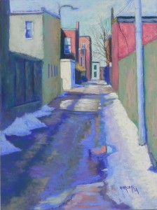
Today I finished a painting I started several weeks ago. It’s a small alley picture (16 x 12 as opposed to 24 x 20).  I had the board and a picture from Feb. 2015 that I liked so decided to do another alley.  It was not easy working with so much detail so small!  I liked the composition and didn’t bother to do a comp. study (I am getting lazy).  I wanted the sunlit building on left middle to be the center of interest, with the window above it.  For that reason, I did not make the building to the left of it as light or white as it appeared in the photo.  But the colors were an issue. Much of the original photo (buildings in left foreground and fence on right) were all gray, brown, white–boring!  So I did a color study.  I wasn’t real happy with it.

When I went to do the underpainting, I picked up blues, blue greens and violets, and bronze Caran d’ache hard pastels and I really had a good time doing the underpainting. Loved it! I decided that the color palette would be oranges (buildings) with blue green and blue violet (a split complement).  I brought my box of Terry Ludwig “vibrants” to the studio for the brick buildings and ended up using a lot of his blues for the sky and road.  What turned out to be particularly useful were the grays in the box of “cerulean” Blue Earth pastels. They were odd greens that worked really nicely in the road where it was covered in ice.

But I’m not sure that my plan for the color really worked out. It’s really more red, green and blue violet. Ah well!  I’m happy with it.

The road, of course, was the real challenge.  I used a variety of violets, blues, blue greens, and odd browns.  I loved the puddle and the sunlit part in foreground that showed red brick covered with blue water.

It was nice to get back to the alleys. I’ll be visiting Capitol Hill in May and will take some summer pictures.


Shore Houses in Winter

Shore Houses in Winter, 16" x 20", resurfaced Pastelbord

Shore Houses in Winter, 16″ x 20″, resurfaced Pastelbord

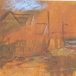
Initial sketch on toned board

Initial sketch on toned board

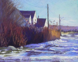
Today I decided to paint something completely different from the fog picture. I had a black and white photo from Mattapoisett that I had taken some years ago (haven’t seen snow there in a number of years!). I knew that a resurfaced pastelbord would be perfect for it as there were many bushes, reeds and trees, as well as a snow-covered road. So I resurfaced my last 16 x 20 board with two coats of relatively dark-toned liquid primer and brought it to the studio this morning.  I didn’t do any sketches or preliminary studies, but I had looked at the photo a lot. The only change i made was to move the houses a bit to the left to minimize the trees at left and give more room for the road. I began with a charcoal and light hard pastel sketch and remembered to take a picture just as I was starting to add the pastel! You can see from the first layer of pastel, how rough the board was.

I began this painting similarly to the way I did the field painting behind my mother’s house. I used Ludwigs and Unisons and brushed in color to lay out the major areas.  For the houses, I used a light green where the yellow would eventually go. The road was the hard part!  I began with blue violets and a blue-tinted white .  Once done, I went back to the sky.  I think I may have overworked it.  I basically got rid of all of the texture so it looks quite different from the rest, but I still rather liked it. I decided to add low clouds on the right to give it more interest, and I added some light red violet as the last thing.

The road was a lot of work and I kept taking breaks. I used a dark blue violet Ludwig in the snow beneath the darkest part of the reeds and I really liked the sense of shadow that it provided.  I used it as well on the road, but then added blue green and other blues and violets over it to tone it down and bring down some of the sky color into the road.  I did not overdo the road like I did the sky, leaving it quite rough in places. The surface really worked for me in trying to create the tire tracks in the snow at bottom.

The bushes and houses were quite simple, in comparison to the road.  Using warm ochres at the right of the grasses, and warm red browns to indicate light on the left, varied nicely with the dark violet and red that I added in the middle. I added the wires at the end using a pastel pencil.

It was fun to do something with structure after the fog of the past two days!  I love both and am happy that I have the opportunity to paint varies scenes.


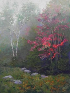
Red Emerging, #2

Red Emerging, #2, 24" x 18", mounted 320 UART

Red Emerging, #2, 24″ x 18″, mounted 320 UART

Watercolor underpainting

Watercolor underpainting

Over the past three days I’ve been in the studio, while Jeanne Rossier Smith has been teaching a workshop of 18 members of the Maryland Pastel Society in the classroom that I normally teach in. It’s fun to be there at the same time and I want them to feel welcome at Artists and Makers.  So I’ve had a lot of time to paint.  Last fall I did a painting that I loved doing–Red Emerging.  I put it on Facebook and sold it almost immediately!  With that, I decided that I wanted to do it again larger so that I could spend more time on it and have the painting as well. I had purchased an 18 x 24 True Grit panel with this in mind so I was all set.

But when I looked at the size of the panel last week, it seemed awfully big!  So I gave thought to turning it horizontally and adding other things.  But when I went to do the painting, I realized that I wanted to keep it pretty much the way it was.  I printed out a picture of sumac that I thought I might add on the left.

As with the first painting, I began with a totally abstract watercolor underpainting. I used a warm orange for the sky and tried to get the darks as rich as possible. For the bottom, I used a violet and then a deep warm brown on top of it.  The underpainting worked well for me, providing color to work over, without worrying about the composition at this point.

The composition was a major concern with this painting.  I had to keep it from being half and half. I tried putting the sumac in at the base of the birch tree, but I really didn’t like it!  So I got rid of it and late in the game, lightly added the hint of a red tree just to the right of the birch in the background.

I had more foreground in this painting than in the first one, so I decided to do more with rocks. I had added some to the first but decided to add more and make them more prominent. I got rid of one and kept the others as visitors to the studio said that they liked them.  Another compositional change was to raise the foreground on the left to push it back further and keep it from being too straight.

I had a great time with the background on the left side. I used various greens to indicate trees, going light as it went up and then put a light violet in. The violet really pushed it back. And in the area of leaves in the birch, I added a pale majenta into the green to further gray it.  For the tree on the right, I used a lot of Blue Earth quinacrodone red–a cool red with a lot of grays that were just perfect.  I also used my box of turquoise and their grays for the leaves.  These pastels are so handy in a painting like this where the values and chroma are so important.

Jeanne was focusing her workshop on color–value, chroma and temperature.  I realized that that was what this painting was all about!

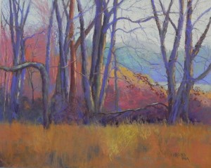
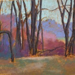
March Morning

March Morning, 16 x 20, resurfaced Pastelbord

March Morning, 16 x 20, resurfaced Pastelbord

Initial layers of pastel

Initial layers of pastel

My second painting was also from an old photo and on a resurfaced Pastelbord with the same gold-tone liquid primer. It’s a photo of my mother’s back yard, taken in March before the grass turned green.  The early morning sun comes through the trees and hits the brambles and sides of the trees in the back of the yard and I’ve taken any number of photos of this over the years. (The house was sold in 2014, so this has some sentimental value.)  Like the heron painting, I had tried drawing the trees to determine the composition and had had problems with it. This time, I just loosely drew the trees onto the board with charcoal.  I decided to make one important change by bringing the tree on the left that curves off the left to the foreground, in order the break up the line.

I did not want to lose the gold surface, so for this one, I began by defining the trees with three values of Girault grayed violet, then added a light turquoise in the sky and other colors to define the bushes and grassy area.  Note that what was in the photo was a lawn, much like what you see in the “initial layers of pastel”.  It was really boring!

I began to get excited about this piece when I picked up a relatively soft blue violet and started adding it to the trees. This really perked them up. One tree was noticeable warmer and I used red violets and browns on it. I worked on the large trunks, correcting from my original sketchy beginning. Then I finished off the sky behind them with more turquoise and a light Ludwig orange over that on the right side.  Then I added in the small branches, keeping them very loose.

I had fun doing the background bushes and brambles and the more distant trees within them that were catching the light.  The background trees and field also were fun to do.  Because the light was coming from the upper right, they were light but cool in tone.  So I got all that done and then was faced with the lawn!

Having used blue violet, I realized that yellow orange was what was needed and that a field would be far superior to dull green grass!  So i rather quickly added it.  I added some darks in, then went over them, trying to give a pattern. There was also a hint of a path showing and I decided to emphasize that by adding the more yellow tones, that could have resulted from light coming through the opening.

This was a fun painting to do of something I’ve always wanted to paint but couldn’t figure out how to do successfully.  I find that this kind of problem solving is really fun and it helps me (and those who sometimes work with me and make suggestions) on our toes!

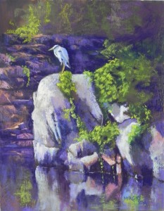
Keeping Watch

Keeping Watch, 14" x 11", resurfaced Pastelbord

Keeping Watch, 14″ x 11″, resurfaced Pastelbord

Initial stage

Initial stage

After first applications of pastel

After first applications of pastel

These past weeks I’ve been “playing” — using resurfaced Pastelbords and old photos. I came across a photo I had taken of a heron sitting on rocks at Wide Water, near Great Falls on the C&O Canal. The photo was in black and white and it was a horizontal photo that showed a lot of foliage on the right side. I had spent time drawing it some years ago but thought it was going to be too complex. Upon finding the photo, I realized that I could do it as a vertical and leave out a whole lot of boring greenery.  What I loved was the way the light was coming in and strafing the background rocks and that the bird and foreground rocks were light against dark. I  also loved the fact that the photo was B&W and I never went to look for the original. I know that there would have been a whole lot more green!

I had a board with gold-toned liquid primer on it from a batch I made up this winter.  I drew the bird and rocks onto the board, then added watercolor around it to further tone the board, leaving a lot of the gold showing in the light places.  I wanted to keep the detail in the center and let the top and bottom go off into less description. So I was careful laying in the color, beginning in the upper left with the rocks and the green bush. I used Ludwig pastels to lay in the color in the background rocks, using a combination of dark “eggplant”, a lighter red violet, and several oranges.  I added small details of light  and tried very hard not to overdo it.

For the rocks that the bird is on, I used a combination of pastels, but began with muted Giraults.  The greens were all done with my Blue earth green set and the bird was also done with soft Blue Earth blues.  I couldn’t use anything harder as it wouldn’t make enough of an impact on the hard, textured board. I used the dark to go around the bird’s head and refine the beak, etc.

This was painting that I absolutely LOVED doing!  It felt really good to lightly layer in the pastel and I tried really had not to overdo it. I was also concerned about the light on the right overpowering the area where the bird is standing. I added orange on the left side of the rounded rock and added aqua to the rocks at right to try to keep them in check. I also brought greenery from the right on over the rock on which he was standing, a change from the photo that makes a bit different. There was a large gap there that didn’t look realistic. You can see it in the initial stage.

I’m really happy with the way this painting came out and hope to do more like this!