Light Under the Bridge, Georgetown

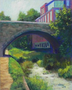
Light Under the Bridge, Georgetown, 20" x 16", UART 320

Light Under the Bridge, Georgetown, 20″ x 16″, UART 320

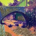
Underpainting, first stage

Underpainting, first stage

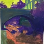
Underpainting with alcohol

Underpainting with alcohol

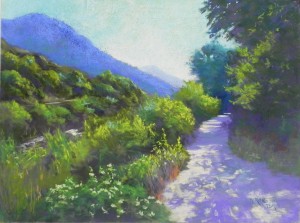
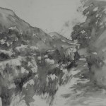
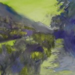
On Wednesday, I spent the day in the studio painting another scene from the Georgetown Canal sans water.  But this one actually had a little water and the light was gleaming off of it. So it was fun to paint.  I liked the view of the stone bridge with the lovely grasses in light and shadow and the one building complex at upper right, which I tried to minimize.  I wanted to get a really rich, dark underpainting, so I chose UART and used hard pastel and alcohol.  I used the bright yellow green for the sky and windows, a mixture of darks in the dark areas, and oranges and browns under the grasses.

I used a combination of blue green, brown, and grayed violet Giraults for the bridge, using the sides, and just layering them on. I was really happy with the way it came out, with the feeling of the stones without specific articulation.  I loved doing the various greens and I particularly tried hard to keep the values close on the right side, while keeping interest in it.

Doing the water was the most fun!  I decided the brown underpainting wasn’t dark enough (after doing all the green around it) and I laid on my hard pastel and very carefully added alcohol.  Then I began with two Giraults–aqua, then yellow and laid in the pond scum (!).  I finished with a soft lighter yellow, added it with more force near the middle of the picture.

When I first filmed it, the dark blue that I had used under the bridge and in various other darks was way too striking. So today I added dark green and brown into it, which made it look a lot more natural.

The last thing I did was to take some of the light yellow and add it to the sky to give a sense of a light cloud.  I felt that that finished the picture nicely!

Meeker Sunrise

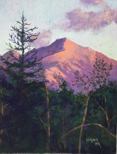
Meeker Sunrise, 20" x 16", mounted UART 320

Meeker Sunrise, 20″ x 16″, mounted UART 320

Hard pastel and alcohol underpainting

Hard pastel and alcohol underpainting

Reference photo

Reference photo

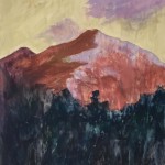
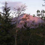
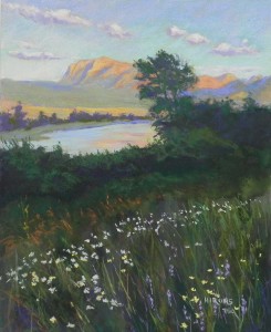
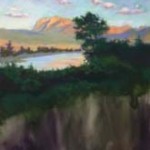
Today I worked on a commissioned painting that I offered to our church auction. It’s taken several years for the purchaser to get back to me, then we decided that I’d use my own photo.  This is Mt. Meeker in Colorado. I was staying in Allenspark, giving a small pastel workshop and I took this photo early one morning.  The photos that the purchaser had were even less interesting than mine!  So I was happy that she agreed to let me use this one.

Compositionally, I knew that I had to make a lot of changes. To begin with, I knew right away that it would be a vertical rather than horizontal.  I also did a lot of tree pruning! I chose to keep in the large evergreen on the left, but shortened or removed some of the aspens.  And, perhaps most importantly, I moved the main cloud to the right side, and added a smaller one by the mountain.  I also added a distant mountain on the left, with a hint of light on it, which I thought made it more interesting.

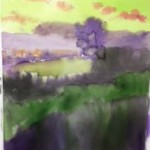
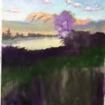
Since this is UART, I was able to do an underpainting with hard pastel and alcohol, which was a very big help!  You can see how dark the bottom is: a combination of dark blue, violet, and dark cool green.  I used a Caran d’ache almond color for the sky to add some underlying brightness.  I used a warm under cool/cool under warm approach to the mountain, using a reddish brown under the violet, and light violet under the orange.

For the sky, I began with Ludwig aqua, the a very pale Ludwig violet, then a softer very light green that added some yellow to it. I also used the lightest of the Blue Earth violets on the sky.  I LOVED doing the clouds!  So much fun. Have to get back to sky pictures!

The mountain was easy. But then I had to put the dark tree in over the heavily painted sky.  I used soft pastels, trying to keep the branches fine as possible. A the bottom I used my trusty Ludwig eggplant to brush in color, then added various greens around it. The tree trunks with light on them helped break up the foreground.

All of this took 2.5 hours!  I was really quite pleased with it.  Fortunately, I had a clear idea in my head as to what I would do with it.  I hope the buyer likes it!

A New Canal Painting

Canal (no title yet!), 20 x 16, pastel premiere

Canal (no title yet!), 20 x 16, pastel premiere

Watercolor underpainting

Watercolor underpainting

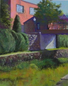
Monday was Labor Day and I took advantage of the holiday to drive to Georgetown first thing in the morning. It’s much easier to drive there and park on holidays. It was a lovely sunny day and I was looking forward to getting summer pictures of the canal.  But when I got there, I saw a lot of greenery but no water!  I remembered reading something about them draining the canal ….  Oh well!  I decided to do my walk anyway and found that it was quite interesting. There were some areas with a little water and the light was shining on it.  I took a number of pictures and today spent a rainy day in the studio painting.

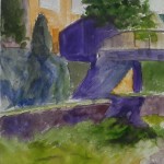
I chose a 16 x 20 mounted white Pastel Premiere board and it was just right for the painting.  I used watercolor, as advised by the maker.  I found that the board was resisting the watercolor quite a bit and had to use a lot of water with it.  But it finally took and was god enough to give me the basic shapes.

I chose this photo because of the dark and light patterns and the rather zig-zag shape of dark.  I also loved the light on the stone wall and the warm colors of the greens in the “canal”.  I made one important change to the composition, lowering the lamp so that it is against the dark wall and not against the window, where it was in the photo.

For the painting, I used mainly Ludwigs and Giraults.  I stuck to the colors I saw, pretty much and didn’t try to impose a limited palette on it. But it’s pretty much reds and greens, and I added dark reds into the bridge, shadowed building and the wall below.  I wasn’t sure whether I was going to add the fire escape in front of the left window, but it stood out too much, so I added it and some cast shadows and thought it made an interesting touch.

Yesterday I painted another western scene, an 18 x 24, that was just OK. Nothing much of interest to it. So I’m going to wash it off.  I was happy to do a painting with a lot more detail and interest.

And if any of you have an idea for a good title, let me know!

Thursday: I came up with the title Light Play, Georgetown. Very happy with that. Decided to leave the mention of the canal out since it now looks more like a ditch!

Evening Light, Waterton Lakes (3-pt demo)

Evening Light, Waterton Lakes, 20" x 16", pastelbord

Evening Light, Waterton Lakes, 20″ x 16″, pastelbord

Watercolor underpainting

Watercolor underpainting

Day 1 painting and repainted underpainting

Day 1 painting and repainted underpainting

Day 2 painting-water, tree, bushes

Day 2 painting-water, tree, bushes

Last week I gave my regular three-day “Beat the Heat” workshop in Rockville. Rather than doing a demo in the first morning, as I always have, I decided to do the demo in three parts, finishing on the third day.  I chose an image from my trip that had everything–sky with clouds, mountains with late afternoon light, water and reflections, tree against sky, bushes, and a field of flowers! What a gold mine for teaching landscape painting!!!

I took all of the in-process shots with my cell phone and they are very small images–sorry, will have to learn to change them!

Waterton Lakes is just north of Glacier National Park and is in Alberta, CA. It is an amazingly beautiful place!  There are so many flowers (and bears!) and wonderful places to walk (with bears!).  We ran into a mother grizzly on the first morning (not so good), then a smallish black bear the next day who went for a swim in the lake (much better!)

This image was taken after dinner on the road that leads into the park. Quite beautiful!

Day 1: Underpainting, sky and mountains.  I used watercolor for the underpainting, which faded of course. I later added more violet to the dark bushes.  But it produced a gorgeous gold color under the lake. I painted the sky and clouds with Ludwigs and used Giraults for the mountain and distant grasses. In my photo the distant trees were very dark and I made them lighter.  Late in the day, I decided to add more watercolor to the un-painted portions of the surface and you can see the difference!  The dark violet really made the golden water glow!

Day 2: Water, tree, and bushes. I hated to cover up the water!  I very lightly applied a blue green Ludwig, letting some of the gold show through, then added some peachy color for the reflection. Then I worked on the tree, using greens and violets. In the photo, this whole area is very dark.  I purposely lightened it a little, as I know what late day photography does, and I wanted it to have more interest as well.  I began the bushes with very dark green and violet, then added slightly lighter greens on over, leaving the dark in the underneath parts.  It was enough to provide a good contrast with the water.

Day 3: Field of flowers.  I began by adding darker swaths of greens and some browns in the field, to build up the grasses. Added some blades of grass with the sides of Giraults. I began with the orange seed heads of the grasses in the back of the field and liked the way they looked over the dark green. Then I added the flowers: white daises, yellow flowers at right, and some purple ones I made up.  Finally, I added stalks of grass over the flowers to push them into the field.

Today, I took a final look at it and made a few more changes. I softened the shadows in the distant mountain (too blue) by adding some light red violet and I felt much happier with it.


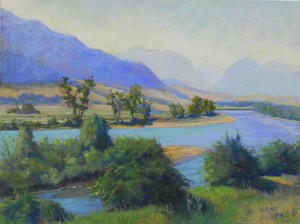
Hazy Morning, Paradise Valley

Hazy Morning, Paradise Valley, 18" x 24", pastelbord

Hazy Morning, Paradise Valley, 18″ x 24″, pastelbord

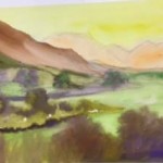
Watercolor underpainting

Watercolor underpainting

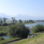
Photo ref 1

Photo ref 1

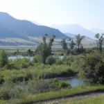
Photo ref. 2

Photo ref. 2

This morning I finished a painting that I started prior to last week’s three-day workshop (next post!).  It’s from the Paradise Valley in Montana, just south of Livingston, where the Yellowstone River flows out of the park and forms a truly beautiful valley.  We had a great time stopping and taking photos and just looking on our way down to the park.

I’m including the photo references as I used two, taken close together. I liked the dark mountain in #2 and the bend of the river and foreground in #1.  You can also see how odd the trees are!  I tried to minimize this a bit.  When I got to the foreground, I decided I liked the bushes in the #1 shot, but took out the path with it’s dark line. I really liked just playing with the shadows and light.

I began with watercolor again, this time using yellow for the sky. I wanted the sense of the hazy light (probably smoke from fires!).  I began with an aqua over the yellow, then added a real yellow, and my very whited orange and yellow–all Ludwigs.  I used the brown for the mountain, thinking that warm under the cool violet would add some contrast and I was pleased with it.  I did all of the mountains and sky with Ludwigs.

In putting in the distant fields, I got out various boxes of Blue Earth pastels and played with the grayed colors. I REALLY had a good time with this!  I wanted the colors to be muted and I found that the grayed blues, greens, and oranges were really perfect.  Used them for most of the foreground as well, with Ludwigs for the the water.  Colorwise, I stuck to blues and didn’t go to true violets at all. But the there is blue violet in the mountain and in the river.

I loved doing this painting!  One of my favorite painters is Russell Chatham, who is known for his paintings of the Paradise Valley–frequently with winter snow. My picture is a bit “prettier” and maybe “happier” than his–an no where near as good!  But I had a good time doing it. AND–if you are ever in Livingston, MT, be sure to visit the hospital which doubles as the local art museum!  Russell Chatham paintings everywhere, along with original art by other local artists. A really wonderful find!!!

In Logan Canyon (Utah)

In Logan Canyon, 18" x 24", Pastelbord

In Logan Canyon, 18″ x 24″, Pastelbord

Today was a rainy day and I was happy to be in the studio with two good friends. I finished my first painting from our recent trip to the West.  I have a number of 18 x 24 white Pastelbords and a number of 18 x 24 frames that I bought  years ago. So I’ve decided to do a series of paintings using the boards and the frames.  I decided to begin with the first day of our trip when we surprisingly found that we were driving up a gorgeous canyon with many stops and a lovely path along the river.  What a great way to begin our trip!

Water-soluble grapite drawing on the Pastelbord

Water-soluble grapite drawing on the Pastelbord

I decided to try out my new water-soluble graphite sticks that I got at IAPS last month to draw in the composition.  This was not such a good idea!  It came out very dark (unlike when I’ve just added water over regular pencils). And then it mixed with the watercolor underpainting!  So I probably won’t do this again.

For the underpainting, I used watercolor as I like the way it leaves lots of the tooth in the board.  I did it fairly loosely and it became quite dark, with the addition of the graphite! But it worked.

I began with the sky, using Terry Ludwig blue greens, then a light orange over the top.  These have become my favorite sky colors for sure. I like the way they go on loosely and the ability to layer.

Compositionally, I added the faint distant mountain, which was not in the picture.  The printed out 8 x 10  was more narrow and the 18 x 24 format needed something more of interest.

When I took the picture, it was the distant tree, the tree above it, and the light and shadow on the path that really made me love it. So I decided that the path had to be the main thing. The idea of walking up the path should be inviting.  At one point, I had more water to the left, and in a very bright yellow.  I decided it was a competing force with the path and changed it. Used the dark colors from above and added some light to indicate moving water, but left it as a minor element in the painting.

When we were there, I remembered the beautiful light on the bushes, so I wanted to highlight that, along with the small flowers, and other details in the foreground. On the right, there was a tree in light with a darker tree in front of it.  I worked on that and then added slightly lighter color as the bottom to indicate small grasses and plants. I also added some orange on in the flowers to left of path and some dark orange brown on the right.  Adding warm to cool, or vice versa, always gives more depth and interest to an area of color.

For the path, I began with a violet and a pinky-orange for the light. Then I added some of my very light blue violet Blue Earth pastels into it to give it more variety.  I have to say that the Blue Earths are wonderful on Pastelbord. Because this is a very hard surface, and they are soft, they go on lightly (particularly if you can use a light touch!).  So much of the finished painting is from the green and blue violet Blue Earths.

It was lovely to be in my studio reliving my trip and sharing the experience with good friends!

Watercolor underpainting

Watercolor underpainting

Stonington Sunset

Stonington Sunset, 20 x 16, Pastel Premiere, 400 white

Stonington Sunset, 20 x 16, Pastel Premiere, 400 white

I am back from a 2.5 week trip to the West with John, driving from Utah to Idaho, Montana, Canada (Waterton Lakes), Wyoming, and Colorado.  It was a great trip with good weather, interesting scenes, and lots to paint from!  But today I went to the studio to finish the painting of Stonington, Maine at sunset that I began before I left.  I did the underpainting with watercolor and probably filmed it, but at this point, I have no idea where the image is!  So I’m just sharing the finished product.

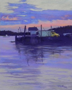
This was a pretty straightforward painting with not a lot of changes made from the photo. I loved combining the trucks and pilings from the dock with the beauty of the sunset and water. I love Stonington because it is a working harbor and not completely a tourist destination. There is no beach!

I pretty much used the colors I was seeing in the photo: dark violets for the darkest areas, blues, violets, and grayed greens for the sky and water, with the addition of pinks and oranges.  I went back and forth with violets and blues and used my new Blue Earth blue violets a lot.  And I used my fingers a lot in the water!

I have another painting of this that I did in 2015 from a mid-day photo. It has the same truck in it!  I think that they use this as a storage facility.  Anyone who has been to Stonington, Maine, will know this view immediately.

I’ll be focusing on the West for awhile, but also have to get some new images for next year’s Insider’s Washington show in Rockville.  Meanwhile, I’ll be doing a lot of workshops in Aug. and Sept. before beginning the regular class schedule in Oct.  I want to enjoy August. We were very fortunate to miss the hottest weather and this past weekend’s deluge!  Looking forward to corn and peaches and dinners on the screen porch.  Hope you are all having an enjoyable summer.

Paintings from Massachusetts

Marion Sunrise, 12 x 12, UART 400

Marion Sunrise, 12 x 12, UART 400

As promised, here are the three paintings that I did in Sarah Brown’s studio in Marion, MA.  The first one was painted from a photo I took that morning of light over Marion harbor. It was pouring rain when I painted it.  The underpainting was in three values: 2 shades of brown and a dark.  The photo was completely gray, black and white with no color. I used a variety of grayed blues, violets and greens in the sky, with yellow, and did a certain amount of smudging.  It was really fun and took about 1 hour to do!  A great way to spend time while it’s raining outside.

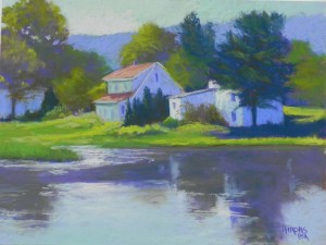
Then I worked on the painting that I originally was going to do as the demo–Houses on Lake.  I had decided I didn’t want to do it for that purpose, but brought it along. I did an underpainting with hard pastel and alcohol. The major change from the photo is the background mountain (or hillside). In the photo, it was all green with a lot of different trees sticking up.  I decided to simplify it with the violet, and added an additional large tree behind the house. I thought it worked much better.  But I don’t think this is a particularly great painting!

Wash Day, Madrid, 16" x 12", UART 400

Wash Day, Madrid, 16″ x 12″, UART 400

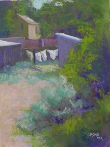
And finally, the demo, which was done from a picture I took in Madrid, New Mexico, on the way to Santa Fe.  By far, the most interesting part of this town is the backs of the houses!  I found wash on the line and decided that this might make a good demo. My goal was to do a “center of interest” painting with the emphasis being on the wash and leaving the foliage rather loose. I did a watercolor underpainting to facilitate leaving some of it uncovered. I began the underpainting with no drawing at all, focusing only on the shapes of the dark and light.   I added charcoal lines on top of the watercolor to lay out the position of the buildings and wash.  I wasn’t pleased with the wash–a little too heavy looking, I think.  I added some sky at top, which really opened up the painting.  I think that this was successful as a demo, but again, probably not a great painting!

Houses on Lake

Early Morning, Stonington Harbor

Early Morning, Stonington Harbor, 16" x 12", Pastel Premiere white 400 (mounted)

Early Morning, Stonington Harbor, 16″ x 12″, Pastel Premiere white 400 (mounted)

Watercolor underpainting

Watercolor underpainting

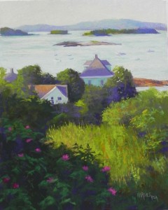
I just spent a hot day in the DC area reliving my time in Stonington, Maine!  We only had one free day there, but it was a wonderful day. And the sun came up at 5:00 and I was up by 5:15!  I walked all over the town, long the harbor, and then up the hill where I could look down on the houses with the harbor above. It was quite glorious!  Of a number of good pictures, this one was my favorite by far and I just had to paint it today.  I used watercolor as an underpainting, per instructions from the people making the paper (they plan to change this).  I really enjoyed putting the watercolor on the surface, particularly in the background. I applied it on the easel, so it did run, but not too much. And I was able to get a good rich dark, as you can see.

My main concern with the photo was the extremes of light and dark in the foreground.  So I kept the underpainting fairly close in value so as not to go to extreme too fast.

One of the things I liked the most of this scene is the composition, with the shape of the darks leading from the foreground back to the house with light hitting the roof.  I also liked the fact that there were other houses, and I could carry the warm in the roof on left into the shape of rocks to the right of the house.

The sky doesn’t look like much in the photo. I started with light red watercolor. Then used a light violet Girault, along with some pale green and a yellow Ludwig on the left side. The water began with a blue green Girault, with a very light blue green Unison and some of the same yellow Ludwig added to it. I put the boats in carefully, trying to get some of them to reflect the light (I hate painting little boats in a harbor!!!)  They came out OK.

I used a lot of Blue Earth pastels in the greenery, which is a combination of violets, greens, and a few oranges. My brand new blue violets were quite nice!

While in Massachusetts, I did a one day workshop and will share the demo, along with two other paintings with you in the next post.

Next Wed. we leave for the west–Idaho, Montana, and Wyoming, with a trip to Waterton Lakes in Canada (thinking of staying there …well, maybe not!) Will be gone for the rest of July.  So expect to see more paintings from New England and the West — two VERY different places!

Happy 4th


Report from IAPS, pt. 2: new products

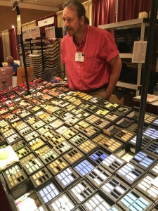
Terry's son Geoff at the Ludwig counter

Terry’s son Geoff at the Ludwig counter

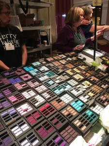
More Ludwigs

More Ludwigs

I spent a lot of time in the trade show at the convention, looking primarily for new products that might be of interest. And, also, for good sets for beginners in my classes and workshops. Of course, the old favorites, like Ludwigs were there and irresistible. I bought a box of 14.

One thing that is evident is that the manufacturers are getting older! But fortunately, their descendants are taking over. Terry Ludwig recently announced his retirement, but his son Geoff will take over the company.  I also spoke to Marge Heilmann (of the Heilmann box).  She noted that both she and John are having difficulties, but fortunately, one of their grandsons is taking over the business and he was there at the booth. This is a wonderful thing to see, since so many of the products we use are family businesses. Jack Richeson is also looking older, but his kids and employees were there taking care of business.  So, hopefully, things will go on, but it’s too bad we’ve lost Wallis paper!

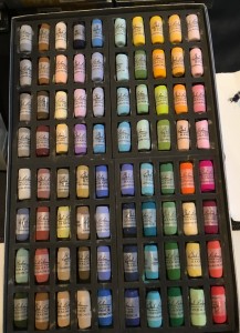
Speaking of Richeson, they have a whole new line of 500 small, soft pastels that will be available soon. They were giving out boxes with 20 spaces with the first 10 free. So, of course, I got a box. And I looked at their various sets.  The 80 piece landscape set (pictured below) looks quite good and might be just the thing for new pastel artists. I have a number of potential new students, so I’m quite eager to find good products that are affordable.  I still love the 120 Unison half stick set (Richeson owns Unison) but I think these new sticks will be a lot less. They should be available from Dakota and other stores soon. The convention price was $120, but will no doubt be more. I also spoke to a representative about Plaza Art (our local art store) and hope they might carry them.

I stopped by the Dakota/Blue Earth booth and found out that they have come out with new blue violets, something they were definitely missing!  So I bought them–of course!  I love the Blue Earth and use them regularly, depending on the type of surface I’m using.

More good news from Dakota: Pastel Premiere (made for Dakota) is now mounting their surfaces in many sizes. I bought some 16 x 20s and some smaller 8 x 8 and 6 x 8 in 2 packs. Quite nice. And they will be coming out with a new mounting of eco-board (not sure what it is, but it was very lightweight).  I’m happy to hear this, given the demise of True Grit pastel panels and the fact that UART is only mounting in three sizes.  I will probably be using more of the white Pastel Premiere in the future.

The Chinese sent a large contingent of painters and paintings to the convention, along with a new Chinese paper.  It’s somewhat similar to pastel premiere (feels like an iron oxide finish). I have a sample of it. (We shipped everything back so I don’t have it now).  Also, Art Spectrum has a new “Smooth” paper. I assume that this replaces their “suede”.  I have a small sample of that, as well. Am assuming that this is meant to be like Pastelmat.  We’ll see!

That’s it. If any of my readers were there and found interesting products, do let us all know.
I’m off to Massachusetts and Maine on Monday.  Will deliver paintings to two galleries, give a one day workshop, and celebrate my mothers’ 98th!  Will be back on the 28th.  Busy times.  Hope you are enjoying the summer.

Richeson landscape set of new soft pastels

Richeson landscape set of new soft pastels