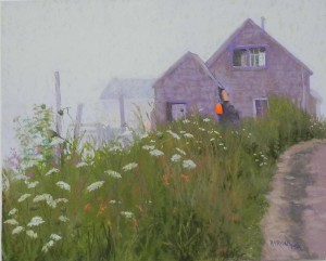
Foggy Day, Port Clyde

Foggy Day, Port Clyde, 16" x 20", Pastel premiere white

Foggy Day, Port Clyde, 16″ x 20″, Pastel premiere white

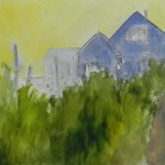
Watercolor underpainting

Watercolor underpainting

While working on the Monhegan picture, I decided to look through my Port Clyde photos.  This one jumped out at me.  I know that I tried to paint it in the past but wasn’t successful with it. Can’t remember why.  But I decided I really needed to try it again.  I used a mounted sheet of white Pastel Premiere that I purchased at IAPS.  Since I learned that this surface doesn’t like alcohol, I used a watercolor underpainting.  And I found it quite useful for the grassy area.  I wasn’t too inspired by the other colors!  But I have to say that the surface felt really good when I started applying the pastel.

Compositionally, I made one change.  The building barely seen in the fog to the left of the others was highher up and not as wide.  I decided that this would look a lot better and help fill up the vacuum.  Otherwise, this is pretty close to the photo, whose composition I really liked. The other thing I really loved was that there were three orange buoys, a bright one with a duller to the right and a very light one to the left.

I used a very whitish Ludwig blue and a whitish Unison green in the sky, along with a very light violet.  I ended up using primarily very soft pastels in this painting–Great American red violets and browns, and other soft greens.  It was a nice change from my normal diet of Giraults!

Because this is a fog picture, everything has to be muted, except for the one bright buoy.  When I first began the buildings they were a little too dark.  I use grayed red violets, with grayed browns on over and used the pastels to try and indicate the shingles.  In the photo, the buildings are a very cool gray, but I’ve traditionally used more of a violet for weather-beaten shingles.  Getting the values right in the upper window was critical and I was pleased with the way it came out.  The roadway was done with Schminckes–grayed browns and violets.

For the grasses, I began using a selection of warm greens, some very warm, I also added a reddish brown into them, seeing this color in the photo. What’s really nice about the photo is that there are purplish flowers in the grasses on the left side, which nicely pick up the colors of the buildings!  So convenient!

I’m glad that I was finally able to do this painting as I really like the composition and the colors.

One problem, however. The paper buckled.  This is a problem!!! If the paper can’t take alcohol, then it really has to be mounted on something that won’t buckle with water. I plan to discuss this with Dakota Pastels some time soon, since this paper was developed for them. At the convention, the fellow who produces it said that he was working on making it alcohol-tolerant.   Has anyone else experienced this with their mounted boards?  This is the 4-ply.

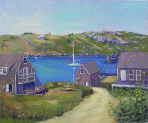
Happy Day, Monhegan–Commissioned painting

Happy Day, Monhegan Island, 20 x 24, UART 320

Happy Day, Monhegan Island, 20 x 24, UART 320

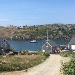
Source photo

Source photo

Graphite drawing on board

Graphite drawing on board

Underpainting, hard pastel and alcohol

Underpainting, hard pastel and alcohol

Last week I spent three days in the studio working on a commission from a new client in Buffalo.  He was interested in Maine and sent me a photo from Monhegan Island to see if I could paint it.  I knew I could–although there was a lot in this photo that I felt needed changing!  The first thing I had to do was get rid of the people in the picture!  The dock was crowded with vehicles and people that I knew I didn’t want (and couldn’t draw!!!).  And there were way too many picnic tables as well.  I also didn’t like the positioning of the boats in the harbor, or the design of the house on the far island.  All of this needed to be simplified, moved, or eliminated.

Secondly, the light in the picture was flat and uninteresting. I couldn’t change it a lot as it would have been too complicated, but I tried to improve on the sky and make it a little more dramatic.  I did a drawing on paper, then spent a lot of time doing the drawing on the mounted UART 320 paper.  I did the underpainting with hard pastel.  For some reason, I decided to start with reds and decided I really didn’t like them!  I left it in the sky, but used blue in the water, browns for the buildings, and aqua for the road.  I didn’t have a clear color palette in mind.  I knew that I needed to stick with the actual colors to a great extent, so I just used what I saw or thought would be useful.  I sent the drawing and underpainting images to the client and he pointed out that the house on the right was more at an angle.  I appreciated that and changed it.

In painting the island (Manana), I simplified the house and decided to add a small dock and boat below it.  I really like the tiny little building at the top of the hill!  Not sure if someone lives there???  There is also what looks like a pipe running down the hill to the left of the rocks. Every picture I’ve seen has it (including those I took when there), so I decided to keep it.

When I got to the water, I had some challenges.  In the photo it’s really dark. The client wanted something more turquoise, but I said that it couldn’t look like the Caribbean!  So I began with blues, but added some warm green into them on the left, where the sun is.  I think that worked pretty well.  I also put more of the turquoisy green in the sky at the client’s request.  I moved the sail boat to the left of the middle building, almost right in the middle. But I it was better than where it was in the photo, and when I tried to place it more to the left it stood out too much. So I liked having it “attached” in a way to the building.

The house on the left and the truck were the biggest challenge.  I tried to change the truck, to remove the wooden frame on the back of it, and also to change the color.  None of this worked!  In the end, I copied the picture as close as I could and it finally made sense.  The road goes down a bit to the left where the truck is parked and the land to its right is on a little hill.  I didn’t see this right away but it finally made sense. I tried various colors on the truck, from a cool red that looked too purple, to blue, and finally to a dark shadowed red.  This was one of the last changes I made, after having added the yellow and orange buoys to the two buildings at the request of the client. I knew that I needed warm color on the left and the red of the truck was perfect, finally!

Another big challenge was the dock, since I was removing all the clutter!  What to put there?  I decided to add a fishing boat behind it and keep it simple.  For awhile, I had the dock the same color as the road and it was very much in competition with it.  So I darkened it and was much happier.

The aqua underpainting really worked for the road.  I left a little of it showing through and used various Girault ochres, then added a very soft yellow at the far end where it begins to turn.

I happily used a lot of red violets in the painting, in the distant rocks and in the buildings.  I hadn’t used them in my recent shore painting and I missed them!  They are a good base color for the weather-beaten shingle buildings, over which I added some browns.  And they worked well with the various greens and the ocher of the road.

This was a challenging painting.  I spent three days last week, then took a fresh look at it on Monday. It was then that I made the truck red and added some finishing touches.  The painting is now on its way to the framer’s in Buffalo.  I really enjoyed sharing my progress with my client, Devin and I think he really appreciated it.  His mother was an artist so he has an “eye”!


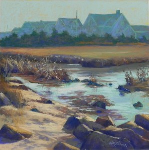
The Cedars (Demo for Maryland Pastel Society)

The Cedars, 20 x 20, Uart 320 mounted to gatorfoam

The Cedars, 20 x 20, Uart 320 mounted to gatorfoam

Painting at end of demo

Painting at end of demo

Underpainting

Underpainting

Small Heilmann box with four colors of demo

Small Heilmann box with four colors of demo

Me with the board and my color-coordinated outfit!

Me with the board and my color-coordinated outfit!

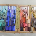
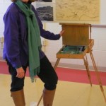
Yesterday I was privileged to give a demonstration for the Maryland Pastel Society. I did a lot of work ahead of time, all before Christmas–drawing, color studies, and the drawing on the 20 x 20 board.  For the demo, I focused on color and chose a split complement of blue green/red orange and blue violet/ yellow orange. I filled my small Heilmann box with just those four colors.  And I even wore clothes that matched!!!  Today I put in a couple of hours on making it a lot better in the quiet and privacy of my studio.

I did a hard pastel underpainting using warm under cool and cool under warm (primarily) and found the result rather interesting.  But I wiped out a lot of the detail in the carefully done drawing. I was working a little too fast, probably.

The houses are a combination of blue green and blue violet over the warm brown underpainting.  I used a slightly lighter green pastel  to indicate the “white” trim. There is a band of cedar trees in front of them that are also a combination of blues and greens.

The area of marsh grasses at top was a challenge. When I first did them, they were too orange. So I swiped some green on top and that calmed them down. But it was also too large of an area and too boring (see the underpainting).  I came up with the solution of cutting the line so that one part juts out . That was a bit improvement.

For the sky and water I used various aquas. In the sky, I used the same greenish Great American that I used in my pumpkin field painting. For the water I used some darker and lighter colors.  Aqua is a beautiful color and it looks so wonderful with all of the warm colors.

The hard part was the foreground. There is so much of it and it’s where all the detail is!  Little pebbles, foot prints in the sand, rocks, grasses, seaweed!  During the demo, I added some light orange highlights in the grasses in the midleft.  It was too early to do it, but I wanted to show people what I had in mind.  But I was getting really tired by the time I got to the sand and rocks!  I used the same combination of colors in all of the rocks in the foreground, which was quite boring.

So I was tired and sore by the end of the day but I felt that the demo was a success.  Today’s changes make me feel much better about it!  Here they are.

I refined the houses and delineated the two telephone poles. I brushed more color over the trees, ending with a dark grayed warm green.  I did more work with the edge of the marsh, adding some lights on the top and trying to keep it from being one dark line.

In the mid-left grasses, I brushed out most of the light orange I had used, and went in with a light grayed green.  I think that it gives the effect of light without hitting you over the head!  The other was too noticeable.  I think they have a more natural look now.

I did a lot of work with the water, adding the light orange in the middle and to the left. I believe that the light is coming from gap in the houses above.

I changed the shapes of the rocks at bottom and gave them more color.  I also added more colors to the sand and refined the rocks on the left.

As my husband said, this was a pretty detailed painting to do as a demo!  While I knew I’d never finish it completely, I think I gave people a good idea how to plan out and execute a difficult picture.

New Hampshire Farm

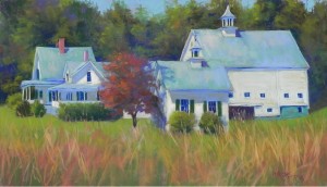
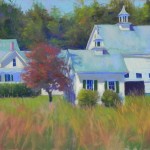
New Hampshire Farm, 14" x 24", Pastel Premiere Italian clay

New Hampshire Farm, 14″ x 24″, Pastel Premiere Italian clay

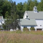
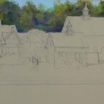
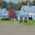
Reference photo

Reference photo

Stage 1 with sky and background trees

Stage 1 with sky and background trees

Completed buildings before foreground added

Completed buildings before foreground added

Painting as completed on first date

Painting as completed on first day

Happy New Years to you all!  I have finally gotten back to painting for the first time since early December. Between a bad foot, then a bad back, then Christmas, it just wasn’t in the cards. So it felt good to get back to my studio.

When it was so cold, I spent some time looking at summer photos from New England. I found a picture of a farm in New Hampshire that we stopped to film on the road between Maine and Vermont.  I’m including the photo so you can see what it looked like. I love farms that have a series of buildings and I really liked the shapes of the house, barn and outbuildings in this farm. But the colors were kind of dull (to say the least!).  It was Sept. and so I decided to advance things a bit and put in a red tree and hints of red in the background.

While sketching and thinking about the painting, I decided to do it on a full sheet of Italian clay Pastel Premiere. I did the drawing at home, doubling the size of the farm buildings.  At first, I had it as 12 x 24. But later on, I decided it needed more foreground and added two more inches at the bottom. By placing the drawing in the middle of the paper, I was free to add as much as I wanted to the top or bottom.

I began with the trees and sky. I didn’t want them to be fussy!  So, I worked pretty quickly with them, using a variety of greens, blues, and violets, then adding some pieces of red and orange to give a sense of impending fall color.  I then began on the buildings. For the roofs, I began with a blue, then used a blue green on top–all Girault. I wanted something more interesting than the dull green in the photo.  For the white sides of the buildings, I first used a very hard Caran d’ache light “almond”, then added a softer yellow on top in places for emphasis.

There’s a LOT of detail in this picture!  The windows and cupolas were all rather painstaking to do.  I found I was using hard pastel a lot in order to keep things looking OK.

Compositionally, I lowered the bottom, as I mentioned, before putting in the grasses and I was much happier with it. Also, I moved foreward the small building to the left of the red tree. In the photo it’s roof is at the same level with the bottom of the barn roof, which I didn’t like.  By making it taller and a little bigger, it moved it foreward and broke up the line of the buildings, which I liked much better than what is in the photo.  I put the grasses in and left for the day yesterday.

Today I came back and took a good look at it. I immediately saw that the windows in the barn were too big and the dark open space was also too high.  I also tried to change the color of the barn (not shown) by adding blue to it. It seemed like there was too much of the same and I thought it might read like shadow. It didn’t!  And it called too much attention to the barn.  I really wanted the area around the red tree to be the focus of the picture.  But I did add some blues and pinks to the the three roofs to give them variety.  The roof of the barn is a big area that really needed to be diversified.

I’m so used to doing underpaintings that I’m sometimes stymied when I try to work directly. However, I knew that I didn’t want to lose the drawing.  I tried to use the paper color and let some of it show through a little, but there isn’t a lot of it. And I completely lost it in the barn after adding too much pastel and brushing off!

But I’m pretty happy with it now.  I’m interested in what you think of it.

Pumpkin Field

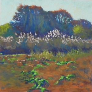
Pumpkin Field, 20" x 20", UART 320

Pumpkin Field, 20″ x 20″, UART 320

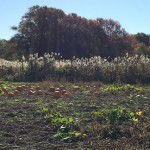
Source photo

Source photo

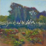
Smaller initial painting done as color study, 12 x 12, UART 320

Smaller initial painting done as color study, 12 x 12, UART 320

On Monday, I did a large demo–a 20 x 20. I had my framer mount UART 320 onto gator foam. I used to paint directly on gator foam and still have sheets of it from a case I bought many years ago. So now I’ve decided to use it for mounting paper.

This painting was important to me, given its size.  After looking at the source photo several times, I suddenly realized its potential.  I took the photo with my friend Sarah Brown in Tiverton, RI. She suggested we ignore the “no trespassing” sign and just drive in, park and take pictures, which we did.  Shortly thereafter, I woman road down the road and into the field and chased us out!  But not before I got this photo.  The others are all looking away from the sun and are much less interesting. I loved the light streaming through the trees and the way it hit the reeds and the tops of the pumpkins.

My initial thinking on this painting was that I wanted this to be a combination of blue greens and red oranges, and it actually turned out that way!  If you look at the photo, it’s all pretty much brown, including the ground.  But I thought there was real potential with the trees for multiple colors with the warm blues prevailing.  I also decided that this would be a good painting for a watercolor underpainting. None of the darks are as dark as they might be, given the profusion of light in the picture and the shapes are all pretty nebulous as well.  I used yellow in the sky. Then a combination of ultramarine blue, mars violet, and turquoise for the trees and grasses. I used warmer colors in the foreground.

I was worried about this painting and decided that doing a 12 x 12 study would be a good idea and I was glad that I did it. The first thing I blew was the sky!  I went too dark, then too light, and brushed it off, completely losing the yellow underpainting. When I did the big one, I knew exactly what I would use and I was able to leave a lot of yellow glowing through.

For the trees, my initial thinking was that I could do the trees solely in watercolor and then add some color to the top, and finally the streaming light.  However, I ended up using very light layers of Giraults, mixing different blues, greens, and warm reddish browns.

Compositionally, I made one change that I thought was important. In the photo, you can see that some of the grasses are taller and they are directly below the tallest part of the tree. I decided that they would be better on the right side. I used the bright green leaves to lead the eye into the picture to the grasses, then up to the bright orange at the top. I think this makes a better flow.

You’ll notice that the pumpkins are not all that visible, due to the warm color of the earth around them.  I loved the fact that they were primarily in shadow and I used a combination of cool green and dark red orange, first Girault and then Blue Earth, to give them form and depth. I used a peach Schmincke to begin with for the light on the top, then wen to my lightest Ludwig orange, which really made them stand out.

One of my students noted that in the 12 x 12, the color of the earth was lighter, creating a path into the picture, and asked if I wanted to do that. But we decided that the green leaves were enough.

I added a number of warm greens into the background trees on left and right, in the reeds, and in the grasses in front of the reeds. I think that this helps balance the color. I used a blue green for the darks under the leaves, to bring the color into the foreground.  I made final adjustments to the sky holes and shape of the trees after the class, but really enjoyed engaging my students in the creation of the painting. One person looked at the photo and wondered what the heck I was going to do with it!  And I did pass it by the first time I looked at it.  But working from photos is all about seeing potential.  I like working this way because it gives me time to think about the painting and where I’ll go with the color, what kind of surface and underpainting will work best, and how I might change the composition.  I wouldn’t always do the kind of detailed “color study” that I did, but because the  surface cost me money, I decided it was worth it.  Every painting is a new adventure and a change to explore!

Morning Light on the Bog

Morning Light on the Bog, 14" x 12", UART 320

Morning Light on the Bog, 14″ x 12″, UART 320

Underpainting, hard pastel and alcohot

Underpainting, hard pastel and alcohot

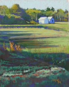
On Tuesday, I taught a group of three experienced oil painters who are interested in learning more about pastel.  In the first class, we used direct application of pastel on the brown Pastel Premiere. This class was about hard pastel underpaintings on UART.  I chose a photo that was primarily in greens and oranges. It was mid October and the colors were starting to change but there was still a lot of green.  I like the shapes in this composition and the way the raised areas of the cranberry bog lead the eye to the two small buildings that are in light and shadow.  The light hitting the tall grasses and strafing the foreground was particularly beautiful.

My initial thinking on the painting was to limit it with greens and oranges, a favorite color combination. But I thought it needed a little more punch, so I decided to add blue violets as well. I used a primarily warm underpainting with the dark violet in the foreground and in some of the shadows.

For the buildings, I began with a light aqua, then added very light orange on top and used a mid-value blue violet for the shadows. While I used Giraults for much of the background trees and the light and shadow on the bogs, the foreground was done with the turquoise and orange Blue Earth pastels.  Their range of values for cool greens is really nice and made it a real joy to lay in the foreground.

Cranberry bogs are a great subject for paintings and I’ve done a number of them.  In the winter, they are red and quite spectacular. But I really loved the colors of this autumn bog.  This was the first time I had seen this bog as it is in back woods, well off the road, but I grew up down the street for a bog that looked pretty much like this one!


Three Boats, Crescent Beach

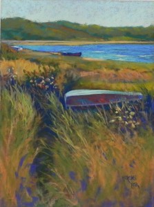
Three Boats, Crescent Beach, 16" x 12", UART 320

Three Boats, Crescent Beach, 16″ x 12″, UART 320

Watercolor underpainting

Watercolor underpainting

stage 2

stage 2

This past week I had three classes and did three demos, two with watercolor underpaintings and one with hard pastel.  I’m going to begin the first of three blogs with the most recent one, which was done with watercolor.  All of the paintings are from my October trip to New England, so the subject matter is very familiar to me.  The purpose of the watercolor underpaintings was to show my classes a different approach to underpaintings and both worked fairly well.

This demo was for my small Wednesday class and I solicited a lot of feedback from my students on this one. My original thought was not to finish it all at the bottom, as you can see in the two small images. But my students didn’t like it, so I kept going!  I think that the resulting painting is overworked, but who knows!

When I took the photo, I liked the path, the triangle of water, and the fact that there were three boats and in different locations.  The boat in the foreground was dark green on the left, with light red on the top and then a lot of white on the right side. None of us liked it and I ended up with the reds and greens that you see in the final painting.  I had to keep toning down the top to keep it from being too bright and distracting. Probably still is!

The background areas were easy in this painting. The trees were just starting to turn red and the marsh grasses were turning gold. I liked putting in patterns of color around the two distant boats, and I added a small piece of beach to the right of the boat in the middle, that everyone thought was a great addition.  Then I got into the reeds in the foreground. I didn’t fill them all in and asked the group what they thought.  No one was particularly pleased with it, so I kept going. I added turquoise watercolor in the blank areas, then filled this up with oranges and greens, and finished with a few pieces of violet to indicate the shadowed areas.

Boats are challenging–particularly upside down boats, which tend to have the appearance of beached whales!


Around the Corner (Capitol Hill)

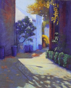
Around the Corner (Capitol Hill), 24" x 20", UART 320

Around the Corner (Capitol Hill), 24″ x 20″, UART 320

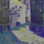
Underpainting, first stage

Underpainting, first stage

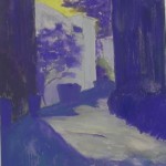
Underpainting, stage 2

Underpainting, stage 2

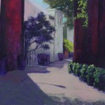
Painting in first color scheme (unfinished)

Painting in first color scheme (unfinished)

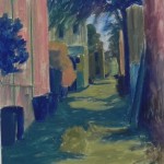
This past weekend was Open Studios Weekend at Artists and Makers so I needed a painting to work on.  I decided to do another alley picture, from the recent photo shoot. This is the same alley I painted in Back Alley Blues, but it was closer to the street and I found the shadow to be quite dramatic.

I spent Friday night working on the drawing and then adding it to the board. When I arrived on Saturday, I didn’t like it, and erased it all!  There was too much alley.  I finally got the drawing right, then proceeded to the underpainting.

The primary compositional challenges were the sizes of the two walls, and the height of the alley.  There was also a solid row of trash cans in the photo, which was REALLY boring!  In my drawing, I placed them more strategically — and I make them look like old fashioned trash cans as well.

Colorwise, the walls were dark red brick and the trees and bushes were all green. I just assumed that this was going to be a red and green painting, without giving a lot of thought to it (big mistake!!!).  Normally, I would use dark green under dark red for an underpainting, but for some reason, I went to violet and, as you can see, the whole underpainting ended up being kind of violet and yellow!  Not exactly what one wants under a red/green painting. Personally, I find this to be one of the least inspiring and ugliest of underpaintings that I’ve done!!!

I proceeded to add the reds and the greens.  However, I had real problems with the sky color, the color of the buildings in the middle, and the color of the shadow on the left.  I used a warm grayed reddish brown for the base coat of the alley, which worked with the reds.  But, I was not enthralled with this painting.  What you see in the third small image is the painting as I left it on Saturday.

I woke up at 3:00 in the morning (which, due to the end of day lights savings time, was actually 2:00!). I knew that I was very unhappy with the painting so I started thinking about it. I just knew that I wanted to use violets and yellows in it–thus, the underpainting, I guess.  So I started thinking through the various pieces of the painting. It took almost 2 sleepless hours to realize that it is now fall and I could change the green trees and bush to yellow oranges! And then I’d have a blue violet/yellow orange complement that might work rather nicely.

I got back to the studio at 9:00 AM and brushed off the sky and the green tree and shrub, as well as the color in the alley.  I left the dark red. The value was right and I just added violets on over it.  I then used light blue violets for the sky and the middle buildings and I was suddenly much happier with my painting!  As I proceeded, I added some blue greens and red oranges (particularly in the walls).  I used yellow ochre and aqua in the alley and a warm brown and blue green in the shadow.  So I ended up with a double complement: blue violet/yellow orange and blue green/red orange.  One of the big advantages to this scheme was that I could make the trash cans blue violet!!!  This wouldn’t have worked as well with the reds.

When I first filmed the painting, the building at left was too dark and did not relate well to its shadow. I used a deep blue green to lighten it, using a diagonal stroke to help lead the eye into the alley. I worked to lose the edge between the tree and the building, and I think it works much better.

The shadow of the tree at bottom was a struggle, and I’m still not completely satisfied with it.  I wanted it to be more of a suggestion.

But, on the whole, I am happy now with this picture.

12 x 12’s of the West

In anticipation of our upcoming Open Studios Weekend at Artists and Makers–Nov. 4-5–I decided to do a series of 12 x 12’s of pictures from our Western trip in July.  Last week I did three demos for three different classes on 12 x 12’s, one of which will be washed

Through the Fields, 12 x 12, gray pastelbord

Through the Fields, 12 x 12, gray pastelbord

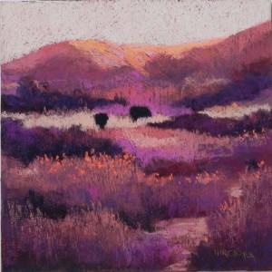
off!  The other two are OK, but not in this post.  In the past two days I’ve done three more that I’m sharing with you.  First, I want to mention that when we were in Bozeman and Waterton Lakes taking the walks from which these paintings come, I kept thinking about doing larger, more abstracted pieces, with less detail.  So I tried to keep that in mind while I was doing these.  I began with the textured painting “Warm Fields”, done on a resurfaced pastelbord. I toned Art Spectrum liquid primer with a very dark brown liquid acrylic (too much fell in!). This gives the painting an overall dark appearance compared to the other two. For this painting, I used a lot of my American ArtWorks pastels.  One of my students has the red “Try me” set, which I’ve been ogling for some time, but knowing that I own the complete set, meant that I no doubt had all of those colors!  So I brought them to the studio and had great fun pairing warm and cool reds, browns and oranges. I loved working on the surface and probably over did it with the little orange flowers, but I couldn’t help myself!  The combination of pastelbord and the liquid primer makes a very hard surface, so it requires soft pastels.   One of my fellow artists saw the painting and said she loved everything but the texture in the sky. I told her that: 1) I didn’t have a choice with this, and 2) it wouldn’t look right if there was texture everywhere else but not in the sky.  I’ve learned that from experience.

The second painting I did was “Through the Fields”.  This and “Warm Fields” are both from the Painted Hills area on the south side of Bozeman. I’ve tried to do several paintings from this area and haven’t liked any of them. I think the problem was the blue and green landscape. For this one, I used a gray pastelbord, so direct application of pastel.  But I worked from a black and white photo (which I also did for “Warm Fields”). The surface was completely different from the first, much smoother. I began the sky with the same soft pinks and oranges I had used before, but hated it!  So I brushed it off, making the surface even smoother.  I then applied a light violet with aqua on over it. The violet makes it look like rain is imminent!  I then added a light suggestion of cloud. This was all done with soft Great Americans and they hardly made a dent!!!  For this painting, I used a combination of violets, oranges, greens, and aquas. I did a lot of layering, beginning the fields with violet, than adding the oranges on top.  The combination of warm and cool grays down the colors, making them more subdued.  I used some darker, brighter oranges and turquoises in the foreground to perk it up.  Compositionally, I really liked this scene because of the triangle of  dark trees nestled near the hills and the shape of the path leading into the distance.

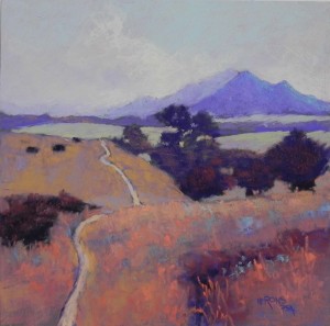
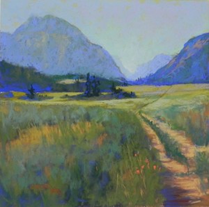
My last painting was done on mounted UART and it felt really nice after the hard board. For this one, I used the color photo.  I was really happy that I had changed the picture to a square as it meant less of the foreground and I like the resulting composition, which leads the eye into the area of trees, flat fields, and distant mountains. I did an underpainting for this one, using a bright yellowish green for the sky, and a lot of the Caran d’ache brownish “almond” colors for the fields and mountains, which produced a lovely warm color, particularly for the distant mountain on the left.  I was careful with the value of the mountains, beginning with the lightest and working forward. I liked the fact that the mountain at right is darker than the one at left and I really liked the subtle pieces of lighter color (rocks) in the left mountain.  I used Ludwigs and Great Americans and a few Giraults for this.  Even though I was working on a softer, more grabby surface, I continued using soft pastels and liked the feel. But when I got into the more detailed path with grasses, I used some of the Giraults to have better control.  The large patch of green on the left was a challenge, but I broke it up with ochre grasses, pieces of dark blue shadow, and finally a few orange flowers just to the left of the path that look like California poppies.  The flowers that were there were violet and yellow, and wouldn’t have worked in this painting.

These paintings were all really fun to do. I enjoyed pushing myself to use the completely warm palette, then trying other color palettes. I have four 20 x 20 boards of UART 320 that my framer prepared for me and I’m trying to decide what to use them for.  Perhaps one of these, or perhaps another from the West.  We’ll see!

Into the Mountains, 12 x 12, mounted UART 400

Into the Mountains, 12 x 12, mounted UART 400

Warm Fields, 12 x 12, resurfaced pastelbord

Warm Fields, 12 x 12, resurfaced pastelbord

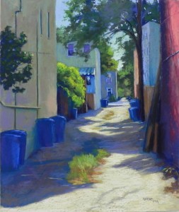
Back Alley Blues

Back Alley Shadows, 24" x 20", UART 320

Back Alley Shadows, 24″ x 20″, UART 320

Underpainting, stage 1

Underpainting, stage 1

Underpainting, with alcohol

Underpainting, with alcohol

Version as finished on Friday

Version as finished on Friday

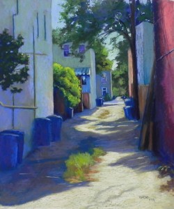
I’ve just spent several days working on a new alley painting from Capitol Hill.  It’s from a recent photo shoot, so no fall foliage yet, but a lovely day with good shadows. I found this painting to be challenging in a number of ways, but primarily in the color balance.  I’m showing the underpainting in two stages, and what I thought was the final version, and the version as adjusted today.

I was drawn to the composition due to the shadow surrounding the tuft of grasses, and the green bush catching the light in the middle. I also liked the way the alley goes way back and the light pieces of sky.

I began by using some warm color on the building at left for several reasons. In another photo of it, there is warm pink light reflecting on it, and I thought it might balance the red wall at right.  I put greens on over it  to tone it down, but it stands out as being quite different  from the other buildings (I think).  I was fortunate that I did the painting during a Desmond O’Hagan workshop (which was going on elsewhere) and I could ask my friend Joyce Lister for a critique.  She suggested making the left building cooler and my shadows weren’t light enough at the time.

My initial concern with the painting was with the red wall on the far right.  So today, I asked the other person whose opinion I highly value, my “student” Muriel Ebitz.  She said that her eye went to the left building and stopped there because it was so different from the buildings behind it.  She didn’t have a problem with the red.  Today after class, I added various blues and greens to the wall, with some orange light on the far right side, as well as warm green from the bush.  I also added more light on the trash can lids, and added some deep reds into the browns on the right near the bush.  I think that the resulting picture hangs together better and the wall enables the eye to travel into the distance rather than stopping it.

A big thanks to Joyce and Muriel!  It’s always great to get opinions for other artists we respect.  What do you think???