Spring in Clarksburg

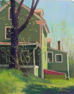
Spring in Clarksburg, 20" x 16", UART 320

Spring in Clarksburg, 20″ x 16″, UART 320

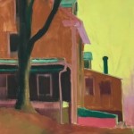
Underpainting

Underpainting

Last weekend we had our semiannual Open Studios and I knew exactly what I’d paint. I took a picture a year ago that I found last fall and did a drawing of. And finally, I was ready to paint it.  I used a mounted 20 x 16 UART board from Dakota and did the drawing on Friday night.  On Saturday I came in and began the underpainting.  I decided to use a warm brown of the same value under the green of the house, which turned out to work perfectly.  I used my typical yellow green for the sky and was pleased with this as well.  What really worked was the windows. I put in a dark, then a light frame. Then I used a wide brush with a lot of alcohol and brushed it down with a vertical stroke, not worrying about the details.  It worked really well.  The red under green/green under red in the bulkhead at right also worked.

I was doing all of this while people were coming in to see the studio and talk to me–more people on Saturday than Sunday.  So I was just a little distracted!  I put in the sky and liked it, but then quickly threw in some trees that were terrible. Later I brushed it down and put in what you see which I was much happier with.  It made it clear to me how difficult it is to paint while people are coming in!

What I loved about the original photo was the position of the house and the orange trim and reflected light.  AND the bush in front of the tree and gave life to the picture. In the photo, there was a large evergreen going up the right side, and there was a driveway on the right.  I decided to dispense with both of these and was very happy with the results.  I like the “swoop” of the dark shadow at bottom leading up to the tree and bush and the light hitting the right side of the house.  I felt that this painting was very successful because of the energy and spirit that it conveys.  It’s primarily green but there is enough orange and red to give it balance.

I haven’t mentioned the most important part–the window!  What I really loved about the photo was that there was light showing in the window against the lit side of the building.  This gives an opening to the inside of the house and perhaps a far side window.  I used various light grayed green Giraults in it and it worked perfectly.  This is a house portrait and the windows are the “eyes” of the house.  Having the light in the one window was just perfect.

For the house I used Giraults.  For the sky, grasses, tree and bright leaves, I used various soft pastels, including Unisons and Ludwigs.

When was the last time you saw a bulkhead?  I’m surprised I even remember the term!!!

Happy spring to you all.

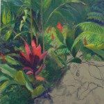
Red Unfolding

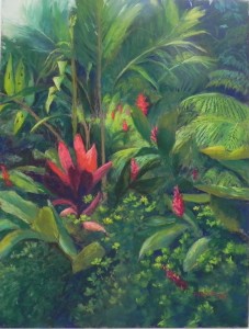
Red Unfolding, 24 x 18, Pastel Premiere "Italian clay"

Red Unfolding, 24 x 18, Pastel Premiere “Italian clay”

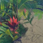
Photo reference

Photo reference

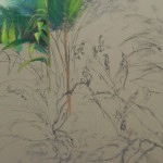
Initial pastel application after drawing

Initial pastel application after drawing

Stage 2

Stage 2

Stage 3

Stage 3

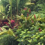
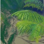
Detail of ferns

Detail of ferns

Filled in but not complete

Filled in but not complete

Detail of bottom right

Detail of bottom right

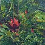
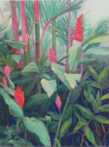
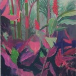
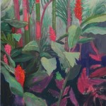
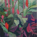
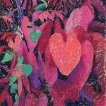
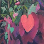
This afternoon I spent about an hour finishing my third 24 x 18 botanical from Costa Rica.  I had worked on it a lot on Wednesday afternoon and wasn’t real happy but couldn’t do anymore.  Today I went in with a fresh eye, knowing what I didn’t like and worked it to my satisfaction. I’m much happier with it now and want to share the process with you.

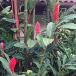
To begin with, I had a very complicated image that most people thought I was nuts to tackle!  But one good friend and excellent pastelist told me to go for it and I was happy that I was giving it a try.  I knew that I had to do more with the red plant on the left side of the photo, making it larger and more prominent.  Then, my plan was to use the small ginger flowers to give a flow into the center of the painting where there would be more light. That was the plan!

The details were what scared me!  The palms and the ferns and all that schefflera at the bottom.  (It’s odd to see house plants growing in the wild!).  Because of the details and lack of large shapes, I decided that I did not want to do an underpainting and used mounted Pastel Premiere Italian clay instead.  I did a rough drawing with my graphite stick then began with the upper left corner where there was some sky.  I immediately had fun doing the ferns!  I used Giraults–of course–and lightly applied some darker then lighter color, leaving streaks showing through.  By using the side of the stick in a motion that mimiced the palms, I found it was quite easy to do them.  Of course, I also loved the pattern of front tips pointing down above the red plant, and the pointy leaves standing straight up on the far left. These were the fun details!

I tried several darks for the background and ended up using the darkest blue and a cool green.  I laid in light applications of the pastel, then worked the details in over and it worked quite well. I really was happy I hadn’t done an underpainting!

I was afraid of the ferns, but found them not to be so bad. I just lay in the greens, then put in a pattern of darks to separate the fronds.  It really was much easier than I thought it would be.

For the red plant (I don’t know what it is called) I made it larger and more full than in the picture or in another reference I used.  I used a deep magenta with some dark blue for the dark petals used cool and warm Giraults and Ludwigs for the sunlit petals. I was quite pleased with their shape and the way it gave so much more to the painting.

The hard parts were the middle and the bottom right.  I worked on both, putting in too much detail and finally covered the surface and called it quits.  I knew there were two things i didn’t like in the “not complete” picture.  The middle area was muddled and it was very hard to read what was going on. I had not accomplished the idea of using the small reds to lead the eye into the center of the painting.  The other problem was the schefflera. There was too much detail and it was a distraction.  I began by brushing out some of the color in the middle. I added three dark leaves and then more light to make it clearer.  I also changed some of the ginger flowers, getting rid of one on the mid right and adding a new one in the bottom right.  To fix the problem of the bottom right, I took the blue that was in the upper left corner and lightly brushed it on over the entire area, smudging the leaves and getting rid of a lot of the detail. I immediately felt that the painting was the better for it. I’ve added a detail so you can see what it looks like.

I’m going to do reproductions of these three paintings. They were a lot of work and I hope they’ll be popular.  Now on to something different I think!

Dancing Ginger

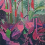
Dancing Ginger, 24" x 18", UART 320

Dancing Ginger, 24″ x 18″, UART 320

Photo reference

Photo reference

Drawing with graphite stick

Drawing with graphite stick

Underpainting step 1

Underpainting step 1

Underpainting step 2

Underpainting step 2

Step 1, beginning sky and background and red flower

Step 1, beginning sky and background and red flower

Adding green to leaves

Adding green to leaves

Developing the bottom

Developing the bottom

Further progression

Further progression

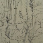
Now for my second 24″ x 18″ from the tropics of Costa Rica.  For this one I’m showing you the photo reference so you can see how I changed it. There were two challenges with this painting:  there was a building and roof in the background that I wanted to omit. and I had competing reds!  Both the ginger flowers and the lipstick palms had reds.  I really wanted to paint the palms as I’d never seen anything like them before. However, I quickly realized that this had to be about the ginger flowers and their movement and not about the palms.

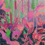
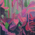
I began with a light drawing using a graphite stick, which I’m finding very handy as it doesn’t require sharpening.  I then laid in the underpainting with red under green and vice versa.  It’s very pink!  After the alcohol, I went to the upper right corner where I’d decided to put in sky with pale green and some very pale orange (this was the easy part!).  I used slightly darker green and cool pink to add in background that looks like fog (but there wasn’t any there).  I lightly added some trees in the distance trying to give the sense of a forest.  My major problem with the background was the progression from very light at the top to very dark at the bottom and how to deal with the middle.  I think i resolved some of it by adding more big leaves.

I put in the red on the upper ginger flower and then painted the palms.  I realized that I had a conflict, as I noted above.  So I put some light greens and greenish browns over the reds to soften them (not sure what stage this was).  Then I worked my way down the painting, working in areas to complete them before going on.  It was pains-taking but I liked the overall flow of the picture and the way the leaves lead the eye up to the majore flower and the sky.

Unlike the last painting, where the title came to me, I wasn’t sure what to call this one. One of my students noted that what I was painting was ginger and I decided that it was about movement and came up with “Dancing Ginger”, which I really liked.

I’m now almost done with the third and most difficult painting of the trio.  Stay tuned!

San Blas Sunset no. 2

San Blas sunset, no. 2

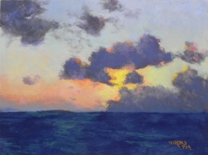
San Blas sunset, no. 2, 12″ x 16″, UART 320

Water color and hard pastel underpainting prior tio alcohol

Water color and hard pastel underpainting prior tio alcohol

Finished underpainting

Finished underpainting

Step 1 sky

Step 1 sky

Step 2 clouds

Step 2 clouds

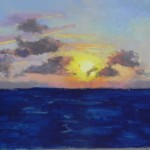
Step 3  Sun

Step 3 Sun

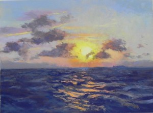
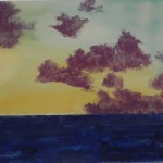
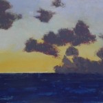
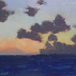
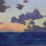
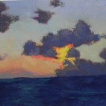
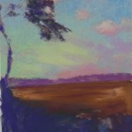
On this rainy cold Thursday I’m going to add two new blog posts for paintings I finished last week.  This one is my Wednesday morning demo and the second of my sunsets.  They are both now framed and hanging in my studio!  For this second one, I was more challenged with the photo. It had white clouds in the upper left corner that I didn’t like and chose to omit.  And in this one there is reflection on the water, which is choppy, unlike the calm sea in no. 1.

Like the first, I decided to do a watercolor underpainting for the sky and hard pastel for the water and clouds.  There are two layers of clouds: distant clouds that are warmed by the sunlight, and closer clouds that are darker.  Having gotten rid of the white ones, I added more of these two categories.  In laying in the sky I used some pan pastel to show the class how they work, but pretty quickly resorted to Giraults!  They go on much faster when one is doing a demo!  In step 1, I roughly laid in where the sun would go but didn’t want to put it in right away. I focused instead on getting the sky the way I wanted it then softening the color in the clouds.  Then, in step three I added the sun–a bright, very soft deep yellow with a soft whitish yellow in the middle and oranges around it.  It really popped!  The final, and most difficult part, was putting in the water.  As I noted, it was very choppy when I took this picture (on the way to San Blas, actually).  I began by using three values of cool blue to indicate the waves and water.  I then found a dull orange soft pastel that seemed right and indicated the light.  But it wasn’t quite bright enough.  I went to a more yellow orange and it didn’t look right at all.  So I brushed it off and found a brighter true orange that I only added in a few of the major light pieces.  This seemed perfect as it produced more of a glow.  I did a little finger blending of the waves but not too much.
The last step, following the demo, was to fix the clouds. I didn’t like the diagonal line they were creating  on the left (see step 3).  So I extended the top cloud with a light piece to break it up.  As in the other painting, I added a small hump on the horizon on the right to indicate one of the little cays.

This demo took longer than the first and was more challenging.  But I’m quite pleased with it and the two paintings–framed in light gold plein air frames–look great together.

San Blas Sunset #1

San Blas Sunset no. 1, 12" x 16", UART 320

San Blas Sunset no. 1, 12″ x 16″, UART 320

Step 1 Watercolor

Step 1 Watercolor

Step 2  Hard pastel applied

Step 2 Hard pastel applied

Step 3 Alcohol applied

Step 3 Alcohol applied

Step 4 Beginnings of sky color added

Step 4 Beginnings of sky color added

Step 5  Warm colors added to sky

Step 5 Warm colors added to sky

Step 6 Further def of sky and clouds

Step 6 Further def of sky and clouds

On Monday I did the first of two sunset demos from our recent trip to Costa Rica and Panama.  I was going to do snow but decided I had little interest in it at this point!  I gave the picture a lot of thought

Step 7 Sun added

Step 7 Sun added

and decided that I would do a dual underpainting.  My first step was to draw the horizon line and do a watercolor underpainting for the sky. I used a turquoise and an orange, mixed in places, and it worked quite nicely.  My next step was to add the clouds and water with hard pastel. I chose a “plum” colored NuPastel for the clouds and the Indigo blue and blue violet for the water. I chose the warmer color for the clouds to provide warm under cool and the sense of backlighting.

I decided to try using Pan Pastels to show how they can be used.  I find that the one place where they are useful is in these types of skies.  But after a quick try, I decided I needed to first use light applications of Giraults to the sky.  In step 4, I’ve added some light blues. In Step 5, I’ve added the distant cloud bank and the warmer sky colors with Girault.  I then added light layers of warmer colors in Pan Pastel over the blues, which you can see in Step 6. I used a little green as well to transition from the warm to the cool above. I did this at various times. I used a wedge-shaped applicator and found that using the applicator “smudged’ the pastel rather nicely but then I needed to do it everywhere so that the surface of the sky would all look the same.

For the clouds I used various shades of gray violet Giraults. I tried using a Ludwig but it was too big and soft for what I was doing.  I used very light, delicate applications of pastel.  Finally I added some of the high chroma color around the sun.  In Step 7 you can see some pretty garish red oranges!   I toned these down and then added yellow to the right and left of the sun .  Finally, I added the little mists of clouds and the pieces of backlighting and light on the clouds.

For the water, I put dark blue over dark blue, then added some lighter blue and finally some pieces of cool green.  I did very little with it. There’s a dark hump on the left side of the horizon which is one of the many tiny cays which make up the San Blas islands.

This demo took less than two hours and I got lots of help from my class!  It was really fun to do and to show how we use different methods for beginning a painting and different types of pastel to achieve subtle layers of color. I talked to them afterwards about the fact that I view each painting as a problem to to be solved and the importance of giving it thought and knowing what our options are.  That’s what makes it all so much fun and keeps it interesting.  Now I have to go off and solve the next problem for today’s demo!

Abundance

Abundance, 24" x 18", UART 320 8-ply board

Abundance, 24″ x 18″, UART 320 8-ply board

Drawing

Drawing

Underpainting stage 1

Underpainting stage 1

Underpainting stage 2

Underpainting stage 2

Painting in process

Painting in process

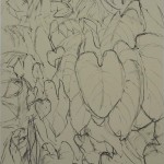
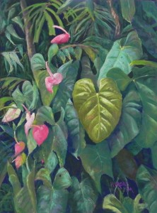
I’ve just completed my first Costa Rica painting. It wasn’t easy!  I’ve never thought I could paint complicated subject matter like this before and I never thought i’d have the patience. For some reason, I’m wanting to do more difficult work, more slowly and I’m really enjoying it.  For this one, I didn’t have to make any serious changes to the photo, which really helped. But I didn’t want it to look just like the photo either.  I knew that i wanted to do an underpainting of red under green, and green under red.  I purchased 18 x 24 UART 320 grit boards from Dakota, mounted on 8 ply mat board.  I did the drawing and left it in my studio for a few days.  When I came back it had warped pretty badly. I was very disappointed in this.  But after my initial work on it, I lay it face down on a piece of glassine and put a bunch of magazines on it. It flattened right out, thank goodness.

Anyway, I’m sharing the initial drawing done with a graphite stick and the stages of the underpainting before and after the alcohol.  I lost some of the drawing with the alcohol. I’ve included an image of the painting in process where you can see that I’ve used a hard pastel to redraw the painting as I went along.

I chose this photo because I really liked the large warm heart-shaped leaf facing the viewer and the procession of dainty pink blooms up the left side of the picture.  I also liked the fact that the leaves around the primary one were all of cooler greens, thus setting off the major leaf.  In the photo, I could see a lot of orangey-pinks in the warm leaf.  I left some underpainting showing through but also added oranges and pinks to the greens and highlight areas.

When painting the many (MANY) leaves I tried to use light applications of pastel so the reds would show through.  I primarily used Giraults, but also some Blue Earth and Schminckes in the flowers and major leaf.

Given the dark background, I thought about ordering black UART but decided against it. I prefer to add the darks and have a hard time when everything is black to begin with. I used my darkest Prussian blue NuPastel for the darks in the underpainting.  When I began the painting I used the Unison dark green, but quickly realized that using the darkest blue Girault was even better.  I wanted to be able to show various layers of greens within the darks and using the blue was better and really set everything off.

I was worried that I’d end up with too many hard edges and I did some finger softening of the whitish flower at far right and some of the leaves.  I used the large cool leaf in the upper right to point down to the center of interest, then carried the cool color down to the lower leaves.

As with my Great Falls Blues painting, I’ve never done anything like this before–not that I can remember anyways!  Finding out that I CAN do this sort of thing has been fun and rewarding and I plan to do several more and make prints of them.  But next week I’ll be doing two Caribbean sunset demos for my classes which will give me a nice break!

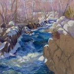
Great Falls Blues

Great Falls Blues, 24" x 18", Wallis Beligan Mist

Great Falls Blues, 24″ x 18″, Wallis Beligan Mist

Initial drawing

Initial drawing

Sky and trees

Sky and trees

Beginning the water

Beginning the water

Water almost done

Water almost done

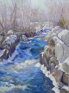
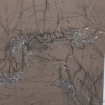
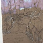
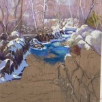
Greetings!  We arrived home from spending 12 days in Costa Rica and Panama a week ago. After being immersed in greens, I’ve been back to painting ice, snow, and really cold blue waters!  I began this painting before I left.  I had one sheet left of Wallis and had my framer mount it to gatorfoam. I wanted to do something special with it. I found a picture of Great Falls that I took in 2015 (I tried to go this year but the park was closed–of course!).  I had printed out the photo a year or two ago and decided it was too cold looking and too much work.  But now, I realized that it was just what I was looking for!  I’ve been doing my series of “Local Wonders” and this surely is one of them.  Perhaps the most spectacular.  This is a small tributary near the entrance to the walk to Olmsted Island. It’s not the major falls, which is steeper and generally all white!

One of my students asked me to post pictures of the process, so I’ve done that.  With such a complicated picture, I find it’s much better to work on a toned surface and the Wallis was just perfect, alas!  With so many colors in the water, there’s no point in doing an underpainting.  And the brown was perfect for the sky, trees, and rocks.

I used an 18 x 24, which is longer, than the 8 x 10 photo I used as a reference. I had no problem with it, however. This is a picture that benefits from a little more distance. I began with pencil and then decided to add some white pastel to indicate the snow. However, I decided I didn’t like it and got rid of most of it. You can still see some in the initial drawing.

I began the painting with an aqua Girault, laying in the sky.  I used a light neutral brown and a light magenta for the trees.  The diagonal white snow line in the background is the tow path. I could just barely see it in the photo, but instinctively made more of it in the painting.  I like the way the water leads to it, and the towpath than leads the eye on.  One of the things I loved about the whole scene were the diagonal lines caused by the rocks and snow and the planes of the water.  You can really feel the movement.

This painting is 98% Girault!  I had just the right colors of blues and it was easy using these relatively small pastels to lightly layer in the water and the colors on the rocks.  To do the water, I focused on value, temperature, and planes, laying in initial planes with a darker color and adding warmer blue greens on top.  The water is a combination of blues, blue violets, true violet, blue greens, and grayed warm greens.  For the spray in the middle, I added some light softer yellow, which I added selectively in other places to lead the eye up to the trees.

The rocks at right were a bit of a challenge–some were too large. So I broke them up with cracks and more snow.  I used very light grayed greens along with browns and violets.

I’ve never painted water like this before!  It was a challenge, but a fun challenge. It’s all about value, temperature and shapes.  Strokes were important as well to get the feel of the planes and the direction of the flow.

I know this is a very cold-looking painting but I’m hoping that there is enough warmth in it to make it appealing.  Now on to the greens and reds of Costa Rica!!!


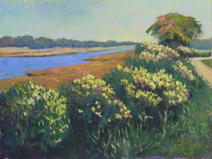
Sepowet Blooms

Sepowet Blooms, 12" x 16", Rives with Golden fine pumice gel

Sepowet Blooms, 12″ x 16″, Rives with Golden fine pumice gel

Underpainting stage 1

Underpainting stage 1

Underpainting stage 2

Underpainting stage 2

Iphone version for comparison

Iphone version for comparison

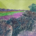
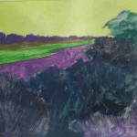
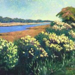
My second painting of the year, just finished this morning, is for an upcoming show called “Shorescapes: Maine to Chincoteague” which will be held at my church in Bethesda this April.  I probably mentioned it when I posted the Adamsville painting.  Anyway, I decided to try another 12 x 16.  The photo was taken at Sepowet Marsh in Tiverton, RI, one of my favorite places to paint in New England.  It was taken in October so the grasses by the river are brown.  The flowers in the photo were white and there was no tree. Instead, the lovely progression of flowered bushes led the eye to — a telephone pole!!!  I knew I had to do something with that.

I did an initial drawing playing with various possibilities. My first thought was a house roof appearing above the bushes.  I tried this on the board and kept erasing.  Then, I remembered this wonderful tree from Westport and decided this would make a much better addition.

Because of the large amount of textured bushes, I decided that I wanted to work on a more textured surface.  I used Rives with Golden acrylic gel, untoned.  I used watercolor to tone the sky but decided I had to use hard pastel to get a dark enough underpainting for the rest of it. This qualifies for one of the ugliest underpaintings I’ve ever done!!!  No question.  But it worked out OK.

The original photo was pretty cool–all blues and greens with white flowers and only the marsh in warm tones.  I knew I wanted to warm it up. My first thought was to use oranges and pinks in the flowers, but with the orange grasses, that really wouldn’t have worked.  So I used yellows instead.  I decided to add some oranges and pinks to the tree and I made the road warm, so that it resembles more of a path.  In the dark areas of the bushes, I mixed a dark green with a dark cool red. Then, I added some pieces of dark turquoise which was an intuitive addition that felt right.

I was pleased with my decision to use the more textured surface. It really enabled me to get more interest in the sky, as well as creating textured bushes.  I used a yellow green pastel in the sky around the tree to create something of a glow that I could see in the B&W photo.

I’m including a photo that I took with my Iphone for comparison to the one taken with my Nikon Coolpix camera, which I use to photograph my paintings.  When I took the picture with the camera this morning, I didn’t think that it picked up the colors as well. So I filmed it with the Iphone and felt that it looked identical to the original painting.  The problem with the phone is that the photos all come out as 72 dpi. I can save them at maximum size, but still they are low resolution.  Does anyone know if there is a way to get 300 dpi images with an Iphone?
My next painting will be on my remaining sheet of 18 x 24 Wallis.  It will be a painting of Great Falls with ice and snow and many wonderful blues.  I found it in a book of photos this morning and knew that the time had come to paint from it.  However, between now and then, John and I will be going to Costa Rica and Panama!!!  Very different from what’s in that cold, snowy picture, I must say.  We leave next Wednesday but I hope to have the drawing done before I go so that I don’t decide to paint monkeys or birds or something of that ilk!!!

Wonder

Wonder, 18" x 24", UART 320

Wonder, 18″ x 24″, UART 320

Underpainting stage 1

Underpainting stage 1

Underpainting stage 2

Underpainting stage 2

Painting, first stage

Painting, first stage

Painting 2nd stage

Painting 2nd stage

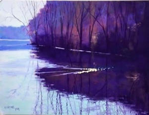
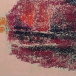
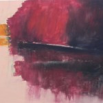
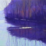
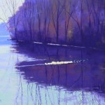
It’s been some time since I’ve posted new paintings and now I have two to share with you–my first paintings of 2019.  I’ll use  separate posts.  This one is the second painting in my new series that I’m calling “Local Wonders” (thank you Sunny!)   It’s another painting from Lake Frank in Rockville. (For those in the area, we approached the lake from Meadowside Nature Center, so this is not near the tree that I painted in Grace.)  It was another cold day with low light and most of what we saw was pretty brown!  But then we got to the lake, and what I saw was a row of ducks kicking up a wake which was catching the sun. Quite wonderful!  And thus, the title.

There wasn’t much drawing involved with this one, obviously!  Just a large shape of trees with reflections below.  I opted for a warm underpainting with the idea that it might glow from behind (which it actually does).  I used a lot of Ludwigs and almost a whole stick of “eggplant” on this painting.  It’s all blues and violets with no other colors.  However, it still wasn’t very straightforward.  I thought I was finished when I took the photo labelled “Painting, first stage.”  What I saw immediately was that the background trees and reflection were way too light.  So I brushed it off, darkened it, and that became “Painting, 2nd stage.”  I thought I was done.

The painting as it was at this point was on the easel for our January openings.  Several people came in and weren’t sure what the yellow line was.  I had to admit that it was disappointing to me. I thought I would have done better with a 16 x 20.  Then my former studio neighbor, Scott, came in and he mentioned something about a “V”.  Bingo!  Ducks swim in a V!!!  When I looked carefully at the photo I could see that there were two lines of ducks, pretty close together.  I brushed it off, added another line, more obviously apart from the first than in the photo, and everyone who came in after that knew exactly what it was!  I think that it looks more complete now and I’m not upset with the size of the picture.

I have to say that this is not a favorite painting.  Too much dark perhaps and not enough interest. But it got good comments on Facebook, so who knows. Someone actually asked me whether using violet was something new for me!  I wasn’t sure if this was serious or not! Anyway, I’m happy to share it’s progression with you.

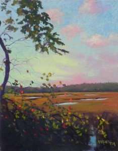
Day’s End Marion

Day'End, Marion, 14" x 11", UART 320

Day’End, Marion, 14″ x 11″, UART 320

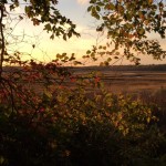
Reference photo

Reference photo

Partial underpainting before alcohol

Partial underpainting before alcohol

Partial underpainting with alcohol

Partial underpainting with alcohol

Early stage after input of sky

Early stage after input of sky

Today a friend wanted to come to the studio at 1:00 and I was free so came early and decided to do one more painting for this year.  It’s appropriate being a sunset!  The photo, had a lovely sky by way too many leaves covering and black at the bottom, so I had decided earlier not to bother with it. But today I thought I might as well tackle it and see what I could do.  I looked at various surfaces and decided that the 11 x 14 would be best.  I did a simple drawing, leaving out the leaves on the right and emphasizing the arc of the tree and liked it. I also decided to add some water at the bottom right, to open up the picture a bit.

I decided that the colors in the sky were too subtle and not to do an underpainting there. So I did a quick partical underpainting, primarily to lay in the shape of the leaves and to get the darks in below.  This worked well.

I had to begin the sky first.  I thought about using pan pastels but I didn’t have the applicators. Instead, started with Giraults and ended with much softer Schminckes, very lightly applied.  It worked well over the beige paper.  I went from cool blues to warm greenish blues then to pinks and oranges and violets on the right and a cool green, yellow green and yellow on the left.  I’m not real happy with the clouds.  The look like four plops of pink!  They are just barely visible in the photo and I wanted them due to their color, but I’m not sure how much they add.  I may do some more work on them before I frame it.
This is a painting with many layers, the sky, the background marsh, and the tree and leaves in the foreground.  I put the blues of the sky in and around the leaves to give them form and used a hard pastel for the tiny branches coming off the tree.  The biggest challenge of the painting was probably the foreground leaves. Some were bright red, others greens and yellows and were backlit.  I tried to get enough of them in to make it interesting and added a few bright pieces of red orange.

It’s almost Christmas and the beginning of a new year.  I hope that you will have safe travels and enjoy the company of loved ones and friends.  We look forward to hosting Christmas eve here with two couples from our UU congregation. We will play the piano and the psaltry, tell stories and poems and eat cioppino and other good things!  It will be my first Christmas here and the first without my mother.  A time for new traditions to begin.  Wishing you all the best!

Jean