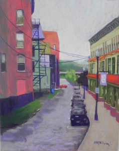
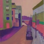
Happy New Years (I think!) Not sure what the coming year will be like, but at least I can spend a good part of it painting with my friends. I recently spent time in the studio prior to beginning classes this week. Actually, I spent innauguration day in the studio doing the underpainting for this! I decided that I needed bright cheery colors and I had two new sets of Caran d’ache hard pastel “cubes” so I used them almost exclusively for the underpainting.
A neighbor came in after I had completed the underpainting and told me I should stop right there and not do anything else. But, of course, I couldn’t do that! But I tried to keep the happy feeling of the place, even though it was an overcast day. I also was trying to make this painting a little more stylized and not quite so real. I kept the buildings and fire escape on the left fairly simple, but had to add a lot of detail on the right. I also worked at keeping the cars blocky and undetailed.
I brought the picture to a critique session and the original photo blew away! Then I realized that I hadn’t added the wires, which I really liked in the photo, as they connected the two buildings. So I added them with no reference. They might be a little low, but I think they work (???)
The color palate is pretty much red, green and violate with a few more neutral colors. I started with a lot of violet in the sky, then added more light yellow and orange to the bottom to brighten it up. I kind of liked the flat orange, but …
Any comments will be greatly received!


Jean,
I love the colors of this painting. Appreciate the notes on your thought process behind it. I feel, this painting has the right balance between design and realism.
Garima
Thanks so much Garima. I appreciate it! Jean
I love the way you handled the cars, and the whole right side of the painting. the sense of distance in the sidewalk and road are wonderful. I am having a little trouble with the left side because the pink door, and to some extent the coral building in the back, catch my eye and hold me there. They seem a little too intense for the unity of this lovely painting, but maybe that is my monitor. Thanks for sharing your work. Carmela
Thanks so much Carmela. Very legitimate comments. The door is too bright and so is the back building. Part of that is the digital photography, but I also think that part of it is the painting. I think that both need to be “laid down” a bit! The door is also quite large in comparison to the cars. It is really a boarded up window I think but due to its size, looks more like a door. Jean