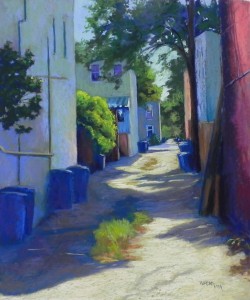
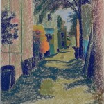
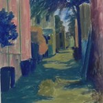
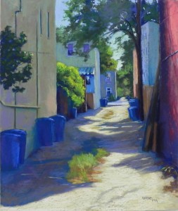
I’ve just spent several days working on a new alley painting from Capitol Hill. It’s from a recent photo shoot, so no fall foliage yet, but a lovely day with good shadows. I found this painting to be challenging in a number of ways, but primarily in the color balance. I’m showing the underpainting in two stages, and what I thought was the final version, and the version as adjusted today.
I was drawn to the composition due to the shadow surrounding the tuft of grasses, and the green bush catching the light in the middle. I also liked the way the alley goes way back and the light pieces of sky.
I began by using some warm color on the building at left for several reasons. In another photo of it, there is warm pink light reflecting on it, and I thought it might balance the red wall at right. I put greens on over it to tone it down, but it stands out as being quite different from the other buildings (I think). I was fortunate that I did the painting during a Desmond O’Hagan workshop (which was going on elsewhere) and I could ask my friend Joyce Lister for a critique. She suggested making the left building cooler and my shadows weren’t light enough at the time.
My initial concern with the painting was with the red wall on the far right. So today, I asked the other person whose opinion I highly value, my “student” Muriel Ebitz. She said that her eye went to the left building and stopped there because it was so different from the buildings behind it. She didn’t have a problem with the red. Today after class, I added various blues and greens to the wall, with some orange light on the far right side, as well as warm green from the bush. I also added more light on the trash can lids, and added some deep reds into the browns on the right near the bush. I think that the resulting picture hangs together better and the wall enables the eye to travel into the distance rather than stopping it.
A big thanks to Joyce and Muriel! It’s always great to get opinions for other artists we respect. What do you think???


I actually prefer the first version that has a lighter wall: it gives a brighter overall feel to the image and gives it more life. Both are wonderful though and I love seeing how you work the different stages of the image.
Thanks Kerry. I know what you mean. I liked it too! But I think that the new version is more cohesive.
The painting turned out great!
Thanks Margaret. Good to hear form you.