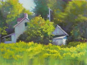
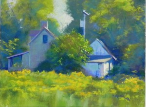
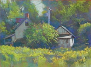
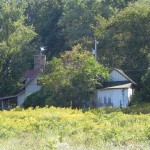
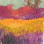
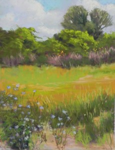
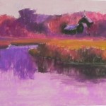
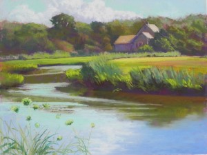
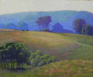
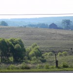
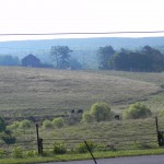
Today in class I showed my students how to make your own surface using Art Spectrum Liquid Primer, various colors of liquid acrylic, and whatever surfaces they brought in to work with. I used the Rives and toned it a reddish brown. Others used mat board and reused Pastelbords. Once their surfaces were done, I did a demo on mine. It was a very different experience from doing the other two on the Pastelbord for a number of reasons. The first was that I was working with a solid tone and no underpainting. The second was that the tone was such a dark reddish brown. Some colors I chose early on just didn’t work! I finally decided to use blue greens, with some blue violets and browns to tone them down. I thought about trying to make it more orange and fallish, but the color photo was there influencing me and I kept it truer to the photo. However, the resulting painting is quite different from the other two, I think. The rough surface is fantastic for foliage, but the light that I see in the first two seems to be missing from the third. Of course, it might be my choice of colors, but it does seem a little duller. (I also just noticed the solid dark outlining on the shed, which needs to be revised!) The house in #3 was done with blue green with the same value of red orange mixed in. I really enjoyed doing this painting, but not as much as the one on Pastelbord with watercolor. So that should tell me something! So what do you all think???
Author Archives: admin
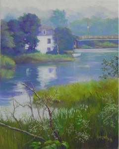
River House
This second painting of Maine is from a trip in 2009. This was shot inland, somewhere near Rockland. I’m hoping to figure out where it was and perhaps use the name of the river in the title. For this painting, I decided to use watercolor as an underpainting. It worked very nicely in the top part, not quite as well, but OK, at the bottom. I used violet and used varying degrees of color to lay in the layers of trees in fog. It was an overcast, misty day and I loved the quality of the light. For the sky, I began with light violet, then used the lemon yellow Art Spectrum tinted white pastel, which is one of the most useful I have! I used a combination of violets and greens in the trees. I made up the boat and showed a lot more of the house than what was in the photo. I left out overhanging branches in the upper right corner, but kept in the lower branches, which I really liked. I wanted this to have a sense of softness and mystery. Used some finger blending in the water. I really enjoyed doing this painting and once again painting over watercolor on Pastelbord.
Stonington Blues
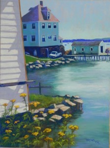
I’ve been painting Maine! Knowing that I’ll have paintings in a gallery in Blue Hill and also that ArtBlend wants New England scenes for the Art Hamptons Art Fair in July is giving me a lot of energy to paint! Stonington Blues is based on a photo I took this summer. I saw and filmed this house and wharf building from many angles, but I liked this one best. I love the idea of peaking around a corner and seeing the house, truck and shed. There was a deck attached to the building at left that was covering much of the house. Fortunately, I had another shot of it that revealed what the house looked like. I simplified the foreground by removing the deck and a lot of litter in the “yard”! I began the picture with a hard pastel and alcohol underpainting, using oranges, browns, and some violets underneath. I used orange in the sky and left small pieces of it showing through. I warmed up the roof of the house with reds, but kept the roof of the shed as it was (loved it!). What I really love are the different colors of the blue house and more teal-colored shed. The sky, background islands, and water added additions blues and blue greens. I used a dark blue for the deepest shadows among the rocks and the base of the house. I limited violets to the roofs and parts of the water and white building at left. The yellow flowers at the bottom added an important touch of color.
Stonington Blues, 24 x 18, Pastelbord
Catching the Light #2
I did a demo and discussion for my class today on creating a “useful” underpainting. My original intention for this was to do my usual hard pastel and alcohol underpainting and discuss color choices. As noted in an earlier post, I realized that this subject matter would lend itself nicely to a center of interest approach with a watercolor underpainting. My newer students have never seen me do a watercolor underpainting and it’s not something I’ve done in a long time! I went through my “Richard McKinley phase” some years ago, trying to apply watercolor to gatorfoam and other surfaces on an upright easel. A few of them were successful, but on the whole, I decided it wasn’t for me. I was a “big shape” painter and hard pastel worked better. Doing this painting today was a revelation and sheer joy! But I made some changes from past practice.
I worked on Pastelbord (white) and I worked flat when applying the watercolor. I didn’t want it to run down and pool at the bottom. I found that the surface didn’t take it very well immediately, then realized that it took it if there was enough water in the brush. I could have added more but didn’t want to take the time. I had to use the hair dryer to dry it, unlike alcohol. What I learned from the past is that you have to be careful not to use heavy, dark applications of pastel over the watercolor. It doesn’t look right and you end up covering it all up. Giraults are perfect and I opted for lighter values than what I used in the first painting. What I discovered in layering the Girault on the board was that the surface hadn’t been compromised at all, as it is with the hard pastel, and I had a lot more grit to work with. It was great! I was in heaven!!! I worked more slowly, carefully, and sensitively (as Richard teaches), putting small pieces on and taking my time. I really loved how the colors layered and the light effects that I could get with the Girault. In a few places (to the left of the house on left) I left the watercolor with no pastel. In other places I applied it very lightly. I used the softer pastels on the shed and the goldenrod (using a yellow green and two yellow Blue Earth pastels).
I totally enjoyed the experience of doing this painting. If you compare it to the first iteration, you will see that the colors are different. While waiting at a stop light this morning, I observed the distant trees with light hitting them and the beauty of the blue greens and decided that this was my palatte! I think both paintings work, but I really enjoyed doing something different in this one. If you compare them both you may not see alot of difference, but the first is clearly darker and the applications of pastel are heavier.
On Nov. 2, I’ll be doing a class on making your own surface and I plan to do this again on the toned Rives. I’ll put all three of them on the blog so you can compare them. It’s a good thing I found a picture that I like so much!!! I’ve just invested a lot of money in Pastelboard, so you can expect to see more with watercolor underpaintings.
Last week I attended a demo with Doug Dawson. He’s been doing the same kind of painting for years now. I can’t seem to keep to just one thing. I’m constantly searching for the perfect surface, the perfect feel. Today I found it–for now! But I know it won’t work for everything.
Catching the Light, no. 1
And here is my second post of the day! I completed this painting on Friday after starting it as a demonstration for the Rockville Art League on Thursday night. My presentation was billed as “Creating a Useful Underpainting”. I chose the photo from one that I took a week ago Wednesday when my husband and I were in Washington, VA, prior to celebrating our 20th anniversary at the Inn at Little Washington (purported to be the best restaurant in the country. It was great, but back to the picture). I saw this little shed catching the afternoon light and the house next to it all in shadow and it really excited me. I took many pictures of it from different angles as we walked on a lovely path, where a sign said “all welcome”! (This place is fantasy land!!!)
I spent a lot of time on the composition. In the photo, the peaks of the two buildings are at the same level. I kept redrawing the shed until it was low enough and where I wanted it, nestled into the trees and surrounding fields. The other major change in the composition was to open up the background with a very large sky hole. I thought that the solid mass of green was rather ominous looking and overpowering.
As I was drawing it, I realized that I was going to use this picture as an example of the type of hard pastel and alcohol underpainting that I do almost exclusively these days. However–I also realized that this is what I call a “center of interest composition” rather than the typical “big shape” composition that I more often do. And I realized that what might be better would be a watercolor underpainting that could produce a softer background and a foreground with less detail. However, I haven’t worked with watercolor successfully in some years and I certainly didn’t want to try it out on the Rockville Art League!!!
SO–I talked with my class. The focus of our fall class is on achieving different looks by using different materials and techniques. I realized that I have the perfect subject here! I’m going to do a demo for them on the 12th using the same subject, using watercolor and perhaps not covering the entire surface. And then, we are going to make our own surfaces and I’ll do it again on the Rives printmaking paper with a toned surface and no underpainting to see how that looks. I’ll share them all with you. I’ll do them all in the same size. This should be a really interesting experiment. Hope I don’t get too sick of the subject!
For the underpainting (which I couldn’t film), I used mainly red violets, and warm reds and browns and oranges in the background trees, with browns and greens in the field. I used a brown on the buildings. I put some violet onto the shadowed side of the shed, then a grayed green on top of that. Really liked the effect.
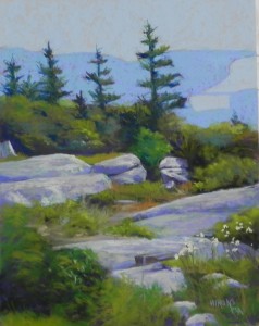
Acadia View
I’m sharing a painting that I did as a “paint-along” with a new student. I chose the photo from our recent trip to New England as one that would be good for an underpainting. I liked the simplicity of the background, compared with the richness of the foreground. The picture was one of many I filmed at the top of Cadillac Mountain in Acadia National Park. What you are seeing at the top is water and distant land with a bridge. There is no sky, but it really doesn’t matter. It was a hazy day, so the distance was not clear at all, just shapes, which I liked.
I did the underpainting, choosing two values of oranges for the upper portion and various warm and cool reds, red violets, browns, etc. for the foliage and I think an aqua for the rocks. I indicated the trees lightly in charcoal or graphite but didn’t include them in the underpainting. However, I worked on them before putting in the color in the water and distant land, going back and forth between trees and background. Since the trees had to be fairly dark, I didn’t want to try to paint them over layers of quite light blues. This was not the easiest photo for my student, Monir. He is from Bangladesh, where there are no trees that look anything like this! But the integration of rocks, grasses, bushes and trees was a good one to work with and something he’s been wanting to improve on.
September Gold
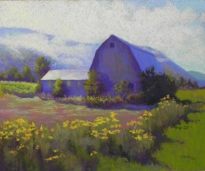
I just completed this painting, potentially for the gallery in Vermont. It’s actually not Vermont–it’s the Finger Lakes. But who’s to know! I loved the shape and color of the barn and the lifting fog, not to mention the golden rod leading the eye into the distance. I made a few changes in the composition but they are relatively minor. I worked on a gold surface without any underpainting, just a pencil drawing. I wanted to capture the sense of the intense morning light flooding in as the fog was lifting and the sparkle of the flowers and grasses. I’m not sure what color the barn really is. It might be brown. But it looked violet to me when I took the picture and certainly in the photos. It works so well with all the warm greens and yellows. I filmed the barn from the east side of Lake Seneca on our drive home. Everything was so beautiful, I kept stopping the car to jump out, irritating my driving companion, who was anxious to get home! But I’m glad that I did. I’ve just gotten up my courage and sent the three images to the gallery owner. Wish me luck!
More on the painting. The biggest challenge was the large expanse of barn. I resolved it in two ways. First, I added a small tree just to the left of the bottom window to help break it up. Then I added some greens and a little of the red from the ground into the surface. This breaks it up and helps tie the colors together. Before I did this, it was too purple! Imagine!!! I worked very hard when applying the primer to the paper to avoid loose bristles. But one got past me that was in the roof to right. I was finally able to remove it. I keep remembering Richard McKinlay saying that loose bristles are like “little logs” in your painting. He’s quite right!
John downloaded Windows 10 to my computer and I’m having a really hard time with my photos. I download them, then can’t find them. If anyone knows the secret to this, let me know!
Vermont Paintings
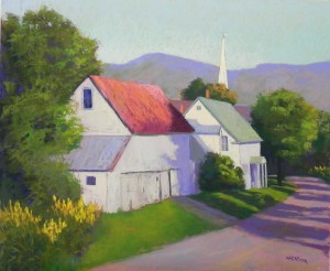
I have been painting Vermont this week. It’s beautiful here and I really should be outside. But, instead, I’ve been in the studio, trying to remember what our one late afternoon in northern Vermont felt like! I’m doing this in the hopes that Jud Hartmann will want my paintings for his gallery in Grafton. We’ll see! The first one was the painting from the small town of Barnet, Vermont Whites. I’m not sure how well the various colors I used are showing up in the photo. I used a warm but light lemon yellow in the church steeple and house (left side) and various cooler violets in the barn and front of house. We were there around 4:30 and the light was very bright. I’m worried that the painting may appear too cool, however. The composition is pretty true to the photo, but I moved the church steeple and widened the roof of the barn. I also added a hint of more golden rod in the far distance on the right.
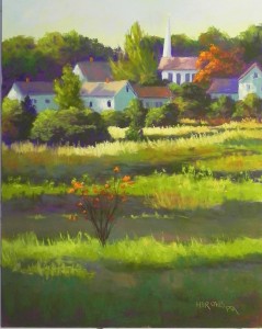
The painting from Danville area was done yesterday. For both paintings, I used a yellow green hard pastel in the underpainting. However, in the Vermont Whites, I used soft blue pastels that pretty much covered it up. In the Danville painting, I brushed a very light violet Girault over the yellow, allowing it to show through and I’m really happy with the glow that it produced. In this painting, I converted a house in the background into a Congregational Church. I Like the progression of buildings and the vertical of the steeple. I’ve included the underpainting, which I took with my cell phone. It might be a bit blurry but I wanted to include it. I decided to use a warm under warm/cool under cool approach for this painting. I was afraid that I’d get confused in the grasses and it made it a lot easier. This is one of my favorite types of composition: a high horizon with interesting building shapes and lots of grasses! I also made up the orange tree in the background and added orange leaves to the small bush in foreground (which was there, but not orange) to help balance the color. I wanted the feeling of late summer/early autumn, just as the colors are beginning to turn.
New England Plein Air
I’m finally back from my three wonderful weeks up north. I was in Massachusetts for the first week, giving a three-day workshop in Tiverton, RI. We painted at Sepowet Marsh in Tiverton and in the lovely town of Adamsville, RI. We went to the marsh on the second day and had a great time until it got too hot! I chose a vertical scene that included grasses, flowers, and patterns of color in the marsh. On the third day, we went to the lovely town of Adamsville, RI and painted at Adamsville landing. For both of these paintings, I basically used a warm under cool approach for the underpainting. I was particularly happy with the one for Adamsville and liked the way the painting came out.
Following my week in Massachusetts, John and I spent a week in Belfast, Maine. While there we went to Rockland to see the Farnsworth and other galleries. I’m always inspired by the art there. This time we also went to the neighboring town of Thomaston, where I discovered the wonderful Haynes Gallery. There were gorgeous paintings by Joseph McGurl and Peter Poskas, two of my favorite New England artists. On a day trip to the Blue Hill penninsula, I went into Jud Hartmann’s gallery in Blue Hill and we got into a conversation. And now I’m going to be in both of his gallieres in Blue Hill and Grafton, VT!!! I’m delighted. The one in Blue Hill is a beautiful gallery and the selection of paintings is quite nice and well displayed. He is a sculptor and that’s all you’ll see on his website, unfortunately. But I’m very happy that he wanted me!
During the third week, we went to Montreal and went to the big museums and the local galleries. I was not impressed with the current stuff at all. Kind of schlocky I thought. But I guess I’m pretty old fashinioned and opinionated!!! We ended our trip in the Finger Lakes and saw MORE beautiful farms, houses, fields of golden rod. Really beautiful. Glad that I can depict some of this for galleries that appreciate this kind of work.
Hill Barn in Morning Glow
Last Friday I drove to Loretto, PA to visit my friend Karl, who is in the Federal Correctional Institution. I am his mentor–or at least I was. He’s mainly doing oil now and painting rock stars and I don’t think I have a lot to contribute! Anyway, it was a beautiful day and I brought my camera, stopping on the way up and back to take pictures. In the morning, I filmed this wonderful barn that I’ve seen on every trip. The sunlight was coming from behind and creating a magical glow. I’ve always loved the way the hillside forms a line that leads to the barn. However, I made changes to the composition. I printed out three photos–two of the barn and a reference shot of cows. I’m including the two primary shots so you can see how I rearranged elements of the landscape. I tried the barn on the left first, but decided that it should be on the right to offset the trees on the lower left. This painting is done on the surface that I created in my last post. It was quite hard and rough and there were many bristles still stuck in the gel, despite my efforts to eradicate them. But I decided to use it anyway, thinking that I was just playing. Of course, now, I really like the picture! (They actually fit with the brush lines and aren’t too distracting.) My biggest challenge was the large hillside in front of the barn. I had it too light originally and ended up brushing off some color to darken it. It has a glow now, but isn’t too starkly different from the other grasses and barn. Because of the hardness and roughness of the surface, I ended up using a lot of soft pastels on this painting. I started with Holbeins laying in broad shapes. But they made almost no impact. So I moved to Girault and finally to softer Unisons, etc. I thought about adding other details, larger cows in the lower right and a tractor to the left of the barn. But I decided against all of that. I like my three small cows in the background. I’m off for New England on Saturday so I expect this to be my last painting and post for some time. I’ll be painting outside in Tiverton and Little Compton next Mon.-Wed. and looking forward to seeing old friends and new, as well as my mother and sisters. Enjoy the end of the summer!

