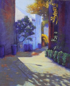
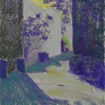
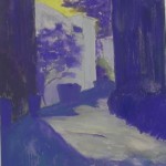
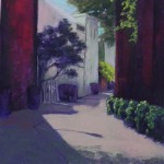
This past weekend was Open Studios Weekend at Artists and Makers so I needed a painting to work on. I decided to do another alley picture, from the recent photo shoot. This is the same alley I painted in Back Alley Blues, but it was closer to the street and I found the shadow to be quite dramatic.
I spent Friday night working on the drawing and then adding it to the board. When I arrived on Saturday, I didn’t like it, and erased it all! There was too much alley. I finally got the drawing right, then proceeded to the underpainting.
The primary compositional challenges were the sizes of the two walls, and the height of the alley. There was also a solid row of trash cans in the photo, which was REALLY boring! In my drawing, I placed them more strategically — and I make them look like old fashioned trash cans as well.
Colorwise, the walls were dark red brick and the trees and bushes were all green. I just assumed that this was going to be a red and green painting, without giving a lot of thought to it (big mistake!!!). Normally, I would use dark green under dark red for an underpainting, but for some reason, I went to violet and, as you can see, the whole underpainting ended up being kind of violet and yellow! Not exactly what one wants under a red/green painting. Personally, I find this to be one of the least inspiring and ugliest of underpaintings that I’ve done!!!
I proceeded to add the reds and the greens. However, I had real problems with the sky color, the color of the buildings in the middle, and the color of the shadow on the left. I used a warm grayed reddish brown for the base coat of the alley, which worked with the reds. But, I was not enthralled with this painting. What you see in the third small image is the painting as I left it on Saturday.
I woke up at 3:00 in the morning (which, due to the end of day lights savings time, was actually 2:00!). I knew that I was very unhappy with the painting so I started thinking about it. I just knew that I wanted to use violets and yellows in it–thus, the underpainting, I guess. So I started thinking through the various pieces of the painting. It took almost 2 sleepless hours to realize that it is now fall and I could change the green trees and bush to yellow oranges! And then I’d have a blue violet/yellow orange complement that might work rather nicely.
I got back to the studio at 9:00 AM and brushed off the sky and the green tree and shrub, as well as the color in the alley. I left the dark red. The value was right and I just added violets on over it. I then used light blue violets for the sky and the middle buildings and I was suddenly much happier with my painting! As I proceeded, I added some blue greens and red oranges (particularly in the walls). I used yellow ochre and aqua in the alley and a warm brown and blue green in the shadow. So I ended up with a double complement: blue violet/yellow orange and blue green/red orange. One of the big advantages to this scheme was that I could make the trash cans blue violet!!! This wouldn’t have worked as well with the reds.
When I first filmed the painting, the building at left was too dark and did not relate well to its shadow. I used a deep blue green to lighten it, using a diagonal stroke to help lead the eye into the alley. I worked to lose the edge between the tree and the building, and I think it works much better.
The shadow of the tree at bottom was a struggle, and I’m still not completely satisfied with it. I wanted it to be more of a suggestion.
But, on the whole, I am happy now with this picture.


I think that it is beautiful and it was great reading through your thought process and how you changed the image.
Thanks Kerry. I’m glad that you like it. Sometimes we think we know what we are doing and find out we don’t! But it’s always nice to come up with solutions.