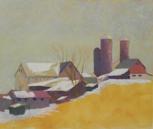
Well, so far so good! I resolved my problem with the sky by lightly layering an aqua Unison over the entire sky. It allows some of the underlying color to show through, so it isn’t all the same (you probably can’t see this), and it combines the colors of blue and yellow that I was seeing. Am happy with this! For the buildings, I’ve used Ludwigs and Blue Earth pastels primarily. For Christmas I received boxes of the violet and the nearlly neutral warm (i.e., brown). I’ve use these a lot, along with blues, greens and a bit of reddish color. I used a light Ludwig pink for most of the roof snow and may continue with it in the field. That’s the big challenge now. And I know I’m not done with the buildings. This is the first pass. Some of them are getting pretty grayed with too much color on them. But I like the simplicity of it so far. It reminds me of Charles Sheeler, one of my favorite of the early 20th century painters. I”m trying to focus on the shapes and keep the details to window suggestions and a few trees. Am still unsure what to do with the field. The corn rows could provide interesting lines and direction, but I’m afraid it might destroy the simplicity that I’m aiming for.

