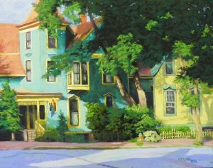
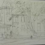
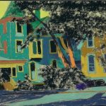
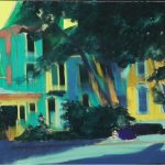
I’ve just completed another painting from Portland, Maine. This one has no roses or flowers of any kind. But a lot of windows and leaves! The drawing took most of my free time on Saturday. For the underpainting, you’ll see that I ended up using local color for the houses. For the foliage, I used what’s become my favorite NuPastel–Prussian blue. This was such a complicated picture, I decided to use the real color, but a little darker. I liked doing that in the last painting with the brick building and it worked quite nicely in this as well.
While everyone else wants to be loose, I find that I LOVE detail! Particularly the small details of light and shadow, like in the small window in the middle of the painting. This turned out to be one of my favorite spots.
Doing the shadows was fun on this picture. I used a combination of darker yellow oranges and yellow greens for the yellow trim in shadow. For the cast shadows on the yellow house, I used a yellow green mixed with the same turquoise from the left side of the house. For the darker blue shadows, I used brown and two blues. And in other areas, such as around the lower window, I used pure pieces of dark turquoise. This turned out to be the most enjoyable part of working on this painting.
I was concerned about the complexity of this painting and what the center of interest really is. The light strongly leads to the yellow house. But there is the porch at left with rainbow Pride flag, and the interesting windows. My husband said that was it. I think so as well, and I added small pieces of very whitish yellow to the window frames on that side. If you look closely, you’ll see a hydrant by the light bush. My husband said it should be red to bring the red from the flag over. But it seemed to be painted in the colors of the two houses and I didn’t want to change that. So I added a small piece of pinkish color in the window at right. Not sure how effective that is, but…
I simplified the blue house–hard to tell! Both houses have a Dutch colonial design with curved roof lines. You can see that on the yellow house. But I removed it on the blue. It was on the central part and I have to say I really didn’t like it! So I took my artistic license and I’m very happy! The house is simpler as a result. These houses were obviously built together because of the similar design and complementary colors. Blue green house with yellow trim; yellow house with blue green trim. They are also set at different angles. The yellow house faces the main road, but the blue is sideways and at an angle, with a driveway in between (I think). It makes for a more interesting picture.
The very dark leaves are from a tree in the foreground. I like the way it provides contrast, but it was very hard to film. The left side of the house is not as light as it looks, but I couldn’t get the tree light enough without getting the house a little washed out.
The sky is also washed out a bit. It’s the blue violet color of the road. I loved the shadows in the road. Used blue violets with some turquoises added on top and then some warmer color over the sunlit area.
This may be it for awhile for paintings from the trip. However, I may share some of my summer challenges paintings with you. I have to start focusing on my fall classes and what I’ll be doing. Looks like they’ll be zoom classes at this point–until the Delta variant goes away. BUT–I continue to love teaching via zoom when I can’t be in person. And it enables people to take from anywhere. I’ll be teaching Monday and Saturday mornings and Wednesday afternoons. I’m currently taking names in case you are interested. The focus will be on light and shadow!


