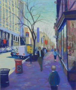
This afternoon I was able to put in a couple of hours at the studio and (hopefully) completed my latest painting of the Chinatown area. I’m calling this one Chinatown Reflections because it was the window reflections that most attracted me to the photo, which is otherwise not terribly exciting. It’s very dark and very light and there is too much sidewalk. But I decided to do it anyway. I began the drawing and painting during our Open Studios weekend two weeks ago, and I’ve been working on it ever since.
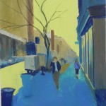
From the underpainting, you can see that there were only two figures originally. And these aren’t the two that were in the photo! I tried them out and didn’t like them, so I chose others from other photos, but kept them in the same place so that the proportions would be right. However, there was WAY too much sidewalk and I decided to add a third figure at the bottom. I based this on the figure in my first Chinatown painting but changed him a bit. I like the fact that the three figures form a triangle, as do the two men and two trash cans!
I had another compositional problem in that the street seemed too high in proportion to the horizon. With help from my friend Sunny, I decided to add a car next to the truck (actually in the photo) and I made the line of the road (obvious in the underpainting) less slanted. Now, I think it looks fine.
This is a very busy picture–much more so than my first one. There are many signs, cars, window reflections, and people! My original plan was to minimize–leave out the car next to the truck, omit the yellow sign, etc. But I found that all of these elements were needed and helped balance the color in the painting. And it was hard making up what would go in without them.
I began with the sky and then the buildings on the left. I wanted to keep them suggestive and brushed in color without using a ruler or worrying about the window sizes. I particularly enjoyed doing the part above the cars, just lightly adding color and finally the red sign. There are reds throughout the picture which help balance the colors. However, the sidewalk was a challenge and still is! I began the underpainting with blue, then used magenta on top. That color was impossible to subdue. You’ll see I added a lot of blues and blue greens on over it, which now make it look purple. I added light pieces of brick to make it more interesting. But it’s a lot of the same color. I used some similar colors in the upper part of the building on the right, hoping to make it more cohesive.
The tree is really important and I worked on it off an on throughout the picture. Most of it had to be done after the sky and building was done. I really like the gracefulness of it. (I thought about calling this “A Tree Grows in Chinatown”!)
Next week I’ll be in Massachusetts visiting my mother and giving a two day workshop. Fortunately, my demo will be trees, water, and bushes–no people, signs, or vehicles!


