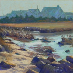
The Cedars (Demo for Maryland Pastel Society)

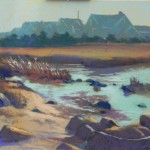
The Cedars, 20 x 20, Uart 320 mounted to gatorfoam

The Cedars, 20 x 20, Uart 320 mounted to gatorfoam

Painting at end of demo

Painting at end of demo

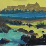
Underpainting

Underpainting

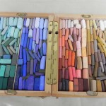
Small Heilmann box with four colors of demo

Small Heilmann box with four colors of demo

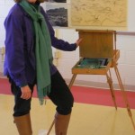
Me with the board and my color-coordinated outfit!

Me with the board and my color-coordinated outfit!

Yesterday I was privileged to give a demonstration for the Maryland Pastel Society. I did a lot of work ahead of time, all before Christmas–drawing, color studies, and the drawing on the 20 x 20 board.  For the demo, I focused on color and chose a split complement of blue green/red orange and blue violet/ yellow orange. I filled my small Heilmann box with just those four colors.  And I even wore clothes that matched!!!  Today I put in a couple of hours on making it a lot better in the quiet and privacy of my studio.

I did a hard pastel underpainting using warm under cool and cool under warm (primarily) and found the result rather interesting.  But I wiped out a lot of the detail in the carefully done drawing. I was working a little too fast, probably.

The houses are a combination of blue green and blue violet over the warm brown underpainting.  I used a slightly lighter green pastel  to indicate the “white” trim. There is a band of cedar trees in front of them that are also a combination of blues and greens.

The area of marsh grasses at top was a challenge. When I first did them, they were too orange. So I swiped some green on top and that calmed them down. But it was also too large of an area and too boring (see the underpainting).  I came up with the solution of cutting the line so that one part juts out . That was a bit improvement.

For the sky and water I used various aquas. In the sky, I used the same greenish Great American that I used in my pumpkin field painting. For the water I used some darker and lighter colors.  Aqua is a beautiful color and it looks so wonderful with all of the warm colors.

The hard part was the foreground. There is so much of it and it’s where all the detail is!  Little pebbles, foot prints in the sand, rocks, grasses, seaweed!  During the demo, I added some light orange highlights in the grasses in the midleft.  It was too early to do it, but I wanted to show people what I had in mind.  But I was getting really tired by the time I got to the sand and rocks!  I used the same combination of colors in all of the rocks in the foreground, which was quite boring.

So I was tired and sore by the end of the day but I felt that the demo was a success.  Today’s changes make me feel much better about it!  Here they are.

I refined the houses and delineated the two telephone poles. I brushed more color over the trees, ending with a dark grayed warm green.  I did more work with the edge of the marsh, adding some lights on the top and trying to keep it from being one dark line.

In the mid-left grasses, I brushed out most of the light orange I had used, and went in with a light grayed green.  I think that it gives the effect of light without hitting you over the head!  The other was too noticeable.  I think they have a more natural look now.

I did a lot of work with the water, adding the light orange in the middle and to the left. I believe that the light is coming from gap in the houses above.

I changed the shapes of the rocks at bottom and gave them more color.  I also added more colors to the sand and refined the rocks on the left.

As my husband said, this was a pretty detailed painting to do as a demo!  While I knew I’d never finish it completely, I think I gave people a good idea how to plan out and execute a difficult picture.

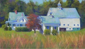
New Hampshire Farm

New Hampshire Farm, 14" x 24", Pastel Premiere Italian clay

New Hampshire Farm, 14″ x 24″, Pastel Premiere Italian clay

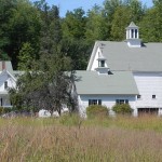
Reference photo

Reference photo

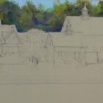
Stage 1 with sky and background trees

Stage 1 with sky and background trees

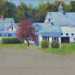
Completed buildings before foreground added

Completed buildings before foreground added

Painting as completed on first date

Painting as completed on first day

Happy New Years to you all!  I have finally gotten back to painting for the first time since early December. Between a bad foot, then a bad back, then Christmas, it just wasn’t in the cards. So it felt good to get back to my studio.

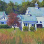
When it was so cold, I spent some time looking at summer photos from New England. I found a picture of a farm in New Hampshire that we stopped to film on the road between Maine and Vermont.  I’m including the photo so you can see what it looked like. I love farms that have a series of buildings and I really liked the shapes of the house, barn and outbuildings in this farm. But the colors were kind of dull (to say the least!).  It was Sept. and so I decided to advance things a bit and put in a red tree and hints of red in the background.

While sketching and thinking about the painting, I decided to do it on a full sheet of Italian clay Pastel Premiere. I did the drawing at home, doubling the size of the farm buildings.  At first, I had it as 12 x 24. But later on, I decided it needed more foreground and added two more inches at the bottom. By placing the drawing in the middle of the paper, I was free to add as much as I wanted to the top or bottom.

I began with the trees and sky. I didn’t want them to be fussy!  So, I worked pretty quickly with them, using a variety of greens, blues, and violets, then adding some pieces of red and orange to give a sense of impending fall color.  I then began on the buildings. For the roofs, I began with a blue, then used a blue green on top–all Girault. I wanted something more interesting than the dull green in the photo.  For the white sides of the buildings, I first used a very hard Caran d’ache light “almond”, then added a softer yellow on top in places for emphasis.

There’s a LOT of detail in this picture!  The windows and cupolas were all rather painstaking to do.  I found I was using hard pastel a lot in order to keep things looking OK.

Compositionally, I lowered the bottom, as I mentioned, before putting in the grasses and I was much happier with it. Also, I moved foreward the small building to the left of the red tree. In the photo it’s roof is at the same level with the bottom of the barn roof, which I didn’t like.  By making it taller and a little bigger, it moved it foreward and broke up the line of the buildings, which I liked much better than what is in the photo.  I put the grasses in and left for the day yesterday.

Today I came back and took a good look at it. I immediately saw that the windows in the barn were too big and the dark open space was also too high.  I also tried to change the color of the barn (not shown) by adding blue to it. It seemed like there was too much of the same and I thought it might read like shadow. It didn’t!  And it called too much attention to the barn.  I really wanted the area around the red tree to be the focus of the picture.  But I did add some blues and pinks to the the three roofs to give them variety.  The roof of the barn is a big area that really needed to be diversified.

I’m so used to doing underpaintings that I’m sometimes stymied when I try to work directly. However, I knew that I didn’t want to lose the drawing.  I tried to use the paper color and let some of it show through a little, but there isn’t a lot of it. And I completely lost it in the barn after adding too much pastel and brushing off!

But I’m pretty happy with it now.  I’m interested in what you think of it.