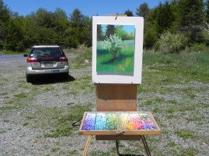
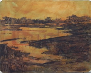
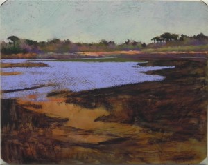
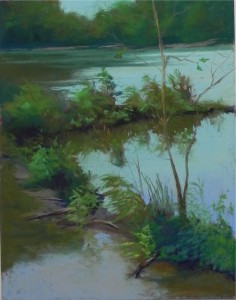
 So here is today’s painting–an 11 x 14 on UART 500. I’ve filmed it as it was completed outside. I will no doubt make changes to it as it is pretty dark. I was in full light and what looked bright to me in the sun doesn’t read like light in the house. For this reason, I never consider a plein air painting complete until I’ve looked at it inside. However, I don’t want to make too many changes. I want to preserve as much of the freshness as possible. In this post, I want to talk about what I look for when choosing subject matter. Today, I really didn’t think I was going to find anything! Not until I went over a small bridge and looked back at the lake, did I see the potential in this scene. What it had for me were the following: 1) diagonal lines, along with a strong horizontal in the background and the vertical of the tree; 2) interesting shapes created by the foliage and reflections, and 3) strong value differences between the land and the water. When painting in summer on the East Coast, we have to find anything that will create value differences. Those in the West often have lovely mountains and vistas that are more distinct. Here it’s one huge mass of green and pretty boring!!! Color is almost always blues, greens, and browns. I try to vary this by doing underpaintings in warm colors, adding violets, etc. But I rarely look for color first. As to color approach, I also tend to use observed color, since that’s a primary reason for painting on location. In this painting, note that the water at the bottom looks different from that above it. Because it is reflecting the sky above, it is a little cooler but it was also very shallow and the warm orangey dirt underneath was showing through. So I used a more violet blue along with a light orange. Some tips on choosing subject matter: 1) look for simple subjects with strong shapes and values; 2) feel free to omit or move but be very careful adding anything that isn’t there; 3) don’t do subjects that are too complicated (e.g., street scenes), unless you are really comfortable with them. I don’t do buildings as much outside as I do in the studio, and when I do them I try to simplify them. Getting the perspective right in a row of buildings can be really hard when outside. In this painting, I changed the background in order to introduce a section of sky and I left out buildings and docks that were on the far shore. I hope this has been helpful. With the beginning of summer, I know that a lot of you will be painting outside and thought I’d share my journey with you.
Monthly Archives: May 2013
Painting en Plein Air–Part 1
I thought I was done posting, but I went out to paint today and decided that it would be nice to share my personal journey of plein air painting with you. There is a lot of information out there on what to bring and use, but I thought I’d share with you what I’ve found most useful. I also want to talk about what I look for when choosing subject matter, which I’ll cover in the next post. This one will discuss equipment, materials and techniques. For that reason, I’m repeating this photo from my first outdoor session this year so I have something for you to look at! I began painting outside on 9-11! I set up my new Julian easel with the legs backwards, but it was OK. It was so wonderful to be outside in nature and not feel like everything I knew had changed. I’ve been painting outside now for 12 years and it’s been a real odyssey. I finally feel like I have my act together (maybe!) so I thought I’d share my experiences with you. First of all equipment. I use a standard Julian easel for its sturdiness. I’ve painted with it on windy hillsides and by the ocean and it hasn’t let me down (but I’ve seen other peoples easels and paintings go flying!) I don’t take this on planes and basically avoid painting when I go anywhere on a plane! I also use the Heilmann back pack box for my pastels. I love this box–really well made and carries the right amount of pastel. There are 6 columns and I have 5 of them devoted to soft pastels (Ludwig, Schmincke, Great American and Unison) and one for Girault on the right. I also carry a small plastic box of hard pastels that I use for underpaintings, and have a few of them in the Girault space in case I need more detail. Those are the basics. In addition, I have an old bag in which I carry everything else–brushes, alcohol, sun lotion and bug spray, paper towels and wet ones, and my box of corn meal. I also try to remember to put some business cards in there. AND, almost forgot–my 3 in one picture perfect viewfinder, which I always use. One other piece of equipment is a small plastic stool that allows me to sit and rest. I have been all over the place on surfaces, beginning with sanded, moving to rough home-made, then to Pastelbord. Now I’m into UART and I’m sticking with it for now. Here’s what I’ve learned: 1) use a surface that you really like; 2) don’t work too large (I generally don’t go about 12 x 16); 3) use a surface that won’t take too much time to complete! I used to feel that sanded surfaces were restricting because I got too heavy on them. But I realized that the rough surfaces take forever, unless I use really soft pastels, which get too gummy. Learning to use my Giraults and a light touch has really helped. I like the UART (400 and 500) because I get immediate gratification! The pastel goes on so nicely. This is true of Wallis as well, I just don’t happen to have as much of it right now. And because my outdoor painting is done in humid, damp climates on the East Coast, I like to have the paper mounted. Ive purchased the UART 500 boards from ProArt Panels on foam core (very nice) and more recently I got the 400 grit from Dakota in 11 x 14 and 12 x 16 sizes. These are my preferred sizes for painting outside–not too large and not too small. I’ll also be taking some 9 x 12 mounted Wallis gray to the Cape, given that I have it on hand. As to pastels, the major change I’ve made over the years is to use more Girault. I first purchased the Mowry Poetic Landscape set in wood box in 2002 and really didn’t like them. I was so used to the soft Great Americans. They seemed hard and not pleasant to work with. But as I’ve gotten back into softer sanded surfaces, I know how much I depend on them. I also use the soft pastels, but I try to be careful not to build up too much pastel. As to techniques, I now prefer a hard pastel and alcohol underpainting. I’ve used watercolor a lot, but the hard pastel is easier and gives me more in the way of composition and values support. I’ve been doing my layin with the side of a hard pastel and moving quickly to the underpainting. I don’t always do any studies in my notebook, I have to confess! But it’s there, along with the Tombow pens, just in case!
IAPS
Next Wednesday, I’ll be flying to Albuquerque to attend my 5th IAPS convention. IAPS is the International Association of Pastel Societies and it holds a convention every two years (now always in Albuquerque). I attended my first in 2003, just as I was about to retire from the Library of Congress. After attending library conventions twice a year that took up an entire city, with shuttle buses and an enormous convention center filled with computer systems, IAPS was a true joy! To begin with, it was all in one hotel. No problems finding the next demonstration. And the exhibitions hall–well, it was quite amazing. Filled with color and every type of pastel. After all of the work I had done at the ALA conventions, I just wanted to enjoy and learn at IAPS. I attended demonstrations with many leading pastelists and my paintings and the information in my book reflects a lot of what I learned. That first year, I went by myself, knowing no one. Liz Haywood-Sullivan and two friends learned that I was originally from Massachusetts and “adopted” me. We had a wonderful time and I’ve always been grateful to her. This year, I have the opportunity to give back as I will be running the “Pastel Pics” silent auction that she innaugurated 2 years ago. I’m very happy to be helping and to be more a part of things at last. If any of you will be there, I hope to meet you! I’ll be at the IAPS booth some of the time in the afternoons and I’ll be doing a book signing at 3:00 on Saturday. I would love to meet you! I’ll also have two paintings in the juried show and excited about that (Gracie and Fog Study in Blue). I will be travelling with my husband afterwards, then going to Massachusetts for a workshop with Liz and a demonstration I’ll be giving at the Falmouth Art Center on Sunday June 30th. I won’t be posting anything during this time so this will probably be my last post until July. I’m not the kind to take pictures with my phone and immediately post them to my blog, but I’d like to learn! Thanks all for making the first months of my blog so much fun!
Lock 6, C&O Canal
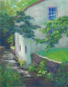
A friend and I went out to paint today. After two beautiful (but cool) days, today seemed perfect. We went to the C&O Canal along the Clara Barton Parkway and wonderously found a parking spot–many canoers and hikers there as it is a federal holiday. We spent some time looking around and filming then decided to do the gatehouse from this angle with the light on the house and water. Unfortunately, by the time we were set up, the light was gone and it never came back–totally overcast! I had made a mental note of how the light was hitting the house and just had to wing it! The building is whitewashed stone, very irregular, with interesting off-white color. Of course, it was all the same when we were looking at it. I chose a mid-value blue green and beige color and used those two for the shadowed side, with a light yellow for the lit area. The running water was a challenge for me–not something I do very often. I used greens, browns, grayed reds, and slate blues. I carried the blues and blue greens into the window in the house as well. Simplifying the color palette, I hope, keeps the eye focused on the light, while creating harmonious surroundings.
- Lock 6, C&O Canal, 14 x 11, UART 500
Assateague Pines Revisited
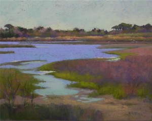
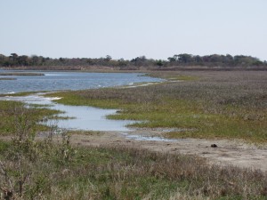
I’m done, for today, at least. I’m quite happy with this picture, after struggling to get the shapes the way I wanted them. There were a number of challenges with this painting. First, is that the major interest is in the background! I made the pine trees on right taller to give them interest but had to tone everything down to keep it back. Nevertheless, this is one of the primary parts of the painting. The second challenge was the large area at the right of the picture, which in the photo, is a dull gray. I tried to make this more interesting with the use of blue violet, cool reds, and greens brushed over one another. I do like the way the cool red shows against the blue violet of the water. (Note: I cropped the photo when I printed it, cutting off much of the right side.) I think you can see from the photo the challenge with the color. But I hope you can also see what drew me to the scene as well. While far from perfect, this is a much more successful painting than the one that is currently on my website and will be removed soon!
Bach, Lewis, and Assateague
It’s a rainy day here in Maryland. I had intended to paint outside today, but that’s not to be. So I’m spending the day in the studio with two CD’s of John Lewis’s jazz improvisations of Bach’s preludes and fugues. I know nothing about jazz and don’t often listen to it. But I do know a little about Bach and these albums are amazing. This is a total side issue–except that I’m hoping that listening to a genius like Lewis improvise on the music of our greatest genius, Bach, will help me improvise on my color!!! This is another reinterpretation of a painting I did years ago. I’m working on a 16 x 20 pastelbord. The original painting, which I worked on last week, was washed off and I applied two coats of toned gel. I decided to do a simple underpainting of the composition with a single hard pastel in dark violet to get the overall shapes of the land, water and sky. When I started applying pastel, I used Giraults for the background trees and bushes and soft Terry Ludwigs for much of the sky and the water below. I love the shapes in this picture; nothing dramatic, but pleasing to me. I didn’t do a good job with it the first time (a number of years ago)–too much color–and I’m hoping I can do a better job this time around. The photo is all greens and browns, pretty dull. So I’ll see where it goes! I’m being brave to put this on the blog at this point because I don’t know whether it’s going to work or not, but so far I have really good feelings about it and that always helps!
Spring Hillside
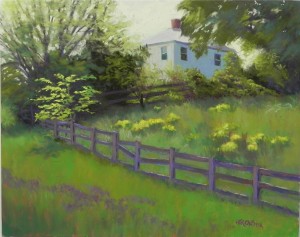
I just went back to Monday’s picture and finished it off with a number of small changes. First, I added more color to the fence: some rich browns, slate blue, and a light warm color for the tops of the slats. I added spots of dark red violet under the bushes along the fence in front of the house and light yellow to the sky in between the house and tree. A little majenta was added to the bugle in front and also brought into the greens below the mustard and in front of the fence. It gives them a richer color. The windows on left and right were straightened a bit. These were all small changes but I’m now much happier with the painting. While my original thought was for the locust tree to be the center of interest, it really is the house. Once you add a building, animal, or person to a painting, it’s almost impossible for it not to be the center of interest. But that’s OK because it’s always been the house that has drawn me to the scene. The locust tree is a nice focal point on the way up the hill to the house. I’ve decided to call it Spring Hillside as it is about the abundance of life and the variety of greens at this time of year. A happy picture!
Demonstration-4
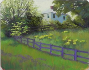
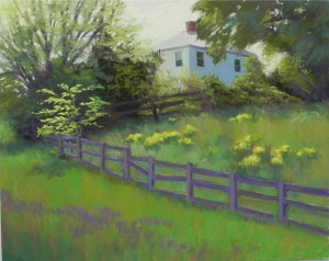 Here are the last two pictures. In the first, I have filled in the field and grasses. I’ve reconfigured the fence but haven’t worked on it yet. I decided to add more color to the shadow side of the house and found a blue violet the same value as the blue green. This gives it added dimension, I think. I tried to keep the wild mustard from competing with the locust tree by adding a yellow green Girault over the initial yellows. I’ve made the foreground grasses brighter and added a band of purple bugle, which breaks up the space. In the final image (final for now only!), I’ve worked on the fence, added a little orange to the roof, and made other small changes, including removing the tape and finishing off the corners. I think I may need to add a little more variety of color and value to the fence but I’m quite happy with this now. It needs to rest for a day or two so I can bring a fresh eye to it. Thanks for sharing this cold day with me! I’ve enjoyed sharing my painting process with you all and will no doubt do it again.
Demonstration–3
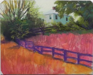
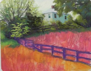 Here are the next two stages. In the first picture, I’ve painted in the tree at right and some of the foliage along the fence and have begun working on the large tree at left. I’ve used cooler, darker colors below, progressing up to lighter and warmer colors. I’ve also indicated lightly with a medium warm green where the small locust tree will go. In the next photo, I’ve complete the trees and left upper side of the picture. For the locust tree, I began with a light, cool Girault, then used two values of softer pastels to really give it punch. In the upper bushes along the fence, I’ve added several values of majenta to give more depth and interest to the color. I’m using a small piece of dark red violet for the fence and tree trunks. I’m very happy at this point with my choice of sky color–a big relief!
Demonstration–Part 2
- First application of pastel
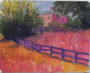
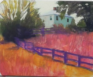
I decided to use hard pastel for my underpainting, rather than watercolor, as I want really rich color and plan to cover the entire surface with pastel. I wanted to get a rich dark behind the locust tree and I certainly got it! The grasses inside the fence appear cooler
This next picture shows where I’m at right now. I’ve added pastel to the sky and house. My original thought was to put a brighter blue in the sky, but the photo influenced me and I went with a light, warm green, and some pale orange (not visible in this photo, I’m afraid). The roof of the house is painted with a slightly cooler green that distinguishes it from the sky but keeps the values similar. There is more house right now than what I see in the photo and my plan is to add more foliage over it. I’ve used light applications of two values of cool green Girault on the house and have let the underpainting color show through. This adds more interest to the bland walls. One of the things I notice at this point is that I’ve lost the angle of the upper fence–it needs to go down more on the left–and I will need to correct that. (Note: you might notice that the corners are taped. The board is stuck on foam core with artist’s tape, but it’s too heavy to stay and I find I need to tape the edges to keep if from landing on the floor! I’ll finish the corners later.)

