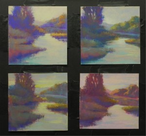
On Mondays I teach an advanced class all day. I encourage people to experiment but I’m usually the only one doing it! Yesterday I decided to play with color for a potential square painting of the Mattapoisett River in early morning light. I worked from a black and white photo and interpreted it loosely. I used 7 x 7 pieces of UArt (the strips cut from the 20 x 20s). All but the last one (lower right) were done solely with hard pastels–a combination of Faber Castell Polychromos and NuPastels. The last one was done this morning at home using my Terry Ludwig vibrants set and some Giraults. I began with the sky color and used different colors in each: clockwise from upper left: orange, blue, pink, and green. I’ve done many types of color studies over the years and often don’t do them at all. For these studies, I didn’t limit the palette and I applied warm over cool, cool over warm in many different layers. The one in upper right came out the coolest and is probably my favorite; the one below it is the warmest and my least favorite (which says something about my taste in colors). None of these have much relation to the photograph, which was totally green. I did add some greens in the upper right and lower left and this gives it a little more realistic look. But I wasn’t really aiming for that. It was more about shape, value, and temperature balance. I really liked what happened in the foreground grasses in the upper left picture, where I began with warm colors and layered a greenish blue on top. This is a good way of creating those odd sundown-type colors that are so hard to define. Playing is fun! I encourage everyone to do it–don’t just work on one painting after another.
Monthly Archives: February 2013
Using analogous and complementary color
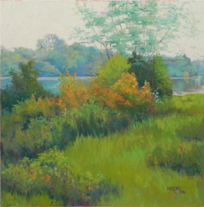
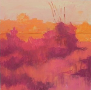
One of the things I love about winter is that I can work from photos without guilt! And one of the things I love about working from photos is the ability to think about them for awhile and play with various ideas. I began thinking about painting this scene from inland Maine on Monday and did sketches with a ball point pen on newsprint. Then, while driving to the grocery store on Thursday, I came up with the idea of doing an underpainting of complementary warm colors under the analogous warm and cool greens of the photo. The underpainting also allowed me to play with and improve on the composition: in the photo, there was a triangle of mown grass in the lower right and everything else was high bushes. The river was only visible on the right. By playing with shapes of darker value, I came up with a composition that invites the viewer to walk into the scene to the river. This painting is also about strokes. I used many small strokes of varying colors in all of the folieage and really had fun with oranges, using my new box of Dakota Blue Earth orange pastels. While the scene is a peaceful one, the strokes make it more active and vibrant. The sky is a combination of a pale grayed blue green, light orange, and a very light whitish green from the Art Spectrum “super soft” set that pulled it all together. While probably not visible in this image, I did leave some of the reds and oranges of the underpainting showing in small spots of color.


